

Python 数学应用(二)
原文:
zh.annas-archive.org/md5/123a7612a4e578f6816d36f968cfec22译者:飞龙
第五章:处理随机性和概率
在本章中,我们将讨论随机性和概率。我们将首先通过从数据集中选择元素来简要探讨概率的基本原理。然后,我们将学习如何使用 Python 和 NumPy 生成(伪)随机数,以及如何根据特定概率分布生成样本。最后,我们将通过研究涵盖随机过程和贝叶斯技术的一些高级主题,并使用马尔可夫链蒙特卡洛方法来估计简单模型的参数来结束本章。
概率是特定事件发生的可能性的量化。我们在日常生活中直观地使用概率,尽管有时正式理论可能相当反直觉。概率论旨在描述随机变量的行为,其值是未知的,但是该随机变量取某些(范围的)值的概率是已知的。这些概率通常以几种概率分布的形式存在。可以说,最著名的概率分布是正态分布,例如,它可以描述大规模人口中某一特征的分布。
我们将在第六章 处理数据和统计 中再次在更应用的环境中看到概率,那里我们将讨论统计学。在这里,我们将利用概率理论来量化误差,并建立一个系统的数据分析理论。
在本章中,我们将涵盖以下示例:
-
随机选择项目
-
生成随机数据
-
更改随机数生成器
-
生成正态分布的随机数
-
处理随机过程
-
使用贝叶斯技术分析转化率
-
使用蒙特卡罗模拟估计参数
技术要求
对于本章,我们需要标准的科学 Python 包 NumPy、Matplotlib 和 SciPy。我们还需要 PyMC3 包来完成最后的示例。您可以使用您喜欢的软件包管理器(如pip)来安装它:
python3.8 -m pip install pymc3
此命令将安装 PyMC3 的最新版本,在撰写本文时为 3.9.2。该软件包提供了概率编程的功能,涉及执行许多由随机生成的数据驱动的计算,以了解问题解的可能分布。
本章的代码可以在 GitHub 存储库的Chapter 04文件夹中找到:github.com/PacktPublishing/Applying-Math-with-Python/tree/master/Chapter%2004。
查看以下视频以查看代码实际运行情况:bit.ly/2OP3FAo。
随机选择项目
概率和随机性的核心是从某种集合中选择一个项目的概念。我们知道,从集合中选择项目的概率量化了被选择的项目的可能性。随机性描述了根据概率从集合中选择项目,而没有任何额外的偏见。随机选择的相反可能被描述为确定性选择。一般来说,使用计算机复制纯随机过程是非常困难的,因为计算机及其处理本质上是确定性的。然而,我们可以生成伪随机数序列,当正确构造时,可以展示出对随机性的合理近似。
在这个示例中,我们将从集合中选择项目,并学习本章中将需要的一些与概率和随机性相关的关键术语。
准备工作
Python 标准库包含一个用于生成(伪)随机数的模块称为random,但在这个示例中,以及本章的其他地方,我们将使用 NumPy 的random模块。NumPy 的random模块中的例程可以用来生成随机数数组,比标准库中的例程更灵活。和往常一样,我们使用别名np导入 NumPy。
在我们继续之前,我们需要确定一些术语。样本空间是一个集合(一个没有重复元素的集合),事件是样本空间的子集。事件A发生的概率表示为P(A),是 0 到 1 之间的数字。概率为 0 表示事件永远不会发生,而概率为 1 表示事件一定会发生。整个样本空间的概率必须为 1。
当样本空间是离散的时,概率就是与每个元素相关的 0 到 1 之间的数字,所有这些数字的总和为 1。这赋予了从集合中选择单个项目(由单个元素组成的事件)的概率以意义。我们将在这里考虑从离散集合中选择项目的方法,并在“生成正态分布随机数”示例中处理连续情况。
如何做…
执行以下步骤从容器中随机选择项目:
- 第一步是设置随机数生成器。目前,我们将使用 NumPy 的默认随机数生成器,在大多数情况下这是推荐的。我们可以通过调用 NumPy 的
random模块中的default_rng例程来实现这一点,这将返回一个随机数生成器的实例。通常情况下,我们会不带种子地调用这个函数,但是在这个示例中,我们将添加种子12345,以便我们的结果是可重复的:
rng = np.random.default_rng(12345)
# changing seed for repeatability
- 接下来,我们需要创建数据和概率,我们将从中进行选择。如果您已经存储了数据,或者希望以相等的概率选择元素,则可以跳过此步骤:
data = np.arange(15)
probabilities = np.array(
    [0.3, 0.2, 0.1, 0.05, 0.05, 0.05, 0.05, 0.025,
    0.025, 0.025, 0.025, 0.025, 0.025, 0.025, 0.025]
)
作为一个快速的健全性测试,我们可以使用断言来检查这些概率确实相加为 1:
assert round(sum(probabilities), 10) == 1.0, \
    "Probabilities must sum to 1"
- 现在,我们可以使用随机数生成器
rng上的choice方法,根据刚刚创建的概率从data中选择样本。对于这种选择,我们希望打开替换,因此调用该方法多次可以从整个data中选择:
selected = rng.choice(data, p=probabilities, replace=True)
# 0
- 要从
data中选择多个项目,我们还可以提供size参数,该参数指定要选择的数组的形状。这与许多其他 NumPy 数组创建例程的shape关键字参数起着相同的作用。给定size的参数可以是整数或整数元组:
selected_array = rng.choice(data, p=probabilities, replace=True, size=(5, 5))
#array([[ 1, 6, 4, 1, 1],
#       [ 2, 0, 4, 12, 0],
#       [12, 4, 0, 1, 10],
#       [ 4, 1, 5, 0, 0],
#       [ 0, 1, 1, 0, 7]])
工作原理…
default_rng例程创建一个新的伪随机数生成器(PRNG)实例(带有或不带有种子),可以用来生成随机数,或者如我们在示例中看到的,从预定义数据中随机选择项目。NumPy 还具有基于隐式状态的接口,可以直接使用random模块中的例程生成随机数。然而,通常建议显式地创建生成器,使用default_rng或自己创建Generator实例。以这种方式更加明确更符合 Python 的风格,并且应该会导致更可重现的结果(在某种意义上)。
种子是传递给随机数生成器以生成值的值。生成器以完全确定的方式基于种子生成一系列数字。这意味着给定相同种子的相同 PRNG 的两个实例将生成相同的随机数序列。如果没有提供种子,生成器通常会产生一个依赖于用户系统的种子。
NumPy 的Generator类是低级伪随机比特生成器的包装器,这是实际生成随机数的地方。在最近的 NumPy 版本中,默认的 PRNG 算法是 128 位置换同余生成器。相比之下,Python 内置的random模块使用 Mersenne Twister PRNG。有关不同 PRNG 算法的更多信息,请参阅更改随机数生成器示例。
Generator实例上的choice方法根据底层BitGenerator生成的随机数执行选择。可选的p关键字参数指定与提供的数据中的每个项目相关联的概率。如果没有提供此参数,则假定均匀概率,其中每个项目被选择的概率相等。replace关键字参数指定是否应进行带或不带替换的选择。我们打开了替换,以便可以多次选择相同的元素。choice方法使用生成器给出的随机数进行选择,这意味着使用相同种子的相同类型的两个 PRNG 在使用choice方法时将选择相同的项目。
还有更多...
choice方法也可以通过将replace=False作为参数来创建给定大小的随机样本。这保证了从数据中选择不同的项目,这对于生成随机样本是有利的。例如,这可能用于从整个用户组中选择用户来测试界面的新版本;大多数样本统计技术依赖于随机选择的样本。
生成随机数据
许多任务涉及生成大量的随机数,这些随机数在它们最基本的形式下要么是整数,要么是浮点数(双精度),位于范围 0 ≤ x < 1. 理想情况下,这些数字应该是均匀选择的,这样如果我们绘制大量这样的数字,它们应该大致均匀地分布在范围 0 ≤ x < 1 之间。
在这个示例中,我们将看到如何使用 NumPy 生成大量的随机整数和浮点数,并使用直方图显示这些数字的分布。
准备工作
在开始之前,我们需要从 NumPy 的random模块中导入default_rng例程,并创建默认随机数生成器的实例以在示例中使用:
from numpy.random import default_rng
rng = default_rng(12345) # changing seed for reproducibility
我们已经在随机选择项目示例中讨论了这个过程。
我们还将 Matplotlib 的pyplot模块导入为别名plt。
如何做...
执行以下步骤生成均匀随机数据并绘制直方图以了解其分布:
- 要生成 0 到 1 之间的随机浮点数,包括 0 但不包括 1,我们使用
rng对象上的random方法:
random_floats = rng.random(size=(5, 5))
# array([[0.22733602, 0.31675834, 0.79736546, 0.67625467, 0.39110955],
#        [0.33281393, 0.59830875, 0.18673419, 0.67275604, 0.94180287],
#        [0.24824571, 0.94888115, 0.66723745, 0.09589794, 0.44183967],
#        [0.88647992, 0.6974535 , 0.32647286, 0.73392816, 0.22013496],
#        [0.08159457, 0.1598956 , 0.34010018, 0.46519315, 0.26642103]])
- 要生成随机整数,我们使用
rng对象上的integers方法。这将返回指定范围内的整数:
random_ints = rng.integers(1, 20, endpoint=True, size=10)
# array([12, 17, 10, 4, 1, 3, 2, 2, 3, 12])
- 为了检查随机浮点数的分布,我们首先需要生成一个大数组的随机数,就像我们在步骤 1中所做的那样。虽然这并不是严格必要的,但更大的样本将能够更清楚地显示分布。我们生成这些数字如下:
dist = rng.random(size=1000)
- 为了显示我们生成的数字的分布,我们绘制了数据的直方图:
fig, ax = plt.subplots()
ax.hist(dist)
ax.set_title("Histogram of random numbers")
ax.set_xlabel("Value")
ax.set_ylabel("Density")
生成的图表显示在图 4.1中。正如我们所看到的,数据大致均匀地分布在整个范围内:
图 4.1:在 0 和 1 之间生成的随机数的直方图
它是如何工作的...
Generator接口提供了三种简单的方法来生成基本的随机数,不包括我们在随机选择项目示例中讨论的choice方法。除了random方法用于生成随机浮点数,integers方法用于生成随机整数,还有一个bytes方法用于生成原始的随机字节。这些方法中的每一个都调用底层BitGenerator实例上的相关方法。这些方法还允许生成的数字的数据类型进行更改,例如,从双精度到单精度浮点数。
还有更多...
Generator类上的integers方法通过添加endpoint可选参数,结合了旧的RandomState接口上的randint和random_integers方法的功能。(在旧接口中,randint方法排除了上限点,而random_integers方法包括了上限点。)Generator上的所有随机数据生成方法都允许自定义生成的数据类型,而在旧接口中是不可能的。(这个接口是在 NumPy 1.17 中引入的。)
在图 4.1中,我们可以看到我们生成的数据的直方图在范围 0 ≤ x < 1 上大致均匀。也就是说,所有的柱状图大致是水平的。(由于数据的随机性,它们并不完全水平。)这是我们从random方法生成的均匀分布的随机数所期望的。我们将在生成正态分布随机数的示例中更详细地解释随机数的分布。
更改随机数生成器
NumPy 中的random模块提供了几种替代默认 PRNG 的选择,它使用了 128 位置换同余生成器。虽然这是一个很好的通用随机数生成器,但对于您的特定需求可能不够。例如,这个算法与 Python 内部的随机数生成器使用的算法非常不同。我们将遵循 NumPy 文档中为运行可重复但适当随机的模拟设置的最佳实践指南。
在这个示例中,我们将向您展示如何切换到另一种伪随机数生成器,并如何在程序中有效地使用种子。
准备工作
像往常一样,我们使用别名np导入 NumPy。由于我们将使用random包中的多个项目,我们也从 NumPy 中导入该模块,使用以下代码:
from numpy import random
您需要选择 NumPy 提供的替代随机数生成器之一(或者定义自己的;请参阅本示例中的*还有更多...*部分)。在本示例中,我们将使用 MT19937 随机数生成器,它使用了类似于 Python 内部随机数生成器中使用的 Mersenne Twister 算法。
如何做...
以下步骤展示了如何以可重现的方式生成种子和不同的随机数生成器:
- 我们将生成一个
SeedSequence对象,可以从给定的熵源可重现地生成新的种子。我们可以像为default_rng提供种子一样提供我们自己的熵,或者让 Python 从操作系统中收集熵。在这里,我们将使用后者,以演示其用法。为此,我们不提供任何额外的参数来创建SeedSequence对象:
seed_seq = random.SeedSequence()
- 现在我们有了一种方法来为会话的其余部分生成随机数生成器的种子,接下来我们记录熵,以便以后如果需要的话可以重现这个会话。以下是熵应该看起来的示例;您的结果必然会有些不同:
print(seed_seq.entropy)
# 9219863422733683567749127389169034574
- 现在,我们可以创建底层的
BitGenerator实例,为包装的Generator对象提供随机数:
bit_gen = random.MT19937(seed_seq)
- 接下来,我们创建包装
Generator对象以围绕此BitGenerator实例创建可用的随机数生成器:
rng = random.Generator(bit_gen)
它是如何工作的...
如随机选择项目配方中所述,Generator类是围绕实现给定伪随机数算法的基础BitGenerator的包装器。NumPy 通过BitGenerator类的各种子类提供了几种伪随机数算法的实现:PCG64(默认);MT19937(在此配方中看到);Philox;和SFC64。这些位生成器是用 Cython 实现的。
PCG64生成器应该提供具有良好统计质量的高性能随机数生成。 (在 32 位系统上可能不是这种情况。)MT19937生成器比更现代的 PRNG 慢,不会产生具有良好统计特性的随机数。然而,这是 Python 标准库random模块使用的随机数生成器算法。Philox生成器相对较慢,但产生非常高质量的随机数,而SFC64生成器速度快,质量良好,但缺少其他生成器可用的一些功能。
在此配方中创建的SeedSequence对象是以独立且可重现的方式为随机数生成器创建种子的一种方法。特别是,如果您需要为几个并行进程创建独立的随机数生成器,但仍然需要能够稍后重建每个会话以进行调试或检查结果,这将非常有用。存储在此对象上的熵是从操作系统中收集的 128 位整数,它作为随机种子的来源。
SeedSequence对象允许我们为每个独立的进程/线程创建一个独立的随机数生成器,这些生成器彼此独立,消除了可能使结果不可预测的数据竞争问题。它还生成非常不同的种子值,这可以帮助避免一些 PRNG(例如 MT19937,它可以使用两个相似的 32 位整数种子值产生非常相似的流)的问题。显然,当我们依赖这些值的独立性时,有两个独立的随机数生成器产生相同或非常相似的值将是有问题的。
还有更多...
BitGenerator类充当原始随机整数生成器的通用接口。先前提到的类是 NumPy 中使用BitGenerator接口实现的类。您也可以创建自己的BitGenerator子类,尽管这需要在 Cython 中实现。
有关更多信息,请参阅 NumPy 文档numpy.org/devdocs/reference/random/extending.html#new-bit-generators。
生成正态分布的随机数
在生成随机数据配方中,我们生成了在 0 和 1 之间遵循均匀分布的随机浮点数,但不包括 1。然而,在大多数需要随机数据的情况下,我们需要遵循几种不同的分布之一。粗略地说,分布函数是一个描述随机变量具有低于x值的概率的函数f(x)。在实际情况下,分布描述了随机数据在范围内的分布。特别是,如果我们创建遵循特定分布的数据的直方图,那么它应该大致类似于分布函数的图形。这最好通过示例来看。
最常见的分布之一是正态分布,在统计学中经常出现,并且构成了我们将在第六章中看到的许多统计方法的基础,处理数据和统计。在这个示例中,我们将演示如何生成遵循正态分布的数据,并绘制这些数据的直方图以查看分布的形状。
准备工作
与生成随机数据示例中一样,我们从 NumPy 的random模块中导入default_rng例程,并创建一个具有种子生成器的Generator实例以进行演示:
from numpy.random import default_rng
rng = default_rng(12345)
像往常一样,我们导入了 Matplotlib 的pyplot模块并将其命名为plt,以及导入了 NumPy 并将其命名为np。
如何操作...
在接下来的步骤中,我们生成遵循正态分布的随机数据:
- 我们在
Generator实例上使用normal方法来生成符合normal分布的随机数据。正态分布有两个参数,位置和比例。还有一个可选的size参数,用于指定生成数据的形状。(有关size参数的更多信息,请参见生成随机数据示例。)我们生成一个包含 10,000 个值的数组,以获得一个相当大的样本:
mu = 5.0 # mean value
sigma = 3.0 # standard deviation
rands = rng.normal(loc=mu, scale=sigma, size=10000)
- 接下来,我们将绘制这些数据的直方图。我们增加了直方图中的
bins数量。这并不是严格必要的,因为默认数量(10)已经足够了,但这样做可以更好地显示分布:
fig, ax = plt.subplots()
ax.hist(rands, bins=20)
ax.set_title("Histogram of normally distributed data")
ax.set_xlabel("Value")
ax.set_ylabel("Density")
- 接下来,我们创建一个函数,用于生成一系列值的预期密度。这是通过将正态分布的概率密度函数乘以样本数(10,000)得到的:
def normal_dist_curve(x):
    return 10000*np.exp(-0.5*((x-
        mu)/sigma)**2)/(sigma*np.sqrt(2*np.pi))
- 最后,我们在数据的直方图上绘制我们的预期分布:
x_range = np.linspace(-5, 15)
y = normal_dist_curve(x_range)
ax.plot(x_range, y, "k--")
结果显示在图 4.2中。我们可以看到这里,我们抽样数据的分布与正态分布曲线的预期分布非常接近:
图 4.2:从均值为 5,比例为 3 的正态分布中绘制的数据的直方图,并叠加了预期密度
工作原理...
正态分布具有以下公式定义的概率密度函数:
这与正态分布函数F(x)相关,根据以下公式:
这个概率密度函数在均值处达到峰值,与位置参数重合,而"钟形曲线"的宽度由比例参数确定。我们可以在图 4.2中看到,由Generator对象上的normal方法生成的数据的直方图非常接近预期分布。
Generator类使用 256 步 Ziggurat 方法生成正态分布的随机数据,与 NumPy 中还可用的 Box-Muller 或逆 CDF 实现相比,速度更快。
还有更多...
正态分布是连续概率分布的一个例子,因为它是针对实数定义的,并且分布函数是由积分(而不是求和)定义的。正态分布(以及其他连续概率分布)的一个有趣特征是,选择任何给定实数的概率都是 0。这是合理的,因为只有在给定范围内测量所选分布中的值的概率才有意义。(选择特定值的概率为零是没有意义的。)
正态分布在统计学中很重要,主要是因为中心极限定理。粗略地说,该定理指出,具有共同均值和方差的独立同分布(IID)随机变量的总和最终会像具有共同均值和方差的正态分布。这适用于这些随机变量的实际分布。这使我们能够在许多情况下使用基于正态分布的统计检验,即使变量的实际分布不一定是正态的。(但是,当引用中心极限定理时,我们需要非常谨慎。)
除了正态分布之外,还有许多其他连续概率分布。我们已经遇到了在 0 到 1 范围内的均匀分布。更一般地,范围为a ≤ x**≤ b的均匀分布具有以下概率密度函数:
连续概率密度函数的其他常见例子包括指数分布、贝塔分布和伽玛分布。每个分布都有一个对应的Generator类的方法,用于从该分布生成随机数据。这些方法通常根据分布的名称命名,全部使用小写字母。因此,对于上述分布,对应的方法分别是exponential、beta和gamma。这些分布都有一个或多个参数,例如正态分布的位置和尺度,用于确定分布的最终形状。您可能需要查阅 NumPy 文档(numpy.org/doc/1.18/reference/random/generator.html#numpy.random.Generator)或其他来源,以查看每个分布需要哪些参数。NumPy 文档还列出了可以生成随机数据的概率分布。
处理随机过程
随机过程无处不在。粗略地说,随机过程是一组相关的随机变量系统,通常是关于时间t ≥ 0的索引,对于连续随机过程,或者是关于自然数n = 1, 2, …的索引,对于离散随机过程。许多(离散)随机过程满足马尔可夫性质,这使它们成为马尔可夫链。马尔可夫性质是指该过程是无记忆的,即只有当前值对于下一个值的概率是重要的。
在本教程中,我们将研究一个简单的随机过程示例,该示例模拟了一段时间内公交车到站的数量。这个过程被称为泊松过程。泊松过程N(t)有一个参数λ,通常称为强度或速率,在给定时间t时,N(t)取值为n的概率由以下公式给出:
这个方程描述了在时间t之前到达的n辆公共汽车的概率。数学上,这个方程意味着N(t)服从参数为λt的泊松分布。然而,有一种简单的方法可以通过取遵循指数分布的到达间隔时间的总和来构建泊松过程。例如,让X[i]表示第(i-1)次到达和第i次到达之间的时间,这些时间遵循参数为λ的指数分布。现在,我们得到以下方程:
*
在这里,数字N(t)是最大的n,使得T_n <= t。这是我们将在本教程中进行的构造。我们还将通过计算到达间隔时间的平均值来估计该过程的强度。
准备工作
在开始之前,我们从 NumPy 的random模块中导入default_rng例程,并创建一个新的随机数生成器,为了演示目的设置了一个种子:
from numpy.random import default_rng
rng = default_rng(12345)
除了随机数生成器,我们还导入 NumPy 作为np和 Matplotlib 的pyplot模块作为plt。我们还需要有 SciPy 包可用。
如何操作...
接下来的步骤展示了如何使用泊松过程模拟公交车的到达:
- 我们的第一个任务是通过从指数分布中抽样数据来创建样本到达时间间隔。NumPy 的
Generator类上的exponential方法需要一个scale参数,这是1/λ,其中λ是速率。我们选择速率为 4,并创建 50 个样本到达时间间隔:
rate = 4.0
inter_arrival_times = rng.exponential(scale=1./rate, size=50)
- 接下来,我们使用 NumPy 的
add通用函数的accumulate方法计算实际到达时间。我们还创建一个包含 0 到 49 的整数的数组,表示每个点的到达次数:
arrivals = np.add.accumulate(inter_arrival_times)
count = np.arange(50)
- 接下来,我们使用
step绘图方法绘制随时间到达的情况:
fig1, ax1 = plt.subplots()
ax1.step(arrivals, count, where="post")
ax1.set_xlabel("Time")
ax1.set_ylabel("Number of arrivals")
ax1.set_title("Arrivals over time")
结果显示在图 4.3中,每条水平线的长度代表了到达时间间隔:
图 4.3:随时间到达,其中到达时间间隔呈指数分布,使得某一时间的到达次数成为泊松过程
- 接下来,我们定义一个函数,将评估在某个时间内计数的概率分布,这里我们取
1。这使用了我们在本篇介绍中给出的泊松分布公式:
from scipy.special import factorial
N = np.arange(15)
def probability(events, time=1, param=rate):
    return ((param*time)**events/factorial(events))*np.exp(-
       param*time)
- 现在,我们绘制每单位时间的计数的概率分布,因为在上一步中我们选择了
time=1。我们稍后会在这个图上添加内容:
fig2, ax2 = plt.subplots()
ax2.plot(N, probability(N), "k", label="True distribution")
ax2.set_xlabel("Number of arrivals in 1 time unit")
ax2.set_ylabel("Probability")
ax2.set_title("Probability distribution")
- 现在,我们继续从我们的样本数据中估计速率。我们通过计算到达时间间隔的均值来实现这一点,对于指数分布来说,这是一个1/λ的估计量:
estimated_scale = np.mean(inter_arrival_times)
estimated_rate = 1.0/estimated_scale
- 最后,我们使用估计的速率绘制每单位时间的计数的概率分布。我们将这个绘制在我们在步骤 5中产生的真实概率分布上:
ax2.plot(N, probability(N, param=estimated_rate), "k--", label="Estimated distribution")
ax2.legend()
得到的图在图 4.4中,我们可以看到,除了一点小差异外,估计的分布非常接近真实分布:
图 4.4:单位时间内到达次数的泊松分布,真实分布,以及从采样数据估计的分布
工作原理...
泊松过程是一个计数过程,它计算在一段时间内发生的事件(公交车到达)的数量,如果事件在时间上是随机间隔的(时间上)并且具有固定参数的指数分布。我们通过从指数分布中抽样到达时间间隔来构建泊松过程,遵循我们在介绍中描述的构建过程。然而,事实证明,当泊松过程在概率方面给出其正式定义时,这一事实(到达时间间隔呈指数分布)是所有泊松过程的属性。
在本篇中,我们从具有给定rate参数的指数分布中抽样了 50 个点。我们必须进行一些小的转换,因为 NumPy 的Generator方法用于从指数分布中抽样使用了一个相关的scale参数,即1除以rate。一旦我们有了这些点,我们创建一个包含这些指数分布数字的累积和的数组。这创建了我们的到达时间。实际的泊松过程是在图 4.3中显示的,是到达时间和在该时间发生的事件数量的组合。
指数分布的均值(期望值)与比例参数相符,因此从指数分布中抽取的样本的均值是估计比例(速率)参数的一种方法。由于我们的样本相对较小,这种估计不会完美。这就是为什么在图 4.4中两个图之间存在一些小的差异。
还有更多...
有许多类型的随机过程描述各种真实世界的情景。在这个示例中,我们使用泊松过程模拟到达时间。泊松过程是一个连续的随机过程,这意味着它是由一个连续变量t≥0 来参数化的,而不是一个离散变量n=1,2,….泊松过程实际上是马尔可夫链,在适当的马尔可夫链定义下,也是更新过程的一个例子。更新过程描述了在一段时间内发生的事件数量。这里描述的泊松过程是更新过程的一个例子。
许多马尔可夫链除了其定义的马尔可夫性质外,还满足一些其他属性。例如,如果对于所有n、i和j值,以下等式成立,则马尔可夫链是均匀的:
简单来说,这意味着在单个步骤中从一个状态转移到另一个状态的概率随着步数的增加而不变。这对于检查马尔可夫链的长期行为非常有用。
构建均匀马尔可夫链的简单示例非常容易。假设我们有两个状态A和B。在任何给定的步骤中,我们可能处于状态A或状态B。我们根据概率在状态之间移动。例如,假设从状态A转移到状态A的概率为 0.4,从状态A转移到状态B的概率为 0.6。同样,假设从状态B转移到状态B的概率为 0.2,从状态B转移到状态A的概率为 0.8。请注意,在这两种情况下,切换的概率加上保持不变的概率总和为 1。我们可以用矩阵形式表示每个状态的转移概率,如下所示:
*
这个矩阵被称为转移矩阵。这里的想法是,一步后处于特定状态的概率是通过将包含状态A和B的概率的向量(分别为位置 0 和 1)相乘得到的。例如,如果我们从状态A开始,那么概率向量将在索引 0 处包含 1,在索引 1 处包含 0。然后,一步后处于状态A的概率为 0.4,处于状态B的概率为 0.6。这是我们预期的结果,根据我们之前概述的概率。然而,我们也可以使用矩阵公式来表示这个计算:
为了得到两个步骤后处于任一状态的概率,我们再次将右侧向量乘以转移矩阵T,得到以下结果:
我们可以无限地继续这个过程,得到一系列状态向量,构成我们的马尔可夫链。这种构造可以应用于许多简单的真实世界问题,如果需要,可以使用更多的状态。
使用贝叶斯技术分析转化率
贝叶斯概率允许我们通过考虑数据系统地更新我们对情况的理解(以概率意义)。更加技术性的说法是,我们使用数据更新先验分布(我们当前的理解)以获得后验分布。例如,当检查用户在查看网站后购买产品的比例时,这是特别有用的。我们从我们的先验信念分布开始。为此,我们将使用beta分布,该分布模拟了成功的概率,给定成功(完成购买)和失败(未购买)的数量。在这个示例中,我们假设我们的先验信念是,我们期望从 100 次浏览中获得 25 次成功(75 次失败)。这意味着我们的先验信念遵循 beta(25, 75)分布。假设我们希望计算成功率至少为 33%的概率。
我们的方法大致分为三个步骤。首先,我们需要了解我们对转化率的先验信念,我们决定其遵循 beta(25, 75)分布。我们通过(数值)积分先验分布的概率密度函数来计算转化率至少为 33%的概率,从 0.33 到 1。下一步是应用贝叶斯推理来使用新信息更新我们的先验信念。然后,我们可以使用后验信念执行相同的积分,以检查在给定这些新信息的情况下,转化率至少为 33%的概率。
在这个示例中,我们将看到如何使用贝叶斯技术根据我们假设的网站的新信息更新先验信念。
准备工作
像往常一样,我们需要导入 NumPy 和 Matplotlib 包,分别命名为np和plt。我们还需要导入 SciPy 包,命名为sp。
如何做...
以下步骤显示了如何使用贝叶斯推理来估计和更新转化率估计:
- 第一步是建立先验分布。为此,我们使用 SciPy 的 stats 模块中的
beta分布对象,该对象具有各种用于处理 beta 分布的方法。我们从stats模块中导入beta分布,并使用别名beta_dist创建一个方便的概率密度函数:
from scipy.stats import beta as beta_dist
beta_pdf = beta_dist.pdf
- 接下来,我们需要计算在先验信念分布下,成功率至少为 33%的概率。为此,我们使用 SciPy 的 integrate 模块中的
quad例程,该例程执行函数的数值积分。我们使用这个例程来积分 beta 分布的概率密度函数(在步骤 1中导入),并使用我们的先验参数。我们将根据我们的先验分布将概率打印到控制台上:
prior_alpha = 25
prior_beta = 75
args = (prior_alpha, prior_beta)
prior_over_33, err = sp.integrate.quad(beta_pdf, 0.33, 1, args=args)
print("Prior probability", prior_over_33)
# 0.037830787030165056
- 现在,假设我们已经收到了关于一个新时间段内成功和失败的一些信息。例如,我们观察到这段时间内有 122 次成功和 257 次失败。我们创建新的变量来反映这些值:
observed_successes = 122
observed_failures = 257
- 要获得 beta 分布的后验分布的参数值,我们只需将观察到的成功和失败添加到
prior_alpha和prior_beta参数中:
posterior_alpha = prior_alpha + observed_successes
posterior_beta = prior_beta + observed_failures
- 现在,我们重复数值积分,使用后验分布(使用先前计算的新参数)计算成功率现在高于 33%的概率。然后,我们在终端打印这个概率:
args = (posterior_alpha, posterior_beta)
posterior_over_33, err2 = sp.integrate.quad(beta_pdf, 0.33, 1,
   args=args)
print("Posterior probability", posterior_over_33)
# 0.13686193416281017
- 我们可以看到,根据更新后的后验分布,新的概率为 13%,而不是先前的 3%。这是一个显著的差异,尽管我们仍然不能确定在给定这些值的情况下转化率是否高于 33%。现在,我们绘制先验和后验分布,以可视化这种概率增加。首先,我们创建一个值数组,并根据这些值评估我们的概率密度函数:
p = np.linspace(0, 1, 500)
prior_dist = beta_pdf(p, prior_alpha, prior_beta)
posterior_dist = beta_pdf(p, posterior_alpha, posterior_beta)
- 最后,我们将在一个新的图中绘制步骤 6中计算的两个概率密度函数:
fig, ax = plt.subplots()
ax.plot(p, prior_dist, "k--", label="Prior")
ax.plot(p, posterior_dist, "k", label="Posterior")
ax.legend()
ax.set_xlabel("Success rate")
ax.set_ylabel("Density")
ax.set_title("Prior and posterior distributions for success rate")
结果图显示在图 4.5中,我们可以看到后验分布比先验分布更窄,且向右集中:
图 4.5:遵循 beta 分布的成功率的先验和后验分布
工作原理...
贝叶斯技术通过采用先验信念(概率分布)并使用贝叶斯定理将先验信念与给定此先验信念的数据的可能性相结合,形成后验信念。这实际上类似于我们在现实生活中理解事物的方式。例如,当你在某一天醒来时,你可能会相信(来自预报或其他方式)外面下雨的可能性是 40%。打开窗帘后,你看到外面非常多云,这可能表明下雨的可能性更大,因此我们根据这些新数据更新我们的信念,说有 70%的可能性会下雨。
要理解这是如何工作的,我们需要了解条件概率。条件概率涉及一个事件在另一个事件已经发生的情况下发生的概率。用符号表示,事件B发生的情况下事件A发生的概率如下所示:
贝叶斯定理是一个强大的工具,可以用以下方式(符号化)表示:
概率P(A)代表我们的先验信念。事件B代表我们收集到的数据,因此P(B | A)是我们的数据出现在我们先验信念下的可能性。概率P(B)代表我们的数据出现的可能性,P(A | B)代表我们的后验信念给定数据。在实践中,概率P(B)可能很难计算或估计,因此用贝叶斯定理的比例版本替换上面的强等式是非常常见的:
在这个配方中,我们假设我们的先验分布是 beta 分布。Beta 分布的概率密度函数由以下方程给出:
这里,Γ(α)是伽玛函数。可能性是二项分布的,其概率密度函数由以下方程给出:
这里,k是观察次数,j是其中一个成功的次数。在这个配方中,我们观察到m = 122次成功和n = 257 次失败,这给出k = m + n = 379和j = m = 122。要计算后验分布,我们可以使用 beta 分布是二项分布的共轭先验的事实,看到贝叶斯定理的比例形式的右侧是具有参数α + m**和β +* *n**的 beta 分布。这就是我们在这个配方中使用的。Beta 分布是二项随机变量的共轭先验的事实使它们在贝叶斯统计中非常有用。
**我们在这个配方中展示的方法是使用贝叶斯方法的一个相当基本的例子,但它仍然对以系统的方式更新我们的先验信念给出了有用的方法。
还有更多...
贝叶斯方法可以用于各种各样的任务,使其成为一个强大的工具。在这个配方中,我们使用了贝叶斯方法来基于我们对网站表现的先验信念和从用户那里收集到的额外数据来建模网站的成功率。这是一个相当复杂的例子,因为我们将我们的先验信念建模为 beta 分布。这里是另一个使用贝叶斯定理来检验两个竞争假设的例子,只使用简单的概率(0 到 1 之间的数字)。
假设你每天回家时都把钥匙放在同一个地方,但有一天早上你醒来发现它们不在那里。搜索了一会儿后,你找不到它们,于是得出结论它们必须已经从存在中消失了。让我们称这个假设为H[1]。现在,H[1]确实解释了你找不到钥匙的数据D,因此似然P(D | H[1]) = 1。 (如果你的钥匙从存在中消失了,那么你不可能找到它们。)另一个假设是你昨晚回家时把它们放在了别的地方。让我们称这个假设为H[2]。现在这个假设也解释了数据,所以P(D | H[2]) = 1,但实际上,*H[2]比H[1]*更合理。假设你的钥匙完全消失的概率是 100 万分之 1——这是一个巨大的高估,但我们需要保持合理的数字——而你估计你昨晚把它们放在别的地方的概率是 100 分之 1。计算后验概率,我们有以下结果:
这突显了一个现实,那就是你简单地把钥匙放错地方的可能性要比它们突然消失的可能性大 10,000 倍。果然,你很快就发现你的钥匙已经在口袋里了,因为你早上早些时候已经把它们拿起来了。
使用蒙特卡洛模拟估计参数
蒙特卡洛方法广泛描述了使用随机抽样解决问题的技术。当潜在问题涉及某种不确定性时,这些技术尤其强大。一般方法涉及执行大量模拟,每个模拟根据给定的概率分布抽样不同的输入,然后聚合结果,以给出比任何单个样本解更好的真实解的近似。
马尔可夫链蒙特卡洛(MCMC)是一种特定类型的蒙特卡洛模拟,其中我们构建一个马尔可夫链,逐步得到我们寻求的真实分布的更好近似。这是通过在每个阶段基于精心选择的接受概率接受或拒绝随机抽样的提议状态来实现的,旨在构建一个唯一的稳态分布恰好是我们希望找到的未知分布的马尔可夫链。
在这个食谱中,我们将使用 PyMC3 包和 MCMC 方法来估计一个简单模型的参数。该包将处理运行模拟的大部分技术细节,因此我们不需要进一步了解不同 MCMC 算法的工作原理。
准备工作
像往常一样,我们导入 NumPy 包和 Matplotlib pyplot模块,分别命名为np和plt。我们还导入并创建一个默认的随机数生成器,为了演示目的,设置了一个种子:
from numpy.random import default_rng
rng = default_rng(12345)
对于这个食谱,我们还需要从 SciPy 包中导入一个模块,以及 PyMC3 包,这是一个用于概率编程的包。
如何做...
执行以下步骤,使用马尔可夫链蒙特卡洛模拟来估计简单模型的参数:
- 我们的第一个任务是创建一个代表我们希望识别的基本结构的函数。在这种情况下,我们将估计二次函数的系数。这个函数接受两个参数,一个是固定的范围内的点,另一个是我们希望估计的变量参数:
def underlying(x, params):
    return params[0]*x**2 + params[1]*x + params[2]
- 接下来,我们设置
true参数和一个size参数,确定我们生成的样本中有多少点:
size = 100
true_params = [2, -7, 6]
- 我们生成将用于估计参数的样本。这将包括由我们在Step 1中定义的
underlying函数生成的基础数据,以及遵循正态分布的一些随机噪音。我们首先生成一系列x值,这将在整个配方中保持不变,然后使用underlying函数和我们的随机数生成器上的normal方法来生成样本数据:
x_vals = np.linspace(-5, 5, size)
raw_model = underlying(x_vals, true_params)
noise = rng.normal(loc=0.0, scale=10.0, size=size)
sample = raw_model + noise
- 在开始分析之前,将样本数据与基础数据叠加在一起是一个好主意。我们使用
scatter绘图方法仅绘制数据点(不连接线),然后使用虚线绘制基础的二次结构:
fig1, ax1 = plt.subplots()
ax1.scatter(x_vals, sample, label="Sampled data")
ax1.plot(x_vals, raw_model, "k--", label="Underlying model")
ax1.set_title("Sampled data")
ax1.set_xlabel("x")
ax1.set_ylabel("y")
结果是图 4.6,我们可以看到即使有噪音,基础模型的形状仍然可见,尽管这个模型的确切参数不再明显:
图 4.6:叠加了基础模型的采样数据
- 我们已经准备好开始我们的分析,所以现在导入 PyMC3 包并使用别名
pm如下:
import pymc3 as pm
- PyMC3 编程的基本对象是
Model类,通常使用上下文管理器接口创建。我们还为参数创建先验分布。在这种情况下,我们假设我们的先验参数服从均值为 1,标准差为 1 的正态分布。我们需要 3 个参数,因此我们提供shape参数。Normal类创建将在蒙特卡洛模拟中使用的随机变量:
with pm.Model() as model:
    params = pm.Normal("params", mu=1, sigma=1, shape=3)
- 我们为基础数据创建一个模型,可以通过将我们在Step 6中创建的随机变量
param传递给我们在Step 1中定义的underlying函数来完成。我们还创建一个处理我们观测值的变量。为此,我们使用Normal类,因为我们知道我们的噪音在基础数据y周围是正态分布的。我们设置标准差为2,并将我们观察到的sample数据传递给observed关键字参数(这也在Model上下文中):
y = underlying(x_vals, params)
y_obs = pm.Normal("y_obs", mu=y, sigma=2, observed=sample)
- 要运行模拟,我们只需要在
Model上下文中调用sample例程。我们传递cores参数以加快计算速度,但将所有其他参数保持默认值:
trace = pm.sample(cores=4)
这些模拟应该需要很短的时间来执行。
- 接下来,我们绘制使用 PyMC3 中的
plot_posterior例程的后验分布。这个例程使用了从进行模拟的采样步骤中得到的trace结果。我们提前使用plt.subplots例程创建自己的图和坐标轴,但这并不是严格必要的。我们在单个图上使用了三个子图,并将axs2的Axes元组传递给绘图例程的ax关键字参数:
fig2, axs2 = plt.subplots(1, 3, tight_layout=True)
pm.plot_posterior(trace, ax=axs2)
结果图显示在图 4.7中,您可以看到每个分布都近似正态,均值与真实参数值相似:
图 4.7:估计参数的后验分布
- 现在通过使用
trace中的params项上的mean方法检索每个估计参数的均值,这只是一个 NumPy 数组。我们传递axis=0参数,因为我们想要矩阵参数估计的每一行的均值。我们在终端打印这些估计参数:
estimated_params = trace["params"].mean(axis=0)
print("Estimated parameters", estimated_params)
# Estimated parameters [ 2.03213559 -7.0957161 5.27045299]
- 最后,我们使用我们估计的参数通过将x值和估计的参数传递给Step 1中定义的
underlying函数来生成我们估计的基础数据。然后我们在同一坐标轴上绘制这个估计的基础数据和真实的基础数据:
estimated = underlying(x_vals, estimated_params)
fig3, ax3 = plt.subplots()
ax3.plot(x_vals, raw_model, "k", label="True model")
ax3.plot(x_vals, estimated, "k--", label="Estimated model")
ax3.set_title("Plot of true and estimated models")
ax3.set_xlabel("x")
ax3.set_ylabel("y")
ax3.legend()
结果图在图 4.8中,这两个模型在这个范围内只有很小的差异:
图 4.8:真实模型和估计模型绘制在同一坐标轴上。估计参数和真实参数之间存在一些小差异
它是如何工作的...
这个示例中代码的有趣部分可以在Model上下文管理器中找到。这个对象跟踪随机变量,编排模拟,并跟踪状态。上下文管理器为我们提供了一个方便的方法,将概率变量与周围代码分开。
首先,我们为代表我们的参数的随机变量的分布提出了先验分布,其中有三个参数。我们提出了正态分布,因为我们知道参数不能偏离值 1 太远。(例如,通过查看我们在步骤 4中生成的图表可以得知。)使用正态分布将使靠近当前值的值具有更高的概率。接下来,我们添加了与观察数据相关的细节,这些细节用于计算用于接受或拒绝状态的接受概率。最后,我们使用sample例程启动采样器。这构建了马尔可夫链并生成了所有步骤数据。
sample例程根据将要模拟的变量的类型设置了采样器。由于正态分布是一个连续变量,sample例程选择了无 U 转弯采样器(NUTS)。这是一个适用于连续变量的合理通用采样器。NUTS 的一个常见替代品是 Metropolis 采样器,在某些情况下比 NUTS 更快但不太可靠。PyMC3 文档建议尽可能使用 NUTS。
一旦采样完成,我们绘制了轨迹的后验分布(由马尔可夫链给出的状态),以查看我们生成的近似的最终形状。我们可以看到,我们的三个随机变量(参数)都大致上以正确的值为中心呈正态分布。
在幕后,PyMC3 使用 Theano 来加速计算。这使得 PyMC3 能够在图形处理单元(GPU)上执行计算,而不是在中央处理单元(CPU)上,从而大大提高了计算速度。Theano 还支持动态生成 C 代码以进一步提高计算速度。
还有更多...
蒙特卡洛方法非常灵活,我们在这里给出的例子是它可以使用的一个特定情况。蒙特卡洛方法应用的一个更典型的基本例子是估计积分的值,通常是蒙特卡洛积分。蒙特卡洛积分的一个非常有趣的案例是估计π的值≈3.1415。让我们简要地看一下它是如何工作的。
首先,我们取单位圆盘,其半径为 1,因此面积为π。我们可以将这个圆盘包含在一个顶点为(1,1),(-1,1),(1,-1),和(-1,-1)的正方形内。由于边长为 2,这个正方形的面积为 4。现在我们可以在这个正方形上均匀地生成随机点。当我们这样做时,任何一个随机点位于给定区域内的概率与该区域的面积成比例。因此,通过将随机生成的点中位于该区域内的比例乘以正方形的总面积,可以估计出一个区域的面积。特别地,我们可以通过简单地将位于圆盘内的随机生成点的数量乘以 4,并除以我们生成的总点数来估计圆盘的面积。
我们可以很容易地用 Python 编写一个执行这个计算的函数,可能是以下内容:
import numpy as np
from numpy.random import default_rng

def estimate_pi(n_points=10000):
    rng = default_rng()
    points = rng.uniform(-1, 1, size=(2, n_points))
    inside = np.less(points[0, :]**2 + points[1, :]**2, 1)
    return 4.0*inside.sum() / n_points
仅运行此函数一次将给出对π的合理近似:
estimate_pi() # 3.14224
我们可以通过使用更多的点来提高我们的估计准确性,但我们也可以多次运行这个过程并平均结果。让我们运行这个模拟 100 次并平均结果(我们将使用并发 futures 来并行化这个过程,这样我们就可以运行更多的样本):
from concurrent.futures import ProcessPoolExecutor, as_completed
from statistics import mean

with ProcessPoolExecutor() as pool:
    fts = [pool.submit(estimate_pi) for _ in range(100)]
    results = list(ft.result() for ft in as_completed(fts))

print(mean(results))
运行此代码一次会打印出估计的π值为 3.1415752,这是对真实值的更好估计。
另请参阅
PyMC3 软件包有许多功能,有许多示例文档(docs.pymc.io/)。还有另一个基于 TensorFlow 的概率编程库(www.tensorflow.org/probability)。
进一步阅读
关于概率和随机过程的一个很好的综合参考书是以下书籍:
- Grimmett, G. and Stirzaker, D. (2009). Probability and random processes. 3rd ed. Oxford: Oxford Univ. Press*.*
对贝叶斯定理和贝叶斯统计的简单介绍如下:
- Kurt, W. (2019).Bayesian statistics the fun way. San Francisco, CA: No Starch Press, Inc*.*****
第六章:处理树和网络
网络是包含n**odes和节点对之间的edges的对象。它们可以用来表示各种真实世界的情况,如分布和调度。在数学上,网络对于可视化组合问题非常有用,并且构成了一个丰富而迷人的理论。
当然,有几种不同类型的网络。我们将主要处理简单的网络,其中边连接两个不同的节点(因此没有自环),任何两个节点之间最多只有一条边,并且所有边都是双向的。树是一种特殊类型的网络,其中没有循环;也就是说,没有节点列表,其中每个节点都通过一条边连接到下一个节点,并且最后一个节点连接到第一个节点。树在理论上特别简单,因为它们用尽可能少的边连接了许多节点。完全网络是一种网络,其中每个节点都通过一条边连接到其他每个节点。
网络可以是有向的,其中每条边都有源节点和目标节点,或者可以携带额外的属性,如权重。在某些应用中,加权网络特别有用。还有一些网络,我们允许两个给定节点之间有多条边。
在本章中,我们将学习如何创建、操作和分析网络,然后应用网络算法来解决各种问题。
在文献中,特别是在数学文本中,网络更常被称为图。节点有时被称为顶点。我们更倾向于使用术语网络,以避免与图常用于表示函数图的更常见用法混淆。
在本章中,我们将涵盖以下配方:
-
在 Python 中创建网络
-
可视化网络
-
获取网络的基本特征
-
为网络生成邻接矩阵
-
创建有向和加权网络
-
在网络中查找最短路径
-
量化网络中的聚类
-
给网络着色
-
查找最小生成树和支配集
让我们开始吧!
技术要求
在本章中,我们将主要使用 NetworkX 包来处理树和网络。可以使用您喜欢的软件包管理器(如pip)安装此软件包:
python3.8 -m pip install networkx
通常,我们按照官方 NetworkX 文档中建立的约定,将其别名为nx导入:
import networkx as nx
本章的代码可以在 GitHub 存储库的Chapter 05文件夹中找到:github.com/PacktPublishing/Applying-Math-with-Python/tree/master/Chapter%2005。
查看以下视频以查看代码的实际操作:bit.ly/2WJQt4p。
在 Python 中创建网络
为了解决可以表示为网络问题的多种问题,我们首先需要一种在 Python 中创建网络的方法。为此,我们将利用 NetworkX 包及其提供的例程和类来创建、操作和分析网络。
在这个示例中,我们将创建一个代表网络的 Python 对象,并向该对象添加节点和边。
准备工作
正如我们在技术要求部分中提到的,我们需要导入 NetworkX 包,并使用以下import语句将其别名为nx:
import networkx as nx
如何做...
按照以下步骤创建简单图的 Python 表示形式:
- 我们需要创建一个将存储构成图的节点和边的新
Graph对象:
G = nx.Graph()
- 接下来,我们需要使用
add_node方法为网络添加节点:
G.add_node(1)
G.add_node(2)
- 为了避免重复调用此方法,我们可以使用
add_nodes_from方法从可迭代对象(如列表)中添加节点:
G.add_nodes_from([3, 4, 5, 6])
- 接下来,我们需要使用
add_edge方法或add_edges_from方法在我们添加的节点之间添加边,分别向网络添加单个边或边的列表(作为元组):
G.add_edge(1, 2)  # edge from 1 to 2
G.add_edges_from([(2, 3), (3, 4), (3, 5), (3, 6), (4, 5), (5, 6)])
- 最后,通过访问
nodes和edges属性,我们可以检索图中当前节点和边的视图:
print(G.nodes)
print(G.edges)
# [1, 2, 3, 4, 5, 6]
# [(1, 2), (2, 3), (3, 4), (3, 5), (3, 6), (4, 5), (5, 6)]
工作原理...
NetworkX 软件包添加了几个类和例程,用于使用 Python 创建、操作和分析网络。Graph类是表示不包含任何给定节点之间多条边的网络的最基本类,其边是无向的(双向的)。
创建一个空的Graph对象后,我们可以使用本示例中描述的方法添加新节点和边。在这个示例中,我们创建了保存整数值的节点。然而,节点可以保存除None之外的任何可散列的 Python 对象。此外,可以通过传递给add_node方法的关键字参数向节点添加关联数据。在使用add_nodes_from方法时,还可以添加属性,方法是提供包含节点对象和属性字典的元组列表。add_nodes_from方法用于批量添加节点,而add_node用于将单个节点附加到现有网络。
网络中的边是包含两个(不同的)节点的元组。在简单网络中,例如基本的Graph类表示的网络中,任何两个给定节点之间最多只能有一条边。边是通过add_edge或add_edges_from方法添加的,分别向网络添加单个边或边的列表。与节点一样,边可以通过属性字典保存任意关联数据。特别是,可以通过在添加边时提供weight属性来添加权重。我们将在创建有向和加权网络中提供有关加权图的更多细节。
nodes和edges属性分别保存构成网络的节点和边。nodes属性返回一个NodesView对象,它是节点及其关联数据的类似字典的接口。类似地,edges属性返回一个EdgeView对象。这可以用于检查单个边及其关联数据。
还有更多...
Graph类表示简单网络,这些网络是指节点之间最多只有一条边相连,并且边是无向的。我们将在创建有向和加权网络中讨论有向网络。有一个单独的类用于表示节点对之间可以有多条边的网络,称为MultiGraph。所有网络类型都允许自环,这在文献中有时不允许在“简单网络”中,在那里简单网络通常指的是没有自环的无向网络。
所有网络类型都提供了各种方法来添加节点和边,以及检查当前节点和边。还有一些方法可以将网络复制到其他类型的网络中,或者提取子网络。NetworkX 软件包中还有几个实用程序例程,用于生成标准网络并将子网络添加到现有网络中。
NetworkX 还提供了各种例程,用于将网络读取和写入不同的文件格式,例如 GraphML、JSON 和 YAML。例如,我们可以使用nx.write_graphml例程将网络写入 GraphML 文件,并使用nx.read_graphml例程进行读取。
可视化网络
分析网络的常见第一步是绘制网络,这可以帮助我们识别网络的一些显著特征。(当然,绘图可能会产生误导,因此我们不应过分依赖它们进行分析。)
在这个示例中,我们将描述如何使用 NetworkX 软件包中的网络绘图工具来可视化网络。
准备工作
对于本示例,我们需要按照技术要求部分中描述的方式导入 NetworkX 包,并且还需要 Matplotlib 包。像往常一样,我们使用以下import语句将pyplot模块导入为plt:
import matplotlib.pyplot as plt
如何做...
以下步骤概述了如何使用 NetworkX 的绘图例程绘制简单的网络对象:
- 首先,我们创建一个简单的示例网络来绘制:
G = nx.Graph()

G.add_nodes_from(range(1, 7))
G.add_edges_from([
    (1, 2), (2, 3), (3, 4), (3, 5),
    (3, 6), (4, 5), (5, 6)
])
- 接下来,我们为其创建新的 Matplotlib
Figure和Axes对象,准备使用plt的subplots例程绘制网络:
fig, ax = plt.subplots()
- 现在,我们可以创建一个布局,用于在图上放置节点。对于这个图,我们将使用
shell_layout例程使用壳布局:
layout = nx.shell_layout(G)
- 我们可以使用
draw例程在图上绘制网络。由于我们已经创建了 Matplotlib 的Figure和Axes,我们将提供ax关键字参数。我们还将使用with_labels关键字参数为节点添加标签,并使用pos参数指定我们刚刚创建的布局:
nx.draw(G, ax=ax, pos=layout, with_labels=True)
ax.set_title("Simple network drawing")
生成的绘图如下图所示:
图 5.1:使用壳布局排列的简单网络的绘图
工作原理...
draw例程是专门用于绘制网络的专用绘图例程。我们创建的布局指定了每个节点将被放置的坐标。我们使用了壳布局,它将节点排列在同心圆的布局中,这由网络的节点和边确定。默认情况下,draw例程会创建一个随机布局。
draw例程有许多关键字参数,用于自定义绘制网络的外观。在本示例中,我们添加了with_labels关键字参数,根据节点所持有的对象在图中标记节点。节点持有整数,这就是为什么前面的图中的节点被标记为整数。
我们还使用plt.subplots例程单独创建了一组坐标轴。这并不是严格必要的,因为如果没有提供,draw例程将自动创建新的图和坐标轴。
还有更多...
NetworkX 包提供了几种生成布局的例程,类似于我们在本示例中使用的shell_layout例程。布局简单地是一个由节点索引的字典,其元素是节点应该被绘制的位置的x和y坐标。NetworkX 用于创建布局的例程表示了对大多数情况有用的常见布局,但如果需要,您也可以创建自定义布局。不同布局创建例程的完整列表在 NetworkX 文档中提供。还有一些快捷绘图例程,它们将使用特定布局而无需单独创建布局;例如,draw_shell例程将使用与本示例中给出的draw调用等效的壳布局绘制网络。
draw例程接受许多关键字参数来自定义图形的外观。例如,有关键字参数来控制节点的大小、颜色、形状和透明度。我们还可以添加箭头(用于有向边)和/或仅从网络中绘制特定的节点和边。
获取网络的基本特征
网络具有各种基本特征,除了节点和边的数量之外,这些特征对于分析图形是有用的。例如,节点的度是以该节点为起点(或终点)的边的数量。较高的度表明该节点与网络的其余部分连接更好。
在本示例中,我们将学习如何访问基本属性并计算与网络相关的各种基本度量。
准备工作
像往常一样,我们需要将 NetworkX 包导入为nx。我们还需要将 Matplotlib 的pyplot模块导入为plt。
如何做...
按照以下步骤访问网络的各种基本特征:
- 创建一个我们将在本示例中分析的示例网络,如下所示:
G = nx.Graph()
G.add_nodes_from(range(10))
G.add_edges_from([
    (0, 1), (1, 2), (2, 3), (2, 4),
    (2, 5), (3, 4), (4, 5), (6, 7),
    (6, 8), (6, 9), (7, 8), (8, 9)
])
- 接下来,将网络绘制并将节点布置在圆形布局中是一个良好的做法:
fig, ax = plt.subplots()
nx.draw_circular(G, ax=ax, with_labels=True)
ax.set_title("Simple network")
可以在下图中看到生成的图。正如我们所看到的,网络分为两个不同的部分:
图 5.2:以圆形排列绘制的简单网络。在这个网络中可以看到两个不同的组件
- 接下来,我们使用
nx.info例程显示有关网络的一些基本信息:
print(nx.info(G))
# Name:
# Type: Graph
# Number of nodes: 10
# Number of edges: 12
# Average degree: 2.4000
- 现在,我们使用
Graph对象的degree属性来检索特定节点的度:
for i in [0, 2, 7]:
    degree = G.degree[i]
    print(f"Degree of {i}: {degree}")
# Degree of 0: 1
# Degree of 2: 4
# Degree of 7: 2
- 我们可以使用
connected_components例程获取网络的连接组件,它返回一个我们可以转换为列表的生成器:
components = list(nx.connected_components(G))
print(components)
# [{0, 1, 2, 3, 4, 5}, {8, 9, 6, 7}]
- 我们使用
density例程计算网络的密度,它返回一个介于 0 和 1 之间的浮点数。这代表了满足节点的边与节点可能的总边数之间的比例:
density = nx.density(G)
print("Density", density)
# Density 0.26666666666666666
- 最后,我们可以使用
check_planarity例程确定网络是否平面——意味着没有两条边需要绘制交叉——:
is_planar, _ = nx.check_planarity(G)
print("Is planar", is_planar)
# Is planar True
工作原理...
info例程生成网络的一个小总结,包括网络的类型(在本示例中是简单的Graph类型),节点和边的数量,以及网络中节点的平均度。可以使用degree属性访问网络中节点的实际度,该属性提供类似字典的接口来查找每个节点的度。
如果一组节点中的每个节点都通过边或一系列边连接到其他节点,则称为连接的。网络的连接组件是连接的最大节点集。任何两个不同的连接组件显然是不相交的。每个网络可以分解为一个或多个连接的组件。我们在本示例中定义的网络有两个连接的组件,{0, 1, 2, 3, 4, 5}和{8, 9, 6, 7}。这些在前面的图中清晰可见,第一个连接的组件绘制在第二个连接的组件上方。在这个图中,我们可以沿着网络的边从一个组件中的任何节点到达另一个组件中的任何节点;例如,从 0 到 5。
网络的密度衡量了网络中边的数量与网络中节点数量给出的总可能边数之间的比率。完全网络的密度为 1,但一般情况下,密度会小于 1。
如果网络可以在平面表面上绘制而不交叉,则网络是平面的。非平面网络的最简单示例是具有五个节点的完全网络。至多具有四个节点的完全网络是平面的。通过在纸上绘制这些网络的方式进行一些实验,将会发现一个不包含交叉边的图。此外,任何包含至少五个节点的完全图的网络都不是平面的。平面网络在理论上很重要,因为它们相对简单,但在应用中出现的网络中它们较少。
还有更多...
除了网络类中的方法之外,NetworkX 包中还有许多其他例程可用于访问网络中节点和边的属性。例如,nx.get_node_attributes从网络中的每个节点获取一个命名属性。
生成网络的邻接矩阵
在图的分析中,一个强大的工具是邻接矩阵,它的条目a[ij] = 1,如果有一条边从节点i到节点j,否则为 0。对于大多数网络,邻接矩阵将是稀疏的(大多数条目为 0)。对于非定向的网络,矩阵也将是对称的(a[ij] =a[ji])。还有许多其他可以与网络相关联的矩阵。我们将在本教程的更多内容...部分简要讨论这些。*
**在这个教程中,我们将生成网络的邻接矩阵,并学习如何从这个矩阵中获得网络的一些基本属性。
准备工作
在这个教程中,我们将需要将 NetworkX 包导入为nx,将 NumPy 模块导入为np。
如何做...
以下步骤概述了如何为网络生成邻接矩阵,并从这个矩阵中推导出网络的一些简单属性:
- 首先,我们将生成一个网络,然后在整个教程中使用它。我们将生成一个具有五个节点和五条边的随机网络,同时使用一个种子以便重现:
G = nx.dense_gnm_random_graph(5, 5, seed=12345)
- 要生成邻接矩阵,我们使用 NetworkX 的
adjacency_matrix例程。这默认返回一个稀疏矩阵,因此我们还将使用todense方法将其转换为完整的 NumPy 数组以进行演示:
matrix = nx.adjacency_matrix(G).todense()
print(matrix)
# [[0 0 1 0 0]
#  [0 0 1 1 0]
#  [1 1 0 0 1]
#  [0 1 0 0 1]
#  [0 0 1 1 0]]
- 对邻接矩阵进行n次幂运算可以得到从一个节点到另一个节点的长度为n的路径数:
paths_len_4 = np.linalg.matrix_power(matrix, 4)
print(paths_len_4)
# [[ 3 5  0  0 5]
#  [ 5 9  0  0 9]
#  [ 0 0 13 10 0]
#  [ 0 0 10  8 0]
#  [ 5 9  0  0 9]]
它是如何工作的...
dense_gnm_random_graph例程生成一个(密集的)随机网络,从所有具有n个节点和m条边的网络家族中均匀选择。在这个教程中,n=5,m=5。密集前缀表示这个例程使用的算法应该比对于节点数相对较大的密集网络的替代gnm_random_graph更快。
网络的邻接矩阵很容易生成,特别是在图相对较小的情况下,尤其是在稀疏形式下。对于更大的网络,这可能是一个昂贵的操作,因此可能不太实际,特别是如果你将其转换为完整矩阵,就像我们在这个教程中看到的那样。一般来说,你不需要这样做,因为我们可以简单地使用adjacency_matrix例程生成的稀疏矩阵和 SciPy sparse模块中的稀疏线性代数工具。
矩阵的幂提供了关于给定长度的路径数的信息。通过追踪矩阵乘法的定义,这很容易看出。请记住,当两个给定节点之间存在边(长度为 1 的路径)时,邻接矩阵的条目为 1。
更多内容...
网络的邻接矩阵的特征值提供了关于网络结构的一些额外信息,例如网络色数的上下界。(有关网络着色的更多信息,请参见着色网络教程。)有一个单独的例程用于计算邻接矩阵的特征值。例如,我们可以使用adjacency_spectrum例程生成网络的邻接矩阵的特征值。与网络相关的矩阵的特征值的方法通常被称为谱方法。
与网络相关的还有其他矩阵,如关联矩阵和拉普拉斯矩阵。网络的关联矩阵是一个M × N矩阵,其中M是节点数,N是边数。如果节点i出现在边j中,则该矩阵的第i-j个条目为 1,否则为 0。网络的拉普拉斯矩阵被定义为L = D - A矩阵,其中D是包含网络中节点度数的对角线矩阵,A是网络的邻接矩阵。这些矩阵对于分析网络很有用。
创建定向和加权网络
简单的网络,比如前面的教程中描述的那些,用于描述边的方向不重要且边的权重相等的网络是有用的。实际上,大多数网络都携带额外的信息,比如权重或方向。
在这个教程中,我们将创建一个有向且带权重的网络,并探索这种网络的一些基本属性。
准备工作
对于这个教程,我们将需要 NetworkX 包,以通常的方式导入为nx,导入为plt的 Matplotlibpyplot模块,以及导入为np的 NumPy 包。
如何操作...
以下步骤概述了如何创建一个带权重的有向网络,以及如何探索我们在前面教程中讨论的一些属性和技术:
- 为了创建一个有向网络,我们使用 NetworkX 中的
DiGraph类,而不是简单的Graph类:
G = nx.DiGraph()
- 像往常一样,我们使用
add_node或add_nodes_from方法向网络添加节点:
G.add_nodes_from(range(5))
- 要添加加权边,我们可以使用
add_edge方法并提供weight关键字参数,或者使用add_weighted_edges_from方法:
G.add_edge(0, 1, weight=1.0)
G.add_weighted_edges_from([
    (1, 2, 0.5), (1, 3, 2.0), (2, 3, 0.3), (3, 2, 0.3),
    (2, 4, 1.2), (3, 4, 0.8)
])
- 接下来,我们用箭头绘制网络,以指示每条边的方向。我们还为这个图提供了自己的位置:
fig, ax = plt.subplots()
pos = {0: (-1, 0), 1: (0, 0), 2: (1, 1), 3: (1, -1), 4: (2, 0)}
nx.draw(G, ax=ax, pos=pos, with_labels=True)
ax.set_title("Weighted, directed network")
可以在下图中看到得到的图:
图 5.3:一个带权重的有向网络
- 有向矩阵的邻接矩阵的创建方式与简单网络相同,但是得到的矩阵不会是对称的:
adj_mat = nx.adjacency_matrix(G).todense()
print(adj_mat)
# [[0\. 1\. 0\. 0\. 0\. ]
# [0\. 0\. 0.5 2\. 0\. ]
# [0\. 0\. 0\. 0.3 1.2]
# [0\. 0\. 0.3 0\. 0.8]
# [0\. 0\. 0\. 0\. 0\. ]]
工作原理...
DiGraph类表示一个有向网络,其中在添加边时节点的顺序很重要。在这个教程中,我们添加了两条连接节点 2 和 3 的边,每个方向一条。在简单网络(Graph类)中,添加第二条边不会增加额外的边。然而,在有向网络(DiGraph类)中,添加边时给出的节点的顺序决定了方向。
关于加权边,除了添加附加到边的weight属性之外,没有什么特别之处。(可以通过关键字参数向网络中的边或节点附加任意数据。)add_weighted_edges_from方法只是将相应的权重值(元组中的第三个值)添加到相关的边上。权重可以添加到任何网络中的任何边,而不仅仅是本教程中显示的有向网络。
在绘制有向网络时,draw例程会自动向边添加箭头。可以通过传递arrows=False关键字参数来关闭这种行为。有向或带权重网络的邻接矩阵也与简单网络不同。在有向网络中,矩阵通常不对称,因为边可能只存在一个方向而不是另一个方向。对于带权重的网络,条目可以不同于 1 或 0,而是对应边的权重。
还有更多...
带权重的网络出现在许多应用中,比如用距离或速度描述交通网络。您还可以使用网络来通过为网络中的边提供“容量”(作为权重或其他属性)来研究网络中的流动。NetworkX 有几个工具用于分析网络中的流动,比如通过nx.maximum_flow例程找到网络中的最大流量。
有向网络为网络添加了方向信息。许多现实世界的应用产生了具有单向边的网络,比如工业流程或供应链网络中的网络。这种额外的方向信息对许多处理网络的算法都有影响,我们将在本章中看到。
在网络中查找最短路径
网络出现的一个常见问题是在网络中找到两个节点之间的最短路径或者更准确地说是最高奖励的路径。例如,这可能是两个城市之间的最短距离,其中节点代表城市,边代表连接城市对的道路。在这种情况下,边的权重将是它们的长度。
在这个示例中,我们将在一个带权重的网络中找到两个节点之间的最短路径。
准备工作
对于这个示例,我们将需要导入 NetworkX 包,通常使用nx作为名称,导入 Matplotlib 的pyplot模块作为plt,以及从 NumPy 导入一个随机数生成器对象:
from numpy.random import default_rng
rng = default_rng(12345) # seed for reproducibility
如何做...
按照以下步骤在网络中找到两个节点之间的最短路径:
- 首先,我们将使用
gnm_random_graph和一个seed创建一个随机网络,用于这个演示:
G = nx.gnm_random_graph(10, 17, seed=12345)
- 接下来,我们将以圆形排列的方式绘制网络,以查看节点之间的连接方式:
fig, ax = plt.subplots()
nx.draw_circular(G, ax=ax, with_labels=True)
ax.set_title("Random network for shortest path finding")
生成的图可以在下面的图片中看到。在这里,我们可以看到从节点 7 到节点 9 没有直接的边:
图 5.4:一个随机生成的具有 10 个节点和 17 条边的网络
- 现在,我们需要给每条边添加权重,以便在最短路径方面有些路线更可取:
for u, v in G.edges:
    G.edges[u, v]["weight"] = rng.integers(5, 15)
- 接下来,我们将使用
nx.shortest_path例程计算从节点 7 到节点 9 的最短路径:
path = nx.shortest_path(G, 7, 9, weight="weight")
print(path)
# [7, 5, 2, 9]
- 我们可以使用
nx.shortest_path_来找到这条最短路径的长度
长度routine:
length = nx.shortest_path_length(G, 7, 9, weight="weight")
print("Length", length)
# Length 32
它是如何工作的...
shortest_path例程计算每对节点之间的最短路径。或者,当提供源节点和目标节点时,就像我们在这个示例中所做的那样,它计算两个指定节点之间的最短路径。我们提供了可选的weight关键字参数,这使算法根据边的“权重”属性找到最短路径。这个参数改变了“最短”的含义,默认是“最少的边”。
找到两个节点之间最短路径的默认算法是 Dijkstra 算法,这是计算机科学和数学课程的基础。它是一个很好的通用算法,但效率并不是特别高。其他寻路算法包括 A算法。使用 A算法并提供额外的启发式信息来指导节点选择可以获得更高的效率。
还有更多...
有许多算法可以在网络中找到两个节点之间的最短路径。还有一些变体用于找到最大加权路径。
关于在网络中找到路径的问题还有一些相关问题,比如旅行推销员问题和路线检查问题。在旅行推销员问题中,我们找到一个循环(从同一个节点开始和结束的路径),访问网络中的每个节点,总权重最小(或最大)。在路线检查问题中,我们寻找通过网络中每条边并返回到起点的最短循环(按权重计算)。已知旅行推销员问题是 NP 难题,但路线检查问题可以在多项式时间内解决。
图论中一个著名的问题是 Königsberg 的桥,它要求在网络中找到一条路径,该路径恰好穿过网络中的每条边一次。事实证明,正如欧拉证明的那样,在 Königsberg 桥问题中找到这样的路径是不可能的。穿过每条边恰好一次的路径称为欧拉回路。如果一个网络允许欧拉回路,则称为欧拉。事实上,当且仅当每个节点的度都是偶数时,网络才是欧拉的。Königsberg 桥问题的网络表示如下图所示。这里的边代表河流上的不同桥梁,而节点代表不同的陆地。我们可以看到所有四个节点的度都是奇数,这意味着不能有一条穿过每条边恰好一次的路径:
图 5.5:表示 Königsberg 桥问题的网络
边代表节点之间的桥梁。
在网络中量化聚类
与网络相关的各种量度可以衡量网络的特性。例如,节点的聚类系数衡量了附近节点之间的互连性(这里,附近意味着通过边连接)。实际上,它衡量了邻近节点接近形成一个完整网络或团的程度。
节点的聚类系数衡量了与该节点相邻的节点之间通过边连接的比例;也就是说,两个相邻的节点与给定节点形成一个三角形。我们计算三角形的数量,并将其除以可能形成的总三角形数量,考虑到节点的度。从数值上看,简单无权重网络中节点u的聚类系数由以下方程给出:
这里,T[u]是u处的三角形数,分母是u处可能的三角形总数。如果u的度(u的边数)为 0 或 1,则将*c[u]*设为 0。
在这个示例中,我们将学习如何计算网络中节点的聚类系数。
准备工作
对于这个示例,我们需要导入 NetworkX 包作为nx,并导入 Matplotlib pyplot模块作为plt。
如何做...
以下步骤向您展示了如何计算网络中节点的聚类系数:
- 首先,我们需要创建一个样本网络来使用:
G = nx.Graph()
complete_part = nx.complete_graph(4)
cycle_part = nx.cycle_graph(range(4, 9))
G.update(complete_part)
G.update(cycle_part)
G.add_edges_from([(0, 8), (3, 4)])
- 接下来,我们将绘制网络,以便比较我们将要计算的聚类系数。这将使我们能够看到这些节点在网络中的出现方式:
fig, ax = plt.subplots()
nx.draw_circular(G, ax=ax, with_labels=True)
ax.set_title("Network with different clustering behavior")
结果图可以在下图中看到:
图 5.6:用于测试聚类的示例网络
- 现在,我们可以使用
nx.clustering例程计算网络中节点的聚类系数:
cluster_coeffs = nx.clustering(G)
nx.clustering例程的输出是网络中节点的字典。因此,我们可以按如下方式打印一些选定的节点:
for i in [0, 2, 6]:
    print(f"Node {i}, clustering {cluster_coeffs[i]}")
# Node 0, clustering 0.5
# Node 2, clustering 1.0
# Node 6, clustering 0
- 可以使用
nx.average_clustering例程计算网络中所有节点的平均聚类系数:
av_clustering = nx.average_clustering(G)
print(av_clustering)
# 0.3333333333333333
它是如何工作的...
节点的聚类系数衡量了该节点的邻域接近形成一个完整网络(所有节点彼此连接)。在这个示例中,我们可以看到我们有三个不同的计算值:0 的聚类系数为 0.5,2 的聚类系数为 1.0,6 的聚类系数为 0。这意味着连接到节点 2 的节点形成了一个完整的网络,这是因为我们设计了我们的网络。 (节点 0-4 按设计形成一个完整的网络。)节点 6 的邻域离完整很远,因为它的邻居之间没有相互连接的边。
平均聚类值是网络中所有节点的聚类系数的简单平均值。它与全局聚类系数(使用 NetworkX 中的nx.transitivity例程计算)不完全相同,但它确实让我们了解整个网络接近完全网络的程度。全局聚类系数衡量了三角形的数量与三元组的数量之比 - 由至少两条边连接的三个节点组成 - 在整个网络上。
平均聚类之间的差异非常微妙。全局聚类系数衡量了整个网络的聚类程度,但平均聚类系数衡量了网络在局部平均聚类的程度。这种差异最好在风车网络中看到,它由一个单一节点围绕着偶数个节点的圆圈组成。所有节点都连接到中心,但圆圈上的节点只以交替模式连接。外部节点的局部聚类系数为 1,而中心节点的局部聚类系数为 1/(2N-1),其中N表示连接到中心节点的三角形的数量。然而,全局聚类系数为 3/(2N-1)。
还有更多...
聚类系数与网络中的团相关。团是一个完全的子网络(所有节点都通过一条边连接)。网络理论中的一个重要问题是找到网络中的最大团,这在一般情况下是一个非常困难的问题(这里,最大意味着“不能再扩大”)。
着色网络
网络在调度问题中也很有用,您需要将活动安排到不同的时间段中,以确保没有冲突。例如,我们可以使用网络来安排课程,以确保选择不同选项的学生不必同时上两节课。在这种情况下,节点将代表不同的课程,边将指示有学生同时上两门课。我们用来解决这类问题的过程称为网络着色。这个过程涉及为网络中的节点分配尽可能少的颜色,以便相邻的两个节点没有相同的颜色。
在本教程中,我们将学习如何着色网络以解决简单的调度问题。
准备工作
对于本教程,我们需要导入 NetworkX 包为nx,导入 Matplotlib 的pyplot模块为plt。
如何做...
按照以下步骤解决网络着色问题:
- 首先,我们将创建一个示例网络,用于本教程:
G = nx.complete_graph(3)
G.add_nodes_from(range(3, 7))
G.add_edges_from([
    (2, 3), (2, 4), (2, 6), (0, 3), (0, 6), (1, 6),
    (1, 5), (2, 5), (4, 5)
])
- 接下来,我们将绘制网络,以便在生成着色时能够理解。为此,我们将使用
draw_circular例程:
fig, ax = plt.subplots()
nx.draw_circular(G, ax=ax, with_labels=True)
ax.set_title("Scheduling network")
生成的绘图如下图所示:
图 5.7:简单调度问题的示例网络
- 我们将使用
nx.greedy_color例程生成着色:
coloring = nx.greedy_color(G)
print("Coloring", coloring)
# Coloring {2: 0, 0: 1, 1: 2, 5: 1, 6: 3, 3: 2, 4: 2}
- 要查看此着色中使用的实际颜色,我们将从
coloring字典生成一组值:
different_colors = set(coloring.values())
print("Different colors", different_colors)
# Different colors {0, 1, 2, 3}
它是如何工作的...
nx.greedy_color例程使用多种可能的策略对网络进行着色。默认情况下,它按照从最大到最小的顺序按度数工作。在我们的情况下,它首先为度为 6 的节点 2 分配颜色 0,然后为度为 4 的节点 0 分配颜色 1,依此类推。对于这个序列中的每个节点,选择第一个可用的颜色。这不一定是着色网络的最有效算法。
显然,通过为每个节点分配不同的颜色,可以给任何网络上色,但在大多数情况下,需要更少的颜色。在本教程中,网络有七个节点,但只需要四种颜色。所需的最小颜色数称为网络的色数。
还有更多...
网络的着色问题有几种变体。其中一种变体是列表着色问题,在这个问题中,我们寻找一个网络的着色,其中每个节点从可能颜色的预定义列表中选择一个颜色。这个问题显然比一般的着色问题更困难。
一般着色问题有一些令人惊讶的结果。例如,每个平面网络最多可以用四种不同的颜色着色。这是图论中著名的四色定理,由 Appel 和 Haken 在 1977 年证明。
找到最小生成树和支配集
网络在各种问题中都有应用。两个明显的领域是通信和分配。例如,我们可能希望找到一种在覆盖从特定点到许多城市(节点)的道路网络中最小距离的分配方式。对于这样的问题,我们需要查看最小生成树和支配集。
在这个教程中,我们将在网络中找到一个最小生成树和一个支配集。
准备工作
对于这个教程,我们需要将 NetworkX 包导入为nx,将 Matplotlib 的pyplot模块导入为plt。
如何做...
按照以下步骤找到网络的最小生成树和支配集:
- 首先,我们将创建一个样本网络进行分析:
G = nx.gnm_random_graph(15, 22, seed=12345)
- 接下来,和往常一样,在进行任何分析之前,我们将绘制网络:
fig, ax = plt.subplots()
pos = nx.circular_layout(G)
nx.draw(G, pos=pos, ax=ax, with_labels=True)
ax.set_title("Network with minimum spanning tree overlaid")
- 最小生成树可以使用
nx.minimum_来计算
生成树`例程:
min_span_tree = nx.minimum_spanning_tree(G)
print(list(min_span_tree.edges))
# [(0, 13), (0, 7), (0, 5), (1, 13), (1, 11),
#   (2, 5), (2, 9), (2, 8), (2, 3), (2, 12),
#   (3, 4), (4, 6), (5, 14), (8, 10)]
- 接下来,我们将在绘图上叠加最小生成树的边:
nx.draw_networkx_edges(min_span_tree, pos=pos, ax=ax, width=1.5,
   edge_color="r")
- 最后,我们将使用
nx.dominating_set例程为网络找到一个支配集-一个集合,其中网络中的每个节点都与支配集中的至少一个节点相邻:
dominating_set = nx.dominating_set(G)
print("Dominating set", dominating_set)
# Dominating set {0, 1, 2, 4, 10, 14}
可以在下图中看到叠加了最小生成树的网络的绘图:
图 5.8:叠加了最小生成树的网络绘制
它是如何工作的...
网络的生成树是网络中包含所有节点的树。最小生成树是包含尽可能少的边的生成树,或者说具有最低的总权重。最小生成树对于网络上的分配问题非常有用。一种简单的找到最小生成树的算法是简单地选择边(如果网络是加权的,则首先选择最小权重的边),以便不会创建循环,直到不再可能为止。
网络的支配集是一个顶点集,其中网络中的每个节点都与支配集中的至少一个节点相邻。支配集在通信网络中有应用。我们经常有兴趣找到最小的支配集,但这在计算上是困难的。事实上,测试是否存在一个比给定大小更小的支配集是 NP 完全的。然而,对于某些类别的图形,有一些有效的算法可以找到最小的支配集。非正式地说,问题在于一旦你确定了一个最小大小支配集的候选者,你必须验证是否存在比它更小的支配集。如果你事先不知道所有可能的支配集,这显然是非常困难的。
进一步阅读
有几本经典的图论著作,包括 Bollobás 和 Diestel 的书:
-
- Diestel, R., 2010. Graph Theory. 3rd ed. Berlin: Springer.*
-
- Bollobás, B., 2010. Modern Graph Theory. New York, NY: Springer.***
第七章:处理数据和统计
对于需要分析数据的人来说,Python 最吸引人的特点之一是数据操作和分析软件包的庞大生态系统,以及与 Python 合作的数据科学家活跃的社区。Python 使用起来很容易,同时还提供非常强大、快速的库,使得即使是相对新手的程序员也能够快速、轻松地处理大量数据。许多数据科学软件包和工具的核心是 pandas 库。Pandas 提供了两种数据容器类型,它们建立在 NumPy 数组的基础上,并且对于标签(除了简单的整数)有很好的支持。它们还使得处理大量数据变得非常容易。
统计学是使用数学—特别是概率—理论对数据进行系统研究。统计学有两个方面。第一个是找到描述一组数据的数值,包括数据的中心(均值或中位数)和离散程度(标准差或方差)等特征。统计学的第二个方面是推断,使用相对较小的样本数据集来描述一个更大的数据集(总体)。
在本章中,我们将看到如何利用 Python 和 pandas 处理大量数据并进行统计测试。
本章包含以下示例:
-
创建 Series 和 DataFrame 对象
-
从 DataFrame 中加载和存储数据
-
在数据框中操作数据
-
从 DataFrame 绘制数据
-
从 DataFrame 获取描述性统计信息
-
使用抽样了解总体
-
使用 t 检验来测试假设
-
使用方差分析进行假设检验
-
对非参数数据进行假设检验
-
使用 Bokeh 创建交互式图表
技术要求
在本章中,我们将主要使用 pandas 库进行数据操作,该库提供了类似于 R 的数据结构,如 Series 和 DataFrame 对象,用于存储、组织和操作数据。我们还将在本章的最后一个示例中使用 Bokeh 数据可视化库。这些库可以使用您喜欢的软件包管理器(如 pip)进行安装:
python3.8 -m pip install pandas bokeh
我们还将使用 NumPy 和 SciPy 软件包。
本章的代码可以在 GitHub 代码库的 Chapter 06 文件夹中找到:github.com/PacktPublishing/Applying-Math-with-Python/tree/master/Chapter%2006。
查看以下视频以查看代码示例:bit.ly/2OQs6NX。
创建 Series 和 DataFrame 对象
Python 中的大多数数据处理都是使用 pandas 库完成的,它构建在 NumPy 的基础上,提供了类似于 R 的数据结构来保存数据。这些结构允许使用字符串或其他 Python 对象而不仅仅是整数来轻松索引行和列。一旦数据加载到 pandas 的 DataFrame 或 Series 中,就可以轻松地进行操作,就像在电子表格中一样。这使得 Python 结合 pandas 成为处理和分析数据的强大工具。
在本示例中,我们将看到如何创建新的 pandas Series 和 DataFrame 对象,并访问 Series 或 DataFrame 中的项目。
准备工作
对于这个示例,我们将使用以下命令导入 pandas 库:
import pandas as pd
NumPy 软件包是 np。我们还可以从 NumPy 创建一个(种子)随机数生成器,如下所示:
from numpy.random import default_rng
rng = default_rng(12345)
如何做...
以下步骤概述了如何创建包含数据的 Series 和 DataFrame 对象:
- 首先,创建我们将存储在
Series和DataFrame对象中的随机数据:
diff_data = rng.normal(0, 1, size=100)
cumulative = np.add.accumulate(diff_data)
- 接下来,创建一个包含
diff_data的Series对象。我们将打印Series以查看数据的视图:
data_series = pd.Series(diff_data)
print(data_series)
- 现在,创建一个具有两列的
DataFrame对象:
data_frame = pd.DataFrame({
   "diffs": data_series,
    "cumulative": cumulative
})
- 打印
DataFrame对象以查看其包含的数据:
print(data_frame)
它是如何工作的...
pandas 包提供了Series和DataFrame类,它们反映了它们的 R 对应物的功能和能力。Series用于存储一维数据,如时间序列数据,DataFrame用于存储多维数据;您可以将DataFrame对象视为"电子表格"。
Series与简单的 NumPy ndarray的区别在于Series索引其项的方式。NumPy 数组由整数索引,这也是Series对象的默认索引。但是,Series可以由任何可散列的 Python 对象索引,包括字符串和datetime对象。这使得Series对于存储时间序列数据非常有用。Series可以以多种方式创建。在这个示例中,我们使用了 NumPy 数组,但是任何 Python 可迭代对象,如列表,都可以替代。
DataFrame 对象中的每一列都是包含行的系列,就像传统数据库或电子表格中一样。在这个示例中,当通过字典的键构造 DataFrame 对象时,列被赋予标签。
DataFrame和Series对象在打印时会创建它们包含的数据的摘要。这包括列名、行数和列数,以及框架(系列)的前五行和最后五行。这对于快速获取对象和包含的数据的概述非常有用。
还有更多...
Series对象的单个行(记录)可以使用通常的索引符号通过提供相应的索引来访问。我们还可以使用特殊的iloc属性对象按其数值位置访问行。这允许我们按照它们的数值(整数)索引访问行,就像 Python 列表或 NumPy 数组一样。
可以使用通常的索引符号访问DataFrame对象中的列,提供列的名称。这样做的结果是一个包含所选列数据的Series对象。DataFrames 还提供了两个属性,可以用来访问数据。loc属性提供对个别行的访问,无论这个对象是什么。iloc属性提供按数值索引访问行,就像Series对象一样。
您可以向loc(或只使用对象的索引符号)提供选择条件来选择数据。这包括单个标签、标签列表、标签切片或布尔数组(适当大小的数组)。iloc选择方法接受类似的条件。
除了我们在这里描述的简单方法之外,还有其他从 Series 或 DataFrame 对象中选择数据的方法。例如,我们可以使用at属性来访问对象中指定行(和列)的单个值。
另请参阅
pandas 文档包含了创建和索引 DataFrame 或 Series 对象的不同方法的详细描述,网址为pandas.pydata.org/docs/user_guide/indexing.html。
从 DataFrame 加载和存储数据
在 Python 会话中从原始数据创建 DataFrame 对象是相当不寻常的。实际上,数据通常来自外部来源,如现有的电子表格或 CSV 文件、数据库或 API 端点。因此,pandas 提供了许多用于加载和存储数据到文件的实用程序。pandas 支持从 CSV、Excel(xls 或 xlsx)、JSON、SQL、Parquet 和 Google BigQuery 加载和存储数据。这使得将数据导入 pandas 然后使用 Python 操纵和分析这些数据变得非常容易。
在这个示例中,我们将看到如何将数据加载和存储到 CSV 文件中。加载和存储数据到其他文件格式的指令将类似。
做好准备
对于这个示例,我们需要导入 pandas 包作为pd别名和 NumPy 库作为np,并使用以下命令创建一个默认的随机数生成器:
from numpy.random import default_rng
rng = default_rng(12345) # seed for example
如何做...
按照以下步骤将数据存储到文件,然后将数据加载回 Python:
- 首先,我们将使用随机数据创建一个样本
DataFrame对象。然后打印这个DataFrame对象,以便我们可以将其与稍后将要读取的数据进行比较:
diffs = rng.normal(0, 1, size=100)
cumulative = np.add.accumulate(diffs)

data_frame = pd.DataFrame({
    "diffs": diffs,
    "cumulative": cumulative
})
print(data_frame)
- 我们将使用
DataFrame对象中的数据将数据存储到sample.csv文件中,使用DataFrame对象上的to_csv方法。我们将使用index=False关键字参数,以便索引不存储在 CSV 文件中:
data_frame.to_csv("sample.csv", index=False)
- 现在,我们可以使用 pandas 中的
read_csv例程将sample.csv文件读入一个新的DataFrame对象。我们将打印这个对象以显示结果:
df = pd.read_csv("sample.csv", index_col=False)
print(df)
它是如何工作的...
这个示例的核心是 pandas 中的read_csv例程。这个例程以路径或类文件对象作为参数,并将文件的内容读取为 CSV 数据。我们可以使用sep关键字参数自定义分隔符,默认为逗号(,)。还有一些选项可以自定义列标题和自定义每列的类型。
DataFrame或Series中的to_csv方法将内容存储到 CSV 文件中。我们在这里使用了index关键字参数,以便索引不会打印到文件中。这意味着 pandas 将从 CSV 文件中的行号推断索引。如果数据是由整数索引的,这种行为是可取的,但如果数据是由时间或日期索引的,情况可能不同。我们还可以使用这个关键字参数来指定 CSV 文件中的哪一列是索引列。
另请参阅
请参阅 pandas 文档,了解支持的文件格式列表pandas.pydata.org/docs/reference/io.html。
在 DataFrames 中操作数据
一旦我们在DataFrame中有了数据,我们经常需要对数据应用一些简单的转换或过滤,然后才能进行任何分析。例如,这可能包括过滤缺少数据的行或对单独的列应用函数。
在这个示例中,我们将看到如何对DataFrame对象执行一些基本操作,以准备数据进行分析。
准备工作
对于这个示例,我们需要导入pandas包并使用pd别名,导入 NumPy 包并使用np别名,并使用以下命令从 NumPy 创建一个默认随机数生成器对象:
from numpy.random import default_rng
rng = default_rng(12345)
如何做...
以下步骤说明了如何对 pandas 的DataFrame执行一些基本的过滤和操作:
- 我们将首先使用随机数据创建一个样本
DataFrame:
three = rng.uniform(-0.2, 1.0, size=100)
three[three < 0] = np.nan

data_frame = pd.DataFrame({
    "one": rng.random(size=100),
    "two": np.add.accumulate(rng.normal(0, 1, size=100)),
    "three": three
})
- 接下来,我们必须从现有列生成一个新列。这个新列将在相应的列
"one"的条目大于0.5时保持True,否则为False:
data_frame["four"] = data_frame["one"] > 0.5
- 现在,我们必须创建一个新的函数,我们将应用到我们的
DataFrame上。这个函数将把行"two"的值乘以行"one"和0.5的最大值(有更简洁的编写这个函数的方法):
def transform_function(row):
    if row["four"]:
        return 0.5*row["two"]
    return row["one"]*row["two"]
- 现在,我们将对 DataFrame 中的每一行应用先前定义的函数以生成一个新列。我们还将打印更新后的 DataFrame,以便稍后进行比较:
data_frame["five"] = data_frame.apply(transform_function, axis=1)
print(data_frame)
- 最后,我们必须过滤掉 DataFrame 中包含NaN值的行。我们将打印结果 DataFrame:
df = data_frame.dropna()
print(df)
它是如何工作的...
可以通过简单地将它们分配给新的列索引来向现有的DataFrame添加新列。但是,在这里需要注意一些问题。在某些情况下,pandas 会创建一个“视图”到DataFrame对象,而不是复制,这种情况下,分配给新列可能不会产生预期的效果。这在 pandas 文档中有所讨论(pandas.pydata.org/pandas-docs/stable/user_guide/indexing.html#returning-a-view-versus-a-copy)。
Pandas Series对象(DataFrame中的列)支持丰富的比较运算符,如等于、小于或大于(在本示例中,我们使用了大于运算符)。这些比较运算符返回一个包含布尔值的Series,对应于比较为真和假的位置。这可以用来索引原始Series,并只获取比较为真的行。在本示例中,我们简单地将这个布尔值的Series添加到原始的DataFrame中。
apply方法接受一个函数(或其他可调用函数)并将其应用于 DataFrame 中的每一列。在本示例中,我们希望将函数应用于每一行,因此我们使用了axis=1关键字参数将函数应用于 DataFrame 中的每一行。无论哪种情况,函数都提供了一个由行(列)索引的Series对象。我们还将函数应用于每一行,返回使用每一行数据计算的值。实际上,如果 DataFrame 包含大量行,这种应用会相当慢。如果可能的话,应该整体操作列,使用设计用于操作 NumPy 数组的函数,以获得更好的效率。这对于在 DataFrame 的列中执行简单的算术运算尤其如此。就像 NumPy 数组一样,Series对象实现了标准的算术运算,这可以极大地提高大型 DataFrame 的操作时间。
在本示例的最后一步中,我们使用了dropna方法,快速选择了不包含 NaN 值的 DataFrame 行。Pandas 使用 NaN 来表示 DataFrame 中的缺失数据,因此这个方法选择了不包含缺失值的行。这个方法返回原始DataFrame对象的视图,但也可以通过传递inplace=True关键字参数来修改原始 DataFrame。在本示例中,这大致相当于使用索引表示法,使用包含布尔值的索引数组来选择行。
当直接修改原始数据时,应该始终谨慎,因为可能无法返回到原始数据以重复分析。如果确实需要直接修改数据,应确保数据已备份,或者修改不会删除以后可能需要的数据。
还有更多...
大多数 pandas 例程以明智的方式处理缺失数据(NaN)。然而,如果确实需要在 DataFrame 中删除或替换缺失数据,则有几种方法可以做到这一点。在本示例中,我们使用了dropna方法,简单地删除了缺失数据的行。我们也可以使用fillna方法填充所有缺失值,或者使用interpolate方法插值缺失值使用周围的值。
更一般地,我们可以使用replace方法来用其他值替换特定(非 NaN)值。这种方法可以处理数字值或字符串值,包括与正则表达式匹配。
DataFrame类有许多有用的方法。我们在这里只涵盖了非常基本的方法,但还有两个方法我们也应该提到。这些是agg方法和merge方法。
agg方法在 DataFrame 的给定轴上聚合一个或多个操作的结果。这允许我们通过应用聚合函数快速为每列(或行)生成摘要信息。输出是一个 DataFrame,其中应用的函数的名称作为行,所选轴的标签(例如列标签)作为列。
merge方法在两个 DataFrame 上执行类似 SQL 的连接。这将产生一个包含连接结果的新 DataFrame。可以传递各种参数给how关键字参数,以指定要执行的合并类型,默认为inner。应该将要执行连接的列或索引的名称传递给on关键字参数 - 如果两个DataFrame对象包含相同的键 - 或者传递给left_on和right_on。
从 DataFrame 绘制数据
与许多数学问题一样,找到可视化问题和所有信息的一种方法是制定策略。对于基于数据的问题,这通常意味着生成数据的图表,并在视觉上检查趋势、模式和基本结构。由于这是一个常见的操作,pandas 提供了一个快速简单的接口,可以直接从Series或DataFrame中以各种形式使用 Matplotlib 默认情况下的底层绘制数据。
在本教程中,我们将看到如何直接从DataFrame或Series绘制数据,以了解其中的趋势和结构。
准备工作
对于本教程,我们将需要导入 pandas 库为pd,导入 NumPy 库为np,导入 matplotlib 的pyplot模块为plt,并使用以下命令创建一个默认的随机数生成器实例:
from numpy.random import default_rng
rng = default_rng(12345)
操作步骤...
按照以下步骤使用随机数据创建一个简单的 DataFrame,并绘制其包含的数据的图表:
- 使用随机数据创建一个示例 DataFrame:
diffs = rng.standard_normal(size=100)
walk = np.add.accumulate(diffs)
df = pd.DataFrame({
    "diffs": diffs,
    "walk": walk
})
- 接下来,我们必须创建一个空白图,准备好绘图的两个子图:
fig, (ax1, ax2) = plt.subplots(1, 2, tight_layout=True)
- 我们必须将
walk列绘制为标准折线图。这是通过在Series(列)对象上使用plot方法而不使用其他参数来完成的。我们将通过传递ax=ax1关键字参数来强制在ax1上绘图:
df["walk"].plot(ax=ax1, title="Random walk")
ax1.set_xlabel("Index")
ax1.set_ylabel("Value")
- 现在,我们必须通过将
kind="hist"关键字参数传递给plot方法来绘制diffs列的直方图:
df["diffs"].plot(kind="hist", ax=ax2, title="Histogram of diffs")
ax2.set_xlabel("Difference")
生成的图表如下所示:
图 6.1 - DataFrame 中行走值和差异直方图的图表
工作原理...
Series(或DataFrame)上的plot方法是绘制其包含的数据与行索引的快速方法。kind关键字参数用于控制生成的图表类型,默认情况下是线图。有许多选项可用于绘图类型,包括bar用于垂直条形图,barh用于水平条形图,hist用于直方图(也在本教程中看到),box用于箱线图,scatter用于散点图。还有其他几个关键字参数可用于自定义生成的图表。在本教程中,我们还提供了title关键字参数,以向每个子图添加标题。
由于我们想要将两个图形放在同一图上,我们使用了ax关键字参数将各自的轴句柄传递给绘图例程。即使您让plot方法构建自己的图形,您可能仍然需要使用plt.show例程来显示具有某些设置的图形。
还有更多...
我们可以使用 pandas 接口生成几种常见类型的图表。除了本教程中提到的图表类型之外,还包括散点图、条形图(水平条形图和垂直条形图)、面积图、饼图和箱线图。plot方法还接受各种关键字参数来自定义图表的外观。
从 DataFrame 获取描述性统计信息
描述统计或汇总统计是与一组数据相关的简单值,例如平均值、中位数、标准差、最小值、最大值和四分位数。这些值以各种方式描述了数据集的位置和分布。平均值和中位数是数据的中心(位置)的度量,其他值则度量了数据相对于平均值和中位数的分布。这些统计数据对于理解数据集至关重要,并为许多分析技术奠定了基础。
在这个示例中,我们将看到如何为 DataFrame 中的每列生成描述性统计。
准备工作
为了这个示例,我们需要导入 pandas 包为 pd,导入 NumPy 包为 np,导入 matplotlib 的 pyplot 模块为 plt,并使用以下命令创建一个默认的随机数生成器:
from numpy.random import default_rng
rng = default_rng(12345)
如何做到...
以下步骤展示了如何为 DataFrame 中的每一列生成描述性统计:
- 我们首先创建一些样本数据,以便进行分析:
uniform = rng.uniform(1, 5, size=100)
normal = rng.normal(1, 2.5, size=100)
bimodal = np.concatenate([rng.normal(0, 1, size=50),
    rng.normal(6, 1, size=50)])
df = pd.DataFrame({
    "uniform": uniform,
    "normal": normal,
    "bimodal": bimodal
})
- 接下来,我们绘制数据的直方图,以便了解 DataFrame 中数据的分布:
fig, (ax1, ax2, ax3) = plt.subplots(1, 3, tight_layout=True)

df["uniform"].plot(kind="hist", title="Uniform", ax=ax1)
df["normal"].plot(kind="hist", title="Normal", ax=ax2)
df["bimodal"].plot(kind="hist", title="Bimodal", ax=ax3, bins=20)
- Pandas
DataFrame对象有一个方法,可以为每列获取几个常见的描述性统计。describe方法创建一个新的 DataFrame,其中列标题与原始对象相同,每行包含不同的描述性统计:
descriptive = df.describe()
- 我们还计算了峰度并将其添加到我们刚刚获得的新 DataFrame 中。我们还将描述性统计打印到控制台上,以查看这些值是什么:
descriptive.loc["kurtosis"] = df.kurtosis()
print(descriptive)
#             uniform     normal    bimodal
# count    100.000000 100.000000 100.000000
# mean       2.813878   1.087146   2.977682
# std        1.093795   2.435806   3.102760
# min        1.020089  -5.806040  -2.298388
# 25%        1.966120  -0.498995   0.069838
# 50%        2.599687   1.162897   3.100215
# 75%        3.674468   2.904759   5.877905
# max        4.891319   6.375775   8.471313
# kurtosis  -1.055983   0.061679  -1.604305
- 最后,我们在直方图上添加了垂直线,以说明每种情况下的平均值:
uniform_mean = descriptive.loc["mean", "uniform"]
normal_mean = descriptive.loc["mean", "normal"]
bimodal_mean = descriptive.loc["mean", "bimodal"]
ax1.vlines(uniform_mean, 0, 20)
ax2.vlines(uniform_mean, 0, 25)
ax3.vlines(uniform_mean, 0, 20)
结果直方图如下所示:
图 6.2 – 三组数据的直方图及其平均值
工作原理...
describe 方法返回一个包含以下数据描述统计的 DataFrame:计数、平均值、标准差、最小值、25% 四分位数、中位数(50% 四分位数)、75% 四分位数和最大值。计数相当直观,最小值和最大值也是如此。平均值和中位数是数据的两种不同的“平均值”,大致代表了数据的中心值。平均值的定义是所有值的总和除以值的数量。我们可以用以下公式表示这个数量:
这里,x[i] 值代表数据值,N 是值的数量。在这里,我们也采用了用条形表示平均值的常见符号。中位数是当所有数据排序时的“中间值”(如果值的数量是奇数,则取两个中间值的平均值)。25% 和 75% 的四分位数同样定义,但是取排序后数值的 25% 或 75% 处的值。你也可以将最小值看作是 0% 四分位数,最大值看作是 100% 四分位数。
标准差是数据相对于平均值的分布的度量,与统计学中经常提到的另一个量方差有关。方差是标准差的平方,定义如下:
你可能还会看到这里的分数中出现了 N – 1,这是从样本中估计总体参数时的偏差校正。我们将在下一个示例中讨论总体参数及其估计。标准差、方差、四分位数、最大值和最小值描述了数据的分布。例如,如果最大值是 5,最小值是 0,25% 四分位数是 2,75% 四分位数是 4,那么这表明大部分(实际上至少有 50% 的值)数据集中在 2 和 4 之间。
kurtosis是衡量数据在分布的“尾部”(远离平均值)集中程度的指标。这不像我们在本教程中讨论的其他数量那样常见,但在一些分析中确实会出现。我们在这里包括它主要是为了演示如何计算不出现在describe方法返回的 DataFrame 中的摘要统计值,使用适当命名的方法——在这里是kurtosis。当然,还有单独的方法来计算平均值(mean)、标准差(std)和describe方法中的其他数量。
当 pandas 计算本教程中描述的数量时,它将自动忽略由 NaN 表示的任何“缺失值”。这也将反映在描述性统计中报告的计数中。
还有更多...
我们在统计中包含的第三个数据集说明了查看数据的重要性,以确保我们计算的值是合理的。事实上,我们计算的平均值约为2.9,但通过查看直方图,很明显大部分数据与这个值相差甚远。我们应该始终检查我们计算的摘要统计数据是否准确地总结了样本中的数据。仅仅引用平均值可能会给出样本的不准确表示。
使用抽样理解人口
统计学中的一个核心问题是对整个人口的分布进行估计,并量化这些估计的准确程度,只给出一个小(随机)样本。一个经典的例子是,在测量随机选择的人群的身高时,估计一个国家所有人的平均身高。当通常意味着整个人口的平均值的真实人口分布无法被测量时,这种问题尤其有趣。在这种情况下,我们必须依靠我们对统计学的知识和一个(通常要小得多的)随机选择的样本来估计真实的人口平均值和标准差,并量化我们估计的准确程度。后者是导致广泛世界中统计学的混淆、误解和错误表述的根源。
在本教程中,我们将看到如何估计总体均值,并为这些估计提供置信区间。
准备工作
对于本教程,我们需要导入 pandas 包作为pd,从 Python 标准库导入math模块,以及使用以下命令导入 SciPy 的stats模块:
from scipy import stats
操作步骤...
在接下来的步骤中,我们将根据随机选择的 20 个人的样本,对英国男性的平均身高进行估计:
- 我们必须将我们的样本数据加载到 pandas 的
Series中:
sample_data = pd.Series(
    [172.3, 171.3, 164.7, 162.9, 172.5, 176.3, 174.8, 171.9,
     176.8, 167.8, 164.5, 179.7, 157.8, 170.6, 189.9, 185\. ,
     172.7, 165.5, 174.5, 171.5]
)
- 接下来,我们将计算样本均值和标准差:
sample_mean = sample_data.mean()
sample_std = sample_data.std()
print(f"Mean {sample_mean}, st. dev {sample_std}")
# Mean 172.15, st. dev 7.473778724383846
- 然后,我们将计算标准误差,如下所示:
N = sample_data.count()
std_err = sample_std/math.sqrt(N)
- 我们将计算我们从学生t分布中所需的置信值的临界值:
cv_95, cv_99 = stats.t.ppf([0.975, 0.995], df=N-1)
- 现在,我们可以使用以下代码计算真实总体均值的 95%和 99%置信区间:
pm_95 = cv_95*std_err
conf_interval_95 = [sample_mean - pm_95, sample_mean + pm_95]
pm_99 = cv_99*std_err
conf_interval_99 = [sample_mean - pm_99, sample_mean + pm_99]

print("95% confidence", conf_interval_95)
# 95% confidence [168.65216388659374, 175.64783611340627]
print("99% confidence", conf_interval_99)
# 99% confidence [167.36884119608774, 176.93115880391227]
它是如何工作的...
参数估计的关键是正态分布,我们在第四章中讨论过。如果我们找到z的临界值,使得标准正态分布随机数小于这个值z的概率为 97.5%,那么这样的数值在*-z和z之间的概率为 95%(每个尾部为 2.5%)。这个z的临界值结果为 1.96,四舍五入到 2 位小数。也就是说,我们可以有 95%的把握,标准正态分布随机数的值在-z和z*之间。类似地,99%置信的临界值为 2.58(四舍五入到 2 位小数)。
如果我们的样本是“大”的,我们可以引用中心极限定理,它告诉我们,即使总体本身不服从正态分布,从这个总体中抽取的随机样本的均值将服从与整个总体相同均值的正态分布。然而,这仅在我们的样本足够大的情况下才有效。在这个配方中,样本并不大——它只有 20 个值,与英国男性总体相比显然不大。这意味着,我们不得不使用具有N-1 自由度的学生t分布来找到我们的临界值,而不是正态分布,其中N是我们样本的大小。为此,我们使用 SciPy stats模块中的stats.t.ppf例程。
学生t分布与正态分布有关,但有一个参数——自由度——它改变了分布的形状。随着自由度的增加,学生t分布将越来越像正态分布。你认为分布足够相似的点取决于你的应用和你的数据。一个经验法则说,样本大小为 30 足以引用中心极限定理,并简单使用正态分布,但这绝不是一个好的规则。在基于样本进行推断时,你应该非常小心,特别是如果样本与总体相比非常小。(显然,如果总体由 30 人组成,使用 20 个样本量将是相当描述性的,但如果总体由 3000 万人组成,情况就不同了。)
一旦我们有了临界值,真实总体均值的置信区间可以通过将临界值乘以样本的标准误差,并从样本均值中加减得出。标准误差是对给定样本大小的样本均值分布与真实总体均值之间的差距的近似。这就是为什么我们使用标准误差来给出我们对总体均值的估计的置信区间。当我们将标准误差乘以从学生t分布中取得的临界值(在这种情况下)时,我们得到了在给定置信水平下观察到的样本均值与真实总体均值之间的最大差异的估计。
在这个配方中,这意味着我们有 95%的把握,英国男性的平均身高在 168.7 厘米和 175.6 厘米之间,我们有 99%的把握,英国男性的平均身高在 167.4 厘米和 176.9 厘米之间。事实上,我们的样本是从一个平均身高为 175.3 厘米,标准偏差为 7.2 厘米的人群中抽取的。这个真实的平均值(175.3 厘米)确实位于我们两个置信区间内,但仅仅是刚好。
参见
有一个有用的包叫做uncertainties,用于进行涉及一定不确定性的值的计算。请参阅第十章中的计算中的不确定性配方,其他主题。
使用 t 检验进行假设检验
统计学中最常见的任务之一是在从总体中收集样本数据的情况下,测试关于正态分布总体均值的假设的有效性。例如,在质量控制中,我们可能希望测试在工厂生产的一张纸的厚度是否为 2 毫米。为了测试这一点,我们将随机选择样本纸张并测量厚度以获得我们的样本数据。然后,我们可以使用t 检验来测试我们的零假设H[0],即纸张的平均厚度为 2 毫米,对抗备择假设H[1],即纸张的平均厚度不是 2 毫米。我们使用 SciPy 的stats模块来计算t统计量和p值。如果p值小于 0.05,则我们接受零假设,显著性为 5%(置信度 95%)。如果p值大于 0.05,则我们必须拒绝零假设,支持备择假设。
*在这个步骤中,我们将看到如何使用 t 检验来测试给定样本的假设总体均值是否有效。
准备工作
对于这个步骤,我们需要导入 pandas 包作为pd,并使用以下命令导入 SciPy 的stats模块:
from scipy import stats
如何做...
按照以下步骤使用 t 检验来测试给定一些样本数据的假设总体均值的有效性:
- 我们首先将数据加载到 pandas 的
Series中:
sample = pd.Series([
    2.4, 2.4, 2.9, 2.6, 1.8, 2.7, 2.6, 2.4, 2.8, 2.4, 2.4,
    2.4, 2.7, 2.7, 2.3, 2.4, 2.4, 3.2, 2.2, 2.5, 2.1, 1.8,
    2.9, 2.5, 2.5, 3.2, 2\. , 2.3, 3\. , 1.5, 3.1, 2.5, 3.1,
    2.4, 3\. , 2.5, 2.7, 2.1, 2.3, 2.2, 2.5, 2.6, 2.5, 2.8,
    2.5, 2.9, 2.1, 2.8, 2.1, 2.3
])
- 现在,设置我们将进行测试的假设总体均值和显著性水平:
mu0 = 2.0
significance = 0.05
- 接下来,使用 SciPy 的
stats模块中的ttest_1samp例程生成t统计量和p值:
t_statistic, p_value = stats.ttest_1samp(sample, mu0)
print(f"t stat: {t_statistic}, p value: {p_value}")
# t stat: 9.752368720068665, p value: 4.596949515944238e-13
- 最后,测试p值是否小于我们选择的显著性水平:
if p_value <= significance:
    print("Reject H0 in favour of H1: mu != 2.0")
else:
    print("Accept H0: mu = 2.0")
# Reject H0 in favour of H1: mu != 2.0
它是如何工作的...
t统计量是使用以下公式计算的:
在这里,μ[0]是假设均值(来自零假设),x bar 是样本均值,s是样本标准差,N是样本大小。t统计量是观察到的样本均值与假设总体均值μ[0]之间差异的估计,通过标准误差进行归一化。假设总体呈正态分布,t统计量将遵循N-1 自由度的t分布。查看 t 统计量在相应的学生t分布中的位置,可以让我们了解我们观察到的样本均值来自具有假设均值的总体的可能性。这以p值的形式给出。
p值是观察到比我们观察到的样本均值更极端值的概率,假设总体均值等于μ[0]。如果p值小于我们选择的显著性值,那么我们不能期望真实的总体均值是我们假设的值μ[0]。在这种情况下,我们必须接受备择假设,即真实的总体均值不等于μ[0]。
还有更多...
在这个步骤中我们演示的测试是 t 检验的最基本用法。在这里,我们比较了样本均值和假设的总体均值,以决定整个总体的均值是否合理为假设值。更一般地,我们可以使用 t 检验来比较从每个样本中取出的两个独立总体的2 样本 t 检验,或者使用配对 t 检验来比较数据成对(某种方式)的总体。这使得 t 检验成为统计学家的重要工具。
在统计学中,显著性和置信度是两个经常出现的概念。统计上显著的结果是指具有高正确概率的结果。在许多情境中,我们认为任何具有低于一定阈值(通常为 5%或 1%)的错误概率的结果都是统计上显著的。置信度是对结果的确定程度的量化。结果的置信度是 1 减去显著性。
不幸的是,结果的显著性经常被误用或误解。说一个结果在 5%的显著水平上是统计显著的,意味着我们有 5%的机会错误地接受了零假设。也就是说,如果我们从总体中另外抽取 20 个样本进行相同的测试,我们至少期望其中一个会给出相反的结果。然而,这并不意味着其中一个一定会这样做。
高显著性表明我们更加确信我们得出的结论是正确的,但这并不意味着这确实是情况。事实上,这个配方中找到的结果就是证据;我们使用的样本实际上是从均值为2.5,标准差为0.35的总体中抽取的。(在创建后对样本进行了一些四舍五入,这会稍微改变分布。)这并不意味着我们的分析是错误的,或者我们从样本得出的结论不正确。
重要的是要记住,t 检验只有在基础总体遵循正态分布,或者至少近似遵循正态分布时才有效。如果不是这种情况,那么您可能需要使用非参数检验。我们将在测试非参数数据的假设配方中讨论这一点。
使用 ANOVA 进行假设检验
假设我们设计了一个实验,测试两个新的过程与当前过程,并且我们想测试这些新过程的结果是否与当前过程不同。在这种情况下,我们可以使用方差分析(ANOVA)来帮助我们确定这三组结果的均值之间是否有任何差异(为此,我们需要假设每个样本都是从具有共同方差的正态分布中抽取的)。
*在这个配方中,我们将看到如何使用 ANOVA 来比较多个样本。
做好准备
对于这个配方,我们需要 SciPy 的stats模块。我们还需要使用以下命令创建一个默认的随机数生成器实例:
from numpy.random import default_rng
rng = default_rng(12345)
如何做...
按照以下步骤执行(单向)ANOVA 测试,以测试三个不同过程之间的差异:
- 首先,我们将创建一些样本数据,然后对其进行分析:
current = rng.normal(4.0, 2.0, size=40)
process_a = rng.normal(6.2, 2.0, size=25)
process_b = rng.normal(4.5, 2.0, size=64)
- 接下来,我们将为我们的测试设置显著性水平:
significance = 0.05
- 然后,我们将使用 SciPy 的
stats模块中的f_oneway例程来生成 F 统计量和p值:
F_stat, p_value = stats.f_oneway(current, process_a, process_b)
print(f"F stat: {F_stat}, p value: {p_value}")
# F stat: 9.949052026027028, p value: 9.732322721019206e-05
- 现在,我们必须测试p值是否足够小,以确定我们是否应该接受或拒绝所有均值相等的零假设:
if p_value <= significance:
    print("Reject H0: there is a difference between means")
else:
    print("Accept H0: all means equal")
# Reject H0: there is a difference between means
工作原理...
ANOVA 是一种强大的技术,可以同时比较多个样本。它通过比较样本的变化与总体变化的相对变化来工作。ANOVA 在比较三个或更多样本时特别强大,因为不会因运行多个测试而产生累积误差。不幸的是,如果 ANOVA 检测到不是所有的均值都相等,那么从测试信息中无法确定哪个样本与其他样本有显著差异。为此,您需要使用额外的测试来找出差异。
f_oneway SciPy stats包例程执行单向 ANOVA 测试——ANOVA 生成的检验统计量遵循 F 分布。同样,p值是来自测试的关键信息。如果p值小于我们预先设定的显著性水平(在这个配方中为 5%),我们接受零假设,否则拒绝零假设。
还有更多...
ANOVA 方法非常灵活。我们在这里介绍的单因素方差分析检验是最简单的情况,因为只有一个因素需要测试。双因素方差分析检验可用于测试两个不同因素之间的差异。例如,在药物临床试验中,我们测试对照组,同时也测量性别(例如)对结果的影响。不幸的是,SciPy 在stats模块中没有执行双因素方差分析的例程。您需要使用其他包,比如statsmodels包。我们将在第七章 回归和预测 中使用这个包。
如前所述,ANOVA 只能检测是否存在差异。如果存在显著差异,它无法检测这些差异发生在哪里。例如,我们可以使用 Durnett's 检验来测试其他样本均值是否与对照样本不同,或者使用 Tukey's 范围检验来测试每个组均值与其他每个组均值之间的差异。
非参数数据的假设检验
t 检验和 ANOVA 都有一个主要缺点:被抽样的总体必须遵循正态分布。在许多应用中,这并不太严格,因为许多真实世界的总体值遵循正态分布,或者一些规则,如中心极限定理,允许我们分析一些相关数据。然而,事实并非所有可能的总体值以任何合理的方式都遵循正态分布。对于这些(幸运地是罕见的)情况,我们需要一些替代的检验统计量来替代 t 检验和 ANOVA。
在这个配方中,我们将使用 Wilcoxon 秩和检验和 Kruskal-Wallis 检验来测试两个(或更多,在后一种情况下)总体之间的差异。
准备工作
对于这个配方,我们需要导入 pandas 包作为pd,SciPy 的stats模块,以及使用以下命令创建的默认随机数生成器实例:
from numpy.random import default_rng
rng = default_rng(12345)
如何做...
按照以下步骤比较两个或更多个不服从正态分布的总体:
- 首先,我们将生成一些样本数据用于分析:
sample_A = rng.uniform(2.5, 4.5, size=22)
sample_B = rng.uniform(3.0, 4.4, size=25)
sample_C = rng.uniform(3.0, 4.4, size=30)
- 接下来,我们设置在此分析中使用的显著性水平:
significance = 0.05
- 现在,我们使用
stats.kruskal例程生成零假设的检验统计量和p值,即总体具有相同中位数值的零假设:
statistic, p_value = stats.kruskal(sample_A, sample_B, sample_C)
print(f"Statistic: {statistic}, p value: {p_value}")
# Statistic: 5.09365664638392, p value: 0.07832970895845669
- 我们将使用条件语句打印关于测试结果的声明:
if p_value <= significance:
    print("Accept H0: all medians equal")
else:
    print("There are differences between population medians")
# There are differences between population medians
- 现在,我们使用 Wilcoxon 秩和检验来获得每对样本之间比较的p值:
_, p_A_B = stats.ranksums(sample_A, sample_B)
_, p_A_C = stats.ranksums(sample_A, sample_C)
_, p_B_C = stats.ranksums(sample_B, sample_C)
- 接下来,我们使用条件语句打印出针对那些表明存在显著差异的比较的消息:
if p_A_B > significance:
    print("Significant differences between A and B, p value",
        p_A_B)
# Significant differences between A and B, p value
     0.08808151166219029

if p_A_C > significance:
    print("Significant differences between A and C, p value",
        p_A_C)
# Significant differences between A and C, p value
     0.4257804790323789

if p_B_C > significance:
    print("Significant differences between B and C, p value",
        p_B_C)
else:
    print("No significant differences between B and C, p value",
        p_B_C)
# No significant differences between B and C, p value
     0.037610047044153536
工作原理...
如果从数据抽样的总体不遵循可以用少量参数描述的分布,我们称数据为非参数数据。这通常意味着总体不是正态分布,但比这更广泛。在这个配方中,我们从均匀分布中抽样,但这仍然比通常需要非参数检验时更有结构化的例子。非参数检验可以和应该在我们不确定基础分布的任何情况下使用。这样做的代价是检验略微不够有力。
任何(真实)分析的第一步应该是绘制数据的直方图并通过视觉检查分布。如果你从一个正态分布的总体中抽取一个随机样本,你可能也期望样本是正态分布的(我们在本书中已经看到了几次)。如果你的样本显示出正态分布的典型钟形曲线,那么总体本身很可能也是正态分布的。你还可以使用核密度估计图来帮助确定分布。这在 pandas 绘图界面上可用,kind="kde"。如果你仍然不确定总体是否正态分布,你可以应用统计测试,比如 D'Agostino 的 K 平方检验或 Pearson 的卡方检验。这两个测试被合并成一个用于正态性检验的单一程序,称为 SciPy stats模块中的normaltest,还有其他几个正态性测试。
Wilcoxon 秩和检验——也称为 Mann-Whitney U 检验——是双样本 t 检验的非参数替代方法。与 t 检验不同,秩和检验不会比较样本均值,以量化两个总体是否具有不同分布。相反,它将样本数据组合并按大小排序。检验统计量是从具有最少元素的样本的秩的总和生成的。从这里开始,像往常一样,我们为零假设生成一个p值,即两个总体具有相同分布的假设。
Kruskal-Wallis 检验是一种一元 ANOVA 检验的非参数替代方法。与秩和检验一样,它使用样本数据的排名来生成检验统计量和零假设的p值,即所有总体具有相同中位数值的假设。与一元 ANOVA 一样,我们只能检测所有总体是否具有相同的中位数,而不能确定差异在哪里。为此,我们需要使用额外的测试。
在这个实验中,我们使用了 Kruskal-Wallis 检验来确定与我们三个样本对应的总体之间是否存在显著差异。我们发现了一个p值为0.07的差异,这离 5%的显著性并不远。然后我们使用秩和检验来确定总体之间的显著差异发生在哪里。在这里,我们发现样本 A 与样本 B 和 C 存在显著差异,而样本 B 和 C 之间没有显著差异。考虑到这些样本的生成方式,这并不奇怪。
不幸的是,由于我们在这个实验中使用了多个测试,我们对结论的整体信心并不像我们期望的那样高。我们进行了四次测试,置信度为 95%,这意味着我们对结论的整体信心仅约为 81%。这是因为错误在多次测试中累积,降低了整体信心。为了纠正这一点,我们需要调整每个测试的显著性阈值,使用 Bonferroni 校正(或类似方法)。
使用 Bokeh 创建交互式图表
测试统计和数值推理对于系统分析数据集是很好的。然而,它们并不能真正给我们一个数据集的整体图像,就像图表那样。数值是确定的,但在统计学中可能很难理解,而图表可以立即说明数据集之间的差异和趋势。因此,有大量的库用于以越来越有创意的方式绘制数据。一个特别有趣的用于生成数据图的包是 Bokeh,它允许我们通过利用 JavaScript 库在浏览器中创建交互式图。
在这个实验中,我们将看到如何使用 Bokeh 创建一个可以在浏览器中显示的交互式图。
准备工作
对于这个示例,我们需要将 pandas 包导入为pd,将 NumPy 包导入为np,使用以下代码构建默认随机数生成器的实例,并从 Bokeh 导入plotting模块,我们使用bk别名导入:
from bokeh import plotting as bk
from numpy.random import default_rng
rng = default_rng(12345)
如何做...
这些步骤展示了如何使用 Bokeh 在浏览器中创建交互式绘图:
- 我们首先需要创建一些样本数据来绘制:
date_range = pd.date_range("2020-01-01", periods=50)
data = np.add.accumulate(rng.normal(0, 3, size=50))
series = pd.Series(data, index=date_range)
- 接下来,我们使用
output_file例程指定 HTML 代码的输出文件位置:
bk.output_file("sample.html")
- 现在,我们创建一个新的图,并设置标题和轴标签,并将x轴类型设置为
datetime,以便我们的日期索引将被正确显示:
fig = bk.figure(title="Time series data",
                x_axis_label="date",
                x_axis_type="datetime",
                y_axis_label="value")
- 我们将数据添加到图中作为一条线:
fig.line(date_range, series)
- 最后,我们使用
show例程或save例程来保存或更新指定输出文件中的 HTML。我们在这里使用show来在浏览器中打开绘图:
bk.show(fig)
Bokeh 绘图不是静态对象,应该通过浏览器进行交互。这里使用matplotlib重新创建了数据,以便进行比较:
图 6.3 - 使用 Matplotlib 创建的时间序列数据的绘图
它是如何工作的...
Bokeh 使用 JavaScript 库在浏览器中呈现绘图,使用 Python 后端提供的数据。这样做的好处是用户可以自行生成绘图。例如,我们可以放大以查看绘图中可能隐藏的细节,或者以自然的方式浏览数据。本示例只是展示了使用 Bokeh 可能性的一小部分。
figure例程创建一个代表绘图的对象,我们可以向其中添加元素,比如通过数据点的线条,就像我们向 matplotlib 的Axes对象添加绘图一样。在这个示例中,我们创建了一个简单的 HTML 文件,其中包含 JavaScript 代码来呈现数据。无论是保存还是调用show例程,这段 HTML 代码都会被转储到指定的文件中。在实践中,p值越小,我们对假设的总体均值正确性的信心就越大。
还有更多...
Bokeh 的功能远不止本文所描述的。Bokeh 绘图可以嵌入到文件中,比如 Jupyter 笔记本,这些文件也可以在浏览器中呈现,或者嵌入到现有的网站中。如果您使用的是 Jupyter 笔记本,您应该使用output_notebook例程,而不是output_file例程,将绘图直接打印到笔记本中。它有各种不同的绘图样式,支持在绘图之间共享数据(例如,可以在一个绘图中选择数据,并在其他绘图中突出显示),并支持流数据。
进一步阅读
统计学和统计理论的教科书有很多。以下书籍被用作本章的参考:
- Mendenhall, W., Beaver, R., and Beaver, B., (2006), Introduction To Probability And Statistics, 12th ed., (Belmont, Calif.: Thomson Brooks/Cole)
pandas 文档(pandas.pydata.org/docs/index.html)和以下 pandas 书籍是使用 pandas 的良好参考资料:
- McKinney, W.,(2017),Python for Data Analysis, 2nd ed.,(Sebastopol: O'Reilly Media, Inc, US)
SciPy 文档(docs.scipy.org/doc/scipy/reference/tutorial/stats.html)还包含了本章中多次使用的统计模块的详细信息。
第八章:回归和预测
统计学家或数据科学家最重要的任务之一是生成对两组数据之间关系的系统性理解。这可能意味着两组数据之间的“连续”关系,其中一个值直接取决于另一个变量的值。或者,它可能意味着分类关系,其中一个值根据另一个值进行分类。处理这些问题的工具是回归。在其最基本的形式中,回归涉及将一条直线拟合到两组数据的散点图中,并进行一些分析,以查看这条直线如何“拟合”数据。当然,我们通常需要更复杂的东西来模拟现实世界中存在的更复杂的关系。
时间序列代表这些回归类型问题的一种专门类别,其中一个值在一段时间内发展。与更简单的问题不同,时间序列数据通常在连续值之间有复杂的依赖关系;例如,一个值可能依赖于前两个值,甚至可能依赖于前一个“噪音”。时间序列建模在科学和经济学中非常重要,有各种工具可用于建模时间序列数据。处理时间序列数据的基本技术称为ARIMA,它代表自回归综合移动平均。该模型包括两个基本组件,一个自回归(AR)组件和一个移动平均**(MA)组件,用于构建观察数据的模型。
在本章中,我们将学习如何建立两组数据之间的关系模型,量化这种关系的强度,并对其他值(未来)生成预测。然后,我们将学习如何使用逻辑回归,在分类问题中,这是简单线性模型的一种变体。最后,我们将使用 ARIMA 为时间序列数据构建模型,并基于这些模型构建不同类型的数据。我们将通过使用一个名为 Prophet 的库来自动生成时间序列数据模型来结束本章。
在本章中,我们将涵盖以下内容:
-
使用基本线性回归
-
使用多元线性回归
-
使用对数回归进行分类
-
使用 ARMA 对时间序列数据进行建模
-
使用 ARIMA 从时间序列数据进行预测
-
使用 ARIMA 对季节性数据进行预测
-
使用 Prophet 对时间序列进行建模
让我们开始吧!
技术要求
在本章中,像往常一样,我们需要导入 NumPy 包并使用别名np,导入 Matplotlib pyplot模块并使用plt别名,以及导入 Pandas 包并使用pd别名。我们可以使用以下命令来实现:
import numpy as np
import matplotlib.pyplot as plt
import pandas as pd
在本章中,我们还需要一些新的包。statsmodels 包用于回归和时间序列分析,scikit-learn包(sklearn)提供通用数据科学和机器学习工具,Prophet 包(fbprophet)用于自动生成时间序列数据模型。这些包可以使用您喜欢的包管理器(如pip)进行安装:
python3.8 -m pip install statsmodels sklearn fbprophet
Prophet 包可能在某些操作系统上安装起来比较困难,因为它的依赖关系。如果安装fbprophet出现问题,您可能希望尝试使用 Python 的 Anaconda 发行版及其包管理器conda,它可以更严格地处理依赖关系:
conda install fbprophet
最后,我们还需要一个名为tsdata的小模块,该模块包含在本章的存储库中。该模块包含一系列用于生成样本时间序列数据的实用程序。
本章的代码可以在 GitHub 存储库的Chapter 07文件夹中找到:github.com/PacktPublishing/Applying-Math-with-Python/tree/master/Chapter%2007。
查看以下视频以查看代码实际操作:bit.ly/2Ct8m0B。
使用基本线性回归
线性回归是一种建模两组数据之间依赖关系的工具,这样我们最终可以使用这个模型进行预测。名称来源于我们基于第二组数据形成一个线性模型(直线)。在文献中,我们希望建模的变量通常被称为响应变量,而我们在这个模型中使用的变量是预测变量。
在这个步骤中,我们将学习如何使用 statsmodels 包执行简单的线性回归,以建模两组数据之间的关系。
准备工作
对于这个步骤,我们需要导入 statsmodels 的api模块并使用别名sm,导入 NumPy 包并使用别名np,导入 Matplotlib 的pyplot模块并使用别名plt,以及一个 NumPy 默认随机数生成器的实例。所有这些都可以通过以下命令实现:
import statsmodels.api as sm
import numpy as np
import matplotlib.pyplot as plt
from numpy.random import default_rng
rng = default_rng(12345)
如何做到这一点...
以下步骤概述了如何使用 statsmodels 包对两组数据执行简单线性回归:
- 首先,我们生成一些示例数据进行分析。我们将生成两组数据,这将说明一个良好的拟合和一个不太好的拟合:
x = np.linspace(0, 5, 25)
rng.shuffle(x)
trend = 2.0
shift = 5.0
y1 = trend*x + shift + rng.normal(0, 0.5, size=25)
y2 = trend*x + shift + rng.normal(0, 5, size=25)
- 执行回归分析的一个很好的第一步是创建数据集的散点图。我们将在同一组坐标轴上完成这一步:
fig, ax = plt.subplots()
ax.scatter(x, y1, c="b", label="Good correlation")
ax.scatter(x, y2, c="r", label="Bad correlation")
ax.legend()
ax.set_xlabel("X"),
ax.set_ylabel("Y")
ax.set_title("Scatter plot of data with best fit lines")
- 我们需要使用
sm.add_constant实用程序例程,以便建模步骤将包括一个常数值:
pred_x = sm.add_constant(x)
- 现在,我们可以为我们的第一组数据创建一个
OLS模型,并使用fit方法来拟合模型。然后,我们使用summary方法打印数据的摘要:
model1 = sm.OLS(y1, pred_x).fit()
print(model1.summary())
- 我们重复第二组数据的模型拟合并打印摘要:
model2 = sm.OLS(y2, pred_x).fit()
print(model2.summary())
- 现在,我们使用
linspace创建一个新的x值范围,我们可以用它来在散点图上绘制趋势线。我们需要添加constant列以与我们创建的模型进行交互:
model_x = sm.add_constant(np.linspace(0, 5))
- 接下来,我们在模型对象上使用
predict方法,这样我们就可以使用模型在前一步生成的每个x值上预测响应值:
model_y1 = model1.predict(model_x)
model_y2 = model2.predict(model_x)
- 最后,我们将在散点图上绘制在前两个步骤中计算的模型数据:
ax.plot(model_x[:, 1], model_y1, 'b')
ax.plot(model_x[:, 1], model_y2, 'r')
散点图以及我们添加的最佳拟合线(模型)可以在下图中看到:
图 7.1:使用最小二乘法回归计算的数据散点图和最佳拟合线。
工作原理...
基本数学告诉我们,一条直线的方程如下所示:
在这里,c是直线与y轴相交的值,通常称为y截距,m是直线的斜率。在线性回归的背景下,我们试图找到响应变量Y和预测变量X之间的关系,使其形式为一条直线,使以下情况发生:
在这里,c和m现在是要找到的参数。我们可以用另一种方式来表示这一点,如下所示:
这里,E是一个误差项,一般来说,它取决于X。为了找到“最佳”模型,我们需要找到E误差被最小化的c和m参数值(在适当的意义上)。找到使这个误差最小化的参数值的基本方法是最小二乘法,这给了这里使用的回归类型以它的名字:普通最小二乘法。一旦我们使用这种方法建立了响应变量和预测变量之间的某种关系,我们的下一个任务就是评估这个模型实际上如何代表这种关系。为此,我们形成了以下方程给出的残差:
我们对每个数据点*X[i]和Y[i]*进行这样的操作。为了对我们对数据之间关系建模的准确性进行严格的统计分析,我们需要残差满足某些假设。首先,我们需要它们在概率意义上是独立的。其次,我们需要它们围绕 0 呈正态分布,并且具有相同的方差。(在实践中,我们可以稍微放松这些条件,仍然可以对模型的准确性做出合理的评论。)
在这个配方中,我们使用线性关系从预测数据中生成响应数据。我们创建的两个响应数据集之间的差异在于每个值的误差的“大小”。对于第一个数据集y1,残差呈正态分布,标准差为 0.5,而对于第二个数据集y2,残差的标准差为 5.0。我们可以在图 7.1中的散点图中看到这种变异性,其中y1的数据通常非常接近最佳拟合线 - 这与用于生成数据的实际关系非常接近 - 而y2数据则远离最佳拟合线。
来自 statsmodels 包的OLS对象是普通最小二乘回归的主要接口。我们将响应数据和预测数据作为数组提供。为了在模型中有一个常数项,我们需要在预测数据中添加一列 1。sm.add_constant例程是一个简单的实用程序,用于添加这个常数列。OLS类的fit方法计算模型的参数,并返回一个包含最佳拟合模型参数的结果对象(model1和model2)。summary方法创建一个包含有关模型和拟合优度的各种统计信息的字符串。predict方法将模型应用于新数据。顾名思义,它可以用于使用模型进行预测。
除了参数值本身之外,摘要中报告了另外两个统计量。第一个是R²值,或者调整后的版本,它衡量了模型解释的变异性与总变异性之间的关系。这个值将在 0 和 1 之间。较高的值表示拟合效果更好。第二个是 F 统计量的 p 值,它表示模型的整体显著性。与 ANOVA 测试一样,较小的 F 统计量表明模型是显著的,这意味着模型更有可能准确地对数据进行建模。
在这个配方中,第一个模型model1的调整后的R²值为 0.986,表明该模型非常紧密地拟合了数据,p 值为 6.43e-19,表明具有很高的显著性。第二个模型的调整后的R²值为 0.361,表明该模型与数据的拟合程度较低,p 值为 0.000893,也表明具有很高的显著性。尽管第二个模型与数据的拟合程度较低,但从统计学的角度来看,并不意味着它没有用处。该模型仍然具有显著性,尽管不如第一个模型显著,但它并没有解释所有的变异性(或者至少是数据中的一个显著部分)。这可能表明数据中存在额外的(非线性)结构,或者数据之间的相关性较低,这意味着响应和预测数据之间的关系较弱(由于我们构造数据的方式,我们知道后者是真实的)。
还有更多...
简单线性回归是统计学家工具包中一个很好的通用工具。它非常适合找到两组已知(或被怀疑)以某种方式相互关联的数据之间关系的性质。衡量一个数据集依赖于另一个数据集的程度的统计测量称为相关性。我们可以使用相关系数来衡量相关性,例如Spearman 秩相关系数。高正相关系数表示数据之间存在强烈的正相关关系,就像在这个示例中看到的那样,而高负相关系数表示强烈的负相关关系,其中通过数据的最佳拟合线的斜率为负。相关系数为 0 意味着数据没有相关性:数据之间没有关系。
如果数据集之间明显相关,但不是线性(直线)关系,那么它可能遵循一个多项式关系,例如,一个值与另一个值的平方有关。有时,您可以对一个数据集应用转换,例如对数,然后使用线性回归来拟合转换后的数据。当两组数据之间存在幂律关系时,对数特别有用。
使用多元线性回归
简单线性回归,如前面的示例所示,非常适合产生一个响应变量和一个预测变量之间关系的简单模型。不幸的是,有一个单一的响应变量依赖于许多预测变量更为常见。此外,我们可能不知道从一个集合中选择哪些变量作为良好的预测变量。对于这个任务,我们需要多元线性回归。
在这个示例中,我们将学习如何使用多元线性回归来探索响应变量和几个预测变量之间的关系。
准备就绪
对于这个示例,我们将需要导入 NumPy 包作为np,导入 Matplotlib 的pyplot模块作为plt,导入 Pandas 包作为pd,并创建 NumPy 默认随机数生成器的实例,使用以下命令:
from numpy.random import default_rng
rng = default_rng(12345)
我们还需要导入 statsmodels 的api模块作为sm,可以使用以下命令导入:
import statsmodels.api as sm
如何做...
以下步骤向您展示了如何使用多元线性回归来探索几个预测变量和一个响应变量之间的关系:
- 首先,我们需要创建要分析的预测数据。这将采用 Pandas 的
DataFrame形式,有四个项。我们将通过添加一个包含 1 的列来添加常数项:
p_vars = pd.DataFrame({
"const": np.ones((100,)),
"X1": rng.uniform(0, 15, size=100),
"X2": rng.uniform(0, 25, size=100),
"X3": rng.uniform(5, 25, size=100)
})
- 接下来,我们将仅使用前两个变量生成响应数据:
residuals = rng.normal(0.0, 12.0, size=100)
Y = -10.0 + 5.0*p_vars["X1"] - 2.0*p_vars["X2"] + residuals
- 现在,我们将生成响应数据与每个预测变量的散点图:
fig, (ax1, ax2, ax3) = plt.subplots(1, 3, sharey=True,
   tight_layout=True)
ax1.scatter(p_vars["X1"], Y)
ax2.scatter(p_vars["X2"], Y)
ax3.scatter(p_vars["X3"], Y)
- 然后,我们将为每个散点图添加轴标签和标题,因为这是一个很好的做法:
ax1.set_title("Y against X1")
ax1.set_xlabel("X1")
ax1.set_ylabel("Y")
ax2.set_title("Y against X2")
ax2.set_xlabel("X2")
ax3.set_title("Y against X3")
ax3.set_xlabel("X3")
The resulting plots can be seen in the following figure:
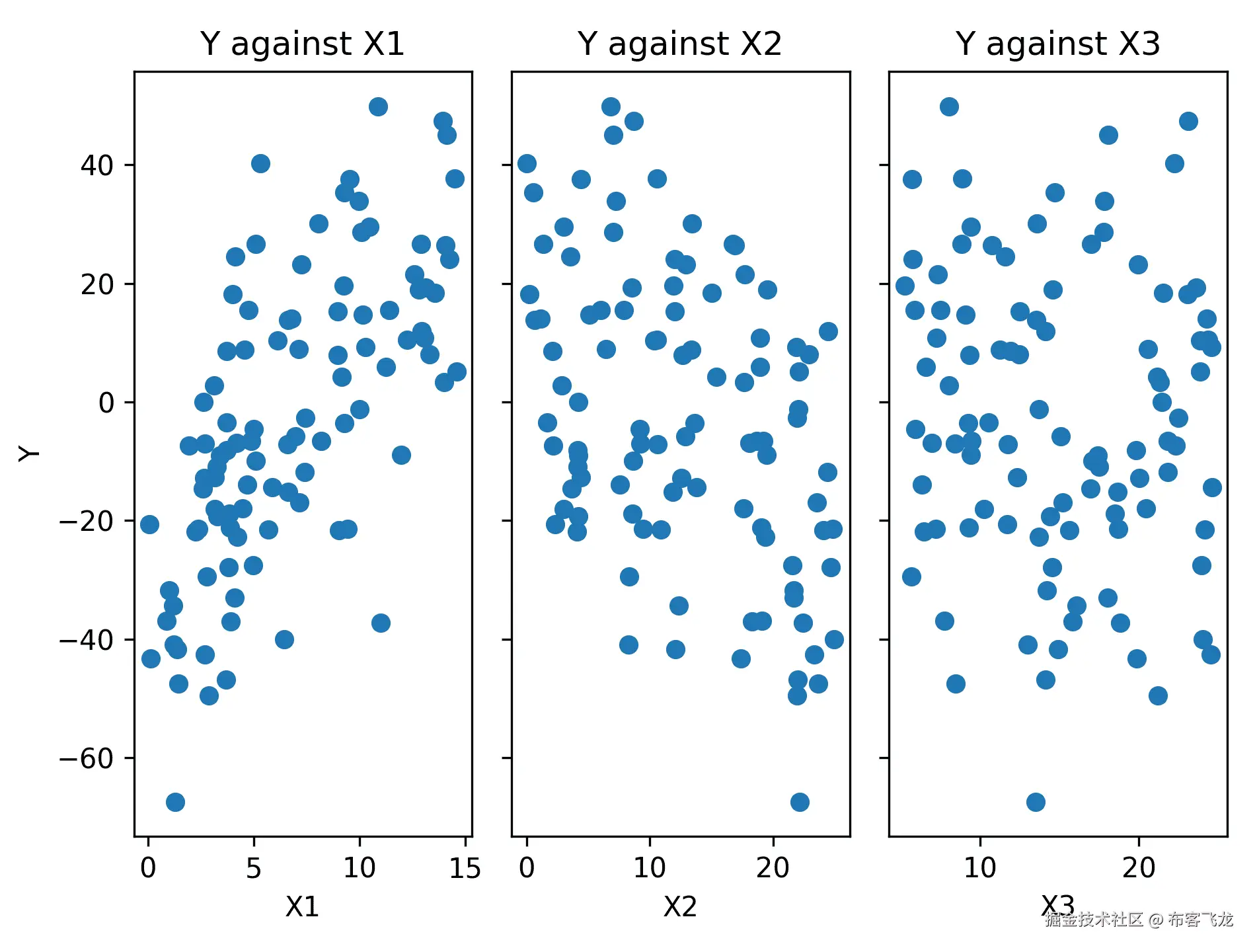
Figure 7.2: Scatter plots of the response data against each of the predictor variables
As we can see, there appears to be some correlation between the response data and the first two predictor columns, `X1` and `X2`. This is what we expect, given how we generated the data.
5. We use the same `OLS` class to perform multilinear regression; that is, providing the response array and the predictor `DataFrame`:
model = sm.OLS(Y, p_vars).fit()
print(model.summary())
The output of the `print` statement is as follows:
OLS 回归结果
==================================================================
因变量:y R 平方:0.770
模型:OLS 调整 R 平方:0.762
方法:最小二乘法 F 统计量:106.8
日期:2020 年 4 月 23 日星期四 概率(F 统计量):1.77e-30
时间:12:47:30 对数似然:-389.38
观测数量:100 AIC:786.8
残差自由度:96 BIC:797.2
模型自由度:3
协方差类型:非鲁棒
===================================================================
coef std err t P>|t| [0.025 0.975]
常数 -9.8676 4.028 -2.450 0.016 -17.863 -1.872
X1 4.7234 0.303 15.602 0.000 4.122 5.324
X2 -1.8945 0.166 -11.413 0.000 -2.224 -1.565
X3 -0.0910 0.206 -0.441 0.660 -0.500 0.318
===================================================================
Omnibus: 0.296 Durbin-Watson: 1.881
Prob(Omnibus): 0.862 Jarque-Bera (JB): 0.292
偏度:0.123 Prob(JB): 0.864
峰度:2.904 条件数 72.9
===================================================================
        In the summary data, we can see that the `X3` variable is not significant since it has a p value of 0.66.

          6.  Since the third predictor variable is not significant, we eliminate this column and perform the regression again:
second_model = sm.OLS(Y, p_vars.loc[:, "const":"X2"]).fit()
print(second_model.summary())
This results in a small increase in the goodness of fit statistics.
How it works...
Multilinear regression works in much the same way as simple linear regression. We follow the same procedure here as in the previous recipe, where we use the statsmodels package to fit a multilinear model to our data. Of course, there are some differences behind the scenes. The model we produce using multilinear regression is very similar in form to the simple linear model from the previous recipe. It has the following form:

Here, *Y* is the response variable, *X[i]* represents the predictor variables, *E* is the error term, and *β*[*i*] is the parameters to be computed. The same requirements are also necessary for this context: residuals must be independent and normally distributed with a mean of 0 and a common standard deviation.
In this recipe, we provided our predictor data as a Pandas `DataFrame` rather than a plain NumPy array. Notice that the names of the columns have been adopted in the summary data that we printed. Unlike the first recipe, *Using basic linear regression*, we included the constant column in this `DataFrame`, rather than using the `add_constant` utility from statsmodels.
In the output of the first regression, we can see that the model is a reasonably good fit with an adjusted *R²* value of 0.762, and is highly significant (we can see this by looking at the regression F statistic p value). However, looking closer at the individual parameters, we can see that both of the first two predictor values are significant, but the constant and the third predictor are less so. In particular, the third predictor parameter, `X3`, is not significantly different from 0 and has a p value of 0.66\. Given that our response data was constructed without using this variable, this shouldn't come as a surprise. In the final step of the analysis, we repeat the regression without the predictor variable, `X3`, which is a mild improvement to the fit.
Classifying using logarithmic regression
Logarithmic regression solves a different problem to ordinary linear regression. It is commonly used for classification problems where, typically, we wish to classify data into two distinct groups, according to a number of predictor variables. Underlying this technique is a transformation that's performed using logarithms. The original classification problem is transformed into a problem of constructing a model for the **log-odds***.* This model can be completed with simple linear regression. We apply the inverse transformation to the linear model, which leaves us with a model of the probability that the desired outcome will occur, given the predictor data. The transform we apply here is called the **logistic function**, which gives its name to the method. The probability we obtain can then be used in the classification problem we originally aimed to solve.
In this recipe, we will learn how to perform logistic regression and use this technique in classification problems.
Getting ready
For this recipe, we will need the NumPy package imported as `np`, the Matplotlib `pyplot`module imported as `plt`, the Pandas package imported as `pd`, and an instance of the NumPy default random number generator to be created using the following commands:
从 numpy.random 导入 default_rng
rng = default_rng(12345)
We also need several components from the `scikit-learn` package to perform logistic regression. These can be imported as follows:
从 sklearn.linear_model 导入 LogisticRegression
从 sklearn.metrics 导入 classification_report
        How to do it...
        Follow these steps to use logistic regression to solve a simple classification problem:

          1.  First, we need to create some sample data that we can use to demonstrate how to use logistic regression. We start by creating the predictor variables:
df = pd.DataFrame({
"var1": np.concatenate([rng.normal(3.0, 1.5, size=50),
rng.normal(-4.0, 2.0, size=50)]),
"var2": rng.uniform(size=100),
"var3": np.concatenate([rng.normal(-2.0, 2.0, size=50),
rng.normal(1.5, 0.8, size=50)])
})
2. Now, we use two of our three predictor variables to create our response variable as a series of Boolean values:
分数 = 4.0 + df["var1"] - df["var3"]
Y = score >= 0
3. Next, we scatter plot the points, styled according to the response variable, of the `var3` data against the `var1` data, which are the variables used to construct the response variable:
fig1, ax1 = plt.subplots()
ax1.plot(df.loc[Y, "var1"], df.loc[Y, "var3"], "bo", label="True
数据")
ax1.plot(df.loc[~Y, "var1"], df.loc[~Y, "var3"], "rx", label="False
数据")
ax1.legend()
ax1.set_xlabel("var1")
ax1.set_ylabel("var3")
ax1.set_title("Scatter plot of var3 against var1")
The resulting plot can be seen in the following figure:

Figure 7.3: Scatter plot of the var3 data against var1, with classification marked
4. Next, we create a `LogisticRegression` object from the `scikit-learn` package and fit the model to our data:
model = LogisticRegression()
model.fit(df, Y)
5. Next, we prepare some extra data, different from what we used to fit the model, to test the accuracy of our model:
test_df = pd.DataFrame({
"var1": np.concatenate([rng.normal(3.0, 1.5, size=50),
rng.normal(-4.0, 2.0, size=50)]),
"var2": rng.uniform(size=100),
"var3": np.concatenate([rng.normal(-2.0, 2.0, size=50),
rng.normal(1.5, 0.8, size=50)])
})
test_scores = 4.0 + test_df["var1"] - test_df["var3"]
test_Y = test_scores >= 0
6. Then, we generate predicted results based on our logistic regression model:
test_predicts = model.predict(test_df)
7. Finally, we use the `classification_report` utility from `scikit-learn` to print a summary of predicted classification against known response values to test the accuracy of the model. We print this summary to the Terminal:
print(classification_report(test_Y, test_predicts))
The report that's generated by this routine looks as follows:
precision recall f1-score support
False 1.00 1.00 1.00 18
True 1.00 1.00 1.00 32
accuracy 1.00 50
macro avg 1.00 1.00 1.00 50
weighted avg 1.00 1.00 1.00 50
How it works...
Logistic regression works by forming a linear model of the *log odds* ratio *(*or *logit*), which, for a single predictor variable, *x*, has the following form:

Here, *p*(*x*) represents the probability of a true outcome in response to the given the predictor, *x*. Rearranging this gives a variation of the logistic function for the probability:

The parameters for the log odds are estimated using a maximum likelihood method.
The `LogisticRegression` class from the `linear_model` module in `scikit-learn` is an implementation of logistic regression that is very easy to use. First, we create a new model instance of this class, with any custom parameters that we need, and then use the `fit` method on this object to fit (or train) the model to the sample data. Once this fitting is done, we can access the parameters that have been estimated using the `get_params` method.
The `predict` method on the fitted model allows us to pass in new (unseen) data and make predictions about the classification of each sample. We could also get the probability estimates that are actually given by the logistic function using the `predict_proba` method.
Once we have built a model for predicting the classification of data, we need to validate the model. This means we have to test the model with some previously unseen data and check whether it correctly classifies the new data. For this, we can use `classification_report`, which takes a new set of data and the predictions generated by the model and computes the proportion of the data that was correctly predicted by the model. This is the *precision* of the model.
The classification report we generated using the `scikit-learn` utility performs a comparison between the predicted results and the known response values. This is a common method for validating a model before using it to make actual predictions. In this recipe, we saw that the reported precision for each of the categories (`True` and `False`) was 1.00, indicating that the model performed perfectly in predicting the classification with this data. In practice, it is unlikely that the precision of a model will be 100%.
There's more...
There are lots of packages that offer tools for using logistic regression for classification problems. The statsmodels package has the `Logit` class for creating logistic regression models. We used the `scikit-learn` package in this recipe, which has a similar interface. `Scikit-learn` is a general-purpose machine learning library and has a variety of other tools for classification problems.
Modeling time series data with ARMA
Time series, as the name suggests, tracks a value over a sequence of distinct time intervals. They are particularly important in the finance industry, where stock values are tracked over time and used to make predictions – known as forecasting – of the value at some future time. Good predictions coming from such data can be used to make better investments. Time series also appear in many other common situations, such as weather monitoring, medicine, and any places where data is derived from sensors over time.
Time series, unlike other types of data, do not usually have independent data points. This means that the methods that we use for modeling independent data will not be particularly effective. Thus, we need to use alternative techniques to model data with this property. There are two ways in which a value in a time series can depend on previous values. The first is where there is a direct relationship between the value and one or more previous values. This is the *autocorrelation* property and is modeled by an *autoregressive* model. The second is where the noise that's added to the value depends on one or more previous noise terms. This is modeled by a *moving average* model. The number of terms involved in either of these models is called the *order* of the model.
In this recipe, we will learn how to create a model for stationary time series data with ARMA terms.
Getting ready
For this recipe, we need the Matplotlib `pyplot` module imported as `plt` and the statsmodels package `api` module imported as `sm`. We also need to import the `generate_sample_data` routine from the `tsdata` package from this book's repository, which uses NumPy and Pandas to generate sample data for analysis:
from tsdata import generate_sample_data
        How to do it...
        Follow these steps to create an autoregressive moving average model for stationary time series data:

          1.  First, we need to generate the sample data that we will analyze:
sample_ts, _ = generate_sample_data()
2. As always, the first step in the analysis is to produce a plot of the data so that we can visually identify any structure:
ts_fig, ts_ax = plt.subplots()
sample_ts.plot(ax=ts_ax, label="Observed")
ts_ax.set_title("Time series data")
ts_ax.set_xlabel("Date")
ts_ax.set_ylabel("Value")
The resulting plot can be seen in the following figure. Here, we can see that there doesn't appear to be an underlying trend, which means that the data is likely to be stationary:

Figure 7.4: Plot of the time series data that we will analyze. There doesn't appear to be a trend in this data
3. Next, we compute the augmented Dickey-Fuller test. The null hypothesis is that the time series is not stationary:
adf_results = sm.tsa.adfuller(sample_ts)
adf_pvalue = adf_results[1]
print("Augmented Dickey-Fuller test:\nP-value:", adf_pvalue)
        The reported p value is 0.000376 in this case, so we reject the null hypothesis and conclude that the series is stationary.

          4.  Next, we need to determine the order of the model that we should fit. For this, we'll plot the **autocorrelation function** (**ACF**) and the **partial autocorrelation function**(**PACF**) for the time series:
ap_fig, (acf_ax, pacf_ax) = plt.subplots(2, 1, sharex=True,
tight_layout=True)
sm.graphics.tsa.plot_acf(sample_ts, ax=acf_ax,
title="Observed autocorrelation")
sm.graphics.tsa.plot_pacf(sample_ts, ax=pacf_ax,
title="Observed partial autocorrelation")
pacf_ax.set_xlabel("Lags")
pacf_ax.set_ylabel("Value")
acf_ax.set_ylabel("Value")
The plots of the ACF and PACF for our time series can be seen in the following figure. These plots suggest the existence of both autoregressive and moving average processes:

Figure 7.5: ACF and PACF for the sample time series data
5. Next, we create an ARMA model for the data, using the `ARMA` class from statsmodels, `tsa` module. This model will have an order 1 AR and an order 1 MA:
arma_model = sm.tsa.ARMA(sample_ts, order=(1, 1))
6. Now, we fit the model to the data and get the resulting model. We print a summary of these results to the Terminal:
arma_results = arma_model.fit()
print(arma_results.summary())
The summary data given for the fitted model is as follows:
ARMA Model Results
===================================================================
Dep. Variable: y No. Observations: 366
Model: ARMA(1, 1) Log Likelihood -513.038
方法:css-mle 创新的标准偏差 0.982
日期:2020 年 5 月 1 日 AIC 1034.077
时间:12:40:00 BIC 1049.687
Sample: 01-01-2020 HQIC 1040.280
- 12-31-2020
===================================================================
coef std err z P>|z| [0.025 0.975]
const -0.0242 0.143 -0.169 0.866 -0.305 0.256
ar.L1.y 0.8292 0.057 14.562 0.000 0.718 0.941
ma.L1.y -0.5189 0.090 -5.792 0.000 -0.695 -0.343
Roots
===================================================================
实部 虚部 模数 频率
AR.1 1.2059 +0.0000j 1.2059 0.0000
MA.1 1.9271 +0.0000j 1.9271 0.0000
        Here, we can see that both of the estimated parameters for the AR and MA components are significantly different from 0\. This is because the value in the `P >|z|` column is 0 to 3 decimal places.

          7.  Next, we need to verify that there is no additional structure remaining in the residuals (error) of the predictions from our model. For this, we plot the ACF and PACF of the residuals:
residuals = arma_results.resid
rap_fig, (racf_ax, rpacf_ax) = plt.subplots(2, 1,
sharex=True, tight_layout=True)
sm.graphics.tsa.plot_acf(residuals, ax=racf_ax,
title="Residual autocorrelation")
sm.graphics.tsa.plot_pacf(residuals, ax=rpacf_ax,
标题="残差部分自相关")
rpacf_ax.set_xlabel("滞后")
rpacf_ax.set_ylabel("值")
racf_ax.set_ylabel("值")
The ACF and PACF of the residuals can be seen in the following figure. Here, we can see that there are no significant spikes at lags other than 0, so we conclude that there is no structure remaining in the residuals:

Figure 7.6: ACF and PACF for the residuals from our model
8. Now that we have verified that our model is not missing any structure, we plot the values that are fitted to each data point on top of the actual time series data to see whether the model is a good fit for the data. We plot this model in the plot we created in *step 2*:
fitted = arma_results.fittedvalues
fitted.plot(c="r", ax=ts_ax, 标签="拟合")
ts_ax.legend()
The updated plot can be seen in the following figure:

Figure 7.7: Plot of the fitted time series data over the observed time series data
The fitted values give a reasonable approximation of the behavior of the time series, but reduce the noise from the underlying structure.
How it works...
A time series is stationary if it does not have a trend. They usually have a tendency to move in one direction rather than another. Stationary processes are important because we can usually remove the trend from an arbitrary time series and model the underlying stationary series. The ARMA model that we used in this recipe is a basic means of modeling the behavior of stationary time series. The two parts of an ARMA model are the autoregressive and moving average parts, which model the dependence of the terms and noise, respectively, on previous terms and noise.
An order 1 autoregressive model has the following form:

Here, *φ[i]* represents the parameters and *ε[t]* is the noise at a given step. The noise is usually assumed to be normally distributed with a mean of 0 and a standard deviation that is constant across all the time steps. The *Y[t]* value represents the value of the time series at the time step, *t*. In this model, each value depends on the previous value, though it can also depend on some constants and some noise. The model will give rise to a stationary time series precisely when the *φ[1]* parameter lies strictly between -1 and 1.
An order 1 moving average model is very similar to an autoregressive model and is given by the following equation:

Here, the variants of *θ[i]* are parameters. Putting these two models together gives us an ARMA(1, 1) model, which has the following form:

In general, we can have an ARMA(p, q) model that has an order *p* AR component and an order q MA component. We usually refer to the quantities, *p* and *q*, as the orders of the model.
Determining the orders of the AR and MA components is the most tricky aspect of constructing an ARMA model. The ACF and PACF give some information toward this, but even then, it can be quite difficult. For example, an autoregressive process will show some kind of decay or oscillating pattern on the ACF as lag increases, and a small number of peaks on the PACF and values that are not significantly different from 0 beyond that. The number of peaks that appear on the PAF plot can be taken as the order of the process. For a moving average process, the reverse is true. There are usually a small number of significant peaks on the ACF plot, and a decay or oscillating pattern on the PACF plot. Of course, sometimes, this isn't obvious.
In this recipe, we plotted the ACF and PACF for our sample time series data. In the autocorrelation plot in *Figure 7.5* (top), we can see that the peaks decay rapidly until they lie within the confidence interval of zero (meaning they are not significant). This suggests the presence of an autoregressive component. On the partial autocorrelation plot in *Figure 7.5* (bottom), we can see that there are only two peaks that can be considered not zero, which suggests an autoregressive process of order 1 or 2\. You should try to keep the order of the model as small as possible. Due to this, we chose an order 1 autoregressive component. With this assumption, the second peak on the partial autocorrelation plot is indicative of decay (rather than an isolated peak), which suggests the presence of a moving average process. To keep the model simple, we try an order 1 moving average process. This is how the model that we used in this recipe was decided on. Notice that this is not an exact process, and you might have decided differently.
We use the augmented Dickey-Fuller test to test the likelihood that the time series that we have observed is stationary. This is a statistical test, such as those seen in Chapter 6, *Working with Data and Statistics*, that generates a test statistic from the data. This test statistic, in turn, determines a p-value that is used to determine whether to accept or reject the null hypothesis. For this test, the null hypothesis is that a unit root is present in the time series that's been sampled. The alternative hypothesis – the one we are really interested in – is that the observed time series is (trend) stationary. If the p-value is sufficiently small, then we can conclude with the specified confidence that the observed time series is stationary. In this recipe, the p-value was 0.000 to 3 decimal places, which indicates a strong likelihood that the series is stationary. Stationarity is an essential assumption for using the ARMA model for the data.
Once we have determined that the series is stationary, and also decided on the orders of the model, we have to fit the model to the sample data that we have. The parameters of the model are estimated using a maximum likelihood estimator. In this recipe, the learning of the parameters is done using the `fit` method, in *step 6*.
The statsmodels package provides various tools for working with time series, including utilities for calculating – and plotting –ACF and PACF of time series data, various test statistics, and creating ARMA models for time series. There are also some tools for automatically estimating the order of the model.
We can use the **Akaike information criterion** (**AIC**), **Bayesian information criterion** (**BIC**), and **Hannan-Quinn Information Criterion** (**HQIC**) quantities to compare this model to other models to see which model best describes the data. A smaller value is better in each case.
When using ARMA to model time series data, as in all kinds of mathematical modeling tasks, it is best to pick the simplest model that describes the data to the extent that is needed. For ARMA models, this usually means picking the smallest order model that describes the structure of the observed data.
There's more...
Finding the best combination of orders for an ARMA model can be quite difficult. Often, the best way to fit a model is to test multiple different configurations and pick the order that produces the best fit. For example, we could have tried ARMA(0, 1) or ARMA(1, 0) in this recipe, and compared it to the ARMA(1, 1) model we used to see which produced the best fit by considering the **Akaike Information Criteria** (**AIC**) statistic reported in the summary. In fact, if we build these models, we will see that the AIC value for ARMA(1, 1) – the model we used in this recipe – is the "best" of these three models.
Forecasting from time series data using ARIMA
In the previous recipe, we generated a model for a stationary time series using an ARMA model, which consists of an **autoregressive** (**AR**) component and an **m****oving average** (**MA**) component. Unfortunately, this model cannot accommodate time series that have some underlying trend; that is, they are not stationary time series. We can often get around this by *differencing* the observed time series one or more times until we obtain a stationary time series that can be modeled using ARMA. The incorporation of differencing into an ARMA model is called an ARIMA model, which stands for **Autoregressive** (**AR**) **Integrated** (**I**) **Moving Average** (**MA**).
Differencing is the process of computing the difference of consecutive terms in a sequence of data. So, applying first-order differencing amounts to subtracting the value at the current step from the value at the next step (*t[i+1] - t[i]*). This has the effect of removing the underlying upward or downward linear trend from the data. This helps to reduce an arbitrary time series to a stationary time series that can be modeled using ARMA. Higher-order differencing can remove higher-order trends to achieve similar effects.
An ARIMA model has three parameters, usually labeled *p*, *d*, and *q*. The *p* and *q* order parameters are the order of the autoregressive component and the moving average component, respectively, just as they are for the ARMA model. The third order parameter, *d*, is the order of differencing to be applied. An ARIMA model with these orders is usually written as ARIMA (*p*, *d*, *q*). Of course, we will need to determine what order differencing should be included before we start fitting the model.
In this recipe, we will learn how to fit an ARIMA model to a non-stationary time series and use this model to make forecasts about future values.
Getting ready
For this recipe, we will need the NumPy package imported as `np`, the Pandas package imported as `pd`, the Matplotlib `pyplot` module as `plt`, and the statsmodels `api` module imported as `sm`. We will also need the utility for creating sample time series data from the `tsdata` module, which is included in this book's repository:
从 tsdata 导入生成样本数据
        How to do it...
        The following steps show you how to construct an ARIMA model for time series data and use this model to make forecasts:

          1.  First, we load the sample data using the `generate_sample_data` routine:
sample_ts,test_ts = generate_sample_data(trend=0.2, undiff=True)
2. As usual, the next step is to plot the time series so that we can visually identify the trend of the data:
ts_fig, ts_ax = plt.subplots(tight_layout=True)
sample_ts.plot(ax=ts_ax, c="b", 标签="观察到的")
ts_ax.set_title("训练时间序列数据")
ts_ax.set_xlabel("日期")
ts_ax.set_ylabel("值")
The resulting plot can be seen in the following figure. As we can see, there is a clear upward trend in the data, so the time series is certainly not stationary:

Figure 7.8: Plot of the sample time series. There is an obvious positive trend in the data.
3. Next, we difference the series to see if one level of differencing is sufficient to remove the trend:
差分=sample_ts.diff().dropna()
4. Now, we plot the ACF and PACF for the differenced time series:
ap_fig, (acf_ax, pacf_ax) = plt.subplots(1, 2,
tight_layout=True, sharex=True)
sm.graphics.tsa.plot_acf(diffs, ax=acf_ax)
sm.graphics.tsa.plot_pacf(diffs, ax=pacf_ax)
acf_ax.set_ylabel("值")
pacf_ax.set_xlabel("滞后")
pacf_ax.set_ylabel("值")
The ACF and PACF can be seen in the following figure. We can see that there does not appear to be any trends left in the data and that there appears to be both an autoregressive component and a moving average component:

Figure 7.9: ACF and PACF for the differenced time series
5. Now, we construct the ARIMA model with order 1 differencing, an autoregressive component, and a moving average component. We fit this to the observed time series and print a summary of the model:
model = sm.tsa.ARIMA(sample_ts, order=(1,1,1))
fitted = model.fit(trend="c")
print(fitted.summary())
The summary information that's printed looks as follows:
ARIMA 模型结果
==================================================================
因变量:D.y 观察次数:365
模型:ARIMA(1, 1, 1) 对数似然-512.905
方法:css-mle 创新的标准差 0.986
日期:星期六,2020 年 5 月 2 日 AIC 1033.810
时间:14:47:25 BIC 1049.409
样本:2020 年 01 月 02 日 HQIC 1040.009
- 12-31-2020
==================================================================
coef std err z P>|z| [0.025 0.975]
const 0.9548 0.148 6.464 0.000 0.665 1.244
ar.L1.D.y 0.8342 0.056 14.992 0.000 0.725 0.943
ma.L1.D.y -0.5204 0.088 -5.903 0.000 -0.693 -0.348
根
==================================================================
实际 虚数 模数 频率
AR.1 1.1987 +0.0000j 1.1987 0.0000
MA.1 1.9216 +0.0000j 1.9216 0.0000
        Here, we can see that all three of our estimated coefficients are significantly different from 0 due to the fact that all three have 0 to 3 decimal places in the `P>|z|` column.

          6.  Now, we can use the `forecast` method to generate predictions of future values. This also returns the standard error and confidence intervals for predictions:
forecast, std_err, fc_ci = fitted.forecast(steps=50)
forecast_dates = pd.date_range("2021-01-01", periods=50)
forecast = pd.Series(forecast, index=forecast_dates)
7. Next, we plot the forecast values and their confidence intervals on the figure containing the time series data:
forecast.plot(ax=ts_ax, c="g", 标签="预测")
ts_ax.fill_between(forecast_dates, fc_ci[:, 0], fc_ci[:, 1],
颜色="r", alpha=0.4)
8. Finally, we add the actual future values to generate, along with the sample in *step 1*, to the plot (it might be easier if you repeat the plot commands from *step 1* to regenerate the whole plot here):
test_ts.plot(ax=ts_ax, c="k", 标签="实际")
ts_ax.legend()
The final plot containing the time series with the forecast and the actual future values can be seen in the following figure:
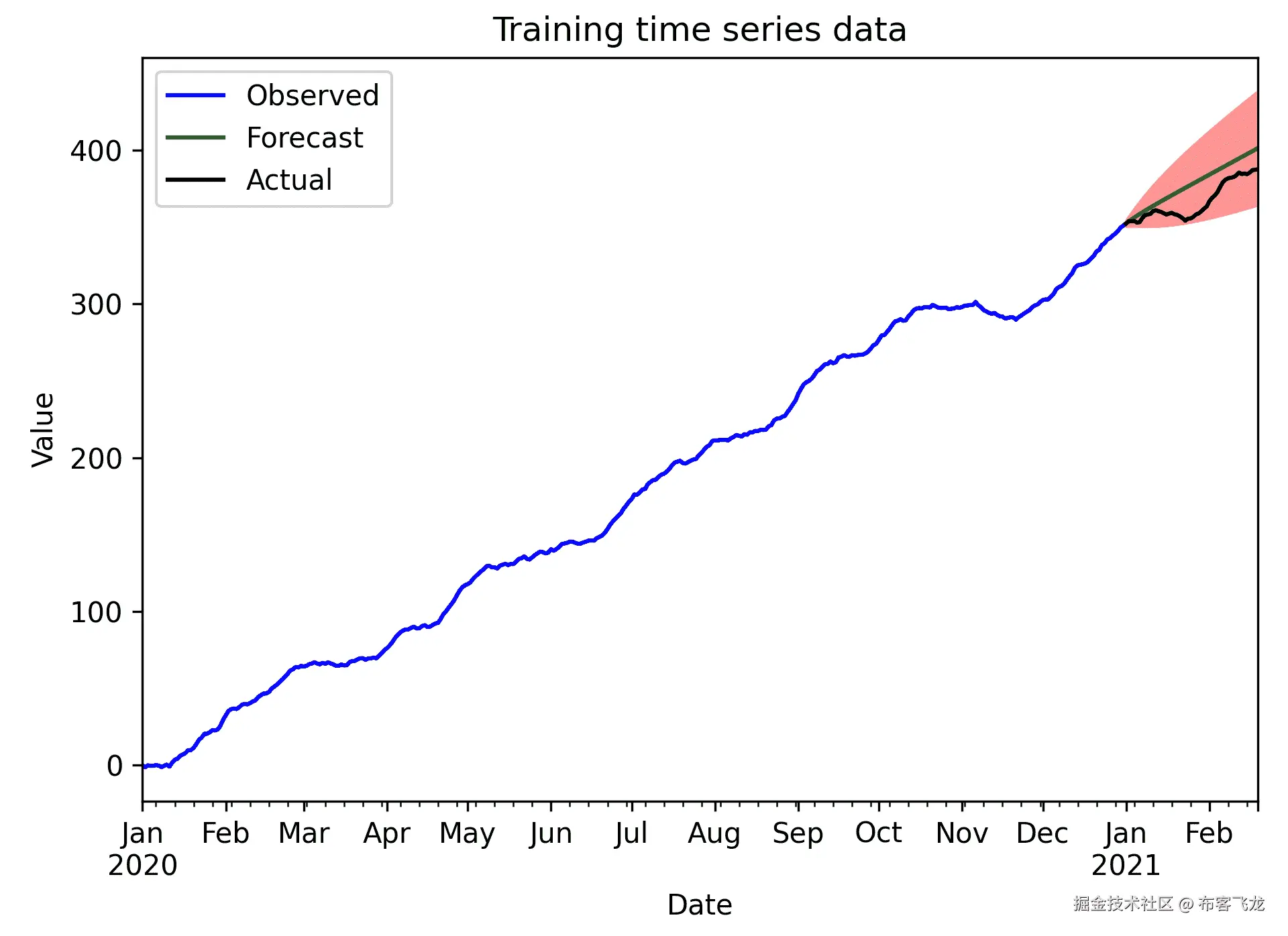
Figure 7.10: Plot of the sample time series with forecast values and actual future values for comparison
Here, we can see that the actual future values are within the confidence interval for the forecast values.
How it works...
The ARIMA model – with orders *p*, *d*, and *q –* is simply an ARMA (*p*, *q*) model that's applied to a time series. This is obtained by applying differencing of order *d* to the original time series data. It is a fairly simple way to generate a model for time series data. The statsmodels `ARIMA` class handles the creation of a model, while the `fit` method fits this model to the data. We passed the `trend="c"` keyword argument because we know, from *Figure 7.9*, that the time series has a constant trend.
The model is fit to the data using a maximum likelihood method and the final estimates for the parameters – in this case, one parameter for the autoregressive component, one for the moving average component, the constant trend parameter, and the variance of the noise. These parameters are reported in the summary. From this output, we can see that the estimates for the AR coefficient (0.8342) and the MA constant (-0.5204) are very good approximations of the true estimates that were used to generate the data, which were 0.8 for the AR coefficient and -0.5 for the MA coefficient. These parameters are set in the `generate_sample_data` routine from the `tsdata.py` file in the code repository for this chapter. This generates the sample data in *step 1*. You might have noticed that the constant parameter (0.9548) is not 0.2, as specified in the `generate_sample_data` call in *step 1*. In fact, it is not so far from the actual drift of the time series.
The `forecast` method on the fitted model (the output of the `fit` method) uses the model to make predictions about the value after a given number of steps. In this recipe, we forecast for up to 50 time steps beyond the range of the sample time series. The output of the `forecast` method is a tuple containing the forecast values, the standard error for the forecasts, and the confidence interval (by default, 95% confidence) for the forecasts. Since we provided the time series as a Pandas series, these are returned as `Series` objects (the confidence interval is a `DataFrame`).
When you construct an ARIMA model for time series data, you need to make sure you use the smallest order differencing that removes the underlying trend. Applying more differencing than is necessary is called *overdifferencing* and can lead to problems with the model.
Forecasting seasonal data using ARIMA
Time series often display periodic behavior so that peaks or dips in the value appear at regular intervals. This behavior is called *seasonality* in the analysis of time series. The methods we have used to far in this chapter to model time series data obviously do not account for seasonality. Fortunately, it is relatively easy to adapt the standard ARIMA model to incorporate seasonality, resulting in what is sometimes called a SARIMA model.
In this recipe, we will learn how to model time series data that includes seasonal behavior and use this model to produce forecasts.
Getting ready
For this recipe, we will need the NumPy package imported as `np`, the Pandas package imported as `pd`, the Matplotlib `pyplot`module as `plt`, and the statsmodels `api`module imported as `sm`. We will also need the utility for creating sample time series data from the `tsdata`module, which is included in this book's repository:
从 tsdata 导入生成样本数据
        How to do it...
        Follow these steps to produce a seasonal ARIMA model for sample time series data and use this model to produce forecasts:

          1.  First, we use the `generate_sample_data` routine to generate a sample time series to analyze:
sample_ts,test_ts = generate_sample_data(undiff=True,
季节性=True)
2. As usual, our first step is to visually inspect the data by producing a plot of the sample time series:
ts_fig, ts_ax = plt.subplots(tight_layout=True)
sample_ts.plot(ax=ts_ax, 标题="时间序列", 标签="观察到的")
ts_ax.set_xlabel("日期")
ts_ax.set_ylabel("值")
The plot of the sample time series data can be seen in the following figure. Here, we can see that there seem to be periodic peaks in the data:

Figure 7.11: Plot of the sample time series data
3. Next, we plot the ACF and PACF for the sample time series:
ap_fig,(acf_ax,pacf_ax) = plt.subplots(2, 1,
sharex=True, tight_layout=True)
sm.graphics.tsa.plot_acf(sample_ts, ax=acf_ax)
sm.graphics.tsa.plot_pacf(sample_ts, ax=pacf_ax)
pacf_ax.set_xlabel("滞后")
acf_ax.set_ylabel("值")
pacf_ax.set_ylabel("值")
The ACF and PACF for the sample time series can be seen in the following figure:

Figure 7.12: ACF and PACF for the sample time series
These plots possibly indicate the existence of autoregressive components, but also a significant spike on the PACF with lag 7.
4. Next, we difference the time series and produce plots of the ACF and PACF for the differenced series. This should make the order of the model clearer:
差分=sample_ts.diff().dropna()
dap_fig, (dacf_ax, dpacf_ax) = plt.subplots(2, 1, sharex=True,
tight_layout=True)
sm.graphics.tsa.plot_acf(diffs, ax=dacf_ax,
标题="差分 ACF")
sm.graphics.tsa.plot_pacf(diffs, ax=dpacf_ax,
标题="差分 PACF")
dpacf_ax.set_xlabel("滞后")
dacf_ax.set_ylabel("值")
dpacf_ax.set_ylabel("值")
The ACF and PACF for the differenced time series can be seen in the following figure. We can see that there is definitely a seasonal component with lag 7:

Figure 7.13: Plot of the ACF and PACF for the differenced time series
5. Now, we need to create a `SARIMAX` object that holds the model, with ARIMA order `(1, 1, 1)` and seasonal ARIMA order `(1, 0, 0, 7)`. We fit this model to the sample time series and print summary statistics. We plot the predicted values on top of the time series data:
model = sm.tsa.SARIMAX(sample_ts, order=(1, 1, 1),
季节性顺序=(1, 0, 0, 7))
fitted_seasonal = model.fit()
print(fitted_seasonal.summary())
fitted_seasonal.fittedvalues.plot(ax=ts_ax, c="r",
标签="预测")
The summary statistics that are printed to the Terminal look as follows:
SARIMAX 结果
===================================================================
因变量:y 观察次数:366
模型:SARIMAX(1, 1, 1)x(1, 0, [], 7) 对数似然-509.941
日期:星期一,2020 年 5 月 4 日 AIC 1027.881
时间:18:03:27 BIC 1043.481
样本:2020 年 01 月 01 日 HQIC 1034.081
- 12-31-2020
协方差类型: opg
===================================================================
coef std err z P>|z| [0.025 0.975]
ar.L1 0.7939 0.065 12.136 0.000 0.666 0.922
ma.L1 -0.4544 0.095 -4.793 0.000 -0.640 -0.269
ar.S.L7 0.7764 0.034 22.951 0.000 0.710 0.843
sigma2 0.9388 0.073 12.783 0.000 0.795 1.083
===================================================================
Ljung-Box (Q): 31.89 Jarque-Bera (JB): 0.47
Prob(Q): 0.82 Prob(JB): 0.79
异方差性(H): 1.15 偏度: -0.03
Prob(H) (双侧): 0.43 峰度: 2.84
===================================================================
警告:
[1] 使用外积计算的协方差矩阵
梯度的数量(复杂步骤)。
6. This model appears to be a reasonable fit, so we move ahead and forecast `50` time steps into the future:
forecast_result = fitted_seasonal.get_forecast(steps=50)
forecast_index = pd.date_range("2021-01-01", periods=50)
预测 = 预测结果.预测均值
7. Finally, we add the forecast values to the plot of the sample time series, along with the confidence interval for these forecasts:
forecast.plot(ax=ts_ax, c="g", label="预测")
conf = forecast_result.conf_int()
ts_ax.fill_between(forecast_index, conf["lower y"],
conf["upper y"], color="r", alpha=0.4)
test_ts.plot(ax=ts_ax, color="k", label="实际未来")
ts_ax.legend()
The final plot of the time series, along with the predictions and the confidence interval for the forecasts, can be seen in the following figure:
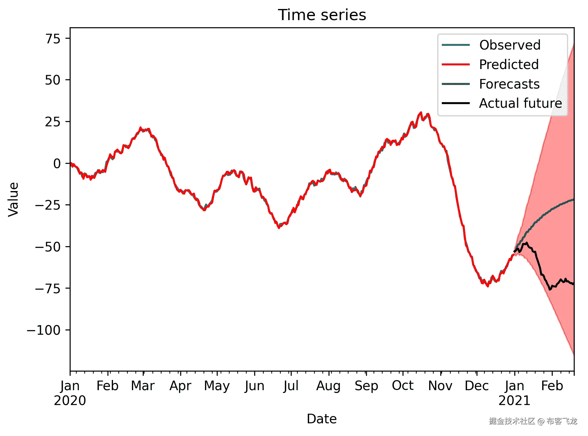
Figure 7.14: Plot of the sample time series, along with the forecasts and confidence interval
How it works...
Adjusting an ARIMA model to incorporate seasonality is a relatively simple task. A seasonal component is similar to an autoregressive component, where the lag starts at some number larger than 1\. In this recipe, the time series exhibits seasonality with period 7 (weekly), which means that the model is approximately given by the following equation:

Here *φ[1]* and *Φ**[1]**are the parameters and *ε[t]* is the noise at time step *t*. The standard ARIMA model is easily adapted to include this additional lag term.* *The SARIMA model incorporates this additional seasonality into the ARIMA model. It has four additional order terms on top of the three for the underlying ARIMA model. These four additional parameters are the seasonal AR, differencing, and MA components, along with the period of the seasonality. In this recipe, we took the seasonal AR to be order 1, with no seasonal differencing or MA components (order 0), and a seasonal period of 7\. This gives us the additional parameters (1, 0, 0, 7) that we used in *step 5* of this recipe.
Seasonality is clearly important in modeling time series data that is measured over a period of time covering days, months, or years. It usually incorporates some kind of seasonal component based on the time frame that they occupy. For example, a time series of national power consumption measured hourly over several days would probably have a 24-hour seasonal component since power consumption will likely fall during the night hours.
Long-term seasonal patterns might be hidden if the time series data that you are analyzing does not cover a sufficiently large time period for the pattern to emerge. The same is true for trends in the data. This can lead to some interesting problems when trying to produce long-term forecasts from a relatively short period represented by observed data.
The `SARIMAX` class from the statsmodels package provides the means of modeling time series data using a seasonal ARIMA model. In fact, it can also model external factors that have an additional effect on the model, sometimes called *exogenous regressors*. (We will not cover these here.) This class works much like the `ARMA` and `ARIMA` classes that we used in the previous recipes. First, we create the model object by providing the data and orders for both the ARIMA process and the seasonal process, and then use the `fit` method on this object to create a fitted model object. We use the `get_forecasts` method to generate an object holding the forecasts and confidence interval data that we can then plot, thus producing the *Figure 7.14*.
## There's more...
There is a small difference in the interface between the `SARIMAX` class used in this recipe and the `ARIMA` class used in the previous recipe. At the time of writing, the statsmodels package (v0.11) includes a second `ARIMA` class that builds on top of the `SARIMAX` class, thus providing the same interface. However, at the time of writing, this new `ARIMA` class does not offer the same functionality as that used in this recipe.
# Using Prophet to model time series data
The tools we have seen so far for modeling time series data are very general and flexible methods, but they require some knowledge of time series analysis in order to be set up. The analysis needed to construct a good model that can be used to make reasonable predictions into the future can be intensive and time-consuming, and may not be viable for your application. The Prophet library is designed to automatically model time series data quickly, without the need for input from the user, and make predictions into the future.
In this recipe, we will learn how to use Prophet to produce forecasts from a sample time series.
## Getting ready
For this recipe, we will need the Pandas package imported as `pd`, the Matplotlib `pyplot` package imported as `plt`, and the `Prophet` object from the Prophet library, which can be imported using the following command:
from fbprophet import Prophet
We also need to import the `generate_sample_data` routine from the `tsdata` module, which is included in the code repository for this book:
from tsdata import generate_sample_data
## How to do it...

The following steps show you how to use the Prophet package to generate forecasts for a sample time series:

1.  First, we use `generate_sample_data` to generate the sample time series data:
sample_ts, test_ts = generate_sample_data(undiff=True, trend=0.2)
2. We need to convert the sample data into a `DataFrame` that Prophet expects:
df_for_prophet = pd.DataFrame({
"ds": sample_ts.index, # dates
"y": sample_ts.values # values
})
3. Next, we make a model using the `Prophet` class and fit it to the sample time series:
model = Prophet()
model.fit(df_for_prophet)
4. Now, we create a new `DataFrame` that contains the time intervals for the original time series, plus the additional periods for the forecasts:
forecast_df = model.make_future_dataframe(periods=50)
5. Then, we use the `predict` method to produce the forecasts along the time periods we just created:
forecast = model.predict(forecast_df)
6. Finally, we plot the predictions on top of the sample time series data, along with the confidence interval and the true future values:
fig, ax = plt.subplots(tight_layout=True)
sample_ts.plot(ax=ax, label="观察到的", title="预测")
forecast.plot(x="ds", y="yhat", ax=ax, c="r",
label="预测")
ax.fill_between(forecast["ds"].values, forecast["yhat_lower"].values,
forecast["yhat_upper"].values, color="r", alpha=0.4)
test_ts.plot(ax=ax, c="k", label="未来")
ax.legend()
ax.set_xlabel("日期")
ax.set_ylabel("值")
The plot of the time series, along with forecasts, can be seen in the following figure:

Figure 7.15: Plot of sample time series data, along with forecasts and a confidence interval
## How it works...
Prophet is a package that's used to automatically produce models for time series data based on sample data, with little extra input needed from the user. In practice, it is very easy to use; we just need to create an instance of the `Prophet` class, call the `fit` method, and then we are ready to produce forecasts and understand our data using the model.
The `Prophet` class expects the data in a specific format: a `DataFrame` with columns named `ds` for the date/time index, and `y` for the response data (the time series values). This `DataFrame` should have integer indices. Once the model has been fit, we use `make_future_dataframe` to create a `DataFrame` in the correct format, with appropriate date intervals, and with additional rows for future time intervals. The `predict` method then takes this `DataFrame` and produces values using the model to populate these time intervals with predicted values. We also get other information, such as the confidence intervals, in this forecast's `DataFrame`.
## There's more...
Prophet does a fairly good job of modeling time series data without any input from the user. However, the model can be customized using various methods from the `Prophet` class. For example, we could provide information about the seasonality of the data using the `add_seasonality` method of the `Prophet` class, prior to fitting the model.
There are alternative packages for automatically generating models for time series data. For example, popular machine learning libraries such as TensorFlow can be used to model time series data.
# Further reading
A good textbook on regression in statistics is the book *Probability and Statistics* by Mendenhall, Beaver, and Beaver, as mentioned in Chapter 6, *Working with Data and Statistics*. The following books provide a good introduction to classification and regression in modern data science:
* *James, G. and Witten, D., 2013\. An Introduction To Statistical Learning: With Applications In R. New York: Springer.*
* *Müller, A. and Guido, S., 2016\. Introduction To Machine Learning With Python. Sebastopol: O'Reilly Media.*
A good introduction to time series analysis can be found in the following book:
* *Cryer, J. and Chan, K., 2008\. Time Series Analysis. New York: Springer.**
```**
