

一、前言
使用@Styles用于样式的重用,在@Styles的基础上,使用@Extend扩展原生组件样式。
说明 从API version 9开始,该装饰器支持在ArkTS卡片中使用。
从API version 11开始,该装饰器支持在元服务中使用。
二、装饰器使用说明
语法
@Extend(UIComponentName) function functionName { ... }
三、使用规则
- 和@Styles不同,@Extend支持封装指定组件的私有属性、私有事件和自身定义的全局方法。
// @Extend(Text)可以支持Text的私有属性fontColor
@Extend(Text) function fancy () {
  .fontColor(Color.Red)
}
// superFancyText可以调用预定义的fancy
@Extend(Text) function superFancyText(size:number) {
    .fontSize(size)
    .fancy()
}
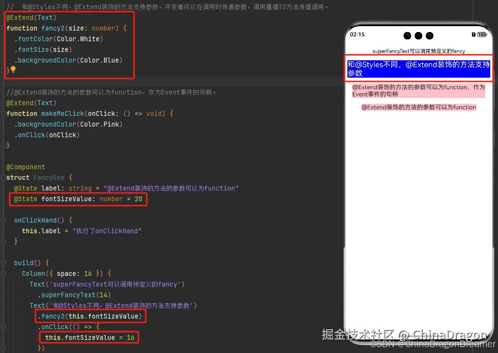
- 和@Styles不同,@Extend装饰的方法支持参数,开发者可以在调用时传递参数,调用遵循TS方法传值调用。
@Extend(Text)
function fancy2(size: number) {
  .fontColor(Color.White)
  .fontSize(size)
  .backgroundColor(Color.Blue)
}

@Component
struct FancyUse {
  build() {
    Column({ space: 16 }) {
      Text('superFancyText可以调用预定义的fancy')
        .superFancyText(14)
      Text('和@Styles不同,@Extend装饰的方法支持参数').fancy2(16)
    }
  }
}
效果图
- @Extend装饰的方法的参数可以为function,作为Event事件的句柄。
import { promptAction } from '@kit.ArkUI'

@Extend(Text)
function makeMeClick(onClick: () => void) {
  .backgroundColor(Color.Pink)
  .onClick(onClick)
}

@Component
struct FancyUse {
  @State label: string = "@Extend装饰的方法的参数可以为function"

  onClickHand() {
    this.label = "执行了onClickHand"
  }

  build() {
    Column({ space: 16 }) {
      Text('@Extend装饰的方法的参数可以为function,作为Event事件的句柄').makeMeClick(() => {
        promptAction.showToast({ message: "执行了点击事件" })
      })

      Text(`${this.label}`).makeMeClick(() => {
        this.onClickHand()
      })
    }.margin({ top: 20 })
  }
}
效果图
- @Extend的参数可以为状态变量,当状态变量改变时,UI可以正常的被刷新渲染。
@Extend(Text)
function fancy2(size: number) {
  .fontColor(Color.White)
  .fontSize(size)
  .backgroundColor(Color.Blue)
}

@Component
struct FancyUse {
  @State label: string = "@Extend装饰的方法的参数可以为function"
  @State fontSizeValue: number = 20

  onClickHand() {
    this.label = "执行了onClickHand"
  }

  build() {
    Column({ space: 16 }) {

      Text('和@Styles不同,@Extend装饰的方法支持参数')
        .fancy2(this.fontSizeValue)
        .onClick(() => {
          this.fontSizeValue = 16
        }
    }.margin({ top: 20 })
  }
}
效果图
四、限制条件
- 和@Styles不同,@Extend仅支持在全局定义,不支持在组件内部定义。
说明 只能在当前文件内使用,不支持export。
如果想实现export功能,推荐使用AttributeModifier。
【反例】
@Entry
@Component
struct FancyUse {
  // 错误写法,@Extend仅支持在全局定义,不支持在组件内部定义
  @Extend(Text) function fancy (fontSize: number) {
    .fontSize(fontSize)
  }

  build() {
    Row({ space: 10 }) {
      Text('Fancy')
        .fancy(16)
    }
  }
}
【正例】
// 正确写法
@Extend(Text) function fancy (fontSize: number) {
  .fontSize(fontSize)
}

@Entry
@Component
struct FancyUse {

  build() {
    Row({ space: 10 }) {
      Text('Fancy')
        .fancy(16)
    }
  }
}
五、使用场景
以下示例声明了3个Text组件,每个Text组件均设置了fontStyle、fontWeight和backgroundColor样式。
@Entry
@Component
struct FancyUse {
  @State label: string = 'Hello World'

  build() {
    Row({ space: 10 }) {
      Text(`${this.label}`)
        .fontStyle(FontStyle.Italic)
        .fontWeight(100)
        .backgroundColor(Color.Blue)
      Text(`${this.label}`)
        .fontStyle(FontStyle.Italic)
        .fontWeight(200)
        .backgroundColor(Color.Pink)
      Text(`${this.label}`)
        .fontStyle(FontStyle.Italic)
        .fontWeight(300)
        .backgroundColor(Color.Orange)
    }.margin('20%')
  }
}
@Extend将样式组合复用,示例如下。
@Extend(Text) function fancyText(weightValue: number, color: Color) {
  .fontStyle(FontStyle.Italic)
  .fontWeight(weightValue)
  .backgroundColor(color)
}
通过@Extend组合样式后,使得代码更加简洁,增强可读性。
@Entry
@Component
struct FancyUse {
  @State label: string = 'Hello World'

  build() {
    Row({ space: 10 }) {
      Text(`${this.label}`)
        .fancyText(100, Color.Blue)
      Text(`${this.label}`)
        .fancyText(200, Color.Pink)
      Text(`${this.label}`)
        .fancyText(300, Color.Orange)
    }.margin('20%')
  }
}
效果图
