

前言
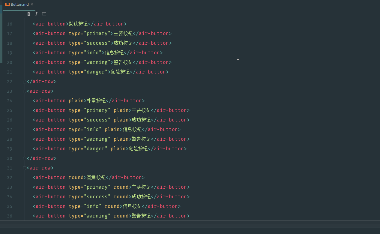
通过上节 自建vue组件 air-ui (9) -- 用 vuepress 写文档 已经会写 button 标签的文档了。 并且写了 7 个例子用来描述 button 和 button-group 的属性,所以最后的 Button.md 的代码如下:
还是很详细的,具体文档效果上一节的最后有 gif 截图显示。 接下来我们继续写其他已完成组件的文档。
内置服务组件的文档怎么写??
那么问题来了,对于标签组件的文档,我们还可以当做局部组件来引入。那么这种内部服务组件呢,或者指令类型的组件?? 要怎么引入?? 毕竟在 vuepress 环境下,可没有像 air-ui 项目那样,可以在 main.js 对组件库进行全局注册?? 那么怎么找到 vuepress 的 vue 对象呢 ??
如果你直接在 vuepress demo 里面这样写:
this.$notify({
  title: '警告',
  message: '这是一条警告的提示消息',
  type: 'warning'
});
编译的时候会提示 this.$notify is not a function, 因为 vuepress 框架的 vue 原型对象根本就没有 $notify 这个方法。
vuepress 应用级别的配置 enhanceApp.js
后面查了一下,发现 vuepress 也可以配置应用级别的,包括各种插件。
由于 VuePress 是一个标准的 Vue 应用,我们可以通过创建一个 .vuepress/enhanceApp.js 文件来做一些应用级别的配置,当该文件存在的时候,会被导入到应用内部。enhanceApp.js 应该 export default 一个钩子函数,并接受一个包含了一些应用级别属性的对象作为参数。你可以使用这个钩子来安装一些附加的 Vue 插件、注册全局组件,或者增加额外的路由钩子等:
export default ({
  Vue, // VuePress 正在使用的 Vue 构造函数
  options, // 附加到根实例的一些选项
  router, // 当前应用的路由实例
  siteData // 站点元数据
}) => {
  // ...做一些其他的应用级别的优化
}
一个例子就是:
/**
 * 扩展 VuePress 应用
 */
import VueHighlightJS from 'vue-highlight.js';
import 'highlight.js/styles/atom-one-dark.css';
import Element from 'element-ui'
import 'element-ui/lib/theme-chalk/index.css'
import VueECharts from 'vue-echarts' //注册图表

import './public/css/index.css' //组件css文件

export default ({
 Vue, // VuePress 正在使用的 Vue 构造函数
 options, // 附加到根实例的一些选项
 router, // 当前应用的路由实例
 siteData // 站点元数据
}) => {
 // ...做一些其他的应用级别的优化
 Vue.use(VueHighlightJS)
 Vue.use(Element)
 Vue.component('chart', VueECharts)
}
我后面用 element-ui 试了一下,发现确实是 ok,可以直接在 demo 里面随意使用 element-ui 的组件,而不用局部申明。
接入 enhanceApp.js
仿照之前接入 element-ui 的写法,创建 .vuepress/enhanceApp.js,并写入:
import DemoBlock from '../../src/components/demo-block'
import AirUI from '../../src/components/index'
import '../../src/styles/index.scss'

export default ({
    Vue, // VuePress 正在使用的 Vue 构造函数
  }) => {
  // ...做一些其他的应用级别的优化
  Vue.use(DemoBlock);
  Vue.use(AirUI);
}
然后将 button 的那些 demo 的引用全部去掉,比如 button/demo-base.vue:
<script>
  export default {
    name: 'button-demo-base',
  }
</script>
只保留 name, 其他的导入全部去掉。因为现在全部用全局注册的组件了,连同 demo-block 都设置为全局注册了。
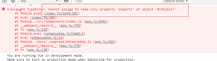
Uncaught TypeError: Cannot assign to read only property 'exports' of object '#<Object>'
结果运行界面的时候,直接报错了?? 后面查了一下 Cannot assign to read only property 'exports' of object
翻译过来就是说,代码没毛病,在webpack打包的时候,可以在js文件中混用require和export。但是不能混用import 以及module.exports,因为webpack 2中不允许混用import和 module.exports , 解决办法就是统一改成ES6的方式编写即可, 全部都用 export default。
而我们刚好在 components/index.js 导出的时候,用了 module.exports,有混用。在 自建vue组件 air-ui (8) -- 实现部分引入组件 有提过。不过那时候我们 air-ui 在打包的时候,其实是没有问题,但是至少可以证明 webpack 3.x 是可以混用的。 所以摆在面前的有两条路:
- 去掉
components/index.js中module.exports语法,全部走export default, 这样子就不会报错了。这样子air-ui的组件就会全部被vuepress中的 vue 对象注册成全局组件了。 但是部分导入的语法糖就不能用了(虽然也没啥卵用,因为不能省体积) - 保留混用,但是不能用组件库的方式导入,只能单个组件一个一个导入并且引用(好累哦)
小孩子才做选择,成年人我全都要。你不觉得部分引入的语法糖很酷吗,干嘛要去掉。所以我选择了第二种(如果是诸位看官,你们还是选第一种吧),新的代码如下:
import DemoBlock from '../../src/components/demo-block'
import Loading from '../../src/components/loading/index.js'
import Notification from '../../src/components/notification/index.js'
import Button from '../../src/components/button/index.js'
import ButtonGroup from '../../src/components/button-group/index.js'

import '../../src/styles/index.scss'

export default ({
    Vue, // VuePress 正在使用的 Vue 构造函数
  }) => {
  Vue.component(DemoBlock.name, DemoBlock);
  Vue.component(Button.name, Button);
  Vue.component(ButtonGroup.name, ButtonGroup);
  Vue.use(Loading.directive);
  Vue.prototype.$loading = Loading.service;
  Vue.prototype.$notify = Notification;
}
这样也是可以的,无非就是手动导入,手动初始化呗。不过这样做的弊端,就是每次我增加一个组件,那么这个文件都要添加这个组件的引用(没办法,要为装逼付出代价!!),但是没事,我后面会写个自动化脚本,来简化这个过程。
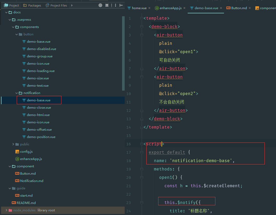
写好 notification 的 demo
既然 enhanceApp.js 写好了,那么就可以安心的写 notification 的 demo, 记得在 config.js 补上对应的组件导航和在 component 目录补上 Notification.md, 然后就可以写 demo 例子了:
这时候可以看到效果了:
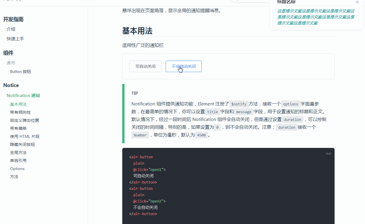
完美,现在写组件的 demo,没有那些乱七八糟的引入了,简直不要太方便。
自动化抠组件代码
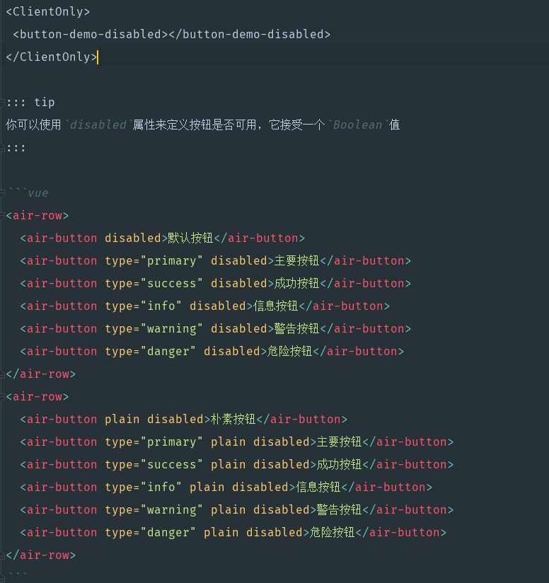
虽然写 demo 是爽了,但是写文档还是很不爽,因为我要抄两遍的代码,先写文档,调完之后,然后再把 demo 的一些相关的组件代码,然后再抠出来放到 md 文件。有没有自动化的方式来处理这个过程。 比如以 button/demo-disabled.vue 为例:
<template>
  <demo-block>
    <air-row>
      <air-button disabled>默认按钮</air-button>
      <air-button type="primary" disabled>主要按钮</air-button>
      <air-button type="success" disabled>成功按钮</air-button>
      <air-button type="info" disabled>信息按钮</air-button>
      <air-button type="warning" disabled>警告按钮</air-button>
      <air-button type="danger" disabled>危险按钮</air-button>
    </air-row>
    <air-row>
      <air-button plain disabled>朴素按钮</air-button>
      <air-button type="primary" plain disabled>主要按钮</air-button>
      <air-button type="success" plain disabled>成功按钮</air-button>
      <air-button type="info" plain disabled>信息按钮</air-button>
      <air-button type="warning" plain disabled>警告按钮</air-button>
      <air-button type="danger" plain disabled>危险按钮</air-button>
    </air-row>
  </demo-block>
</template>

<script>
  export default {
    name: 'button-demo-disabled',
  }
</script>
其实要抠出来写到 md 文件的,只有 demo-block 组件里面的内容(air-row是我后面又创建的组件库里面的组件)。 也就是:
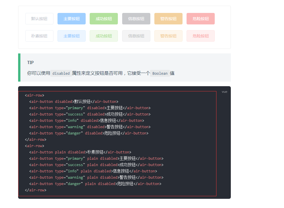
不需要 script 标签, 也不需要 style 标签的内容。但是对于 notification/demo-base.vue 为例:
<template>
  <demo-block>
    <air-button
      plain
      @click="open1">
      可自动关闭
    </air-button>
    <air-button
      plain
      @click="open2">
      不会自动关闭
    </air-button>
  </demo-block>
</template>

<script>
  export default {
    name: 'notification-demo-base',
    methods: {
      open1() {
        const h = this.$createElement;

        this.$notify({
          title: '标题名称',
          message: h('i', { style: 'color: teal'}, '这是提示文案这是提示文案这是提示文案这是提示文案这是提示文案这是提示文案这是提示文案这是提示文案')
        });
      },

      open2() {
        this.$notify({
          title: '提示',
          message: '这是一条不会自动关闭的消息',
          duration: 0
        });
      }
    }
  }
</script>
我只要 demo-block 里面的 html,还有就是 script 标签,但是我又不需要 name 属性,因为会误导别人:
甚至有时候我需要 css 列出来,比如:
所以我需要写一个自动化的构建脚本,要求以下条件:
- 我只需要根据某些规则,就可以自动引入 demo 例子
- 并且去读 demo 里面的代码,然后再根据某些规则,判断要把那些代码留下来。
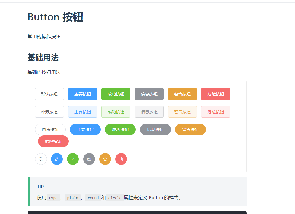
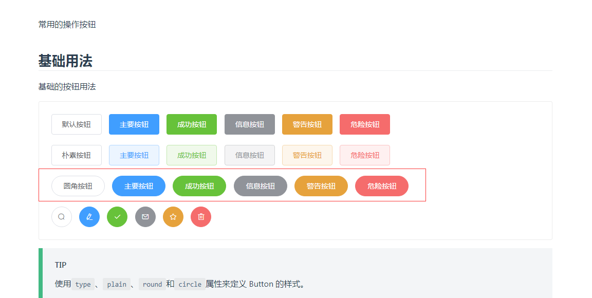
后面成品就是,就以 component/Button.md 为例,我只要写:
# Button 按钮
常用的操作按钮
## 基础用法
基础的按钮用法
:::demo====button-demo-base====使用`type`、`plain`、`round`和`circle`属性来定义 Button 的样式。
## 禁用状态
按钮不可用状态
:::demo====button-demo-disabled====你可以使用`disabled`属性来定义按钮是否可用,它接受一个`Boolean`值
## 文字按钮
没有边框和背景色的按钮
:::demo====button-demo-text====
## 图标按钮
带图标的按钮可增强辨识度(有文字)或节省空间(无文字)
:::demo====button-demo-icon====设置`icon`属性即可,icon 的列表可以参考 Element 的 icon 组件,也可以设置在文字右边的 icon ,只要使用`i`标签即可,可以使用自定义图标。
## 按钮组
以按钮组的方式出现,常用于多项类似操作
:::demo====button-demo-group====使用`<air-button-group>`标签来嵌套你的按钮。
## 加载中
点击按钮后进行数据加载操作,在按钮上显示加载状态。
:::demo====button-demo-loading====要设置为 loading 状态,只要设置`loading`属性为`true`即可。
## 不同尺寸
Button 组件提供除了默认值以外的三种尺寸,可以在不同场景下选择合适的按钮尺寸。
:::demo====button-demo-size====额外的尺寸:`medium`、`small`、`mini`,通过设置`size`属性来配置它们。
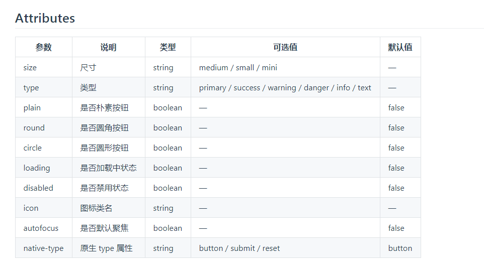
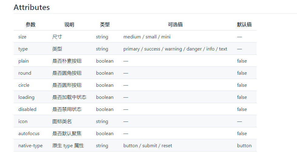
## Attributes
| 参数 | 说明 | 类型 | 可选值 | 默认值 |
|---------- |-------- |---------- |------------- |-------- |
| size | 尺寸 | string | medium / small / mini | — |
| type | 类型 | string | primary / success / warning / danger / info / text | — |
| plain | 是否朴素按钮 | boolean | — | false |
| round | 是否圆角按钮 | boolean | — | false |
| circle | 是否圆形按钮 | boolean | — | false |
| loading | 是否加载中状态 | boolean | — | false |
| disabled | 是否禁用状态 | boolean | — | false |
| icon | 图标类名 | string | — | — |
| autofocus | 是否默认聚焦 | boolean | — | false |
| native-type | 原生 type 属性 | string | button / submit / reset | button |
脚本就会把我变成这一串:
这个其实是通过一个 gulp 任务来实现的:
// 优化文档打包逻辑
gulp.task('doc', cb => {
  return gulp.src('./docs/component_origin/*.md')
    // 模版地址修改
    .pipe(replace(/:::demo====(\w+)-(.+)====(.*)/g, function (match, p1, p2, p3) {
      // console.log("demo:" + match);
      // console.log("p3:" + p3);
      var str = `
<ClientOnly>
 <${p1}-${p2}></${p1}-${p2}>
</ClientOnly>`;
      str += '\n\n';
      if (p3.toString().trim()) {
        str += `::: tip\n${p3}\n:::\n\n`;
      }
      var fileName = `docs/.vuepress/components/${p1}/${p2}.vue`;
      // 接下来读取这个文件,得到里面的代码
      // return fileName;
      var fileStr = fs.readFileSync(path.resolve(fileName));
      // 接下来进行逐行匹配
      str += "```vue\n";
      var tplArr = [], cssArr = [], jsArr = [], canAddTpl = false, canAddCss = false, canAddJs = false;
      fileStr.toString().replace(/(.+)/g, function (match) {
        // console.log(match);
        if (match.indexOf("</demo-block>") > -1) {
          canAddTpl = false;
        }

        if (canAddTpl && match.trim()) {
          // 这边最好再进行两次缩进,即 4 个空格
          tplArr.push(match.substring(4, match.length));
        }
        if (canAddCss && match.trim()) {
          cssArr.push(match);
        }

        // 判断是否要忽略一些 js
        if (match.indexOf("script--ignore--start") > -1) {
          canAddJs = false;
        }

        if (canAddJs && match.trim()) {
          jsArr.push(match);
        }
        // 判断是否要导入 script 的文档
        if (match.indexOf("<script doc>") > -1) {
          canAddJs = true;
          jsArr.push("<script>");
        }

        if (match.indexOf("script--ignore--end") > -1) {
          canAddJs = true;
        }

        if (match.indexOf("<demo-block") > -1) {
          canAddTpl = true;
        }

        if (match.indexOf('<style scoped') > -1) {
          canAddCss = true;
          cssArr.push("<style>");
        }

        if (match.indexOf("</style>") > -1) {
          canAddCss = false;
        }

        if (match.indexOf("</script>") > -1) {
          canAddJs = false;
        }
      });
      // 最后拼起来
      str += tplArr.join("\n");
      if (jsArr.length) {
        str += "\n\n" + jsArr.join("\n");
      }
      if (cssArr.length) {
        str += "\n\n" + cssArr.join("\n");
      }
      str += "\n```";
      return str;
    }))
    .pipe(gulp.dest('./docs/component'));
});
这边我分析一下,主要几个逻辑:
- 获取这个目录
./docs/component_origin/*.md下的所有的所有的 md 文件 - 通过这个规则
/:::demo====(\w+)-(.+)====(.*)/获取 p1 p2 p3 的值,举个例子,假设有一行是这个:
:::demo====button-demo-disabled====你可以使用`disabled`属性来定义按钮是否可用,它接受一个`Boolean`值
那么 p1 就是 button, p2 就是 demo-disabled, p3 就是:
你可以使用`disabled`属性来定义按钮是否可用,它接受一个`Boolean`值`
- 根据 p1 和 p2 的值,我们就可以嵌入 demo 的语法:
var str = `
<ClientOnly>
 <${p1}-${p2}></${p1}-${p2}>
</ClientOnly>`;
- 根据 p3 的值,我们就可以嵌入 tip 的语法:
if (p3.toString().trim()) {
  str += `::: tip\n${p3}\n:::\n\n`;
}
- 接下来就是重头戏了,我们要根据 vue demo 里面的规则,从 vue demo 文件里面把对应的代码抠出来
- 读取 vue demo 里面的代码,然后一行一行的提取:
var fileName = `docs/.vuepress/components/${p1}/${p2}.vue`; // 接下来读取这个文件,得到里面的代码 // return fileName; var fileStr = fs.readFileSync(path.resolve(fileName));- 提取
<demo-block>...<demo-blcok>里面的代码 - 如果包含
<script doc>说明接下来要提取 js 代码,如果没有,直接跳过 js 的代码 - 如果在这过程中,遇到
script--ignore--start这个标记,说明接下来的 js 代码不提取 - 如果在这过程中,遇到
"script--ignore--end"这个标记,说明接下来的 js 代码继续提取 - 如果接下来遇到
</script>这个标签,说明提取 js 代码结束 - 如果接下来遇到
<style scoped这个标记,说明接下来要提取 css 代码。如果没有,跳过 css 代码 - 如果接下来遇到
</style>这个标记,说明提取 css 代码结束
- 最后这几个字符串拼起来就是了。以上面那一句为例,效果就是:
效果非常好,这样子只要 demo 写好了(事先哪些代码要提取,哪些不提取,要先设置好),那么转换为 md 文档,简直不要太方便了。当然代价就是我们要再建一个 docs/compnent_origin/ 目录来写这些未转化后的文档内容:
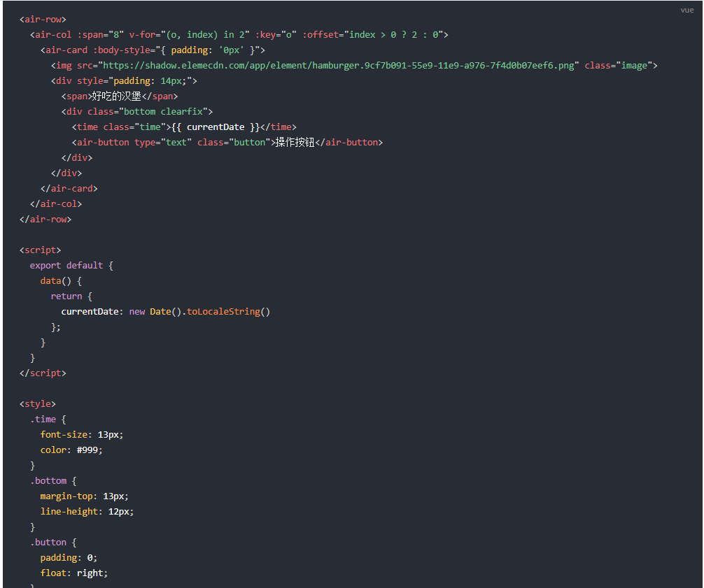
举个例子就是,假设 demo 是这样子写的:
<template>
  <demo-block customClass="demo-card">
    <air-row>
      <air-col :span="8" v-for="(o, index) in 2" :key="o" :offset="index > 0 ? 2 : 0">
        <air-card :body-style="{ padding: '0px' }">
          <img src="https://shadow.elemecdn.com/app/element/hamburger.9cf7b091-55e9-11e9-a976-7f4d0b07eef6.png" class="image">
          <div style="padding: 14px;">
            <span>好吃的汉堡</span>
            <div class="bottom clearfix">
              <time class="time">{{ currentDate }}</time>
              <air-button type="text" class="button">操作按钮</air-button>
            </div>
          </div>
        </air-card>
      </air-col>
    </air-row>
  </demo-block>
</template>

<script doc>
  //script--ignore--start
  import './card.scss'
  //script--ignore--end
  export default {
    //script--ignore--start
    name: 'card-demo-img',
    //script--ignore--end
    data() {
      return {
        currentDate: new Date().toLocaleString()
      };
    }
  }
</script>

<style scoped>
  .time {
    font-size: 13px;
    color: #999;
  }

  .bottom {
    margin-top: 13px;
    line-height: 12px;
  }

  .button {
    padding: 0;
    float: right;
  }

  .image {
    width: 100%;
    display: block;
  }

  .clearfix:before,
  .clearfix:after {
    display: table;
    content: "";
  }

  .clearfix:after {
    clear: both
  }
</style>
那么写成文档的效果就是:
当然构建要改一下,加上这个任务:
"docs:dev": "gulp doc && vuepress dev docs",
vuepress 重写常量 palette.styl
之前在做 button 的文档的时候,有发现部分例子超出的固定宽度,导致折行了:
所以看有没有办法将这个 container 容器的宽度变宽一点,看了一下控制台:
.theme-default-content:not(.custom) {
    max-width: 740px;
    margin: 0 auto;
    padding: 2rem 2.5rem;
}
发现最大宽度只有 740px, 根本不够用。我们要想办法变宽一点。 其实 vuepress 的主题是可以被导出来(当然只能看,不能覆盖):
vuepress eject
这时候就会有一个 .vuepress 的目录在执行目录下。点进去就是这个主题的源代码。然后可以从 .vuepress/theme/styles/wrapper.styl 找到这个配置:
$wrapper
  max-width $contentWidth
  margin 0 auto
  padding 2rem 2.5rem
  @media (max-width: $MQNarrow)
    padding 2rem
  @media (max-width: $MQMobileNarrow)
    padding 1.5rem
里面有这个常量表示最大宽度,我们只需要修改这个变量的值就行了。 vuepress 提供了 docs/.vuepress/styles/palette.styl 可以重写一些变量的值,所以我们把这个文件创建起来, 内容是这样子的:
$contentWidth = 1000px;
这样子宽度就会变大了,重新编译一下,发现变宽了。
当然你也可以修改其他的变量, 看个人习惯,比如:
$accentColor =blue//默认主题颜色
$textColor = red//默认字体颜色
$borderColor = #eaecef//默认边框颜色
$codeBgColor = #282c34//默认背景颜色
vuepress 更改全局样式
如果你觉得 vuepress 的默认主题的样式太丑了,其实是可以更改全局样式的,比如原先的 table 样式是这样的:
我觉得有点丑,我就可以创建这个文件:docs/.vuepress/styles/index.styl, 然后对里面要修改的样式进行重写:
tr
  border-top none
th, td
  border: none
  border-bottom: 1px solid #dfe2e5
效果就会比较好看:
优化 enhanceApp.js
上面有说过,我们在 enhanceApp.js 采用的是手动导入的方式,这个意味这每次我增加组件,我都得修改这个文件,把新组件的引用加进去,这个有点坑爹,那么有没有不需要的情况。其实是有的,我们其实在写好组件的情况下,会往根目录的 components.json 这个文件加入,用来后面将组件单独打包出来。也就是说,一旦我新增组件的话,那么我就要往这个 components.json 添加这个组件的 name 和 对应的引用路径。 所以后面我们直接读取这个文件,然后脚本生成这些组件的引用,并且初始化,是不是就不需要每次都要修改 enhanceApp.js 这个文件了?
这个自动化脚本也是用 gulp 来生成:
//============= vuepress enhanceApp.js 构建 start ===========
const Components = require('./components.json');
// 有些组件要过滤掉, 包括内置组件和指令组件
const excludedComponents = ['locale', 'loading', 'message', 'message-box', 'notification', 'infinite-scroll'];
let needComponents = [];
gulp.task('vuepress', cb => {
  return gulp.src('./docs/.vuepress/enhanceApp_origin.js')
    // 模版地址修改
    .pipe(replace(/(.*gulpStart::(.*)::gulpEnd.*)/g, function (match, p1, p2) {
      var str = '//========这中间的代码全部由构建生成====\n';
      if (p2 === 'import') {
        _.each(Components, function (path, item) {
          // console.log("item:" + item);
          if (_.indexOf(excludedComponents, item) === -1) {
            var name = upperName(item);
            needComponents.push(name);
            // 这边取相对路径, 原来都是 ./src 现在换为 ../../src
            path = '../.' + path;
            str += `import ${name} from '${path}'\n`
          }
        });
      }

      if (p2 === 'use') {
        _.each(needComponents, function (item) {
          str += `  Vue.component(${item}.name, ${item});\n`;
        })
      }
      str += '//========这中间的代码全部由构建生成====\n';
      return str;
    }))
    .pipe(rename('enhanceApp.js'))
    .pipe(gulp.dest('./docs/.vuepress'));
});
//============= vuepress enhanceApp.js 构建 end ===========
gulp.task('buildDoc', ['doc', 'vuepress']);
逻辑其实不难:
- 读取
enhanceApp_origin.js, 一行一行读取 - 如果有遇到标记的地方,通过读取 action
- 如果是
import, 那么就将components.json里面的组件都导入 - 如果是
use, 那么就将components.json里面的组件都初始化 - 中间去掉一些非 标签类型的 组件,这些组件不适用这个模板
所以 enhanceApp_origin.js 内容如下:
/**
 * 扩展 VuePress 应用, 这个 js 的组件是 glup 任务构建的,不要在这个文件里面添加,有修改的话,统一在 enhanceApp_origin.js 这个添加
 */
import DemoBlock from '../../src/components/demo-block'
import Loading from '../../src/components/loading/index.js'
import InfiniteScroll from '../../src/components/infinite-scroll/index.js'
import Message from '../../src/components/message/index.js'
import MessageBox from '../../src/components/message-box/index.js'
import Notification from '../../src/components/notification/index.js'
//gulpStart::import::gulpEnd
import '../../src/styles/index.scss'

export default ({
  Vue, // VuePress 正在使用的 Vue 构造函数
}) => {
  Vue.component(DemoBlock.name, DemoBlock);
  //gulpStart::use::gulpEnd
  // 接下来处理内置函数
  // loading 这个组件比较特殊,它并不能用 component 的方式来挂载,只能用指令和内置函数的方式
  Vue.use(InfiniteScroll);
  Vue.use(Loading.directive);
  // 以下组件,也需要单独加载,他们也没有标签的方式,只有内置服务的方式
  Vue.prototype.$loading = Loading.service;
  Vue.prototype.$message = Message;
  Vue.prototype.$msgbox = MessageBox;
  Vue.prototype.$alert = MessageBox.alert;
  Vue.prototype.$confirm = MessageBox.confirm;
  Vue.prototype.$prompt = MessageBox.prompt;
  Vue.prototype.$notify = Notification;
}
打完包之后的 enhanceApp.js 就会变成:
/**
 * 扩展 VuePress 应用, 这个 js 的组件是 glup 任务构建的,不要在这个文件里面添加,有修改的话,统一在 enhanceApp_origin.js 这个添加
 */
import DemoBlock from '../../src/components/demo-block'
import Loading from '../../src/components/loading/index.js'
import InfiniteScroll from '../../src/components/infinite-scroll/index.js'
import Message from '../../src/components/message/index.js'
import MessageBox from '../../src/components/message-box/index.js'
import Notification from '../../src/components/notification/index.js'
//========这中间的代码全部由构建生成====
import Button from '../../src/components/button/index.js'
import ButtonGroup from '../../src/components/button-group/index.js'
import Row from '../../src/components/row/index.js'
import Col from '../../src/components/col/index.js'
import Container from '../../src/components/container/index.js'
import Header from '../../src/components/header/index.js'
import Footer from '../../src/components/footer/index.js'
import Main from '../../src/components/main/index.js'
import Aside from '../../src/components/aside/index.js'
import Checkbox from '../../src/components/checkbox/index.js'
import CheckboxButton from '../../src/components/checkbox-button/index.js'
import CheckboxGroup from '../../src/components/checkbox-group/index.js'
import Link from '../../src/components/link/index.js'
import Radio from '../../src/components/radio/index.js'
import RadioButton from '../../src/components/radio-button/index.js'
import RadioGroup from '../../src/components/radio-group/index.js'
import Input from '../../src/components/input/index.js'
import Select from '../../src/components/select/index.js'
import Option from '../../src/components/option/index.js'
import OptionGroup from '../../src/components/option-group/index.js'
import Tag from '../../src/components/tag/index.js'
import Scrollbar from '../../src/components/scrollbar/index.js'
import Autocomplete from '../../src/components/autocomplete/index.js'
import CollapseTransition from '../../src/transitions/collapse-transition'
import InputNumber from '../../src/components/input-number/index.js'
import Cascader from '../../src/components/cascader/index.js'
import CascaderPanel from '../../src/components/cascader-panel/index.js'
import Switch from '../../src/components/switch/index.js'
import Tooltip from '../../src/components/tooltip/index.js'
import Slider from '../../src/components/slider/index.js'
import DatePicker from '../../src/components/date-picker/index.js'
import TimeSelect from '../../src/components/time-select/index.js'
import TimePicker from '../../src/components/time-picker/index.js'
import Upload from '../../src/components/upload/index.js'
import Progress from '../../src/components/progress/index.js'
import Dialog from '../../src/components/dialog/index.js'
import Form from '../../src/components/form/index.js'
import FormItem from '../../src/components/form-item/index.js'
import Table from '../../src/components/table/index.js'
import TableColumn from '../../src/components/table-column/index.js'
import Popover from '../../src/components/popover/index.js'
import Menu from '../../src/components/menu/index.js'
import Submenu from '../../src/components/submenu/index.js'
import MenuItem from '../../src/components/menu-item/index.js'
import MenuItemGroup from '../../src/components/menu-item-group/index.js'
import Dropdown from '../../src/components/dropdown/index.js'
import DropdownMenu from '../../src/components/dropdown-menu/index.js'
import DropdownItem from '../../src/components/dropdown-item/index.js'
import Rate from '../../src/components/rate/index.js'
import ColorPicker from '../../src/components/color-picker/index.js'
import Transfer from '../../src/components/transfer/index.js'
import Tree from '../../src/components/tree/index.js'
import Pagination from '../../src/components/pagination/index.js'
import Badge from '../../src/components/badge/index.js'
import Avatar from '../../src/components/avatar/index.js'
import Alert from '../../src/components/alert/index.js'
import Tabs from '../../src/components/tabs/index.js'
import TabPane from '../../src/components/tab-pane/index.js'
import Breadcrumb from '../../src/components/breadcrumb/index.js'
import BreadcrumbItem from '../../src/components/breadcrumb-item/index.js'
import PageHeader from '../../src/components/page-header/index.js'
import Steps from '../../src/components/steps/index.js'
import Step from '../../src/components/step/index.js'
import Card from '../../src/components/card/index.js'
import Carousel from '../../src/components/carousel/index.js'
import CarouselItem from '../../src/components/carousel-item/index.js'
import Collapse from '../../src/components/collapse/index.js'
import CollapseItem from '../../src/components/collapse-item/index.js'
import Timeline from '../../src/components/timeline/index.js'
import TimelineItem from '../../src/components/timeline-item/index.js'
import Divider from '../../src/components/divider/index.js'
import Calendar from '../../src/components/calendar/index.js'
import Image from '../../src/components/image/index.js'
import Backtop from '../../src/components/backtop/index.js'
import Icon from '../../src/components/icon/index.js'
import Drawer from '../../src/components/drawer/index.js'
//========这中间的代码全部由构建生成====

import '../../src/styles/index.scss'

export default ({
  Vue, // VuePress 正在使用的 Vue 构造函数
}) => {
  Vue.component(DemoBlock.name, DemoBlock);
//========这中间的代码全部由构建生成====
  Vue.component(Button.name, Button);
  Vue.component(ButtonGroup.name, ButtonGroup);
  Vue.component(Row.name, Row);
  Vue.component(Col.name, Col);
  Vue.component(Container.name, Container);
  Vue.component(Header.name, Header);
  Vue.component(Footer.name, Footer);
  Vue.component(Main.name, Main);
  Vue.component(Aside.name, Aside);
  Vue.component(Checkbox.name, Checkbox);
  Vue.component(CheckboxButton.name, CheckboxButton);
  Vue.component(CheckboxGroup.name, CheckboxGroup);
  Vue.component(Link.name, Link);
  Vue.component(Radio.name, Radio);
  Vue.component(RadioButton.name, RadioButton);
  Vue.component(RadioGroup.name, RadioGroup);
  Vue.component(Input.name, Input);
  Vue.component(Select.name, Select);
  Vue.component(Option.name, Option);
  Vue.component(OptionGroup.name, OptionGroup);
  Vue.component(Tag.name, Tag);
  Vue.component(Scrollbar.name, Scrollbar);
  Vue.component(Autocomplete.name, Autocomplete);
  Vue.component(CollapseTransition.name, CollapseTransition);
  Vue.component(InputNumber.name, InputNumber);
  Vue.component(Cascader.name, Cascader);
  Vue.component(CascaderPanel.name, CascaderPanel);
  Vue.component(Switch.name, Switch);
  Vue.component(Tooltip.name, Tooltip);
  Vue.component(Slider.name, Slider);
  Vue.component(DatePicker.name, DatePicker);
  Vue.component(TimeSelect.name, TimeSelect);
  Vue.component(TimePicker.name, TimePicker);
  Vue.component(Upload.name, Upload);
  Vue.component(Progress.name, Progress);
  Vue.component(Dialog.name, Dialog);
  Vue.component(Form.name, Form);
  Vue.component(FormItem.name, FormItem);
  Vue.component(Table.name, Table);
  Vue.component(TableColumn.name, TableColumn);
  Vue.component(Popover.name, Popover);
  Vue.component(Menu.name, Menu);
  Vue.component(Submenu.name, Submenu);
  Vue.component(MenuItem.name, MenuItem);
  Vue.component(MenuItemGroup.name, MenuItemGroup);
  Vue.component(Dropdown.name, Dropdown);
  Vue.component(DropdownMenu.name, DropdownMenu);
  Vue.component(DropdownItem.name, DropdownItem);
  Vue.component(Rate.name, Rate);
  Vue.component(ColorPicker.name, ColorPicker);
  Vue.component(Transfer.name, Transfer);
  Vue.component(Tree.name, Tree);
  Vue.component(Pagination.name, Pagination);
  Vue.component(Badge.name, Badge);
  Vue.component(Avatar.name, Avatar);
  Vue.component(Alert.name, Alert);
  Vue.component(Tabs.name, Tabs);
  Vue.component(TabPane.name, TabPane);
  Vue.component(Breadcrumb.name, Breadcrumb);
  Vue.component(BreadcrumbItem.name, BreadcrumbItem);
  Vue.component(PageHeader.name, PageHeader);
  Vue.component(Steps.name, Steps);
  Vue.component(Step.name, Step);
  Vue.component(Card.name, Card);
  Vue.component(Carousel.name, Carousel);
  Vue.component(CarouselItem.name, CarouselItem);
  Vue.component(Collapse.name, Collapse);
  Vue.component(CollapseItem.name, CollapseItem);
  Vue.component(Timeline.name, Timeline);
  Vue.component(TimelineItem.name, TimelineItem);
  Vue.component(Divider.name, Divider);
  Vue.component(Calendar.name, Calendar);
  Vue.component(Image.name, Image);
  Vue.component(Backtop.name, Backtop);
  Vue.component(Icon.name, Icon);
  Vue.component(Drawer.name, Drawer);
//========这中间的代码全部由构建生成====

  // 接下来处理内置函数
  // loading 这个组件比较特殊,它并不能用 component 的方式来挂载,只能用指令和内置函数的方式
  Vue.use(InfiniteScroll);
  Vue.use(Loading.directive);
  // 以下组件,也需要单独加载,他们也没有标签的方式,只有内置服务的方式
  Vue.prototype.$loading = Loading.service;
  Vue.prototype.$message = Message;
  Vue.prototype.$msgbox = MessageBox;
  Vue.prototype.$alert = MessageBox.alert;
  Vue.prototype.$confirm = MessageBox.confirm;
  Vue.prototype.$prompt = MessageBox.prompt;
  Vue.prototype.$notify = Notification;
}
当然这种方式只适用于标签组件的组件新增。如果是指令或者服务类型的,还是要手动添加的, 不过要添加到 enhanceApp_origin.js 这个文件,不然一打包又被覆盖了。不过后续的很多标签也都是标签组件。
最后的构建指令再改一下:
"docs:dev": "gulp buildDoc && vuepress dev docs",
优化 home.vue 的写法
我们很多的 demo 示例都写在 vuepress 上面了。那就 home.vue 不是没有用了?? 这个首页后面还是很有用的,因为后面我们在做主题定制的时候,定制一个新主题的时候,在调试的时候,是需要一个页面来显示调试后的效果,这个页面最好包含所有的组件的所有的demo,这样就可以一目了然了。而 home.vue 就扮演这个角色。他就是把所有的组件 demo 都显示到这个页面上,后面好用于主题定制的调试。 假设我们现在还有 button 和 notification 这两个wiki示例。那么 home.vue 就改成:
<template>
  <div class="wrap">
    <h1 class="warp-title">{{ msg }}</h1>

    <h2>通用组件</h2>

    <h4>Button 按钮</h4>
    <button-demo-base></button-demo-base>
    <button-demo-disabled></button-demo-disabled>
    <button-demo-group></button-demo-group>
    <button-demo-icon></button-demo-icon>
    <button-demo-loading></button-demo-loading>
    <button-demo-size></button-demo-size>
    <button-demo-text></button-demo-text>

    <h2>通知</h2>
    <h4>Notification 通知</h4>
    <notification-demo-base></notification-demo-base>
    <notification-demo-close></notification-demo-close>
    <notification-demo-html></notification-demo-html>
    <notification-demo-icon></notification-demo-icon>
    <notification-demo-offset></notification-demo-offset>
    <notification-demo-position></notification-demo-position>

  </div>
</template>

<script>
  import ButtonDemoBase from '../../docs/.vuepress/components/button/demo-base'
  import ButtonDemoDisabled from '../../docs/.vuepress/components/button/demo-disabled'
  import ButtonDemoGroup from '../../docs/.vuepress/components/button/demo-group'
  import ButtonDemoIcon from '../../docs/.vuepress/components/button/demo-icon'
  import ButtonDemoLoading from '../../docs/.vuepress/components/button/demo-loading'
  import ButtonDemoSize from '../../docs/.vuepress/components/button/demo-size'
  import ButtonDemoText from '../../docs/.vuepress/components/button/demo-text'
  import NotificationDemoBase from '../../docs/.vuepress/components/notification/demo-base'
  import NotificationDemoClose from '../../docs/.vuepress/components/notification/demo-close'
  import NotificationDemoHtml from '../../docs/.vuepress/components/notification/demo-html'
  import NotificationDemoIcon from '../../docs/.vuepress/components/notification/demo-icon'
  import NotificationDemoOffset from '../../docs/.vuepress/components/notification/demo-offset'
  import NotificationDemoPosition from '../../docs/.vuepress/components/notification/demo-position'

  export default {
    data () {
      return {
        msg: `AIR-UI  -  基于vue2.x,可复用UI组件`
      }
    },
    components: {
      [ButtonDemoBase.name]: ButtonDemoBase,
      [ButtonDemoDisabled.name]: ButtonDemoDisabled,
      [ButtonDemoGroup.name]: ButtonDemoGroup,
      [ButtonDemoIcon.name]: ButtonDemoIcon,
      [ButtonDemoLoading.name]: ButtonDemoLoading,
      [ButtonDemoSize.name]: ButtonDemoSize,
      [ButtonDemoText.name]: ButtonDemoText,
      [NotificationDemoBase.name]: NotificationDemoBase,
      [NotificationDemoClose.name]: NotificationDemoClose,
      [NotificationDemoHtml.name]: NotificationDemoHtml,
      [NotificationDemoIcon.name]: NotificationDemoIcon,
      [NotificationDemoOffset.name]: NotificationDemoOffset,
      [NotificationDemoPosition.name]: NotificationDemoPosition,
    },
    methods: {

    },
    mounted () {

    }
}
</script>

<style lang="scss">
  .wrap{
    color: #2c3e50;
    margin: 10px;
    margin-top: 60px;
    .warp-title {
      text-align: center;
    }
  }
  h1,h3{
    margin: 0;
  }
  h3{
    font-weight: normal;
    font-size: 16px;
  }
  h4{
    font-weight: normal;
    font-size: 14px;
    text-align: left;
    background-color: #e9e9e9;
    padding: 10px;
  }
  h2{
    text-align: left;
    width: 100%;
    border-bottom: 1px dashed #ededed;
    font-size: 16px;
    height: 40px;
    line-height: 40px;
    text-indent: 10px;
    margin-top: 30px;
    margin-bottom: 0;
  }
  .demo-block{
    margin-bottom: 10px;
  }
</style>
还要注意一个细节,因为每一个 demo 都会引用 demo-block 这个组件,所以这个组件要注册为全局,所以要在 main.js 注册一下:
import DemoBlock from './components/demo-block'

Vue.use(DemoBlock)
这样就有效果了:
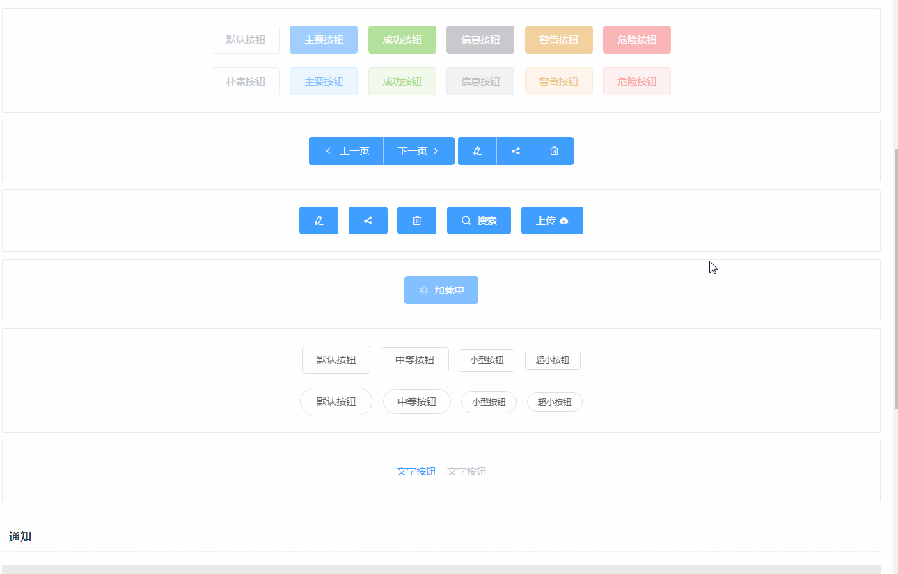
跟在 vuepress 文档的表现一样。
不过这边还有一个问题,就是我就两个组件的文档,显示就很长了,而且都是重复性的,有没有可以用自动化脚本再去处理,就跟之前处理 md文件 和enhanceApp.js一样, 还是通过 gulp 来做这个事情:
//============= home vue 构建 start ===========
var componentsMap = {};
var loadUIComponent = function (name) {
  var files = fs.readdirSync(path.resolve(`docs/.vuepress/components/${name}`));
  //遍历读取到的文件列表
  files.forEach(function (filename) {
    console.log(filename);
    // 这边只取 .vue 结尾的文件
    if (filename.indexOf(".vue") > -1) {
      componentsMap[name] = componentsMap[name] || [];
      // 渠道文件名后面的 .vue, 只取前面
      componentsMap[name].push(filename.split(".")[0]);
    }
  });
  return componentsMap[name];
};

// 优化文档打包逻辑
gulp.task('homeVue', cb => {
  return gulp.src('./src/views/home_origin.vue')
    // 模版地址修改
    .pipe(replace(/(.*gulpStart::(.*)::gulpEnd.*)/g, function (match, p1, p2) {
      var str = '';
      if (p2.indexOf("ui__") > -1) {
        var uiName = p2.split("__")[1];
        var arr = loadUIComponent(uiName);
        arr = _.map(arr, function (item) {
          return `    <${uiName}-${item}></${uiName}-${item}>`;
        });
        str = arr.join("\n");
      }

      if (p2 === 'import') {
        _.each(componentsMap, function (arr, uiName) {
          // console.log("uiName:" + uiName);
          // console.log("uiArr:" + JSON.stringify(arr));
          _.each(arr, function (item) {
            var itemUpperStr = _.map(item.split("-"), function (tmpItem) {
              // 首字母大写
              return tmpItem.replace(tmpItem[0], tmpItem[0].toUpperCase());
            }).join("");
            str += `  import ${uiName.replace(uiName[0], uiName[0].toUpperCase())}${itemUpperStr} from '../../docs/.vuepress/components/${uiName}/${item}'\n`;
          })
        });
        // 去掉最后一个空格
        var strArr = str.split("\n");
        strArr = strArr.splice(0, strArr.length - 1);
        str = strArr.join("\n");
      }

      if (p2 === 'init') {
        _.each(componentsMap, function (arr, uiName) {
          // console.log("uiName:" + uiName);
          // console.log("uiArr:" + JSON.stringify(arr));
          _.each(arr, function (item, index) {
            var itemUpperStr = _.map(item.split("-"), function (tmpItem) {
              // 首字母大写
              return tmpItem.replace(tmpItem[0], tmpItem[0].toUpperCase());
            }).join("");
            var uiModuleName = `${uiName.replace(uiName[0], uiName[0].toUpperCase())}${itemUpperStr}`;
            str += `      [${uiModuleName}.name]: ${uiModuleName},\n`;
          })
        });
        // 去掉最后一行的逗号, 和最后一行换行
        var strArr = str.split("\n");
        // 去掉空行
        strArr = strArr.splice(0, strArr.length - 1);
        str = strArr.join("\n");
        // 去掉逗号
        str = str.substring(0, str.length - 1);
      }

      return str;
    }))
    .pipe(rename('home.vue'))
    .pipe(gulp.dest('./src/views'));
});
逻辑也不复杂,还是通过读取一个原始的 home_origin.vue 的文件,然后通过构建来生成同目录下的真正的 home.vue,其实跟 enhanceApp.js 任务非常像,也是通过读取不同的 action 操作,然后去写入对应的字符串
- 也是一行一行读取,读取到 p2
- 如果 p2 ,然后得到
vuepress组件的目录文档,然后得到这个目录下的 demo 文件的名字,然后如果遇到import就导入,如果遇到init就初始化。
假设 home_origin.vue 的内容是这样子:
<template>
  <div class="wrap">
    <h1 class="warp-title">{{ msg }}</h1>

    <h2>通用组件</h2>
    <h4>Button 按钮</h4>
    <!--gulpStart::ui__button::gulpEnd-->

    <h2>通知</h2>
    <h4>Notification 通知</h4>
    <!--gulpStart::ui__notification::gulpEnd-->
  </div>
</template>

<script>
  //gulpStart::import::gulpEnd

  export default {
    data () {
      return {
        msg: `AIR-UI  -  基于vue2.x,可复用UI组件`
      }
    },
    components: {
      //gulpStart::init::gulpEnd
    },
    methods: {

    },
    mounted () {

    }
}
</script>

<style lang="scss">
  .wrap{
    color: #2c3e50;
    margin: 10px;
    margin-top: 60px;
    .warp-title {
      text-align: center;
    }
  }
  h1,h3{
    margin: 0;
  }
  h3{
    font-weight: normal;
    font-size: 16px;
  }
  h4{
    font-weight: normal;
    font-size: 14px;
    text-align: left;
    background-color: #e9e9e9;
    padding: 10px;
  }
  h2{
    text-align: left;
    width: 100%;
    border-bottom: 1px dashed #ededed;
    font-size: 16px;
    height: 40px;
    line-height: 40px;
    text-indent: 10px;
    margin-top: 30px;
    margin-bottom: 0;
  }
  .demo-block{
    margin-bottom: 10px;
  }
</style>
那么打出来的 home.vue 就是这样子:
<template>
  <div class="wrap">
    <h1 class="warp-title">{{ msg }}</h1>

    <h2>通用组件</h2>
    <h4>Button 按钮</h4>
    <button-demo-base></button-demo-base>
    <button-demo-disabled></button-demo-disabled>
    <button-demo-group></button-demo-group>
    <button-demo-icon></button-demo-icon>
    <button-demo-loading></button-demo-loading>
    <button-demo-size></button-demo-size>
    <button-demo-text></button-demo-text>

    <h2>通知</h2>
    <h4>Notification 通知</h4>
    <notification-demo-base></notification-demo-base>
    <notification-demo-close></notification-demo-close>
    <notification-demo-html></notification-demo-html>
    <notification-demo-icon></notification-demo-icon>
    <notification-demo-offset></notification-demo-offset>
    <notification-demo-position></notification-demo-position>
  </div>
</template>

<script>
  import ButtonDemoBase from '../../docs/.vuepress/components/button/demo-base'
  import ButtonDemoDisabled from '../../docs/.vuepress/components/button/demo-disabled'
  import ButtonDemoGroup from '../../docs/.vuepress/components/button/demo-group'
  import ButtonDemoIcon from '../../docs/.vuepress/components/button/demo-icon'
  import ButtonDemoLoading from '../../docs/.vuepress/components/button/demo-loading'
  import ButtonDemoSize from '../../docs/.vuepress/components/button/demo-size'
  import ButtonDemoText from '../../docs/.vuepress/components/button/demo-text'
  import NotificationDemoBase from '../../docs/.vuepress/components/notification/demo-base'
  import NotificationDemoClose from '../../docs/.vuepress/components/notification/demo-close'
  import NotificationDemoHtml from '../../docs/.vuepress/components/notification/demo-html'
  import NotificationDemoIcon from '../../docs/.vuepress/components/notification/demo-icon'
  import NotificationDemoOffset from '../../docs/.vuepress/components/notification/demo-offset'
  import NotificationDemoPosition from '../../docs/.vuepress/components/notification/demo-position'

  export default {
    data () {
      return {
        msg: `AIR-UI  -  基于vue2.x,可复用UI组件`
      }
    },
    components: {
      [ButtonDemoBase.name]: ButtonDemoBase,
      [ButtonDemoDisabled.name]: ButtonDemoDisabled,
      [ButtonDemoGroup.name]: ButtonDemoGroup,
      [ButtonDemoIcon.name]: ButtonDemoIcon,
      [ButtonDemoLoading.name]: ButtonDemoLoading,
      [ButtonDemoSize.name]: ButtonDemoSize,
      [ButtonDemoText.name]: ButtonDemoText,
      [NotificationDemoBase.name]: NotificationDemoBase,
      [NotificationDemoClose.name]: NotificationDemoClose,
      [NotificationDemoHtml.name]: NotificationDemoHtml,
      [NotificationDemoIcon.name]: NotificationDemoIcon,
      [NotificationDemoOffset.name]: NotificationDemoOffset,
      [NotificationDemoPosition.name]: NotificationDemoPosition
    },
    methods: {

    },
    mounted () {

    }
}
</script>

<style lang="scss">
  .wrap{
    color: #2c3e50;
    margin: 10px;
    margin-top: 60px;
    .warp-title {
      text-align: center;
    }
  }
  h1,h3{
    margin: 0;
  }
  h3{
    font-weight: normal;
    font-size: 16px;
  }
  h4{
    font-weight: normal;
    font-size: 14px;
    text-align: left;
    background-color: #e9e9e9;
    padding: 10px;
  }
  h2{
    text-align: left;
    width: 100%;
    border-bottom: 1px dashed #ededed;
    font-size: 16px;
    height: 40px;
    line-height: 40px;
    text-indent: 10px;
    margin-top: 30px;
    margin-bottom: 0;
  }
  .demo-block{
    margin-bottom: 10px;
  }
</style>
是不是非常的方便,所以下次有一个新的组件的 demo 要加进去,那么只需要在模板里面加入:
    <h4>Input 输入框</h4>
    <!--gulpStart::ui__input::gulpEnd-->
那么就会去 docs/.vuepress/components/input 这个目录下找到所有的 demo 文件,并且导入进去。
当然最后构建也要变一下:
"start": "gulp homeVue && npm run dev",
这边有个细节,因为是用组件的方式来引入 demo 的,所以每一个 demo 都要初始化 name 属性,不然就会出现找不到的情况。这也是为啥之前做 demo 的时候就要设置 name 的原因,就是用在这里。
总结
这一节主要是针对 vuepress 这个文档框架的写文档的时候加入了很多更高级的东西,并且为了更省事,还加入了一些 gulp 任务,让开发者可以更方便的写 demo,并且引入 demo 例子。 不过难道你以为 vuepress 就再也没有问题了, no,no,no,还没有讲入坑和爬坑呢,下一节我们讲 vuepress 的爬坑经验。
系列文章:
- 自建vue组件 air-ui (1) -- 为啥我要自建一个类 element ui 的组件
- 自建vue组件 air-ui (2) -- 先分析一下 element ui 项目
- 自建vue组件 air-ui (3) -- css 开发规范
- 自建vue组件 air-ui (4) -- air-ui 环境搭建和目录结构
- 自建vue组件 air-ui (5) -- 创建第一个组件 Button
- 自建vue组件 air-ui (6) -- 创建内置服务组件
- 自建vue组件 air-ui (7) -- 创建指令组件
- 自建vue组件 air-ui (8) -- 实现部分引入组件
- 自建vue组件 air-ui (9) -- 用 vuepress 写文档
- 自建vue组件 air-ui (10) -- vuepress 写文档 (进阶版)
- 自建vue组件 air-ui (11) -- vuepress 写文档 (爬坑版)
- 自建vue组件 air-ui (12) -- 国际化机制
- 自建vue组件 air-ui (13) -- 国际化机制(进阶版)
- 自建vue组件 air-ui (14) -- 打包构建(dev 和 dist)
- 自建vue组件 air-ui (15) -- 主题定制
- 自建vue组件 air-ui (16) -- 打包构建 pub 任务
- 自建vue组件 air-ui (17) -- 开发爬坑篇以及总结
