

系列文章
- [ 基础系列 ] - CSS 小测 01
- [ 基础系列 ] - CSS 小测 02
- [ 基础系列 ] - CSS 小测 03
- [ 基础系列 ] - CSS 小测 04
- [ 基础系列 ] - CSS 小测 05
- [ 基础系列 ] - CSS 小测 06
- [ 基础系列 ] - CSS 小测 07
- [ 基础系列 ] - CSS 小测 08
- [ 基础系列 ] - CSS 小测 09
- [ 基础系列 ] - CSS 小测 10
- [ 基础系列 ] - CSS 小测 11
说在前面
本篇是张鑫旭老师的 CSS 基础测试13 的阅后笔记。
题目
先来看看题目:
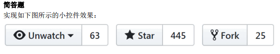
需求:
- 尺寸自适应
- 视觉还原
- 语义化
- 无障碍访问
分析
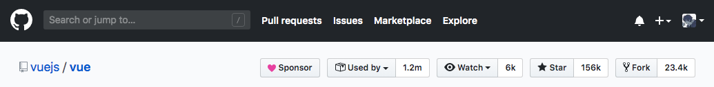
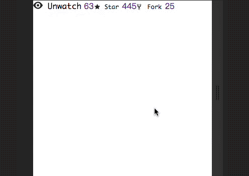
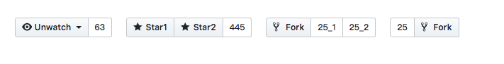
题目看起来似曾相识,仿佛在哪里见过......emmmm,是哪里呢?
!!!
原来是这里,github。既然如此,我们可以直接参考源码:
<ul class="btn-group-list">
<!-- watch -->
<li class="btn-group">
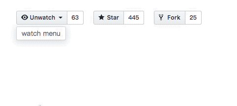
<details class="details-wrap">
<summary class="btn" btn-type="summary">
<i class="icon" icon-type="eye"></i> Unwatch
</summary>
<div class="details-menu">
watch menu
</div>
</details>
<a class="btn" href btn-type="link">63</a>
</li>
<!-- star -->
<li class="btn-group">
<button class="btn" btn-type="default">
<i class="icon" icon-type="star"></i> Star
</button>
<a class="btn" href btn-type="link">445</a>
</li>
<!-- fork -->
<li class="btn-group">
<button class="btn" btn-type="default">
<i class="icon" icon-type="fork"></i> Fork
</button>
<a class="btn" href btn-type="link">25</a>
</li>
</ul>
接下来我们先重置 css 样式:
/* reset css */
body,
ul,
button,
a {
  margin: 0;
  padding: 0;
  list-style: none;
  text-decoration: none;
}

details {
  display: inline-block;
}

summary,
button {
  font-family: -apple-system, BlinkMacSystemFont, "Segoe UI", Helvetica,
    Arial, sans-serif;
}

summary::-webkit-details-marker {
  display: none;
}
效果如下:
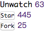
然后设定图标:
/* set icon */
.icon {
  display: inline-block;
  width: 1.2em;
  height: 1.2em;
  vertical-align: -2px;
}

[icon-type="eye"] {
  background: url("data:image/svg+xml,%3Csvg viewBox='0 0 16 16' width='16' height='16' xmlns='http://www.w3.org/2000/svg' fill='%2324292e' aria-hidden='true'%3E%3Cpath fill-rule='evenodd' d='M8.06 2C3 2 0 8 0 8s3 6 8.06 6C13 14 16 8 16 8s-3-6-7.94-6zM8 12c-2.2 0-4-1.78-4-4 0-2.2 1.8-4 4-4 2.22 0 4 1.8 4 4 0 2.22-1.78 4-4 4zm2-4c0 1.11-.89 2-2 2-1.11 0-2-.89-2-2 0-1.11.89-2 2-2 1.11 0 2 .89 2 2z'/%3E%3C/svg%3E")
    no-repeat center/100%;
}

[icon-type="star"] {
  background: url("data:image/svg+xml,%3Csvg viewBox='0 0 16 16' width='16' height='16' xmlns='http://www.w3.org/2000/svg' fill='%2324292e' aria-hidden='true'%3E%3Cpath fill-rule='evenodd' d='M14 6l-4.9-.64L7 1 4.9 5.36 0 6l3.6 3.26L2.67 14 7 11.67 11.33 14l-.93-4.74L14 6z'/%3E%3C/svg%3E")
    no-repeat center/100%;
}

[icon-type="fork"] {
  background: url("data:image/svg+xml,%3Csvg viewBox='0 0 16 16' width='16' height='16' xmlns='http://www.w3.org/2000/svg' fill='%2324292e' aria-hidden='true'%3E%3Cpath fill-rule='evenodd' d='M8 1a1.993 1.993 0 00-1 3.72V6L5 8 3 6V4.72A1.993 1.993 0 002 1a1.993 1.993 0 00-1 3.72V6.5l3 3v1.78A1.993 1.993 0 005 15a1.993 1.993 0 001-3.72V9.5l3-3V4.72A1.993 1.993 0 008 1zM2 4.2C1.34 4.2.8 3.65.8 3c0-.65.55-1.2 1.2-1.2.65 0 1.2.55 1.2 1.2 0 .65-.55 1.2-1.2 1.2zm3 10c-.66 0-1.2-.55-1.2-1.2 0-.65.55-1.2 1.2-1.2.65 0 1.2.55 1.2 1.2 0 .65-.55 1.2-1.2 1.2zm3-10c-.66 0-1.2-.55-1.2-1.2 0-.65.55-1.2 1.2-1.2.65 0 1.2.55 1.2 1.2 0 .65-.55 1.2-1.2 1.2z'%3E%3C/path%3E%3C/svg%3E")
    no-repeat center/100%;
}
效果如下:
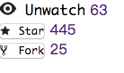
再接着设置布局,这里有以下几种方案:
- flex
- BFC
- table
由于三种布局方案都在前面的小测笔记里介绍过,所以就不分别实现了,这里我们选择最为方便的 flex 来实现布局。
/* layout */
.btn-group-list {
  display: flex;
  flex-wrap: wrap;
}
效果如下:
接下来就是按钮样式的设置了。
/* btn style */
.btn-group {
  display: inline-flex;
  margin: 10px;
}

.btn {
  display: inline-block;
  padding: 3px 9px;
  font-size: 12px;
  font-weight: 600;
  line-height: 20px;
  vertical-align: middle;
  cursor: pointer;
  -webkit-user-select: none;
  -moz-user-select: none;
  -ms-user-select: none;
  user-select: none;
  border: 1px solid #ccced0;
  -webkit-appearance: none;
  -moz-appearance: none;
  appearance: none;
  outline: none;
}

[btn-type="summary"]::after {
  content: "";
  display: inline-block;
  width: 0;
  height: 0;
  margin-left: 3px;
  transform: translateY(25%);
  border: 4px solid transparent;
  border-top-color: currentColor;
}

.details-menu {
  position: absolute;
  margin-top: 4px;
  overflow: hidden;
  padding: 3px 10px;
  font-size: 14px;
  color: #586069;
  background-color: #fff;
  background-clip: padding-box;
  border: 1px solid rgba(27, 31, 35, 0.15);
  border-radius: 3px;
  box-shadow: 0 3px 12px rgba(27, 31, 35, 0.15);
}

[btn-type="summary"],
[btn-type="default"] {
  border-radius: 3px 0 0 3px;
}

[btn-type="link"] {
  border-radius: 0 3px 3px 0;
  border-left: none;
}

[btn-type="summary"],
[btn-type="default"] {
  color: #24292e;
  background-color: #eff3f6;
  background-image: linear-gradient(-180deg, #fafbfc, #eff3f6 90%);
}

[btn-type="link"] {
  color: #24292e;
  background-color: #fff;
}

[btn-type="summary"]:hover,
[btn-type="default"]:hover,
[btn-type="summary"]:focus,
[btn-type="default"]:focus {
  background-color: #e9ecef;
  background-image: none;
  border-color: rgba(27, 31, 35, 0.35);
  box-shadow: inset 0 0.15em 0.3em rgba(27, 31, 35, 0.15);
}

[btn-type="link"]:hover,
[btn-type="link"]:focus {
  color: #0366d6;
}
效果如下:
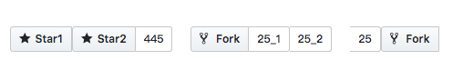
这里值得一提的是,上面的代码有一定的不足:比如
- 按钮组有多个左侧样式的按钮,或者右侧链接是的按钮
- 按钮做右侧反过来放置
那么将会出现如下情况:
通常在实现按钮组,标签组等组件的时候,使用 :first-child,:last-child 伪类来进行样式是比较巧妙的方法,比如用在这里:
.btn-group > .btn:first-child,
.btn-group > .details-wrap:first-child > .btn {
  border-radius: 3px 0 0 3px;
}

.btn-group > .btn:last-child {
  border-radius: 0 3px 3px 0;
}
效果如下:
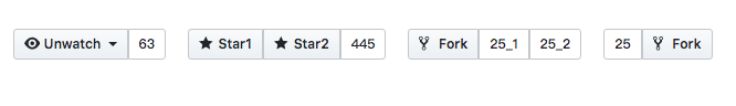
而中间重叠 border 的解决方案,可以利用 :not 伪类:
.btn-group > .btn:not(:first-child),
.btn-group > .details-wrap:not(:first-child) {
  margin-left: -1px;
}
效果如下:
这里是在线 demo
结束语
本题要点张老师已经总结得很详细了,所以这里就不深入展开了:
- 按钮就用
<button>实现即可,而别使用<a> - 按钮组的实现方法,通常有3种 inline-block,float,inline-flex
- 每个按钮控制不要使用标签选择器,而是树结构伪类,例如:first-child,:last-child
- 中间的线要走合并,每一个元素都要有完整的边框,(如margin负值合并),而不是根据标签类型进行缺省
