

系列文章
说在前面
本篇是张鑫旭老师的 CSS基础测试2 的阅后笔记。(另外感谢 XboxYan 的解答,逻辑非常清晰)
题目
话不多说,先上题,HTML 如下:
<a
  href="javascript:"
  class="icon-delete css-tips"
  data-title="删除"
  role="button"
>
  删除
</a>
现需实现如下效果:
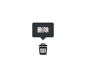
要求:
- 纯 css 实现
- 考虑边界情况
思路
分析完题目之后,可以看到,出题者很贴心的给了 a 标签两个 class:
- icon-delete
- css-tips
意图很明显,icon-delete 用于实现把文字替换成图标的功能,而 css-tips 用于实现气泡提示效果。
那么首先把比较简单的功能完成。
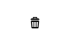
icon-delete
这里可以通过把字体大小设置为 0,然后通过设置背景的方式来完成图标化:
.icon-delete{
    display: block;
    width: 30px;
    height: 30px;
    font-size: 0px;
    background: url(./del.png) no-repeat center;
    background-size: cover;
}
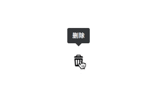
这样就完成了这个简单的功能,效果如下:
css-tips
这个功能较为复杂,我们先不考虑各种场景,只单独的把这个气泡提示做出来。
给元素附加挂件的效果,这里我们可以通过 before 和 after 伪类来做。
由于气泡浮于元素上方,所以这里第一反应是要用到绝对定位:
.css-tips {
    position: relative;
}

.css-tips[data-title]::before,
.css-tips[data-title]::after {
    content: "";
    width: 20px;
    height: 20px;
    display: block;
    position: absolute;
    z-index: 1;
    left: 50%;
    bottom: 100%;
    transform: translate(-50%, -20px);
    background: #373c42;
}
到这里,我们成功的将 before 和 after 定位到了按钮的正上方:
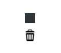
接下来分别对 before 和 after 进行调整,这里我们使用 before 来做为装填文字的容器,使用 after 作为气泡下方的箭头。
before
首先由于我们并不知道提示文字长度,所以不必设置高宽。
那么 before 就没什么好注意的了。(由于提示消息长度不固定,所以可能出现提示文本过长的情况,这样应该能够将文本换行,这个情景后面再提)
.css-tips {
    position: relative;
}

.css-tips[data-title]::before,
.css-tips[data-title]::after {
    content: "";
    display: block;
    position: absolute;
    z-index: 1;
    left: 50%;
    bottom: 100%;
    transform: translate(-50%, -20px);
    background: #373c42;
}

.css-tips[data-title]:before {
    content: attr(data-title);
    border-radius: 3px;
    padding: 6px 10px;
    line-height: 18px;
    text-align: left;
    background-color: #373c42;
    color: #fff;
    font-size: 12px;
    font-style: normal;
    white-space: nowrap;
  }
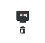
效果如下:
after
上图可以看到,在气泡中间有一块黑色的遮挡,这个就是 after 了,只需要将它画成倒三角,并且贴在 before 的下方即可。
画倒三角的方法有很多,这里简单介绍一个最省事的。
我们给一个元素添加一个 60px 的 border,然后将上下左右设置成不同的颜色:
.border{
    border: 6px solid #fff;
    border-top-color: black;
    border-left-color: red;
    border-bottom-color: blue;
    border-right-color: yellow;
}
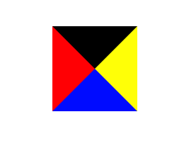
可以看到,四个角刚好是四个三角形,那么需要什么样的三角形,将其他的 color 设置为 transparent 即可,这里也用这种方法来画 after
.css-tips[data-title]::before,
.css-tips[data-title]::after {
    content: "";
    display: block;
    position: absolute;
    z-index: 1;
    left: 50%;
    bottom: 100%;
    transform: translate(-50%, -20px);
    background: #373c42;
}

.css-tips[data-title]:after {
    content: "";
    width: 0;
    height: 0;
    margin-bottom: -12px;
    overflow: hidden;
    border: 6px solid transparent;
    border-top-color: currentColor;
  }
效果如图:

接下来需要做的就是在 hover 的时候显示气泡,别的时候隐藏即可,没什么好说,最终代码如下:
.icon-delete {
    font-size: 0;
    width: 30px;
    height: 30px;
    background: url(./del.png) no-repeat center;
    background-size: cover;
  }

  .css-tips {
    position: relative;
  }

  .css-tips[data-title]:before,
  .css-tips[data-title]:after {
    content: "";
    display: block;
    position: absolute;
    z-index: 1;
    left: 50%;
    bottom: 100%;
    transform: translate(-50%, -20px);
    color: #373c42;
    opacity: 0;
    visibility: hidden;
  }

  .css-tips[data-title]:before {
    content: attr(data-title);
    border-radius: 3px;
    padding: 6px 10px;
    line-height: 18px;
    text-align: left;
    background-color: #373c42;
    color: #fff;
    font-size: 12px;
    font-style: normal;
    white-space: nowrap;
  }

  .css-tips[data-title]:after {
    content: "";
    width: 0;
    height: 0;
    margin-bottom: -12px;
    overflow: hidden;
    border: 6px solid transparent;
    border-top-color: currentColor;
  }

  .css-tips[data-title]:hover:before,
  .css-tips[data-title]:hover:after {
    visibility: visible;
    opacity: 1;
  }
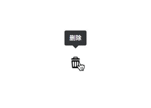
效果如下:
优化
优化要从两个方面说起:
- 适应极端场景
- 体验优化
(其实说白了都是体验优化)
体验优化
我们先来说说体验优化,可以看到上面最后的动图效果非常僵硬,并且鼠标移动过来就立刻出现气泡,假设现在有一个这样的场景:
一个表格,每一行都可以删除,用户从下往上移动鼠标,想要删除第 n 行,但由于鼠标放上去,气泡立马弹出来了,所以这个时候有可能第 n+1 行的气泡弹了出来,并且挡住了第 n 行的按钮,这个时候用户只能重新以不同角度移动过来,这样的体验是相当不友好的。
解决上述场景,我们有一个小技巧:延时。
我们让气泡延迟一点出现,这样当鼠标划过的时候就并不会出现气泡,而是停留的时候才会出现,这样就不会造成上述场景了:
.css-tips[data-title]:before,
  .css-tips[data-title]:after {
    content: "";
    display: block;
    position: absolute;
    z-index: 1;
    left: 50%;
    bottom: 100%;
    transform: translate(-50%, -20px);
    color: #373c42;
    opacity: 0;
    transition: 0.15s 0.15s;
    visibility: hidden;
  }
效果如下:
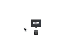
到这里其实气泡也显得并不那么生硬了,当然如果愿意的话可以再增加一个过渡,显得更加灵动:
.css-tips[data-title]:hover:before,
.css-tips[data-title]:hover:after {
    visibility: visible;
    transform: translate(-50%, -10px);
    opacity: 1;
  }
效果如下:
适应极端场景
接下来我们聊聊极端场景,及题目中提到的边界问题。
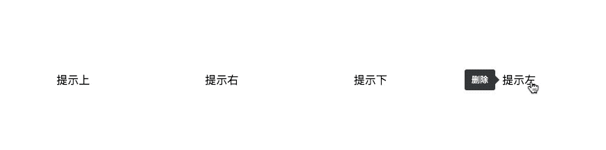
当这个按钮出现在屏幕顶端的时候,如果气泡依然是从顶部出现,很明显将会部分或者完全不可见。解决这个问题,我想到的方案是给气泡添加方向属性,通过从不同方向出现来避免对应的边界。
我们可以为元素添加一个 data-title-dir 属性,默认从上方弹出气泡,如果设置方向,则从指定方向弹出:
| 属性 | 描述 | 使用 |
|---|---|---|
data-title-dir |
规定提示的方向,可以取值top(默认)、right、bottom、left | <span class="css-tips" data-title="删除" data-title-dir="right">提示右</span> |
实现原理上面已经分析过了,就不再赘述:
/* right */
.css-tips[data-title][data-title-dir="right"]:before,
.css-tips[data-title][data-title-dir="right"]:after{
    left: 100%;
    top: 50%;
    bottom: auto;
    transform: translate(20px, -50%);
}
.css-tips[data-title][data-title-dir="right"]:after {
    margin: 0;
    margin-left: -12px;
    border-color: transparent;
    border-right-color: currentColor;
}
.css-tips[data-title][data-title-dir="right"]:hover:before,
.css-tips[data-title][data-title-dir="right"]:hover:after {
    visibility: visible;
    transform: translate(10px, -50%);
    opacity: 1;
}

/* bottom */
.css-tips[data-title][data-title-dir="bottom"]:before,
.css-tips[data-title][data-title-dir="bottom"]:after{
    left: 50%;
    top: 100%;
    bottom: auto;
    transform: translate(-50%, 20px);
}
.css-tips[data-title][data-title-dir="bottom"]:after {
    margin: 0;
    margin-top: -12px;
    border-color: transparent;
    border-bottom-color: currentColor;
}
.css-tips[data-title][data-title-dir="bottom"]:hover:before,
.css-tips[data-title][data-title-dir="bottom"]:hover:after {
    visibility: visible;
    transform: translate(-50%, 10px);
    opacity: 1;
}

/* left */
.css-tips[data-title][data-title-dir="left"]:before,
.css-tips[data-title][data-title-dir="left"]:after{
    left: auto;
    right: 100%;
    top: 50%;
    bottom: auto;
    transform: translate(-20px, -50%);
}
.css-tips[data-title][data-title-dir="left"]:after {
    margin: 0;
    margin-right: -12px;
    border-color: transparent;
    border-left-color: currentColor;
}
.css-tips[data-title][data-title-dir="left"]:hover:before,
.css-tips[data-title][data-title-dir="left"]:hover:after {
    visibility: visible;
    transform: translate(-10px, -50%);
    opacity: 1;
}
效果如下:
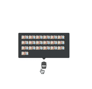
还有一个场景就是提示文本过长。这个问题我们也可以像边界问题那样给元素添加一个 data-title-muti 属性来指定是否换行:
| 属性 | 描述 | 使用 |
|---|---|---|
data-title-muti |
适用于提示文本较多的情况,自动换行 | <span class="css-tips" data-title="删除" data-title-muti>提示</span> |
/* muti */
.css-tips[data-title][data-title-muti]:before {
    width: 150px;
    white-space: normal;
}
效果如图:
结束语
对于这个需求,其实还可以继续优化扩展,比如添加状态,不同状态有不同的颜色来提示,比如结合 js 添加回调等等。
当然这些功能早就有很多开源库做了,而且做得很好很强壮,所以在日常开发中,便不必在重复造轮子了,作为学习了解原理和设计思路可以,但切记不要舍本逐末。
