

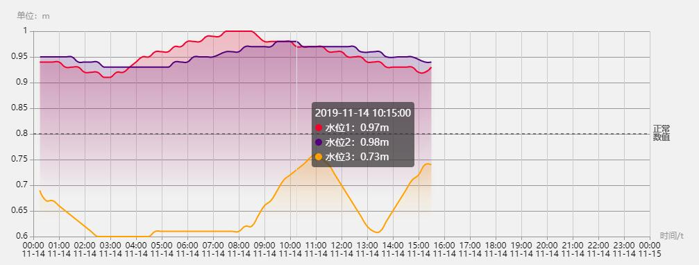
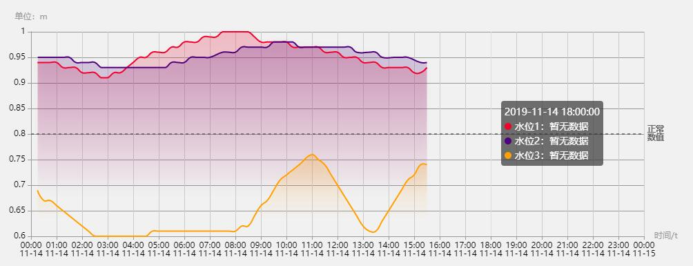
效果图
有数据的自动填充,没数据的提示暂无数据
页面
单条数据效果:juejin.cn/post/684490…
多条线的写法和单条线是一样的,就是对于数据操作有了一定的更改。这里只写echarts的配置(附上详细的配置解释)
数据
数据太长,就随便取了前六个数据演示。若需要使用渐变色,需定义一个color值(自动生成不可控)
chartsData: [
    {
        name: "水位1",
        color: "220,20,60",
        xChart: ["2019-11-14 00:15:00", "2019-11-14 00:30:00", "2019-11-14 00:45:00", "2019-11-14 01:00:00", "2019-11-14 01:15:00", "2019-11-14 01:30:00"],
        yChart: [ "0.94", "0.94", "0.94", "0.94", "0.93", "0.93", ]
    },
    {
        name: "水位2",
        color: "75,0,130",
        xChart: ["2019-11-14 00:16:00", "2019-11-14 00:30:00", "2019-11-14 00:45:00", "2019-11-14 01:00:00", "2019-11-14 01:16:00", "2019-11-14 01:30:00" ],
        yChart: ["0.95", "0.95", "0.95", "0.95", "0.95", "0.95"]
    },
    {
        name: "水位3",
        color: "255,165,0",
        xChart: [ "2019-11-14 00:15:00", "2019-11-14 00:30:00", "2019-11-14 00:45:00", "2019-11-14 01:00:00", "2019-11-14 01:15:00", "2019-11-14 01:30:00"],
        yChart: ["0.69", "0.67", "0.67", "0.66", "0.65", "0.64"]
    }
]
数据显示(附详细样式)
对数据进行操作,使符合图表需要数据,注意的一点是先使用了空数据填充x轴,后面若改x轴有对应的值,需要先删除该元素,再push该条数据
let myCharts = echarts.init(this.$refs.myEcharts);
let today = "2019-11-14"; // 日期(和数据日期对应)
let seriesData = []; // series内容
let contentData = [];
// 配置x轴
let timeShow = "";
let xDate = [];
for (var ii = 0; ii < 25; ii++) {
    timeShow = `${today} ${ii > 9 ? ii : "0" + ii}:00:00`;
    contentData.push([timeShow, ""]); // 默认整点填充数据(用空数据进行填充X轴)
    xDate.push(timeShow); // x轴显示
}
if (!Array.isArray(this.chartsData) || this.chartsData.length == 0) {
    return;
}
let minNum = 0, maxNum = 0; // 记录最大最小值,是图标不留太多空白
// 修改格式为['时间','值']
this.chartsData.map((res, index) => {
    // 配置当前数据的Y轴
    let nowContentData = JSON.parse(JSON.stringify(contentData));
    if (Array.isArray(res.yChart) && res.yChart.length > 0) {
        res.yChart.map((yRes, yIndex) => {
            // 获取最大最小值(根据业务需要)
            if (index == 0 && yIndex == 0) {
                minNum = yRes;
                maxNum = yRes;
            } else if (yRes < minNum) {
                minNum = yRes;
            } else if (yRes > maxNum) {
                maxNum = yRes;
            }

            // 此处直接push赋值会造成整点有一个空数据和一个有数据的情况,所以需要判断整点
            // 如果直接更改整点的数据会产生双倍数量的折线,所以需要先删除为空值的整点数据,在进行整点的赋值
            let arrIndex = nowContentData.findIndex(
                item => item[0] == res.xChart[yIndex]
            );
            if (arrIndex != -1) {
                nowContentData.splice(arrIndex, 1);
            }

            nowContentData.push([res.xChart[yIndex], yRes]); // 填充传过来的x轴和y轴
        });
    }
    seriesData.push({
        name: res.name,
        type: "line",
        smooth: true,
        symbol: "circle",
        symbolSize: 0, // 不显示原点,为了后期需求更改,我这里直接变成了0,也可以不定义
        lineStyle: {
            normal: {
                width: 2 // 线段粗细
            }
        },
        areaStyle: {
            normal: {
                // 线段渐变色
                color: new echarts.graphic.LinearGradient(0, 0, 0, 1, [
                    {
                        offset: 0,
                        color: `rgba(${res.color}, 0.3)` // 曲线色值
                    },
                    {
                        offset: 0.8,
                        color: `rgba(${res.color}, 0)`
                    }],false
                ),
                shadowColor: `rgba(0, 0, 0, 0.1)`,
                shadowBlur: 10
            }
        },
        // 此处定义原点的大小和颜色
        itemStyle: {
            normal: {
                color: `rgb(${res.color})`,
                borderColor: "#fff",
                borderWidth: 2
            }
        },
        data: nowContentData,
        // 使用基准线,记得引入require('echarts/lib/component/markLine')
        markLine: {
            silent: true,
            symbol: "none",
            label: {
                position: "middle",
                formatter: "{b}"
            },
            data: [{
                name: "正常\n数值",
                yAxis: 0.8,
                lineStyle: {
                    color: "#666"
                },
                label: {
                    position: "end",
                    ormatter: "{b}\n {c}%"
                }
            }]
        },
    });
});

myCharts.setOption({
    // tooltip的配置
    tooltip: {
        trigger: "axis",
        axisPointer: {
            lineStyle: {
                color: "#ddd"
            }
        },
        formatter: val => {
            let text = "";
            text = `${val[0].data[0]}<br/>`; // 时间
            val.map((res, index) => {
                // 名字
                text += `${res.marker}${res.seriesName}:`;
                // 值
                if (res.data[1] === 0 || res.data[1]) {
                    text += `${res.data[1]}m`;
                } else {
                    text += "暂无数据";
                }
                text += "<br/>";
            });
            return text;
        },
        textStyle: {
            align: "left"
        }
    },
    // 图表位置
    grid: {
        left: "3%",
        right: "5%",
        bottom: "3%",
        containLabel: true
    },
    xAxis: {
        type: "time",
        // x轴单位
        name: "时间/t",
        nameTextStyle: {
            color: "#999"
        },
        // x轴0值时横线的颜色
        axisLine: {
            lineStyle: {
                color: "#999"
            }
        },
        // x轴坐标文字的颜色配置
        axisLabel: {
            show: true,
            textStyle: {
                color: '#000'
            }
        },
        interval: 1000 * 3600, // x轴时间间隔显示为1小时
        data: xDate,
        min: `${today} 0:00:00` // 初始为0点
    },
    yAxis: {
        splitNumber: 10, // y轴间隔数量
        type: "value",
        name: "单位:m", // 单位
        nameTextStyle: {
            color: "#999" // 单位颜色
        },
        // y轴0值时的纵线颜色
        axisLine: {
            lineStyle: {
                color: "#999"
            }
        },
        // y坐标文字的颜色
        axisLabel: {
            show: true,
            textStyle: {
                color: "#000"
            }
        },
        // 平行于x轴的横向线颜色
        splitLine: {
            show: true,
            lineStyle: {
                color: "#999"
            }
        },
        // 最大最小值
        max: function(value) {
            return maxNum;
        },
        min: function(value) {
            return minNum;
        }
    },
    series: seriesData
});
