1 AxisBottom 使用
// left, top 是距离左边的距离和顶部的距离
// scale  传入的计算函数
// tickformat  显示格式
// numTicks   显示多少个坐标
// 因为ui的标准是左对齐和右边对齐,所以可以设置tickValues,tickValues 必须在xScale 的定义域之内,tickValues 函数把数组均分成几份
const xScale = scaleTime({
             rangeRound: [0, width],
             domain: d3.extent(data, x)
           });
<AxisBottom
                 top={height}
                 scale={xScale}
                 tickFormat={d => d3.timeFormat("%m-%d %H:%M")(d)}
                 tickValues={tickValues(8, d3.extent(data, x))}
               />
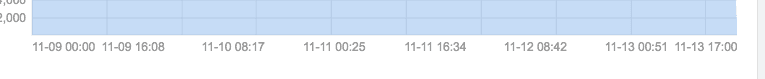
效果图如下
bar 使用
在使用柱形图的时候,经常需要根据数据的大小来动态的调整柱子的宽度,于是可以设置一个最大宽度,然后其它的可以根据d3.scaleBand的padding来动态的设置。
render() {
    let { width, height, data } = this.props;
    // const data = appleStock;
    data = data.slice(0, 4);
    return (
      <div>
        <Container
          padding={padding}
          x={x}
          y={y}
          // 定义tooltip格式
          tooltip={data => (
            <div>
              {String(x(data))}: {y(data)}
            </div>
          )}
        >
          {({
            width,
            height,
            showBasicTooltip,
            showLineTooltip,
            hideTooltip
          }) => {
            const xScale = scaleBand({
              rangeRound: [0, width],
              // domain: d3.extent(data, x)
              domain: data.map(x)
            }).padding(0.5);
            const yScale = scaleLinear({
              rangeRound: [height, 0],
              domain: d3.extent(data, y)
            });
            const xAxisScale = scaleLinear({
              rangeRound: [0, width],
              domain: d3.extent(data, x)
            });
            return (
              <Group>
                {/* <Grid
                  width={width}
                  height={height}
                  xScale={xScale}
                  yScale={yScale}
                /> */}
                <AxisBottom
                  top={height}
                  scale={xAxisScale}
                  tickFormat={d => d3.timeFormat("%m-%d %H:%M")(d)}
                  tickValues={tickValues(8, d3.extent(data, x))}
                />
                <AxisLeft scale={yScale} />
                <Group className="line-graph">
                  {/* <AreaClosed
                    data={data}
                    xScale={xScale}
                    yScale={yScale}
                    x={x}
                    y={y}
                  /> */}
                  {/* 定义整个图形触发区间 */}
                  {data.map(d => (
                    <Bar
                      key={`bar-${x(d)}`}
                      width={xScale.bandwidth() > 20 ? 20 : xScale.bandwidth()}
                      height={height - yScale(y(d))}
                      data={d}
                      fill="#2d84e5"
                      x={xScale(x(d))}
                      y={yScale(y(d))}
                    />
                  ))}

                </Group>
              </Group>
            );
          }}
        </Container>
        {/* <div styleName="sd" />
        <div styleName="sd" /> */}
      </div>
    );
  }
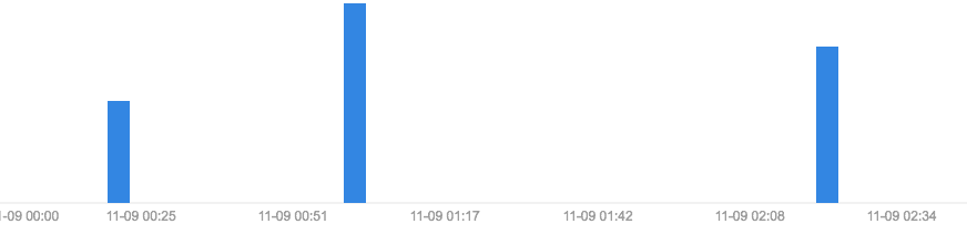
当数据很小的时候,表现如下图:
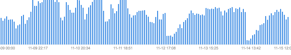
当数据很大的时候,表现如下图:
tooltip
当需要tooltip的时候,可以使用传入tooltip,
<div>
        <Container
          padding={padding}
          x={x}
          y={y}
          // 定义tooltip格式
          tooltip={data => {
            return (
              <div>
                {String(x(data))}: {y(data)}
              </div>
            );
          }}
        >
          {({
            width,
            height,
            showBasicTooltip,
            showLineTooltip,
            hideTooltip
          }) => {
            // const xScale = scaleBand({
            //   rangeRound: [0, width],
            //   // domain: d3.extent(data, x)
            //   domain: data.map(x)
            // }).padding(0.5);
            // const yScale = scaleLinear({
            //   rangeRound: [height, 0],
            //   domain: d3.extent(data, y)
            // });
            const xScale = scaleTime({
              rangeRound: [0, width],
              domain: d3.extent(data, x)
            });
            const yScale = scaleLinear({
              rangeRound: [height, 0],
              domain: d3.extent(data, y)
            });
            const xAxisScale = scaleLinear({
              rangeRound: [0, width],
              domain: d3.extent(data, x)
            });
            return (
              <Group>
                {/* <Grid
                  width={width}
                  height={height}
                  xScale={xScale}
                  yScale={yScale}
                /> */}
                <AxisBottom
                  top={height}
                  scale={xAxisScale}
                  tickFormat={d => d3.timeFormat("%m-%d %H:%M")(d)}
                  tickValues={tickValues(8, d3.extent(data, x))}
                />
                <AxisLeft scale={yScale} />
                <Group className="line-graph">
                  <AreaClosed
                    data={data}
                    xScale={xAxisScale}
                    yScale={yScale}
                    x={x}
                    y={y}
                  />
                  <Bar
                    x={0}
                    y={0}
                    width={width}
                    height={height}
                    fill="transparent"
                    data={data}
                    onMouseMove={d => e => {
                      showLineTooltip({
                        event: e,
                        data: d,
                        xScale,
                        yScale
                      });
                      // showBasicTooltip({
                      //   event: e,
                      //   data: d
                      // });
                    }}
                    onMouseLeave={d => e => hideTooltip()}
                  />
                </Group>
              </Group>
            );
          }}
        </Container>
  </div>
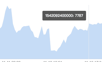
showLineTooltip 是指带有线的tooltip,showBasicTooltip不带线 效果如下
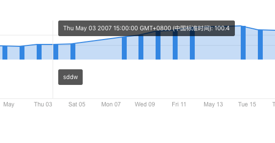
两个tooltip
因为在ui图中经常会出现很多次一个图中出现两个tooltip, 这样可以通过样式让下一个tooltip,像是出现在下方。
 render() {
    const data = appleStock.slice(0, 20);

    return (
      <div style={{ position: "relative" }}>
        <h2>默认配置,坐标轴为category, value</h2>
        <Container
          padding={padding}
          x={x}
          y={y}
          tooltip={data => (
            <Fragment>
              <div>
                {String(x(data))}: {y(data)}
              </div>
              <div
                style={{
                  position: "absolute",
                  backgroundColor: "rgba(0, 0, 0, 0.7)",
                  color: "#fff",
                  padding: "10px",
                  borderRadius: "3px",
                  border: "none",
                  fontSize: "12px",
                  fontWeight: "normal",
                  lineHeight: "1",
                  pointerEvents: "none",
                  zIndex: 10,
                  top: "100px",
                  left: 0
                }}
              >
                sddw
              </div>
            </Fragment>
          )}
        >
效果如下图:
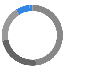
基本圆环图
构建基本的圆环图,圆环图比较简单,
const letters = letterFrequency.slice(0, 4);
const browsers = Object.keys(browserUsage[0])
 .filter(k => k !== "date")
 .map(k => ({ label: k, usage: browserUsage[0][k] }));
const x = d => new Date(d.date);
const y = d => +d.close;
const y2 = d => +d.close - 10;
// console.log(appleStock);

const padding = {
 top: 150,
 left: 140,
 bottom: 20,
 right: 20
};
const radius = 200;
console.log(letters);
const circleColor = ["#888", "#666", "#999"];
class PieTest extends Component {
 render() {
   // const data = appleStock.slice(0, 20);
   return (
     <div style={{ position: "relative" }}>
       <Container
         padding={padding}
         // x={x}
         // y={y}
         tooltip={data => (
           <Fragment>
             <div>{JSON.stringify(data.data.label)}</div>
           </Fragment>
         )}
         height={300}
         style={{}}
       >
         {({
           width,
           height,
           showBasicTooltip,
           showLineTooltip,
           hideTooltip
         }) => {
           return (
             <Group className="bar-group">
               <Pie
                 data={browsers}
                 pieValue={d => d.usage}
                 outerRadius={radius - 100}
                 innerRadius={radius - 120}
                 fill={d => circleColor[d.index] || "#2d84e5"}
                 // fillOpacity={d => 1 / (d.index + 2)}
                 // cornerRadius={3}
                 padAngle={0.002}
                 onMouseMove={d => e =>
                   showBasicTooltip({
                     event: e,
                     data: d
                   })}
                 onMouseLeave={d => e => hideTooltip()}
                 // centroid={(centroid, arc) => {
                 //   const [x, y] = centroid;
                 //   const { startAngle, endAngle } = arc;
                 //   if (endAngle - startAngle < 0.1) return null;
                 //   return arc.data.label;
                 // }}
               />
             </Group>
           );
         }}
       </Container>
     </div>
   );
 }
}

export default PieTest;
基本效果图如下: