

作者: Jooyer, 时间: 2018.10.08

Github地址,欢迎点赞,fork
其实本篇和上一篇 Toolbar 是一起的,因为很多时候我们会自定义一个左边图片文本,右边文本图片的MenuItem.
本次代码也是比较简单,一个组合控件而已,我就直接贴源码,如果还有不清楚的,可以留言或者看github
###只需要一个类 + 一个 XML 文件即可,即拷即用
接下来我们依次讲解,和上一次Toolbar套路一致哈:
- CustomMenu
- 一个 XML 文件
- 属性及默认值
####首先,看看 CustomMenu
package cn.molue.jooyer.custommenu

import android.content.Context
import android.support.v4.content.ContextCompat
import android.text.TextUtils
import android.util.AttributeSet
import android.util.TypedValue
import android.view.LayoutInflater
import android.view.View
import android.widget.ImageView
import android.widget.RelativeLayout
import android.widget.TextView

/**
 * Desc: 自定义普通菜单,格式如下
 *  图片 -- 文字  --------------- 文字/图片  图片
 * Author: Jooyer
 * Date: 2018-08-08
 * Time: 14:44
 */
class CustomMenu(context: Context, attr: AttributeSet, defStyleAttr: Int)
    : RelativeLayout(context, attr, defStyleAttr) {

    /**
     * 最左侧图标
     */
    private lateinit var iv_left_icon_menu: ImageView
    /**
     * 紧挨着左侧图标的文本
     */
    private lateinit var tv_left_name_menu: TextView
    /**
     * 紧挨着右侧的文本(与 紧挨着右侧的图片 只显示一种)
     */
    private lateinit var tv_right_name_menu: TextView
    /**
     * 紧挨着右侧的图片(与 紧挨着右侧的文本 只显示一种)
     */
    private lateinit var iv_near_right_icon_menu: ImageView
    /**
     * 最右侧图标(一般是向右箭头 →)
     */
    private lateinit var iv_right_arrow_menu: ImageView
    /**
     * 底部分割线
     */
    private lateinit var view_bottom_divider_menu: View

    private var rightTextRightMargin = 0

    constructor(context: Context, attr: AttributeSet) : this(context, attr, 0)

    init {
        initView()
        parseAttrs(context, attr)

    }

    private fun initView() {
        val parent = LayoutInflater.from(context).inflate( R.layout.menu_image_text_text_image, this,true)
        iv_left_icon_menu = parent.findViewById(R.id.iv_left_icon_menu)
        tv_left_name_menu = parent.findViewById(R.id.tv_left_name_menu)
        tv_right_name_menu = parent.findViewById(R.id.tv_right_name_menu)
        iv_near_right_icon_menu = parent.findViewById(R.id.iv_right_icon_menu)
        iv_right_arrow_menu = parent.findViewById(R.id.iv_right_arrow_menu)
        view_bottom_divider_menu = parent.findViewById(R.id.view_bottom_divider_menu)
    }

    private fun parseAttrs(context: Context, attr: AttributeSet) {
        val arr = context.obtainStyledAttributes(attr, R.styleable.CustomMenu)
        val leftImageVisible = arr.getBoolean(R.styleable.CustomMenu_cm_left_image_visible, true)
        val leftImageDrawable = arr.getDrawable(R.styleable.CustomMenu_cm_left_image_drawable)
        val leftImageWidth = arr.getDimension(R.styleable.CustomMenu_cm_left_image_width, dp2px(20F)).toInt()
        val leftImageHeight = arr.getDimension(R.styleable.CustomMenu_cm_left_image_height, dp2px(20F)).toInt()

        val leftTextInfo = arr.getText(R.styleable.CustomMenu_cm_left_text_info)
        val leftTextSize = arr.getInteger(R.styleable.CustomMenu_cm_left_text_size, 14).toFloat()
        val leftTextLeftMargin = arr.getDimension(R.styleable.CustomMenu_cm_left_text_left_margin, dp2px(10F)).toInt()
        val leftTextColor = arr.getColor(R.styleable.CustomMenu_cm_left_text_color,
                ContextCompat.getColor(context, R.color.color_111111))

        val rightTextInfo = arr.getText(R.styleable.CustomMenu_cm_right_text_info)
        val rightTextVisible = arr.getBoolean(R.styleable.CustomMenu_cm_right_text_visible, true)
        val rightTextSize = arr.getInt(R.styleable.CustomMenu_cm_right_text_size, 14).toFloat()
        rightTextRightMargin = arr.getDimension(R.styleable.CustomMenu_cm_right_text_right_margin, dp2px(20F)).toInt()
        val rightTextColor = arr.getColor(R.styleable.CustomMenu_cm_right_text_color,
                ContextCompat.getColor(context, R.color.color_111111))

        val rightNearImageVisible = arr.getBoolean(R.styleable.CustomMenu_cm_right_near_image_visible, false)
        val rightNearImageDrawable = arr.getDrawable(R.styleable.CustomMenu_cm_right_near_image_drawable)
        val rightNearImageWidth = arr.getDimension(R.styleable.CustomMenu_cm_right_near_image_width, dp2px(20F)).toInt()
        val rightNearImageHeight = arr.getDimension(R.styleable.CustomMenu_cm_right_near_image_height, dp2px(20F)).toInt()

        val rightDrawableVisible = arr.getBoolean(R.styleable.CustomMenu_cm_right_image_visible, true)
        val rightImageDrawable = arr.getDrawable(R.styleable.CustomMenu_cm_right_image_drawable)
        val rightImageWidth = arr.getDimension(R.styleable.CustomMenu_cm_right_image_width, dp2px(22F)).toInt()
        val rightImageHeight = arr.getDimension(R.styleable.CustomMenu_cm_right_image_height, dp2px(22F)).toInt()

        val bottomDividerVisible = arr.getBoolean(R.styleable.CustomMenu_cm_bottom_divider_visible, false)
        val bottomDividerColor = arr.getColor(R.styleable.CustomMenu_cm_bottom_divider_color,
                ContextCompat.getColor(context, R.color.color_EEEEEE))
        val bottomDividerLeftMargin = arr.getDimension(R.styleable.CustomMenu_cm_bottom_divider_left_margin, dp2px(20F)).toInt()

        iv_left_icon_menu.visibility = if (leftImageVisible) View.VISIBLE else View.GONE
        if (null != leftImageDrawable) {
            iv_left_icon_menu.setImageDrawable(leftImageDrawable)
        }
        val leftImageLp: RelativeLayout.LayoutParams = iv_left_icon_menu.layoutParams as LayoutParams
        leftImageLp.width = leftImageWidth
        leftImageLp.height = leftImageHeight
        iv_left_icon_menu.layoutParams = leftImageLp


        if (!TextUtils.isEmpty(leftTextInfo)) {
            tv_left_name_menu.text = leftTextInfo
            tv_left_name_menu.setTextColor(leftTextColor)
            tv_left_name_menu.setTextSize(TypedValue.COMPLEX_UNIT_DIP, leftTextSize)

            val leftTextLp: RelativeLayout.LayoutParams = tv_left_name_menu.layoutParams as LayoutParams
            leftTextLp.marginStart = leftTextLeftMargin
            tv_left_name_menu.layoutParams = leftTextLp
        }


        tv_right_name_menu.visibility = if (rightTextVisible) View.VISIBLE else View.GONE
        if (!TextUtils.isEmpty(rightTextInfo)) {
            tv_right_name_menu.text = rightTextInfo
            tv_right_name_menu.setTextColor(rightTextColor)
            tv_right_name_menu.setTextSize(TypedValue.COMPLEX_UNIT_DIP, rightTextSize)

            val rightTextLp: RelativeLayout.LayoutParams = tv_right_name_menu.layoutParams as LayoutParams
            if (rightDrawableVisible) {
                rightTextLp.marginEnd = rightTextRightMargin + dp2px(20F).toInt()
            } else {
                rightTextLp.marginEnd = rightTextRightMargin
            }
            tv_right_name_menu.layoutParams = rightTextLp
        }


        iv_near_right_icon_menu.visibility = if (rightNearImageVisible) View.VISIBLE else View.GONE
        if (null != rightNearImageDrawable) {
            iv_near_right_icon_menu.setImageDrawable(rightNearImageDrawable)
        }

        val rightNearImageLp: RelativeLayout.LayoutParams = iv_near_right_icon_menu.layoutParams as LayoutParams
        rightNearImageLp.width = rightNearImageWidth
        rightNearImageLp.height = rightNearImageHeight
        if (rightDrawableVisible) {
            rightNearImageLp.marginEnd = rightTextRightMargin + dp2px(20F).toInt()
        } else {
            rightNearImageLp.marginEnd = rightTextRightMargin
        }
        iv_near_right_icon_menu.layoutParams = rightNearImageLp


        iv_right_arrow_menu.visibility = if (rightDrawableVisible) View.VISIBLE else View.GONE
        if (null != rightImageDrawable) {
            iv_right_arrow_menu.setImageDrawable(rightImageDrawable)
        }

        val rightImageLp: RelativeLayout.LayoutParams = iv_right_arrow_menu.layoutParams as LayoutParams
        rightImageLp.width = rightImageWidth
        rightImageLp.height = rightImageHeight
        iv_right_arrow_menu.layoutParams = rightImageLp

        view_bottom_divider_menu.visibility = if (bottomDividerVisible) View.VISIBLE else View.GONE
        view_bottom_divider_menu.setBackgroundColor(bottomDividerColor)
        val bottomDividerLp: RelativeLayout.LayoutParams = view_bottom_divider_menu.layoutParams as LayoutParams
        bottomDividerLp.leftMargin = bottomDividerLeftMargin
        view_bottom_divider_menu.layoutParams = bottomDividerLp

        arr.recycle()
    }

    fun setRightTextVisible(isVisible: Boolean) {
        tv_right_name_menu.visibility = if (isVisible) View.VISIBLE else View.GONE
    }

    fun setRightNearImageViewVisible(isVisible: Boolean) {
        iv_near_right_icon_menu.visibility = if (isVisible) View.VISIBLE else View.GONE
    }

    fun getRightNearImageView(): ImageView {
        return iv_near_right_icon_menu
    }

    fun setRightImageViewVisible(isVisible: Boolean) {
        val rightNearImageLp: RelativeLayout.LayoutParams = iv_near_right_icon_menu.layoutParams as LayoutParams
        val rightTextLp: RelativeLayout.LayoutParams = tv_right_name_menu.layoutParams as LayoutParams
        if (isVisible) {
            rightNearImageLp.marginEnd = rightTextRightMargin + dp2px(20F).toInt()
            rightTextLp.marginEnd = rightTextRightMargin + dp2px(20F).toInt()
            iv_right_arrow_menu.visibility = View.VISIBLE
        } else {
            rightNearImageLp.marginEnd = rightTextRightMargin
            rightTextLp.marginEnd = rightTextRightMargin
            iv_right_arrow_menu.visibility = View.GONE
        }

        iv_near_right_icon_menu.layoutParams = rightNearImageLp
        tv_right_name_menu.layoutParams = rightTextLp
    }


    fun setLeftText(text: String?) {
        text?.let {
            tv_left_name_menu.text = text
        }

    }

    fun setLeftText(text: String?, color: Int) {
        text?.let {
            tv_left_name_menu.text = text
            tv_left_name_menu.setTextColor(color)
        }
    }

    fun setRightText(text: String?, color: Int) {
        text?.let {
            tv_right_name_menu.text = it
            tv_right_name_menu.setTextColor(color)
        }
    }

    fun setRightText(text: String?) {
        text?.let {
            tv_right_name_menu.text = it
        }
    }

    private fun dp2px(def: Float): Float {
        return TypedValue.applyDimension(TypedValue.COMPLEX_UNIT_DIP, def, context.resources.displayMetrics)
    }

}
来看看自定义的属性(xml文件)
里面就是一大堆自定义的属性,具体含义往下看
   <?xml version="1.0" encoding="utf-8"?>
<resources>

    <declare-styleable name="CustomMenu">
        <!-- 最左侧图标是否可见 -->
        <attr name="cm_left_image_visible" format="boolean"/>
        <!-- 最左侧图标的 drawable -->
        <attr name="cm_left_image_drawable" format="reference"/>
        <!-- 最左侧图标宽度 -->
        <attr name="cm_left_image_width" format="dimension|integer"/>
        <!-- 最左侧图表高度 -->
        <attr name="cm_left_image_height" format="dimension|integer"/>

        <!-- 紧靠左侧的文本 -->
        <attr name="cm_left_text_info" format="reference|string"/>
        <!-- 紧靠左侧的文本大小 -->
        <attr name="cm_left_text_size" format="dimension|integer"/>
        <!-- 紧靠左侧的文本颜色 -->
        <attr name="cm_left_text_color" format="color|reference"/>
        <!-- 紧靠左侧的文本左侧Margin -->
        <attr name="cm_left_text_left_margin" format="dimension|integer"/>

        <!-- 紧靠右侧的文本 -->
        <attr name="cm_right_text_info" format="reference|string"/>
        <!-- 紧靠右侧的文本是否可见 -->
        <attr name="cm_right_text_visible" format="boolean"/>
        <!-- 紧靠右侧的文本大小 -->
        <attr name="cm_right_text_size" format="dimension|integer"/>
        <!-- 紧靠右侧的文本颜色 -->
        <attr name="cm_right_text_color" format="color|reference"/>
        <!-- 紧靠右侧的文本右侧Margin -->
        <attr name="cm_right_text_right_margin" format="dimension|integer"/>

        <!-- 紧靠右侧图标是否可见 -->
        <attr name="cm_right_near_image_visible" format="boolean"/>
        <!-- 紧靠右侧图标的 drawable -->
        <attr name="cm_right_near_image_drawable" format="reference"/>
        <!-- 紧靠右侧图标宽度 -->
        <attr name="cm_right_near_image_width" format="dimension|integer"/>
        <!-- 紧靠右侧图表高度 -->
        <attr name="cm_right_near_image_height" format="dimension|integer"/>

        <!-- 最右侧图标的是否可见 -->
        <attr name="cm_right_image_visible" format="boolean"/>
        <!-- 最右侧图标的 drawable -->
        <attr name="cm_right_image_drawable" format="reference"/>
        <!-- 最右侧图标宽度 -->
        <attr name="cm_right_image_width" format="dimension|integer"/>
        <!-- 最右侧图表高度 -->
        <attr name="cm_right_image_height" format="dimension|integer"/>

        <!-- 底部分割线是否可见 -->
        <attr name="cm_bottom_divider_visible" format="boolean"/>
        <!-- 底部分割线颜色 -->
        <attr name="cm_bottom_divider_color" format="color|reference"/>
        <!-- 底部分割线左侧Margin -->
        <attr name="cm_bottom_divider_left_margin" format="dimension|integer"/>


    </declare-styleable>

</resources>
属性虽然有些多,但是大都都见名知意. 这里还是要看下其布局文件,虽然 so easy
####再来看看其布局(xml文件)
<?xml version="1.0" encoding="utf-8"?>
<RelativeLayout
    xmlns:android="http://schemas.android.com/apk/res/android"
    xmlns:tools="http://schemas.android.com/tools"
    android:layout_width="match_parent"
    android:layout_height="@dimen/height_50"
    android:background="@android:color/white"
    android:orientation="vertical"
    >

    <ImageView
        android:id="@+id/iv_left_icon_menu"
        android:layout_width="wrap_content"
        android:layout_height="wrap_content"
        android:layout_centerVertical="true"
        android:layout_marginStart="@dimen/padding_20"
        />

    <TextView
        android:id="@+id/tv_left_name_menu"
        android:layout_width="wrap_content"
        android:layout_height="match_parent"
        android:layout_centerVertical="true"
        android:layout_marginStart="@dimen/padding_8"
        android:layout_toEndOf="@+id/iv_left_icon_menu"
        android:gravity="center_vertical"
        android:textColor="@color/color_111111"
        android:textSize="@dimen/text_size_15"
        tools:text="宝贝头像"
        />


    <TextView
        android:id="@+id/tv_right_name_menu"
        android:layout_width="wrap_content"
        android:layout_height="match_parent"
        android:layout_alignParentEnd="true"
        android:layout_centerVertical="true"
        android:layout_marginEnd="@dimen/padding_20"
        android:gravity="center_vertical"
        android:textColor="@color/color_111111"
        android:textSize="@dimen/text_size_15"
        tools:text="请填写"
        />

    <ImageView
        android:id="@+id/iv_right_icon_menu"
        android:layout_width="20dp"
        android:layout_height="20dp"
        android:layout_alignParentEnd="true"
        android:layout_centerVertical="true"
        android:layout_marginEnd="@dimen/padding_20"
        android:visibility="visible"
        />


    <ImageView
        android:id="@+id/iv_right_arrow_menu"
        android:layout_width="wrap_content"
        android:layout_height="wrap_content"
        android:layout_alignParentEnd="true"
        android:layout_centerVertical="true"
        android:layout_marginEnd="@dimen/padding_10"
        android:src="@drawable/ic_right_gray_next"
        />

    <View
        android:id="@+id/view_bottom_divider_menu"
        android:layout_width="match_parent"
        android:layout_height="@dimen/divider_2"
        android:layout_alignParentBottom="true"
        android:layout_marginStart="@dimen/padding_20"
        android:background="@color/color_EEEEEE"
        />
</RelativeLayout>
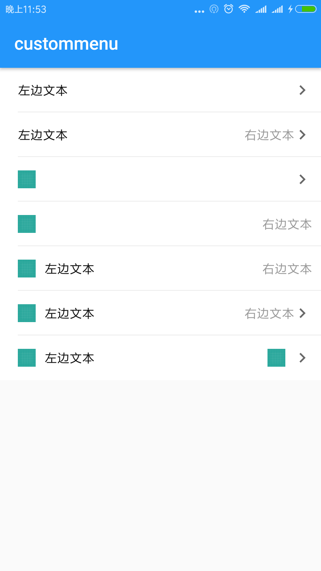
最后来看看在 Activity 布局中的用法
<?xml version="1.0" encoding="utf-8"?>
<android.support.constraint.ConstraintLayout
    xmlns:android="http://schemas.android.com/apk/res/android"
    xmlns:app="http://schemas.android.com/apk/res-auto"
    xmlns:tools="http://schemas.android.com/tools"
    android:layout_width="match_parent"
    android:layout_height="match_parent"
    tools:context="cn.molue.jooyer.custommenu.MainActivity">


    <!-- 左边文本,右边图片 -->
    <cn.molue.jooyer.custommenu.CustomMenu
        android:id="@+id/cm_1_main"
        android:layout_width="match_parent"
        android:layout_height="wrap_content"
        app:cm_left_image_visible="false"
        app:cm_left_text_left_margin="@dimen/padding_20"
        app:cm_left_text_info="左边文本"
        app:cm_bottom_divider_visible="true"
        app:cm_right_text_color="@color/color_999999"
        app:layout_constraintLeft_toLeftOf="parent"
        app:layout_constraintTop_toTopOf="parent"
        app:layout_constraintRight_toRightOf="parent"
        />

    <!-- 左边文本,右边文本+图片 -->
    <cn.molue.jooyer.custommenu.CustomMenu
        android:id="@+id/cm_2_main"
        android:layout_width="match_parent"
        android:layout_height="wrap_content"
        app:cm_left_image_visible="false"
        app:cm_left_text_left_margin="@dimen/padding_20"
        app:cm_left_text_info="左边文本"
        app:cm_right_text_right_margin="@dimen/padding_10"
        app:cm_right_text_info="右边文本"
        app:cm_bottom_divider_visible="true"
        app:cm_right_text_color="@color/color_999999"
        app:layout_constraintLeft_toLeftOf="parent"
        app:layout_constraintTop_toBottomOf="@+id/cm_1_main"
        app:layout_constraintRight_toRightOf="parent"
        />


    <!-- 左边图片,右边图片 -->
    <cn.molue.jooyer.custommenu.CustomMenu
        android:id="@+id/cm_3_main"
        android:layout_width="match_parent"
        android:layout_height="wrap_content"
        app:cm_left_image_visible="true"
        app:cm_left_image_drawable="@drawable/ic_launcher_background"
        app:cm_bottom_divider_visible="true"
        app:cm_right_text_color="@color/color_999999"
        app:layout_constraintLeft_toLeftOf="parent"
        app:layout_constraintTop_toBottomOf="@+id/cm_2_main"
        app:layout_constraintRight_toRightOf="parent"
        />

    <!-- 左边图片,右边文本 -->
    <cn.molue.jooyer.custommenu.CustomMenu
        android:id="@+id/cm_4_main"
        android:layout_width="match_parent"
        android:layout_height="wrap_content"
        app:cm_left_image_visible="true"
        app:cm_left_image_drawable="@drawable/ic_launcher_background"
        app:cm_right_text_right_margin="@dimen/padding_10"
        app:cm_right_text_info="右边文本"
        app:cm_bottom_divider_visible="true"
        app:cm_right_image_visible="false"
        app:cm_right_text_color="@color/color_999999"
        app:layout_constraintLeft_toLeftOf="parent"
        app:layout_constraintTop_toBottomOf="@+id/cm_3_main"
        app:layout_constraintRight_toRightOf="parent"
        />

    <!-- 左边图片+文本,右边文本 -->
    <cn.molue.jooyer.custommenu.CustomMenu
        android:id="@+id/cm_5_main"
        android:layout_width="match_parent"
        android:layout_height="wrap_content"
        app:cm_left_image_visible="true"
        app:cm_left_image_drawable="@drawable/ic_launcher_background"
        app:cm_right_text_right_margin="@dimen/padding_10"
        app:cm_right_text_info="右边文本"
        app:cm_left_text_info="左边文本"
        app:cm_bottom_divider_visible="true"
        app:cm_right_image_visible="false"
        app:cm_right_text_color="@color/color_999999"
        app:layout_constraintLeft_toLeftOf="parent"
        app:layout_constraintTop_toBottomOf="@+id/cm_4_main"
        app:layout_constraintRight_toRightOf="parent"
        />

    <!-- 左边图片+文本,右边文本+图片 -->
    <cn.molue.jooyer.custommenu.CustomMenu
        android:id="@+id/cm_6_main"
        android:layout_width="match_parent"
        android:layout_height="wrap_content"
        app:cm_left_image_visible="true"
        app:cm_left_image_drawable="@drawable/ic_launcher_background"
        app:cm_right_text_right_margin="@dimen/padding_10"
        app:cm_right_text_info="右边文本"
        app:cm_left_text_info="左边文本"
        app:cm_bottom_divider_visible="true"
        app:cm_right_image_visible="true"
        app:cm_right_text_color="@color/color_999999"
        app:layout_constraintLeft_toLeftOf="parent"
        app:layout_constraintTop_toBottomOf="@+id/cm_5_main"
        app:layout_constraintRight_toRightOf="parent"
        />

    <!-- 左边图片+文本,右边图片+图片 -->
    <cn.molue.jooyer.custommenu.CustomMenu
        android:id="@+id/cm_7_main"
        android:layout_width="match_parent"
        android:layout_height="wrap_content"
        app:cm_left_image_visible="true"
        app:cm_left_image_drawable="@drawable/ic_launcher_background"
        app:cm_right_text_visible="false"
        app:cm_right_near_image_visible="true"
        app:cm_right_near_image_drawable="@drawable/ic_launcher_background"
        app:cm_left_text_info="左边文本"
        app:cm_bottom_divider_visible="false"
        app:cm_right_image_visible="true"
        app:cm_right_near_image_width="@dimen/width_20"
        app:cm_right_near_image_height="@dimen/height_20"
        app:cm_right_text_color="@color/color_999999"
        app:layout_constraintLeft_toLeftOf="parent"
        app:layout_constraintTop_toBottomOf="@+id/cm_6_main"
        app:layout_constraintRight_toRightOf="parent"
        />

</android.support.constraint.ConstraintLayout>
这个就不解释了,最后看看 Activity中的操作
class MainActivity : AppCompatActivity() {

    override fun onCreate(savedInstanceState: Bundle?) {
        super.onCreate(savedInstanceState)
        setContentView(R.layout.activity_main)

        // 有多个方法,不够可以自己再定义
//        cm_7_main.setLeftText("")
//        cm_7_main.setRightText("")

    }
}
是不是相当简单呢,其实至于左边图片,右边文本还是图片什么的,可以自己根据需要组合, app:cm_bottom_divider_visible="false" 主要是一个分割线,根据需要可以定制哈!
###喜欢记得点赞,收藏,转发哈!
