

If you look at companies like Dropbox, Google, and Twitter you’ll notice that they each have their own unique aesthetic. Across all their products, both mobile and web, there is a sense of consistency and uniformity in their design.
The way that companies and products achieve consistency is through styleguides. A styleguide is a set of standards that aligns designs with a company’s voice and mission.
Consistency is important because it creates trust. And design is all about creating relationships between products and users.
The goal of this article is to introduce you to some well-thought-out styleguides and branding guidelines. It also details some of the most important elements every styleguide should have.
Hopefully, these elements and examples will serve as a source of inspiration and influence how you design sustainable products in the future.
Here are a few suggestions for when you’re designing styleguides.

- Design your product first and then create a styleguide. Don’t start by creating a styleguide. First figure out what works and what doesn’t work. Then standardize it.
- You’ll never be fully happy with your styleguide. That’s okay. Creating a universal design language is an iterative process.
- Have a strong understanding of the voice and message you want your product to convey before writing a styleguide.
Styleguides should always have a page on design principles. Design principles are a set of guidelines that influence how designers approach and solve problems when building a product.
One of the key characteristics of a good design principle is that it isn’t obvious or too broad. A good design principle should be specific enough to help a designer make decisions.
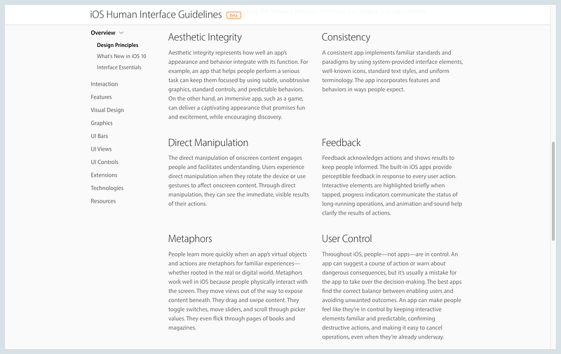
Let’s take a look at Apple’s Human Interface Guidelines, which has a section on design principles. One of their principles is direct manipulation.
The direct manipulation of onscreen content engages people and facilitates understanding… Through direct manipulation, they can see the immediate, visible results of their actions.
This description explains that direct manipulation is a principle that governs and mediates physical and digital interactions. It helps designers choose modes of interactions, such as swiping and rotating.
When coming up with design principles, less is more. Start off with three guiding principles and iterate from there.
For more on design principles, check out Julie Zhuo’s A Matter of Principle article. It has hugely influenced how I think about design principles.
Typography is key to achieving unity across multiple products and designs. Every styleguide should have a few sections detailing typography specifications.
It’s important to limit the number of typefaces and sizes you use in order to keep your designs simple. As a general rule of thumb, start with at most two fonts — one for your headers, and one for your bodies. Most of the time, you won’t need any more than that.
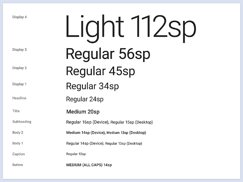
Also, include example use cases of typography to help other designers and developers understand when to use things like bold or italics.

If you have trouble picking fonts, check out Typewolf and FontPair. For font sizing check out Modular Scale and its accompanying article More Meaningful Typography.
Also keep in mind that fonts aren’t set in stone. You can always change them later.
Show, don’t tell. Imagery is a powerful tool in the hands of a designer. Images are dynamic. They convey meaning at first glance, and evoke emotions.
If you have have the assets, consider including a section that details what kinds of images other designers should use to convey your product’s voice and identity.
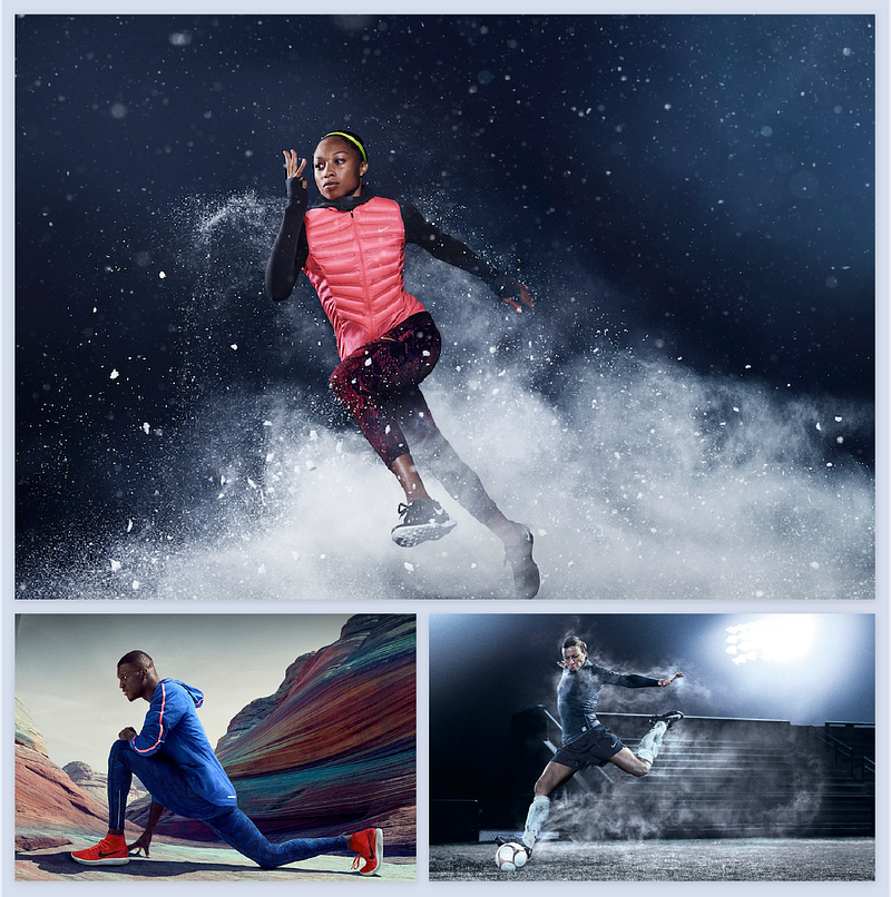
Nike is a good example of a company that uses images to convey their brand. Their photos have a cinematic quality that inspires you to participate in their mission and brand.
Imagery isn’t only limited to photographs. Companies like Dropbox rarely use photographs in their designs. Instead, they convey their personality through illustrations.

Here is an example of Hubspot’s imagery styleguide.
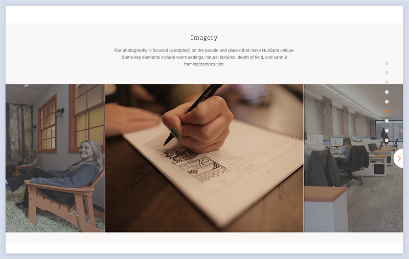
Notice how they describe the tone and goal of the photography before providing examples.
With guidelines for what images to use, designers can better communicate meaning to users and ultimately immerse them into a cohesive experience.
