Android 四种常用布局资源详解
一、LinearLayout(线性布局)
1. 布局特点
- 子视图按**水平(horizontal)或垂直(vertical)**方向依次排列
- 通过
layout_weight 按比例分配剩余空间
- 是最简单、最基础的布局容器
2. 关键属性
| 属性 | 作用 |
|---|
orientation | 设置排列方向:vertical(垂直)/ horizontal(水平) |
gravity | 控制所有子控件在容器中的对齐方式 |
layout_gravity | 控制单个控件在父容器中的对齐方式 |
layout_weight | 分配剩余空间的权重,值越大占越多空间 |
3. 代码示例
<?xml version="1.0" encoding="utf-8"?>
<LinearLayout xmlns:android="http://schemas.android.com/apk/res/android"
    android:layout_width="match_parent"
    android:layout_height="match_parent"
    android:orientation="horizontal">
    <Button
        android:layout_width="0dp"
        android:layout_height="wrap_content"
        android:layout_weight="1"
        android:text="按钮1"/>
    <Button
        android:layout_width="0dp"
        android:layout_height="wrap_content"
        android:layout_weight="1"
        android:text="按钮2"/>
    <Button
        android:layout_width="0dp"
        android:layout_height="wrap_content"
        android:layout_weight="2"
        android:text="按钮3"/>
</LinearLayout>
4. 运行效果截图

5. 适用场景
- 简单的列表排列
- 表单输入界面
- 按钮组排列
- 需要按比例分配空间的场景
二、RelativeLayout(相对布局)
1. 布局特点
- 子视图通过相对于父容器或相对于其他子视图来定位
- 可以有效减少布局嵌套层级,提升性能
- 布局灵活,适合复杂界面
2. 关键属性
| 属性 | 作用 |
|---|
layout_alignParentTop | 与父容器顶部对齐 |
layout_alignParentBottom | 与父容器底部对齐 |
layout_alignParentLeft/Start | 与父容器左边/起始边对齐 |
layout_alignParentRight/End | 与父容器右边/结束边对齐 |
layout_centerInParent | 在父容器中水平垂直居中 |
layout_below | 位于指定控件下方 |
layout_above | 位于指定控件上方 |
layout_toLeftOf/toStartOf | 位于指定控件左侧/起始侧 |
layout_toRightOf/toEndOf | 位于指定控件右侧/结束侧 |
3. 代码示例
<?xml version="1.0" encoding="utf-8"?>
<RelativeLayout xmlns:android="http://schemas.android.com/apk/res/android"
style="@style/AppTheme"
android:id="@+id/mainRelativelayout"
android:layout_width="match_parent"
android:layout_height="match_parent"
android:padding="1dp"
>
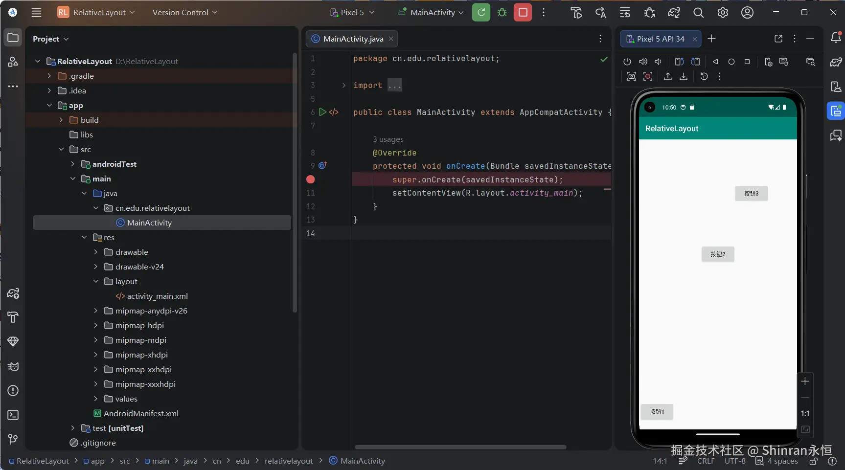
<Button
android:id="@+id/btn_one"
android:layout_width="wrap_content"
android:layout_height="wrap_content"
android:text="按钮1"
android:layout_alignParentBottom="true"
android:layout_marginBottom="20dp"/>
<Button
android:id="@+id/btn_two"
android:layout_width="wrap_content"
android:layout_height="wrap_content"
android:text="按钮2"
android:layout_centerHorizontal="true"
android:layout_marginTop="260dp"/>
<Button
android:id="@+id/btn_three"
android:layout_width="wrap_content"
android:layout_height="wrap_content"
android:layout_alignBottom="@id/btn_two"
android:layout_marginLeft="-5dp"
android:layout_marginBottom="151dp"
android:layout_toRightOf="@id/btn_two"
android:text="按钮3" />
</RelativeLayout>
4. 运行效果截图
5. 适用场景
- 复杂界面的布局
- 需要元素之间相互定位的场景
- 需要减少布局嵌套层级的场景
三、TableLayout(表格布局)
1. 布局特点
- 以**行(TableRow)**为单位组织内容
- 列数由子控件最多的行自动决定
- 支持单元格合并、列拉伸/收缩/隐藏
- 结构清晰,类似 HTML 表格
2. 关键属性
| 属性 | 作用 |
|---|
stretchColumns | 拉伸指定列,列索引从0开始,多个用逗号分隔 |
shrinkColumns | 收缩指定列,内容过长时压缩该列 |
collapseColumns | 隐藏指定列 |
layout_span | 单元格合并列数 |
3. 代码示例
<?xml version="1.0" encoding="utf-8"?>
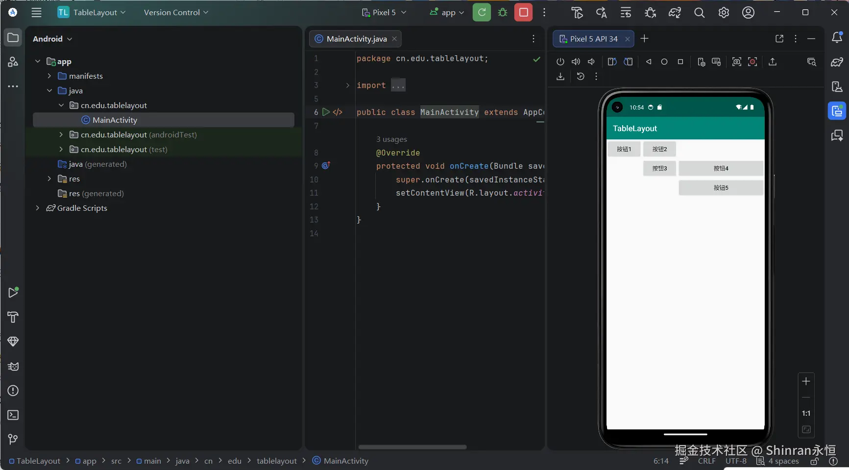
<TableLayout xmlns:android="http://schemas.android.com/apk/res/android"
android:layout_width="wrap_content"
android:layout_height="wrap_content"
android:stretchColumns="2" >
<TableRow>
<Button
android:layout_width="wrap_content"
android:layout_height="wrap_content"
android:layout_column="0"
android:text="按钮1" />
<Button
android:layout_width="wrap_content"
android:layout_height="wrap_content"
android:layout_column="1"
android:text="按钮2" />
</TableRow>
<TableRow>
<Button
android:layout_width="wrap_content"
android:layout_height="wrap_content"
android:layout_column="1"
android:text="按钮3" />
<Button
android:layout_width="wrap_content"
android:layout_height="wrap_content"
android:layout_column="2"
android:text="按钮4" />
</TableRow>
<TableRow>
<Button
android:layout_width="wrap_content"
android:layout_height="wrap_content"
android:layout_column="2"
android:text="按钮5" />
</TableRow>
</TableLayout>
4. 运行效果截图
5. 适用场景
四、NeonLamp(霓虹灯效果布局)
1. 布局特点
- 使用 FrameLayout 作为容器,实现视图叠加
- 通过 shape 资源 绘制渐变光晕效果
- 结合 textShadow 属性实现文字发光感
- 纯 XML 即可实现静态霓虹视觉效果
2. 关键属性
| 属性 | 作用 |
|---|
android:shadowColor | 设置文字阴影颜色 |
android:shadowRadius | 设置阴影模糊半径,值越大发光效果越明显 |
android:shadowDx/dy | 设置阴影偏移量,为0时阴影居中产生光晕效果 |
gradient | shape 中的渐变标签,可实现光晕背景 |
4. 代码示例
<FrameLayout xmlns:android="http://schemas.android.com/apk/res/android"
    android:layout_width="match_parent"
    android:layout_height="match_parent">
    <Button
        android:id="@+id/btn_one"
        android:layout_width="300dp"
        android:layout_height="300dp"
        android:layout_gravity="center"
        android:background="#ff0000" />
    <Button
        android:id="@+id/btn_two"
        android:layout_width="220dp"
        android:layout_height="220dp"
        android:layout_gravity="center"
        android:background="#00ff00" />
    <Button
        android:id="@+id/btn_three"
        android:layout_width="140dp"
        android:layout_height="140dp"
        android:layout_gravity="center"
        android:background="#0000ff" />
    <Button
        android:id="@+id/btn_four"
        android:layout_width="80dp"
        android:layout_height="80dp"
        android:layout_gravity="center"
        android:background="#ff1243" />
    <Button
        android:id="@+id/btn_five"
        android:layout_width="20dp"
        android:layout_height="20dp"
        android:layout_gravity="center"
        android:background="#324678" />
</FrameLayout>
5. 运行效果截图
6. 适用场景
- 欢迎页、启动页
- 需要视觉特效的场景
- 自定义控件演示
总结对比
| 布局类型 | 核心特点 | 适用场景 |
|---|
| LinearLayout | 线性排列,权重分配 | 列表、表单、简单排列 |
| RelativeLayout | 相对定位,灵活布局 | 复杂界面,减少嵌套 |
| TableLayout | 表格行列结构 | 数据输入、类Excel界面 |
| NeonLamp | FrameLayout叠加+shape渐变 | 视觉效果、欢迎页面 |


