NiceGUI .classes() 完整列表教程
.classes() 用于设置 CSS 类名,支持 Tailwind CSS 风格的实用类,是控制布局和外观的核心方法。
1. 基础语法
element.classes('p-4')
element.classes('p-4 m-2 bg-blue-500 text-white')
element.classes('bg-red-500')
element.classes('!bg-red-500')
element.classes('remove bg-blue-500')
2. 常用类名分类速查
📏 尺寸与宽高
| 类名 | 说明 | 示例 |
|---|
w-full | 宽度100% | .classes('w-full') |
h-screen | 高度100vh | .classes('h-screen') |
w-1/2, w-2/3 | 百分比宽度 | .classes('w-1/2') |
min-w-0, max-w-md | 最小/最大宽度 | .classes('max-w-md') |
h-16, h-32 | 固定高度 | .classes('h-16') |
🧭 布局与定位
| 类名 | 说明 | 示例 |
|---|
flex | Flexbox 容器 | .classes('flex') |
flex-col | 垂直排列 | .classes('flex flex-col') |
justify-start, justify-center, justify-end | 主轴对齐 | .classes('flex justify-center') |
items-start, items-center, items-end | 交叉轴对齐 | .classes('flex items-center') |
gap-1, gap-2, gap-4 | 子元素间距 | .classes('flex gap-2') |
grid, grid-cols-2, grid-cols-3 | 网格布局 | .classes('grid grid-cols-3') |
relative, absolute, fixed | 定位 | .classes('relative') |
inset-0, top-4, left-2 | 位置偏移 | .classes('absolute inset-0') |
🎯 间距 (Margins & Paddings)
| 类名 | 说明 | 示例 |
|---|
p-1, p-2, p-4, p-8 | 内边距 | .classes('p-4') |
px-2, py-4 | 水平/垂直内边距 | .classes('px-4 py-2') |
m-1, m-2, m-4 | 外边距 | .classes('m-2') |
mx-auto | 水平居中(auto) | .classes('mx-auto') |
mt-2, mb-4, ml-6 | 单方向外边距 | .classes('mt-4 mb-2') |
space-x-2, space-y-4 | 子元素间距 | .classes('space-y-2') |
🎨 颜色与背景
| 类名 | 说明 | 示例 |
|---|
bg-white, bg-black | 背景色 | .classes('bg-white') |
bg-blue-50, bg-red-100 | 浅色背景 | .classes('bg-blue-50') |
bg-blue-500, bg-red-600 | 主色背景 | .classes('bg-blue-500') |
text-white, text-black | 文字颜色 | .classes('text-white') |
text-blue-600, text-red-500 | 彩色文字 | .classes('text-blue-600') |
text-xs, text-sm, text-lg, text-xl | 文字大小 | .classes('text-lg') |
font-bold, font-semibold | 字重 | .classes('font-bold') |
text-center, text-left | 文本对齐 | .classes('text-center') |
📦 边框与阴影
| 类名 | 说明 | 示例 |
|---|
border, border-2 | 边框 | .classes('border border-2') |
border-t-2, border-b-4 | 单边边框 | .classes('border-b-2') |
border-blue-500 | 边框颜色 | .classes('border-blue-500') |
rounded, rounded-lg, rounded-full | 圆角 | .classes('rounded-lg') |
shadow, shadow-lg, shadow-xl | 阴影 | .classes('shadow-lg') |
outline, outline-2 | 轮廓 | .classes('outline outline-2') |
📏 间距系统参考
| 间距值 | 尺寸 |
|---|
0 | 0px |
1 | 0.25rem (4px) |
2 | 0.5rem (8px) |
3 | 0.75rem (12px) |
4 | 1rem (16px) |
6 | 1.5rem (24px) |
8 | 2rem (32px) |
12 | 3rem (48px) |
16 | 4rem (64px) |
3. 按组件分类的实用组合
按钮
ui.button('保存').classes('px-4 py-2 bg-blue-500 text-white rounded-lg shadow hover:bg-blue-600')
ui.button('取消').classes('px-4 py-2 bg-gray-200 text-gray-700 rounded-lg hover:bg-gray-300')
ui.button('删除').classes('px-4 py-2 border border-red-500 text-red-500 rounded-lg hover:bg-red-50')
输入框
ui.input('名称').classes('w-full px-3 py-2 border border-gray-300 rounded-md focus:outline-none focus:ring-2 focus:ring-blue-500')
ui.input('搜索').classes('w-full px-4 py-2 pl-10 bg-gray-100 border-0 rounded-full focus:bg-white')
卡片
ui.card().classes('p-6 bg-white rounded-xl shadow-md hover:shadow-lg transition-shadow')
ui.label('标题').classes('text-xl font-bold mb-2 text-gray-800')
布局容器
ui.column().classes('w-full max-w-4xl mx-auto p-4 space-y-4')
ui.row().classes('grid grid-cols-1 md:grid-cols-2 lg:grid-cols-3 gap-4')
4. 高级技巧
A. 响应式设计
ui.button('响应式').classes('w-full md:w-1/2 lg:w-1/3')
ui.row().classes('flex-col md:flex-row')
B. 状态伪类
ui.button('悬停我').classes('bg-blue-500 hover:bg-blue-600 active:bg-blue-700')
ui.button('禁用').classes('bg-gray-300 text-gray-500 cursor-not-allowed')
C. 动态类名
btn = ui.button('动态')
is_error = True
if is_error:
btn.classes('bg-red-500')
else:
btn.classes('bg-green-500')
D. 追加与移除
element = ui.button('测试')
element.classes('!shadow-lg')
element.classes('remove bg-blue-500')
element.classes('bg-red-500 text-white')
E. 组合使用
ui.button('综合').classes('px-6 py-3').props('icon=save color=primary').style('font-weight: 600')
5. 常用组合速查表
表单布局
with ui.column().classes('w-full gap-1'):
ui.label('用户名').classes('text-sm font-medium text-gray-700')
ui.input().classes('w-full px-3 py-2 border rounded-md')
按钮组
with ui.row().classes('gap-2'):
    ui.button('确定').classes('bg-green-500 text-white px-4 py-2 rounded')
    ui.button('取消').classes('bg-gray-300 text-gray-700 px-4 py-2 rounded')
卡片列表
with ui.grid().classes('grid-cols-1 md:grid-cols-2 lg:grid-cols-3 gap-4'):
    for i in range(6):
        with ui.card().classes('p-4 bg-white rounded-lg shadow hover:shadow-md'):
            ui.label(f'卡片 {i}').classes('font-bold')
导航栏
with ui.row().classes('w-full bg-blue-600 text-white p-4 justify-between items-center'):
    ui.label('Logo').classes('text-xl font-bold')
    with ui.row().classes('gap-4'):
        ui.link('首页', '#').classes('hover:text-blue-200')
        ui.link('关于', '#').classes('hover:text-blue-200')
6. 与 props/style 的对比
| 特性 | .classes() | .props() | .style() |
|---|
| 用途 | 布局和外观 | 组件行为和类型 | 精细微调 |
| 示例 | p-4 bg-blue-500 | color=primary flat | border-radius: 10px |
| 优先级 | 中 | 低 | 高 |
| 最佳实践 | 90% 的样式问题 | 组件类型、验证 | 特殊动画、渐变 |
推荐工作流:
ui.button('提交').classes('px-4 py-2 rounded-lg')
.props('color=primary icon=send')
.style('box-shadow: 0 4px 6px rgba(0,0,0,0.1)')
7. 调试技巧
btn = ui.button('测试').classes('bg-blue-500 text-white')
print(btn.classes)
8. 实战:完整页面示例
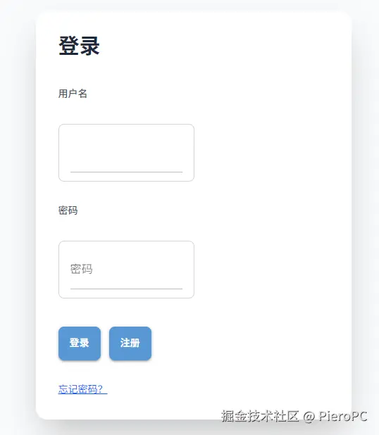
from nicegui import ui
with ui.column().classes('w-full min-h-screen bg-gray-50 flex items-center justify-center p-4'):
with ui.card().classes('w-full max-w-md p-8 bg-white rounded-2xl shadow-xl hover:shadow-2xl transition-shadow'):
ui.label('登录').classes('text-3xl font-bold text-center mb-6 text-gray-800')
with ui.column().classes('space-y-4'):
ui.label('用户名').classes('text-sm font-medium text-gray-600')
ui.input().classes('w-full px-4 py-3 border border-gray-300 rounded-lg focus:ring-2 focus:ring-blue-500 focus:border-transparent')
ui.label('密码').classes('text-sm font-medium text-gray-600')
ui.input('密码').props('type=password').classes('w-full px-4 py-3 border border-gray-300 rounded-lg focus:ring-2 focus:ring-blue-500 focus:border-transparent')
with ui.row().classes('flex gap-3 mt-6'):
ui.button('登录').classes('flex-1 bg-blue-600 text-white py-3 rounded-lg font-semibold hover:bg-blue-700 transition-colors')
ui.button('注册').classes('flex-1 bg-gray-200 text-gray-700 py-3 rounded-lg font-semibold hover:bg-gray-300 transition-colors')
ui.link('忘记密码?', '#').classes('text-center text-sm text-blue-600 hover:underline mt-4')
ui.run()
核心要点:.classes() 是 NiceGUI 样式系统的基石,掌握 Tailwind 风格的类名组合,就能快速构建美观、响应式的界面!


