1. 相对定位
- 相对定位:相对于 自己本身正常位置(即:未使用定位前的位置) 进行定位
- 元素的初始位置占据的空间会被保留
- 相对定位元素不会对其它元素产生任何影响
- 自身的层级会提升半层
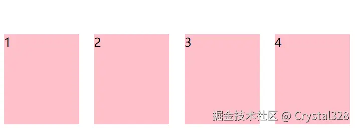
1.1 悬停卡片效果(鼠标滑动到元素,元素少量位置偏移动画)
<!DOCTYPE html>
<html lang="en">
<head>
    <meta charset="UTF-8">
    <meta name="viewport" content="width=device-width, initial-scale=1.0">
    <title>Document</title>
    <style>
        ul {
            list-style-type: none;
            padding: 0;
            width: 600px;
        }
        li {
            float: left;
            width: 80px;
            height: 120px;
            background-color: pink;
            margin: 10px;
        }
        li:hover {
            position: relative;
            left: 10px;
            bottom: 10px;
        }
    </style>
</head>
<body>
    <ul>
        <li>1</li>
        <li>2</li>
        <li>3</li>
        <li>4</li>
    </ul>
</body>
</html>
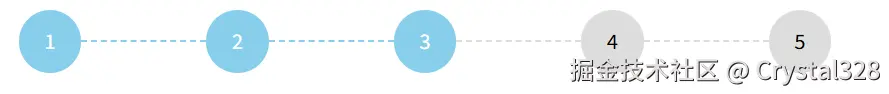
1.2 水平步骤条 (例选3 12也要变色)
- 奇数项画圈偶数项画步骤条线
- 右浮动实现元素从右往左开始排列成一行,第一个排在最后面,最后一个排在最左边
- 通过相对定位微调线条位置,使其与圆形在垂直方向对齐
- 利用 ~ 后续兄弟选择器,来选择他后面的元素,修改样式
<!DOCTYPE html>
<html lang="en">
<head>
<meta charset="UTF-8">
<meta name="viewport" content="width=device-width, initial-scale=1.0">
<title>水平步骤条</title>
<style>
ul {
width: 800px;
list-style: none;
padding: 0;
}
ul li {
float: right;
text-align: center;
line-height: 50px;
}
ul li:nth-child(odd) {
width: 50px;
height: 50px;
border-radius: 50%;
background-color: #ddd;
}
ul li:nth-child(even) {
width: 100px;
border-top: 2px dashed #ddd;
position: relative;
top: 24px;
}
ul li.current {
background-color: skyblue;
color: #fff;
}
ul li.current~li:nth-child(odd) {
background-color: skyblue;
color: #fff;
}
ul li.current~li:nth-child(even) {
border-top: 2px dashed skyblue;
color: #fff;
}
</style>
</head>
<body>
<ul>
<li>5</li>
<li></li>
<li>4</li>
<li></li>
<li class="current">3</li>
<li></li>
<li>2</li>
<li></li>
<li>1</li>
</ul>
</body>
</html>
2. 绝对定位
- 脱离文档流,层级提升
- 相对于离自己最近的定位的祖先元素定位
- 父元素及祖先元素都未定位,则相对于 body 定位
- 行内元素绝对定位后,具有行内块元素特性
- margin:0 auto 水平居中失效
- 定位元素在未设置宽高时
- 同时设置 top 和 bottom 会改变元素高
- 同时设置 left 和 right 会改变元素宽
- top 、 bottom 和 left 、 right 的优先级
- 在元素设置 宽高 情况下
- 同时设置 top 与 bottom,会以 top 值为主 bottom 不生效
- 同时设置 left 与 right,则以 left 为主,right 不生效
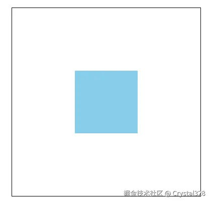
2.1 绝对定位的盒子垂直水平居中(1)
<!DOCTYPE html>
<html lang="en">
<head>
<meta charset="UTF-8">
<meta name="viewport" content="width=device-width, initial-scale=1.0">
<title>Document</title>
<style>
* {
margin: 0;
padding: 0;
}
div {
width: 300px;
height: 300px;
border: 1px solid #000;
margin: 50px auto;
position: relative;
}
p {
width: 100px;
height: 100px;
background-color: skyblue;
position: absolute;
top: 50%;
left: 50%;
margin-top: -50px;
margin-left: -50px;
}
</style>
<body>
<div>
<p></p>
</div>
</body>
</html>
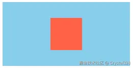
2.2 绝对定位的盒子垂直水平居中(2)
<!DOCTYPE html>
<html lang="en">
<head>
<meta charset="UTF-8">
<meta name="viewport" content="width=device-width, initial-scale=1.0">
<title>Document</title>
<style>
.box {
width: 200px;
height: 100px;
background-color: skyblue;
position: relative;
}
.item {
width: 50px;
height: 50px;
background-color: tomato;
position: absolute;
left: 0;
right: 0;
top: 0;
bottom: 0;
margin: auto;
}
</style>
</head>
<body>
<div class="box">
<div class="item"></div>
</div>
</body>
</html>
2.3 定位元素中心在父元素右上角
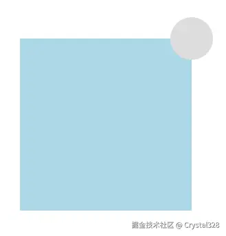
<!DOCTYPE html>
<html lang="en">
<head>
    <meta charset="UTF-8">
    <meta name="viewport" content="width=device-width, initial-scale=1.0">
    <title>Document</title>
    <style>
        .box {
            width: 200px;
            height: 200px;
            margin: 100px auto;
            background-color: lightblue;
            position: relative;
        }
        .box-button {
            width: 50px;
            height: 50px;
            background-color: #ddd;
            position: absolute;
            top: -25px;
            right: -25px;
            border-radius: 50%;
        }
    </style>
</head>
<body>
    <div class="box">
        <div class="box-button"></div>
    </div>
</body>
</html>
2.4 绝对定位实现黑色半透明遮罩层
<!DOCTYPE html>
<html lang="en">
<head>
    <meta charset="UTF-8">
    <meta name="viewport" content="width=device-width, initial-scale=1.0">
    <title>Document</title>
    <style>
        .box{
            width: 150px;
            height: 100px;
            background-color: rgba(0, 0, 0, 0.5);
            position: relative;
            margin: 100px auto;
        }
        .box img{
            width: 150px;
            height: 100px;
        }
        .box:hover::before {
            content: "";
            position: absolute;
            top: 0;
            left: 0;
            bottom: 0;
            right: 0;
            background-color: rgba(0, 0, 0, 0.5);
        }
        .box span{
            position: absolute;
            width: 50px;
            height: 50px;
            top: 50%;
            left: 50%;
            margin-left: -25px;
            margin-top: -25px;
            background-image: url("../html+css/images/04-2.avif");
            background-size: cover;
            display: none;
        }
        .box:hover span{
            display: block;
        }
    </style>
</head>
<body>
    <div class="box">
        <img src="../html+css/images/04-1.webp" alt="">
        <span></span>
    </div>
</body>
</html>
2.5 绝对定位实现带三角形的会话框
<!DOCTYPE html>
<html lang="en">
<head>
<meta charset="UTF-8">
<meta name="viewport" content="width=device-width, initial-scale=1.0">
<title>Document</title>
<style>
.head {
width: 124px;
margin: 150px auto;
position: relative;
}
.head img {
width: 100px;
height: 100px;
border-radius: 50%;
border: 2px solid skyblue;
}
.head-txt {
width: 200px;
height: 140px;
background-color: rgb(213, 241, 252);
position: absolute;
left: 124px;
top: -20px;
border-radius: 20px;
line-height: 100px;
text-align: center;
display: none;
}
.head-txt::after {
display: block;
content: "";
width: 0;
border: 20px solid transparent;
border-right-color: rgb(213, 241, 252);
position: absolute;
top: 50px;
left: -40px;
}
.head:hover .head-txt {
display: block;
}
</style>
<body>
<div class="head">
<img src="../html+css/images/04-1.webp" alt="" />
<div class="head-txt">大家好,我是小美</div>
</div>
</body>
</html>
2.6 鼠标移入展开动画
- 初始线条left/right都为50% 不设置宽
- hover下 left/right都为0
<!DOCTYPE html>
<html lang="en">
<head>
    <meta charset="UTF-8">
    <meta name="viewport" content="width=device-width, initial-scale=1.0">
    <title>Document</title>
    <style>
        a {
            display: block;
            width: 100px;
            height: 50px;
            line-height: 50px;
            text-decoration: none;
            text-align: center;
            margin: 100px auto;
            border: 1px solid #000;
            color: #000;
            position: relative;
        }
        a:after {
            content: '';
            display: block;
            position: absolute;
            height: 2px;
            left: 50%;
            right: 50%;
            bottom: 5px;
            background-color: skyblue;
            transition: all 0.5s ease;
        }
        a:hover:after {
            left: 0;
            right: 0;

        }
    </style>
</head>
<body>
    <a href="">点击进入</a>
</body>
</html>


