

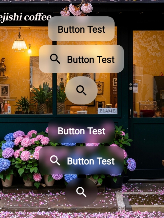
截图
GitHub
快速集成
添加依赖项
在模块的 build.gradle 中添加:
1dependencies {
   implementation 'com.qmdeve.blurview:core:1.1.3'
}
使用BlurButtonView
在XML布局中使用
<com.qmdeve.blurview.widget.QmBlurButtonView
        android:id="@+id/button"
        android:layout_width="wrap_content"
        android:layout_height="wrap_content"
        android:text="Button Test"
        app:buttonCornerRadius="12dp"
        app:buttonIconPadding="8dp"
        app:buttonIconSize="24dp"
        app:buttonTextBold="true"
        app:blurRadius="12dp"
        app:overlayColor="#80FFFFFF"
        android:layout_below="@id/button1"
        android:layout_centerHorizontal="true"
        android:icon="?android:attr/actionModeWebSearchDrawable"
        app:buttonIconTint="@color/black"/>
属性说明
| 属性名 | 类型 | 默认值 | 说明 |
|---|---|---|---|
app:buttonCornerRadius | dimension | 0 | 设置Button的圆角半径 |
app:buttonIconPadding | dimension | 0dp | 设置Icon的内边距 |
app:buttonIconSize | dimension | - | 设置Icon大小 |
app:buttonTextBold | boolean | true | Text是否粗体 |
app:blurRadius | dimension | 10 | 模糊半径 |
app:overlayColor | color | #AAFFFFFF | 叠层颜色 |
app:buttonIconTint | color | - | 设置图标颜色 |
app:buttonTextColorPressed | color | - | 按下状态文本颜色 |
app:buttonTextColorDisabled | color | - | 禁用状态文本颜色 |
android:icon | - | - | 设置图标 |
android:text | - | - | 设置文本 |
android:textSize | - | - | Text大小 |
当然你也可以通过代码设置这些属性
不设置 android:text 则不显示文本
不设置 android:icon 则不显示图标
具体使用方法请查看GitHub
GitHub:github.com/QmDeve/QmBl…
