CSS 属性 clip-path 裁剪案例
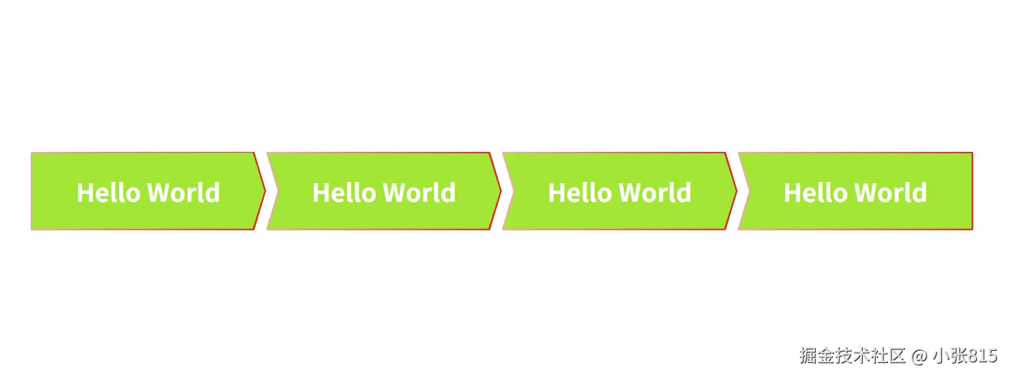
案例需求
- 完成一个步骤条元素
- 箭头形状
> 的元素,背景渐变半透明,渐变描边
- 第一个元素尾部形状和下一个元素开始形状对齐,最后元素开始形状和上一个元素尾部形状对齐
案例实现
- 使用 CSS 属性,clip-path 的 polygon() 函数去截取出形状和描边
- 背景形状通过上面的属性截出来
- 渐变描边使用背景渐变截取掉上面的形状的中间部分
实现代码
<!DOCTYPE html>
<html lang="en">
<head>
<meta charset="UTF-8" />
<meta name="viewport" content="width=device-width, initial-scale=1.0" />
<title>clip-path</title>
<style>
body {
display: flex;
justify-content: center;
align-items: center;
height: 100vh;
}
.stepper {
width: 1200px;
height: 100px;
display: flex;
}
.stepper-item {
position: relative;
flex: 1;
color: #fff;
font-size: 32px;
font-weight: bold;
}
.stepper-item > .content {
height: 100%;
position: relative;
z-index: 1;
display: flex;
justify-content: center;
align-items: center;
}
.stepper-item::before {
display: block;
content: "";
position: absolute;
top: 0;
left: 0;
width: 100%;
height: 100%;
background-color: #a3e635;
border-radius: 2px;
clip-path: polygon(
0 0,
calc(100% - 15px) 0,
100% 50%,
calc(100% - 15px) 100%,
0 100%,
15px 50%,
0 0
);
}
.stepper-item::after {
display: block;
content: "";
position: absolute;
top: 0;
left: 0;
width: 100%;
height: 100%;
background-image: linear-gradient(270deg, #dc2626, #fda4af);
border-radius: 2px;
clip-path: polygon(
0 0,
calc(100% - 15px) 0,
100% 50%,
calc(100% - 15px) 100%,
0 100%,
15px 50%,
17px 50%,
2px calc(100% - 2px),
calc(100% - 17px) calc(100% - 2px),
calc(100% - 2px) 50%,
calc(100% - 17px) 2px,
2px 2px,
17px 50%,
15px 50%,
0 0
);
}
.stepper-item:first-child::before {
clip-path: polygon(
0 0,
calc(100% - 15px) 0,
100% 50%,
calc(100% - 15px) 100%,
0 100%,
0 0
);
}
.stepper-item:first-child::after {
clip-path: polygon(
0 0,
calc(100% - 15px) 0,
100% 50%,
calc(100% - 15px) 100%,
0 100%,
2px calc(100% - 2px),
calc(100% - 17px) calc(100% - 2px),
calc(100% - 2px) 50%,
calc(100% - 17px) 1px,
2px 2px,
2px calc(100% - 2px),
0px calc(100% - 2px),
0 0
);
}
.stepper-item:last-child::before {
clip-path: polygon(0 0, 100% 0, 100% 100%, 0 100%, 15px 50%, 0 0);
}
.stepper-item:last-child::after {
clip-path: polygon(
0 0,
100% 0,
100% 100%,
0 100%,
15px 50%,
17px 50%,
2px calc(100% - 2px),
calc(100% - 2px) calc(100% - 2px),
calc(100% - 2px) 2px,
2px 2px,
17px 50%,
15px 50%,
0 0
);
}
</style>
</head>
<body>
<div class="stepper">
<div class="stepper-item">
<div class="content">Hello World</div>
</div>
<div class="stepper-item">
<div class="content">Hello World</div>
</div>
<div class="stepper-item">
<div class="content">Hello World</div>
</div>
<div class="stepper-item">
<div class="content">Hello World</div>
</div>
</div>
</body>
</html>
效果截图


