场景-二次发送失败
场景描述
- 描述
- 给一个账户更新名称,第一次更新值后端返回已存在,然后修改,重新提交,但是这次都没有接口调用。
- 流程
- 点击提交后,表单数据formData有一个表单项payType是数组形式,校验后,将payType通过JSON序列化,然后调用接口,axios将请求打到后端。然后路由返回到上一个页面。
- 当前页面已进入,在created中拉取数据,会将payType反序列化为数组。
技术背景
- axios
- json序列化和反序列化
- promise
方案解决
- 表单项形式问题
- 分析
- 被卡了一个bug,关键在payType的形式,是序列化后还是反序列化。
- 一般成功后,会直接到上一个页面,然后再次进入,会反序列化为数组形式。发送请求时,也会先序列化,但是若没有操作成功,也就是后端返回已存在相同值,不会返回上一个页面,payType保持为字符串形式,再次点击时,重新走序列化流程,会调用数组的map拼接一个字符串,但是字符串没有相关函数,然后就会报错,就不会走到发送请求这一步,所以没有调用接口。
- 处理
- 请求数据格式问题
- 分析
- 在上面问题的处理中,我设置了在发送请求后,同步修改表单项payType,还原为数组形式,但是请求返回400错误,请求数据格式有问题,不是我预想的发送前的序列化之后的字符串形式,是数组形式。
- 我将发送请求后的同步修改payType时,随便设置为任意数据,发送请求中的载体都是该任意数据。
- 最后是formData传递的是个引用地址,axios网络库是异步发送的,在同步修改后,发送请求读取的该地址中的数据是修改后的。
- 处理
- 在请求返回的promise使用finally中还原数据,确保了正确的时序。
参考资料
场景-触发元素和显示位置解耦的状态可视化标签组件的实现
场景描述
- 管理系统中需要直观显示一些信息的状态,如验证通过、识别失败等状态,同时借助简单颜色标识来辅助快速直观识别。此外,场景需要在标签上悬停触发,然后在目标元素的下方显示对话框,同时要求对话框中文本和目标元素的文本左侧对齐,方便对比。
- 优化体验。鼠标离开触发元素时,对话框会保持显示一段时间,若此时鼠标悬停到对话框上,对话框会一直保持显示。
- 以OCR识别场景为例,
- 系统显示为:
- 验证通过状态。绿色,内容为“OCR识别通过”。
- 识别失败状态。红色,内容为正确内容。
- 识别信息为空状态。黄色,内容为“OCR验证内容为空”。
- 自定义业务状态。
- 特性
- 触发元素和显示位置相分离,支持自定义目标显示位置。
- 需要能根据颜色快速区分优先级和类型。
- 悬停显示详细状态说明。
- 支持灵活扩展新的状态类型。
- 保持统一的视觉风格。
技术背景
- Vue2
- Element UI
- popper.js
- 将元素定位到指定目标元素附近。
- 应用的组件。Tooltip文字提示,Popover弹出框,Popconfirm气泡确认,Dropdown下拉菜单等。
- 原生事件
方案解决
设计
- 组件采用分层配置策略,提供开箱即用的预设状态,同时支持扩展自定义。
- 通过计算属性实现当前实例状态配置的智能合并和优先级处理。
- 显示位置
- 结合popper.js和插槽。
- 通过插槽指定目标元素,获取DOM,在popper中设置对话框DOM和目标元素DOM绑定关系。
- 悬停效果
- 结合鼠标mouseenter、mouseleave事件和定时器防抖函数。
- 效果
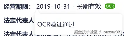
- 触发元素为标签OCR,显示位置在前面的内容下方,且左侧对齐。
源码
<template>
    <div class="tag-popover-wrapper" style="display: contents;position: relative;">
        <slot name="position"></slot>
        <span class="tooltip" ref="tooltipRef">{{ currentStatus.content }}</span>
        <span class='trigger' ref="triggerRef" :style="{ backgroundColor: currentStatus.color }">
            {{ currentStatus.tagName }}
        </span>
    </div>
</templat
- 逻辑
- 对外属性
- statusType。状态类型,提供3种预设和支持扩展的自定义类型。
- tagName。标签名。
- statusConfigDefault。默认状态配置,内含三种配置,和statuType对应。
- statusContentCustom。当状态为error时,需要传入正确的内容。
- statusConfigCustom。自定义状态配置。支持扩展。
- options。popper配置,如偏移。
        /**
         * 状态类型
         * @type {String}
         * @values error/success/empty/custom
         * @default success
         */
        statusType: {
            type: String,
            default: 'success',
            validator: (val) => ['error', 'success', 'empty', 'custom'].includes(val)
        },
        /**
         * 自定义标签名
         * @type {String}
         * @default OCR
         */
        tagName: {
            type: String,
            default: 'OCR'
        },
        /**
         * 默认状态配置(内置三种基础状态)
         * @type {Object}
         * @default 红-error、绿-success、黄-empty 三种状态配置
         */
        statusConfigDefault: {
            type: Object,
            default: () => ({
                error: { color: '#ff0709', content: '', tagName: 'OCR' },
                success: { color: '#3da417', content: '验证通过', tagName: 'OCR' },
                empty: { color: '#fba70b', content: '识别信息为空', tagName: 'OCR' },
            }),
        },
        /**
         * 错误状态自定义内容(statusType=error 时必填)
         * @type {String}
         * @default ''
         */
        statusContentCustom: {
            type: String,
            default: '',
        },
        /**
         * 自定义状态配置(扩展新状态时使用)
         * @type {Object}
         * @required color/content/tagName(均为字符串类型)
         */
        statusConfigCustom: {
            type: Object,
            default: () => ({}),
        },
        /**
         * popper配置
         */
        options: {
            type: Object,
            default: () => [
                {
                    name: 'offset',
                    options: {
                        offset: [0, 8]
                    }
                }
            ]
        },
- 计算属性
    * currentStatus。根据当前传入属性,合并属性,完成当前状态的最终配置。
    computed: {
        /**
         * 当前状态最终配置(合并默认/自定义/优先级逻辑)
         * @returns {Object} { color, content, tagName }
         */
        currentStatus() {
            let baseStatus = (this.statusType === 'custom') ?
                { ...this.statusConfigCustom } : { ...this.statusConfigDefault[this.statusType] }
            this.tagName && (baseStatus.tagName = this.tagName)
            if (this.statusType === 'error')
                baseStatus.content = this.statusContentCustom
            else
                baseStatus.content = baseStatus.tagName + baseStatus.content
            baseStatus.content.includes('\\n') && (baseStatus.content = baseStatus.content.replace(/\\n/g, '\n'))
            return baseStatus
        }
    },
- 方法
    * getPositionElement。
        + 获取插槽中的元素DOM。方便关联显示位置和对话框。
    * setPopover。
        + 创建popper,设置鼠标事件,实现触发元素和显示位置的解耦。
        + 通过事件、防抖函数,实现悬停和对话框的显示的复杂绑定。
    methods: {
        getPositionElement() {
            // 方法1:直接查找 DOM
            if (this.$el && this.$el.parentNode) {
                // 查找最近的 .position 元素(假设插槽内容有 position 类名)
                const parent = this.$el.parentNode;
                const positionEl = parent.querySelector('.position');
                if (positionEl) {
                    return positionEl;
                }
            }
            // 方法2:通过 VNode
            if (this.$slots.position && this.$slots.position[0]) {
                return this.$slots.position[0].elm;
            }
            return null;
        },
        setPopover() {
            const positionElement = this.getPositionElement();
            const triggerElement = this.$refs.triggerRef;
            const tooltipElement = this.$refs.tooltipRef
            if (!positionElement || !triggerElement || !tooltipElement) {
                console.warn('TagPopover: 缺少必要的DOM元素');
                return;
            }
            createPopper(positionElement, tooltipElement, {
                placement: 'bottom-start',
                modifiers: this.options
            })
            tooltipElement.style.visibility = 'hidden';
            let hideTimer = null;
            // 防抖隐藏函数
            const debounceHide = (e, delay=600) => {
                if (hideTimer) {
                    clearTimeout(hideTimer)
                }
                hideTimer = setTimeout(() => {
                    tooltipElement.style.visibility = 'hidden';
                    hideTimer = null;
                }, delay)
            }
            // 立即显示函数(同时取消任何待执行的隐藏)
            const showTooltip = () => {
                if (hideTimer) {
                    clearTimeout(hideTimer)
                    hideTimer = null;
                }
                tooltipElement.style.visibility = 'visible'
            }
            triggerElement.addEventListener('mouseenter', showTooltip)
            triggerElement.addEventListener('mouseleave', debounceHide)
            tooltipElement.addEventListener('mouseenter', showTooltip)
            tooltipElement.addEventListener('mouseleave', debounceHide)
        },
    },
    created() {
    },
    mounted() {
        this.setPopover()
    }
<style>
.tooltip {
    min-width: 150px;
    visibility: hidden;
    -webkit-text-size-adjust: 100%;
    -webkit-font-smoothing: antialiased;
    text-rendering: optimizeLegibility;
    font-family: "Microsoft YaHei",
        微软雅黑,
        Arial,
        sans-serif,
        Helvetica Neue,
        Helvetica,
        PingFang SC,
        Hiragino Sans GB;
    scrollbar-color: transparent transparent;
    box-sizing: inherit;
    border-radius: 4px;
    background: #FFF;
    border: 1px solid #EBEEF5;
    z-index: 2000;
    color: #1F263E;
    line-height: 32px;
    text-align: justify;
    font-size: 14px;
    box-shadow: 0 2px 12px 0 rgba(0, 0, 0, .1);
    word-break: break-all;
    padding: 8px 18px;
    padding-left: 6px;
    width: 200px;
    white-space: pre-wrap;
}

.tooltip::before {
    content: '';
    position: absolute;
    width: 0;
    height: 0;
    left: 0;
    /* transform: translateX(-50%); */
    top: -10px;
    border-left: 6px solid transparent;
    border-right: 6px solid transparent;
    border-bottom: 10px solid #ffffff;
    filter: drop-shadow(0 -2px 1px rgba(0, 0, 0, 0.05));
}

.trigger {
    min-width: 24px;
    min-height: 12px;
    margin-left: 4px;
    border-radius: 8px;
    font-size: 8px;
    background-color: #3da417;
    color: #ffffff;
    display: inline-block;
    letter-spacing: 0.5px;
    line-height: 12px;
    padding-left: 2.5px;
    cursor: pointer;
    overflow: hidden;
}
</style>
- 拓展
- 后续可以提供更多的属性设置,如显示位置、对话框的宽度、对话框箭头位置等。
参考资料


