

ArkUI基础篇-状态管理
一、@State修饰符
界面的数据修改本身是不会触发界面的更新的,需要在定义的变量值前添加@State装饰器来标记,标记后就可以触发数据变更驱动界面刷新
@Entry
@Component
struct CouterPage {
  @State message: string = 'Hello World';
  @State num: number = 0

  add= () => {
    this.num++
  }
  sub = () => {
    this.num--
  }

  build() {
    Row({space: 10}) {
      Button("-")
        .onClick(this.sub)
      Text(this.num+"").fontSize(40)
      Button("+")
        .onClick(this.add)
    }
    .height('100%')
    .width('100%')
  }
}
-
State修饰的类型:Object、class、string、number、boolean、 enum类型,以及这些类型的数组
-
类型必须被指定,嵌套类型的场景请参考观察变化
-
不支持any,不支持简单类型和复杂类型的联合类型,不允许使用undefined 和null
加上该修饰符后,按钮随着数据的变化在变化,因为我们在值改变 的时候赋值,造成了build的重新执行,来保证我们状态的变化可以理解成没有@State修饰符,数据只会作用页面一次!!
改变状态:引用数据类型只能检测到自身和第一层变化
二、双向绑定
与前端的vue一致,是通过数据驱动视图
传统的修改方式:通过`onChange`监听输入组件的变化

通过`$$`绑定属性并赋值给属性就可以触发更新赋值

```ets
@Entry
@Component
struct StatePage {
@State account: string = 'Hello';
build() {
Column() {
TextInput({ placeholder: "please input info", text: $$this.account })
// .onChange((value: string) => {
// this.account = value
// console.log(value)
// })
Button("获取account")
.onClick(() => {
console.log("account = ", this.account)
})
}
.height('100%')
.width('100%')
}
}
```
* 当前$$支持基础类型变量,当该变量使用[@State](https://developer.huawei.com/consumer/cn/doc/harmonyos-guides/arkts-state)、[@Link](https://developer.huawei.com/consumer/cn/doc/harmonyos-guides/arkts-link)、[@Prop](https://developer.huawei.com/consumer/cn/doc/harmonyos-guides/arkts-prop)、[@Provide](https://developer.huawei.com/consumer/cn/doc/harmonyos-guides/arkts-provide-and-consume)等状态管理V1装饰器装饰,或者[@Local](https://developer.huawei.com/consumer/cn/doc/harmonyos-guides/arkts-new-local)等状态管理V2装饰器装饰时,变量值的变化会触发UI刷新。
* 当前$$支持的组件:
* | 组件 | 支持的参数/属性 | 起始API版本 |
| :----------------------------------------------------------- | :-------------- | :---------- |
| [Checkbox](https://developer.huawei.com/consumer/cn/doc/harmonyos-references/ts-basic-components-checkbox) | select | 10 |
| [CheckboxGroup](https://developer.huawei.com/consumer/cn/doc/harmonyos-references/ts-basic-components-checkboxgroup) | selectAll | 10 |
| [DatePicker](https://developer.huawei.com/consumer/cn/doc/harmonyos-references/ts-basic-components-datepicker) | selected | 10 |
| [TimePicker](https://developer.huawei.com/consumer/cn/doc/harmonyos-references/ts-basic-components-timepicker) | selected | 10 |
| [MenuItem](https://developer.huawei.com/consumer/cn/doc/harmonyos-references/ts-basic-components-menuitem) | selected | 10 |
| [Panel](https://developer.huawei.com/consumer/cn/doc/harmonyos-references/ts-container-panel) | mode | 10 |
| [Radio](https://developer.huawei.com/consumer/cn/doc/harmonyos-references/ts-basic-components-radio) | checked | 10 |
| [Rating](https://developer.huawei.com/consumer/cn/doc/harmonyos-references/ts-basic-components-rating) | rating | 10 |
| [Search](https://developer.huawei.com/consumer/cn/doc/harmonyos-references/ts-basic-components-search) | value | 10 |
| [SideBarContainer](https://developer.huawei.com/consumer/cn/doc/harmonyos-references/ts-container-sidebarcontainer) | showSideBar | 10 |
| [Slider](https://developer.huawei.com/consumer/cn/doc/harmonyos-references/ts-basic-components-slider) | value | 10 |
| [Stepper](https://developer.huawei.com/consumer/cn/doc/harmonyos-references/ts-basic-components-stepper) | index | 10 |
| [Swiper](https://developer.huawei.com/consumer/cn/doc/harmonyos-references/ts-container-swiper) | index | 10 |
| [Tabs](https://developer.huawei.com/consumer/cn/doc/harmonyos-references/ts-container-tabs) | index | 10 |
| [TextArea](https://developer.huawei.com/consumer/cn/doc/harmonyos-references/ts-basic-components-textarea) | text | 10 |
| [TextInput](https://developer.huawei.com/consumer/cn/doc/harmonyos-references/ts-basic-components-textinput) | text | 10 |
| [TextPicker](https://developer.huawei.com/consumer/cn/doc/harmonyos-references/ts-basic-components-textpicker) | selected、value | 10 |
| [Toggle](https://developer.huawei.com/consumer/cn/doc/harmonyos-references/ts-basic-components-toggle) | isOn | 10 |
| [AlphabetIndexer](https://developer.huawei.com/consumer/cn/doc/harmonyos-references/ts-container-alphabet-indexer) | selected | 10 |
| [Select](https://developer.huawei.com/consumer/cn/doc/harmonyos-references/ts-basic-components-select) | selected、value | 10 |
| [BindSheet](https://developer.huawei.com/consumer/cn/doc/harmonyos-references/ts-universal-attributes-sheet-transition#bindsheet) | isShow | 10 |
| [BindContentCover](https://developer.huawei.com/consumer/cn/doc/harmonyos-references/ts-universal-attributes-modal-transition#bindcontentcover) | isShow | 10 |
| [Refresh](https://developer.huawei.com/consumer/cn/doc/harmonyos-references/ts-container-refresh) | refreshing | 8 |
| [GridItem](https://developer.huawei.com/consumer/cn/doc/harmonyos-references/ts-container-griditem) | selected | 10 |
| [ListItem](https://developer.huawei.com/consumer/cn/doc/harmonyos-references/ts-container-listitem) | selected | 10 |
* $$绑定的变量变化时,会触发UI的同步刷新。
* 参数是在组件({ text: $$this.xx })
* 属性是在组件().text($$this.xxx)
* 不支持嵌套数据的双向绑定如 组件({ text: $$this.xx.xx })
## 三、组件与样式复用
### 3.1 @Component 可复用组件(全局复用)
1. 内部功能丰富:⾃定义组件可以定义成员函数/变量、⾃定义组件⽣命周期等。
2. 状态管理:⾃定义组件⽀持状态变量,可以通过状态变量的改变来驱动UI的刷新。
3. 插槽功能:⾃定义组件可以实现插槽功能,通过使⽤@Builder和@BuilderParam装饰器来实现。
4. 使⽤⽅式:⾃定义组件可以被其他组件或⻚⾯使⽤,需要通过export和import进⾏导出和导⼊。
目录结构最好是单写一个`components`文件夹进行插件的存储
```ets
//entry\src\main\ets\components\TitleComponent.ets
@Component
export default struct TitleComponent {
title: string = "" // 传递参数
build() {
}
}
// 使用的界面
TitleComponent({title: "这是标题"})
// 插槽
@Component
export struct Card {
@BuilderParam content: () => void;
@BuilderParam rightSlot: () => void = () => Text("默认右侧内容");
build() {
Column() {
Row() {
Text("标题")
.fontColor("#333333")
.fontSize(18);
this.rightSlot(); // 渲染右侧插槽内容
}
this.content(); // 渲染主内容插槽
}
.backgroundColor(Color.White)
.padding({ left: 16, right: 16, top: 20, bottom: 20 });
}
}
// 这里是使用
Card({
content: () => Text("主内容"),
rightSlot: () => Text("右侧内容")
});
```
### 3.2 @builder 局部复用的组件写法
1. 轻量级:相⽐于⾃定义组件,⾃定义构建函数更加轻量,实现和调⽤都较为简洁。
2. 不⽀持状态变量和⽣命周期:⾃定义构建函数不⽀持定义状态变量和⾃定义⽣命周期。它们默认按
值参数传递,不⽀持动态改变组件。
3. 参数传递:⾃定义构建函数的参数传递有按值传递和按引⽤传递两种。只有传⼊⼀个参数且参数需
要直接传⼊对象字⾯量时,才会按引⽤传递该参数。
4. 调⽤限制:⾃定义构建函数可以在所属组件的build⽅法和其他⾃定义构建函数中调⽤,但不允许在
组件外调⽤

```ets
@Entry
@Component
struct BuilderPage {
@Builder
TestBuilder() {
Text("测试")
.fontSize(40)
}
build() {
Column() {
this.TestBuilder()
}
.height('100%')
.width('100%')
}
}
```
### 3.3 @Styles 复用样式
应用场景,比如表单组件,输入框很多样式可能也相同,这样会导致很多很长的不必要的代码,影响美观且冗余很多,并且如果样式需要修改,需要挨个
1. 只能取操作公共样式
2. 不能传递参数
2. 可以写在组件内,也可以写在组件外,组件外需要加`function`

* 使用@Style之前
```ets
@Entry
@Component
struct Index {
build() {
Column({ space: 10 }) {
Column()
.width(320)
.height(100)
.backgroundColor(Color.Pink)
.borderRadius(20)
Column()
.width(320)
.height(100)
.backgroundColor(Color.Pink)
.borderRadius(20)
Column()
.width(320)
.height(100)
.backgroundColor(Color.Pink)
.borderRadius(20)
Column()
.width(320)
.height(100)
.backgroundColor(Color.Pink)
.borderRadius(20)
Column()
.width(320)
.height(100)
.backgroundColor(Color.Grey)
.borderRadius(20)
Column()
.width(320)
.height(100)
.backgroundColor(Color.Grey)
.borderRadius(20)
Column()
.width(320)
.height(100)
.backgroundColor(Color.Grey)
.borderRadius(20)
}
.width("100%")
.height("100%")
}
}
```
* 使用之后
```ets
// 外部样式定义
@Styles
function boxBorder() {
.width(320)
.height(100)
.backgroundColor(Color.Pink)
.borderRadius(20)
}
@Entry
@Component
struct Index {
//内部样式
@Styles
boxBorderInner() {
.width(320)
.height(100)
.backgroundColor(Color.Grey)
.borderRadius(20)
}
build() {
Column({ space: 10 }) {
Column()
.boxBorder()
Column()
.boxBorder()
Column()
.boxBorder()
Column()
.boxBorder()
Column()
.boxBorderInner()
Column()
.boxBorderInner()
Column()
.boxBorderInner()
}
.width("100%")
.height("100%")
}
}
```
**注意:全局Styles扩展符只能和使用它的组件位于同一个文件,不允许导入导出,导入导出也使用不了**
### 3.4 @Extend 复用样式
1. 只能给一类组件使用
2. 可以传递参数
2. 只能写在组件外且不能导出

```ets
@Extend(Button)
function payButton(typeStr: "wechat" | "alipay") {
.type(ButtonType.Normal)
.width("80%")
.fontColor(Color.White)
.backgroundColor(typeStr == "wechat" ? "#00c168" : "#ff1256e")
}
@Entry
@Component
struct ExtendPage {
build() {
Column({space: 10}) {
Button("微信支付")
.payButton("wechat")
Button("支付宝")
.payButton("alipay")
Button("微信支付")
.payButton("wechat")
Button("支付宝")
.payButton("alipay")
Button("微信支付")
.payButton("wechat")
Button("支付宝")
.payButton("alipay")
}
.height('100%')
.width('100%')
}
}
```
**注意:Extend扩展符只能和使用它的组件位于同一个文件,不允许导入导出,导入导出也使用不了**
### 3.5 .stateStyle 组件状态属性
> @Styles仅仅应用于静态页面的样式复用,stateStyles可以依据组件的内部状态的不同,快速设置不同样式。这就是我们本章要介绍的内容stateStyles(又称为:多态样式)。
>
>
>
> 多态样式仅支持通用属性。如果多态样式不生效,则该属性可能为组件的私有属性,例如:[fontColor](https://developer.huawei.com/consumer/cn/doc/harmonyos-references/ts-universal-attributes-text-style)、[TextInput](https://developer.huawei.com/consumer/cn/doc/harmonyos-references/ts-basic-components-textinput)组件的[backgroundColor](https://developer.huawei.com/consumer/cn/doc/harmonyos-references/ts-universal-attributes-background)等。此时,可以通过[attributeModifier](https://developer.huawei.com/consumer/cn/doc/harmonyos-references/ts-universal-attributes-attribute-modifier#attributemodifier)动态设置组件属性来解决此问题。
stateStyles是属性方法,可以根据UI内部状态来设置样式,类似于css伪类,但语法不同。ArkUI提供以下五种状态:
- focused:获焦态。
- normal:正常态。
- pressed:按压态。
- disabled:不可用态。
- selected:选中态。
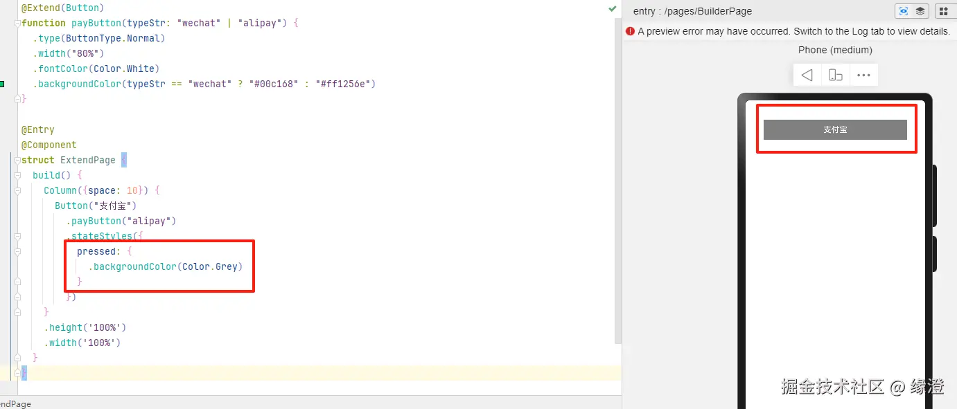
```ets
@Extend(Button)
function payButton(typeStr: "wechat" | "alipay") {
.type(ButtonType.Normal)
.width("80%")
.fontColor(Color.White)
.backgroundColor(typeStr == "wechat" ? "#00c168" : "#ff1256e")
}
@Entry
@Component
struct ExtendPage {
build() {
Column({space: 10}) {
Button("支付宝")
.payButton("alipay")
.stateStyles({
pressed: {
.backgroundColor(Color.Grey)
}
})
}
.height('100%')
.width('100%')
}
}
```
