antd-Steps组件自定义图标和详情拿来即用
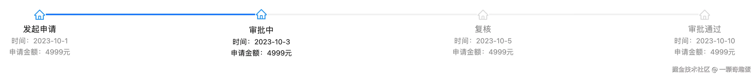
1. 效果如图
2. codepen代码如下直接看效果
const { createRoot } = ReactDOM;
const { HomeOutlined } = icons;
const { Popover, Steps } = antd;
const list = [
{ time: '2023-10-1', cost: '4999元', status: '发起申请' },
{ time: '2023-10-3', cost: '4999元', status: '审批中' },
{ time: '2023-10-5', cost: '4999元', status: '复核' },
{ time: '2023-10-10', cost: '4999元', status: '审批通过'}
];
const customDot = (dot, { status }) => {
const colorMap = {
finish : '#1890ff',
process: '#1890ff',
wait : '#d9d9d9',
};
const iconColor = colorMap[status];
return (
<Popover content={status}>
<div style={{ position: 'relative', display: 'inline-block' }}>
{dot}
<HomeOutlined
style={{
position: 'absolute',
top: '50%',
left: '50%',
transform: 'translate(-50%, -100%) scale(1.5)',
color: colorMap[status],
}}
/>
</div>
</Popover>
);}
const App = () => (
<Steps
current={1}
progressDot={customDot}
items={list.map((item, idx) => ({
title: item.status,
description: (
<>
<div>时间:{item.time}</div>
<div>申请金额:{item.cost}</div>
</>
),
}))}
/>
)
const ComponentDemo = App;
createRoot(mountNode).render(<ComponentDemo />);


