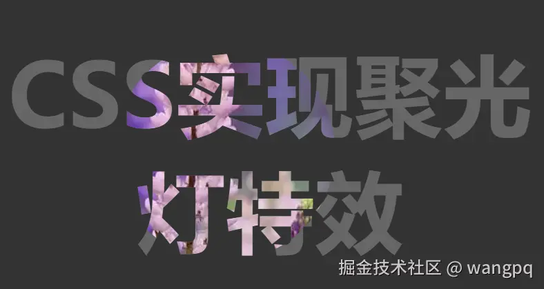
效果:
实现代码
<!DOCTYPE html>
<html lang="zh-CN">
<head>
<meta charset="UTF-8">
<meta name="viewport" content="width=device-width, initial-scale=1.0">
<title>CSS实现聚光灯特效</title>
<style>
body {
background-color: #333;
display: flex;
justify-content: center;
align-items: center;
min-height: 100vh;
}
h2 {
color: #666;
margin: 0;
padding: 0;
font-size: 8rem;
position: relative;
text-align: center;
}
h2::after {
content: attr(data-light);
color: transparent;
position: absolute;
top: 0;
left: 0;
-webkit-clip-path: ellipse(160px 160px at 0% 50%);
clip-path: ellipse(160px 160px at 0% 50%);
animation: spotlight 5s infinite;
background-image: url(https://img0.baidu.com/it/u=1974951509,1598137957&fm=253&fmt=auto&app=138&f=JPEG?w=800&h=500);
background-size: 150%;
background-position: center center;
-webkit-background-clip: text;
background-clip: text;
}
@keyframes spotlight {
0% {
-webkit-clip-path: ellipse(160px 160px at 0% 50%);
clip-path: ellipse(160px 160px at 0% 50%);
}
50% {
-webkit-clip-path: ellipse(160px 160px at 100% 50%);
clip-path: ellipse(160px 160px at 100% 50%);
}
100% {
-webkit-clip-path: ellipse(160px 160px at 0% 50%);
clip-path: ellipse(160px 160px at 0% 50%);
}
}
</style>
</head>
<body>
<h2 data-light="CSS实现聚光灯特效">CSS实现聚光灯特效</h2>
</body>
</html>


