基础实现方案
<div class="gradient-circle"></div>
<style>
.gradient-circle{
   width: 200px;
   height: 200px;
   border-radius: 50%;
   background: linear-gradient(45deg, #6a11cb 0%, #2575fc 100%);
   animation: rotateGradient 5s linear infinite;
   box-shadow: 0 0 20px rgb(0, 0, 0, 0.3);
}
@keyframes rotateGradient {
    0% {
        background: linear-gradient(0deg, #ff00cc, #3333ff);
    }
    25% {
        background: linear-gradient(90deg, #ff00cc, #3333ff);
    }
    50% {
        background: linear-gradient(180deg, #ff00cc, #3333ff);
    }
    75% {
        background: linear-gradient(270deg, #ff00cc, #3333ff);
    }
    100% {
        background: linear-gradient(360deg, #ff00cc, #3333ff);
    }
}
</style

多色渐变旋转圆
<div class="gradient-circle"></div>
.gradient-circle{
   width: 200px;
   height: 200px;
   border-radius: 50%;
   background: linear-gradient(45deg,  #ff00cc, #cc00ff, #9900ff, #6600ff, #3333ff);
   animation: gradientRotate 8s ease infinite, spin 10s linear infinite;
   background-size: 400% 400%;
}
@keyframes gradientRotate {
    0% {
        background-position: 0% 50%;
    }
    50% {
        background-position: 100% 50%;
    }
    100% {
        background-position: 0% 50%;
    }
 }

@keyframes spin {
    from {
        transform: rotate(0deg);
    }
    to {
        transform: rotate(360deg);
    }
}

脉冲渐变圆
<div class="gradient-circle"></div>
.gradient-circle{
   width: 200px;
   height: 200px;
   border-radius: 50%;
   background: radial-gradient(circle, rgba(255,0,204,1) 0%, rgba(51,51,255,1) 100%);
   animation: pulse 3s ease-in-out infinite;
}
@keyframes pulse {
    0% {
        transform: scale(1);
        opacity: 1;
    }
    50% {
        transform: scale(1.1);
        opacity: 0.8;
    }
    100% {
        transform: scale(1);
        opacity: 1;
    }
}
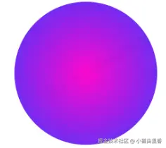
3D 渐变球体效果
<div class="gradient-circle"></div>
 .gradient-circle{
       width: 200px;
       height: 200px;
       border-radius: 50%; background: radial-gradient(circle at 30% 30%, #ff00cc, #cc00ff, #3333ff);
       box-shadow:
            inset 0 0 50px rgba(255,255,255,0.2),
            inset 10px 0 80px rgba(255,0,204,0.5),
            inset -10px 0 80px rgba(51,51,255,0.5),
            inset 10px 0 300px rgba(255,0,204,0.5),
            inset -10px 0 300px rgba(51,51,255,0.5),
            0 0 50px rgba(0,0,0,0.1);
       animation: rotate3d 15s infinite linear;
    }
    @keyframes rotate3d {
        0% {
            transform: rotateY(0deg) rotateX(0deg);
        }
        100% {
            transform: rotateY(360deg) rotateX(360deg);
        }
    }

响应式动态渐变圆
<div class="gradient-circle"></div>
.gradient-circle{
        --size: min(80vw, 300px);
        width: var(--size);
        height: var(--size);
        border-radius: 50%;
        background: conic-gradient(
            from 0deg,
            #ff00cc,
            #cc00ff,
            #9900ff,
            #6600ff,
            #3333ff,
            #0066ff,
            #00ccff,
            #00ffcc,
            #ff00cc
        );
        animation: rotateConic 10s linear infinite;
        filter: drop-shadow(0 0 20px rgba(0,0,255,0.3));
    }
    @keyframes rotateConic {
        from {
            transform: rotate(0deg);
        }
        to {
            transform: rotate(360deg);
        }
    }


