背景
Taro 让跨端开发变得简单,一套代码,多端运行。但在实际开发中,表单处理却成了痛点:
- 重复造轮子:每个表单都要手动封装组件,费时费力
- 校验难维护:校验逻辑分散,容易遗漏,新增/删除字段可能引发问题
- 代码冗余:复制粘贴导致代码臃肿,难以统一管理
为了解决这些问题,开发了一个表单组件 am-taro-form,让开发者只需关注业务,样式和校验交给组件间内部处理,让移动端表单开发变的简单。
组件简介
组件是基于Taro并使用React开发的,所以只能在Taro中使用。组件内置了Input、Select、Cascader、DatePicker组件,通过简单配置即可渲染不同的表单。可以在每个字段组件上配置校验,风格方式就是我们熟悉的 Antd Form表单校验,也提供了统一的错误样式;也可以根据项目需求扩展自己的表单项,让组件管理更简单;项目使用typescript的话,也会有友好的代码提示;
效果展示
基础用法
代码demo
import { View } from '@tarojs/components';
import { Form } from 'am-taro-form';
import { Button } from '@nutui/nutui-react-taro';

export default function Index() {
  const [form] = Form.useForm();

  return (
    <View className="index">
      <Form form={form} onFinish={console.log} onValuesChange={console.log}>
        <View>
          <Form.Item
            label="姓名"
            name="name"
            valueType="input"
            rules={[{ required: true, message: '请填写姓名' }]}
          />
          <Form.Item label="身高" name="height" valueType="input" suffix="cm" />
          <Form.Item label="年龄" name="age" valueType="input" />
        </View>
        <View
          style={{ display: 'flex', justifyContent: 'center', padding: 20 }}
        >
          <Button block onClick={() => form.submit()}>
            提交
          </Button>
        </View>
      </Form>
    </View>
  );
}
效果预览

自定义扩展表单类型
代码demo
import {
createFormItem,
ListItemStyle,
ListItemStylePropsKeyList,
selectPropsKeyList,
FieldSelect,
} from 'am-taro-form';
import type {
ListItemStyleProps,
BaseSelectPickerProps,
SelectOptionType,
SelectPickerProps,
FieldSelectProps,
} from 'am-taro-form';
interface TextProps extends ListItemStyleProps {
valueType: 'text';
value?: string;
}
interface BaseGenderSelectProps extends ListItemStyleProps {
fieldProps?: SelectPickerProps;
placeholder?: string;
valueType: 'gender';
}
export type FieldGenderSelectProps = BaseGenderSelectProps &
(
| (Pick<
BaseSelectPickerProps<SelectOptionType>,
'onChange' | 'value' | 'title'
> & {
labelInValue: true;
})
| (Pick<
BaseSelectPickerProps<string | number>,
'onChange' | 'value' | 'title'
> & {
labelInValue?: false;
})
);
interface FieldBoolSelectProps extends Omit<FieldSelectProps, 'options'> {
fieldProps?: SelectPickerProps;
placeholder?: string;
valueType: 'bool';
}
const Text = (props: TextProps) => (
<ListItemStyle {...props}>{props.value}</ListItemStyle>
);
const Gender = (props: FieldGenderSelectProps) => {
return (
<FieldSelect
{...props}
options={[
{ value: '1', label: '男' },
{ value: '2', label: '女' },
]}
/>
);
};
const Boolean = (props: FieldBoolSelectProps) => {
return (
<FieldSelect
{...props}
options={[
{ value: 'Y', label: '是' },
{ value: 'N', label: '否' },
]}
/>
);
};
const FormItem = createFormItem({
text: [Text, [...ListItemStylePropsKeyList, 'value']],
gender: [Gender, [...selectPropsKeyList.filter((key) => key !== 'options')]],
bool: [Boolean, [...selectPropsKeyList.filter((key) => key !== 'options')]],
});
export default FormItem;
import { View } from '@tarojs/components';
import { Form } from 'am-taro-form';
import { Button } from '@nutui/nutui-react-taro';
import FormItem from './formItem';
export default function Index() {
const [form] = Form.useForm();
return (
<View>
<Form form={form} onFinish={console.log} onValuesChange={console.log}>
<View>
<Form.Item
label="姓名"
name="name"
valueType="input"
rules={[{ required: true, message: '请填写姓名' }]}
/>
<Form.Item label="身高" name="name1" valueType="input" suffix="cm" />
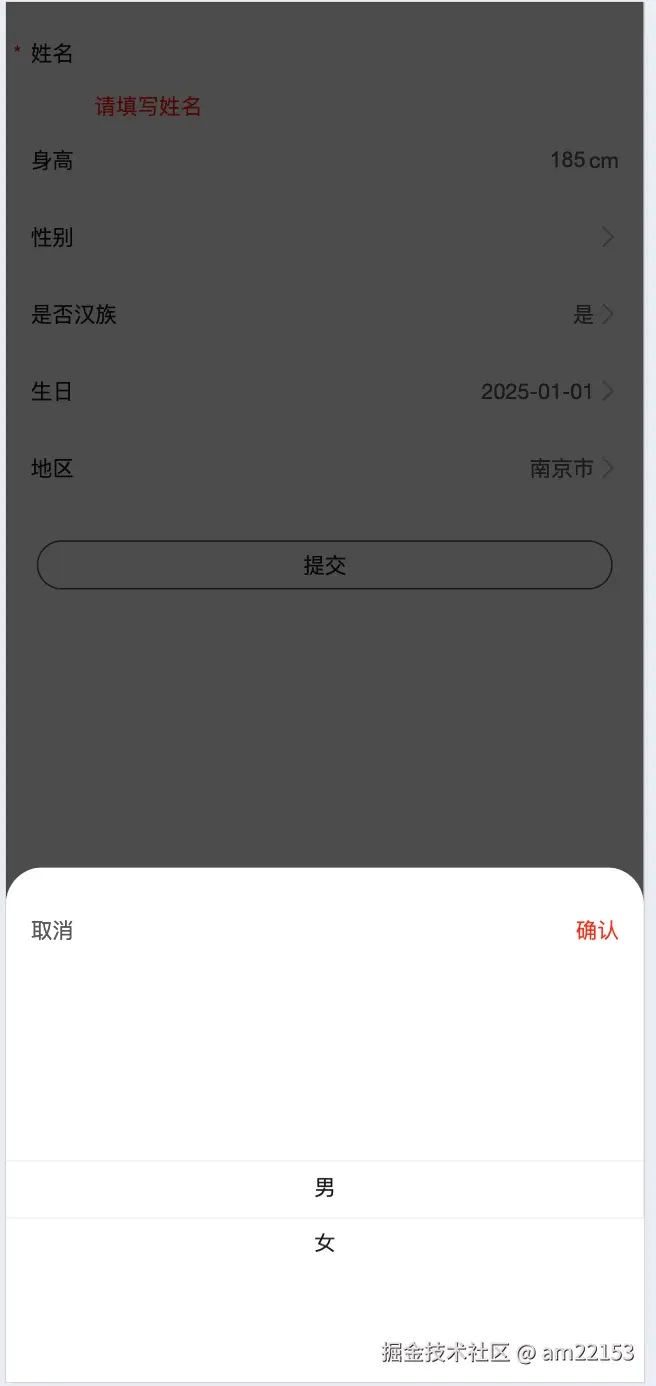
<FormItem label="性别" name="gender" valueType="gender" labelInValue={false} />
<FormItem label="是否汉族" name="isHan" valueType="bool" labelInValue={false} />
<FormItem
label="生日"
name="birthday"
valueType="date"
startDate={new Date()}
/>
<FormItem
label="地区"
name="area"
valueType="select"
labelInValue
onChange={(v) => console.log(v)}
options={[
{ value: 1, label: '南京市' },
{ value: 2, label: '无锡市' },
{ value: 3, label: '海北藏族自治区' },
{ value: 4, label: '北京市' },
{ value: 5, label: '连云港市' },
{ value: 8, label: '大庆市' },
{ value: 9, label: '绥化市' },
{ value: 10, label: '潍坊市' },
{ value: 12, label: '乌鲁木齐市' },
]}
/>
</View>
<View
style={{ display: 'flex', justifyContent: 'center', padding: 20 }}
>
<Button block onClick={() => form.submit()}>
提交
</Button>
</View>
</Form>
</View>
);
}
效果预览


组件API
Form
| 属性名 | 属性说明 | 类型 | 默认值 |
|---|
| form | 通过Form.useForm() 创建 | FormInstance | Form.useForm() |
| initialValues | 表单默认值 | Object | - |
| preserve | 表单删除时是否保留字段 | boolean | false |
| validateMessages | 校验信息模板 | | |
| onFieldsChange | 表单字段变更回调 | function | - |
| onFinish | 当提交时所有校验通过的回调 | (values) => void | - |
| onFinishFailed | 当提交时所有校验失败的回调 | ({ values, errorFields, outOfDate }) => void | - |
| onValuesChange | 表单值改变的回调 | (changedValues, values) => void | - |
FormItem 通用属性
| 属性名 | 属性说明 | 类型 | 默认值 |
|---|
| dependencies | 设置依赖字段 | NamePath[] | - |
| getValueFromEvent | 设置如何将 event 的值转换成字段值 | (...args: EventArgs) => StoreValue | - |
| name | 字段名,支持数组 | NamePath | - |
| label | 左边标题文本 | ReactNode | - |
| trigger | 设置收集字段值变更的时机。 | string | onChange |
| validateTrigger | 设置字段校验的时机 | string | string[] | false | onChange |
| rules | 校验规则,设置字段的校验逻辑 | Rule[] | - |
| preserve | 当字段被删除时保留字段值 | boolean | true |
| initialValue | 设置子元素默认值,如果与 Form 的 initialValues 冲突则以 Form 为准 | | - |
| messageVariables | 默认验证字段的信息 | Record<string, string> | - |
| getValueProps | 为子元素添加额外的属性 (不建议通过 getValueProps 生成动态函数 prop,请直接将其传递给子组件) | | - |
| valuePropName | 子节点的值的属性。注意:Switch、Checkbox 的 valuePropName 应该是 checked,否则无法获取这个两个组件的值。该属性为 getValueProps 的封装,自定义 getValueProps 后会失效 | string | - |
| validateFirst | 当某一规则校验不通过时,是否停止剩下的规则的校验。设置 parallel 时会并行校验 | boolean | parallel | - |
| validateDebounce | 设置防抖,延迟毫秒数后进行校验 | number | - |
| required | 是否显示必填表示(*) | boolean | - |
| onClick | 当前行点击回调 | | - |
| clickable | 是否显示点击反馈样式 | boolean | - |
| showArrowRight | 是否展示右侧箭头,如果没有配置onClick是函数的时候展示 | boolean | - |
| help | 帮助文案,如果有错误文案将不展示 | ReactNode | - |
| errorText | 错误文案,默认红色字体 | ReactNode | - |
| className | 组件class | string | - |
| divider | 是否展示底部分割线 | boolean | true |
| suffix | 末尾额外的文案,在右侧箭头之前 | ReactNode | - |
| fieldProps | 透传给子组件额外的属性,每个自定义表单项值是不同的 | React<string, any> | - |
| valueType | 表单项类型 | 'input' | 'date' | 'select' | 'cascader' | input |
| mode | 表单模式,edit:编辑模式,readOnly:只读模式 | 'edit' | 'readOnly' | - |
FormItem - input
| 属性名 | 属性说明 | 类型 | 默认值 |
|---|
| disabled | 是否禁用 | boolean | - |
| value | 表单值 | string | - |
| placeholder | 提示文本 | string | - |
| onBlur | 失去焦点回调 | | - |
| onFocus | 得到焦点时的回调 | | - |
FormItem - date
| 属性名 | 属性说明 | 类型 | 默认值 |
|---|
| startDate | 选择器开始时间 | Date | 十年前 |
| endDate | 选择器结束时间 | Date | 十年后 |
| type | 日期类型 | 'date' | 'time' | 'year-month' | 'month-day' | 'datehour' | 'datetime' | 'hour-minutes' | date |
| title | 选择器标题 | string | - |
FormItem - select
| 属性名 | 属性说明 | 类型 | 默认值 | | |
|---|
| title | 选择框标题 | string | | | |
| options | 选项列表 | {value: string | number;label: string | number;}[] | |
| onChange | 选择项变更的回调 | | | | |
| value | 选项项值 | string | object | | |
| labelInValue | 设置value值类型, true 表示value 值为对象 | boolean | false | | |
FormItem - cascader
| 属性名 | 属性说明 | 类型 | 默认值 |
|---|
| options | 选项列表 | | |
| onChange | 选择变更回调 | | |
| labelInValue | 值类型 | boolean | |
| valueToList | 值是否转成list,false只返回最后一项 | boolean | |
| fieldProps | 透传给ca's | | |
Form.List
为字段提供数组化管理。
| 属性名 | 属性说明 | 类型 | 默认值 |
|---|
| children | 渲染函数 | (fields: Field[], operation: { add, remove, move }, meta: { errors }) => React.ReactNode | |
| initialValue | 设置子元素默认值,如果与 Form 的 initialValues 冲突则以 Form 为准 | any[] | |
| name | 字段名,支持数组。List 本身也是字段,因而 getFieldsValue() 默认会返回 List 下所有值,你可以通过参数改变这一行为 | NamePath | |
Rule
Rule 支持接收 object 进行配置,也支持 function 来动态获取 form 的数据:
| 属性名 | 类型 | |
|---|
| enum | any[] | |
| len | number | |
| max | number | |
| message | string | |
| min | number | |
| pattern | RegExp | |
| required | boolean | |
| transform | (value) => any | |
| type | string | |
| validator | (rule, value, callback: (error?: string) => void, form) => Promise | void |
| whitespace | boolean | |
| validateTrigger | string | string[] |
预使用
git clone https://github.com/yigexiaoairen/am-taro-form.git
cd am-taro-form
git checkout main
yarn
yarn dev:h5
结语
- 此组件库正常Taro支持的平台都能支持,由于个人精力有限和不同平台要求不同等原因仅调试了H5和微信小程序平台,微信小程序使用需要使用自己的开发者账号其他平台亦如此;
- 组件主要是基于rc-field-form组件进行开发的,更多用法和细节可以参考这个组件的用法;
- 项目现在还处于初版,缺少实践,功能可能没那么完善,欢迎使用和提缺陷,有什么问题或者需要也可以发出来一起讨论;
- 如果有typescript相关的问题也可以发出来一起讨论;


