

vue3项目实战---知乎日报----首页样式结构
目录
[TOC]
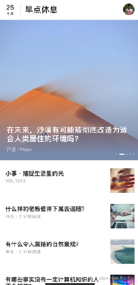
页面效果
模块拆分 header头部swiper轮播图items文章列表 loading
/deep/ 设置vant样式
固定图片大小一般写 min-height: 100%;
//渐变色
background: rgba(0, 0, 0, .4);
background: -webkit-linear-gradient(top, rgba(0, 0, 0, 0), rgba(0, 0, 0, .4));

//两行显示省略号
 overflow: hidden;
 display: -webkit-box;
-webkit-line-clamp: 2;
-webkit-box-orient: vertical;
header头部
<template>
    <header class="header-box">
        <div class="left">
            <div class="time">
                <span>21</span>
                <span>十二月</span>
            </div>
            <h1 class="title">知乎日报</h1>
        </div>
        <div class="pic-box">
            <img src="../assets/images/timg.jpg" alt="">
        </div>
    </header>
</template>

<script>
export default {
    name: "Header",
    setup() { },
}
</script>

<style lang="less" scoped>
.header-box {
    display: flex;
    justify-content: space-between;
    align-items: center;
    padding: 10px 15px;

    .pic-box {
        box-sizing: border-box;
        width: 32px;
        height: 32px;
        background: #ddd;
        border-radius: 50%;
        overflow: hidden;

        img {
            display: block;
            width: 100%;
            height: 100%;
        }
    }

    .left {
        display: flex;

        .time {
            box-sizing: border-box;
            padding-right: 15px;
            height: 32px;

            span {
                display: block;
                line-height: 20px;
                font-size: 18px;
                text-align: center;

                &:nth-last-child(1) {
                    line-height: 12px;
                    font-size: 12px;

                }
            }
        }

    }

    .title {
        padding-left: 15px;
        line-height: 32px;
        font-size: 20px;
    }
}
</style>
轮播图swiper
<template>
    <section class="banner-box">
        <van-swipe :autoplay="3000" lazy-render>
            <van-swipe-item>
                <img class="abbre" src="https://cdn.jsdelivr.net/npm/@vant/assets/apple-1.jpeg" alt="">
                <div class="desc">
                    <h2 class="title">
                        内容 内容 内容 内容 内容 内容 内容 内容 内容 内容 内容 内容 内容
                    </h2>
                    <p class="author">
                        作者 / 李白
                    </p>
                </div>
            </van-swipe-item>
        </van-swipe>
    </section>
</template>

<script>
export default {
    name: "Swiper",
    setup() { },

}
</script>

<style lang="less" scoped>
.banner-box {
    box-sizing: border-box;
    height: 375px;
    background: #eee;
    overflow: hidden;

    .van-swipe {
        height: 100%;
        overflow: hidden;

        .abbre {
            display: block;
            width: 100%;
            min-height: 100%;
        }
    }

    .desc {
        position: absolute;
        bottom: 0;
        left: 0;
        z-index: 10;
        box-sizing: border-box;
        padding: 15px 20px;
        width: 100%;
        background: rgba(0, 0, 0, .4);
        background: -webkit-linear-gradient(top, rgba(0, 0, 0, 0), rgba(0, 0, 0, .4));
        color: #fff;

        .title {
            line-height: 25px;
            font-size: 18px;
            max-height: 50px;
            overflow: hidden;
            display: -webkit-box;
            -webkit-line-clamp: 2;
            -webkit-box-orient: vertical;
        }

        .author {
            font-size: 14px;
            line-height: 25px;
            color: rgba(255, 255, 255, .8);
        }
    }

    /deep/.van-swipe__indicators {
        left: auto;
        transform: none;
        right: 15px;

        .van-swipe__indicator {
            width: 5px;
            height: 5px;
            background: rgba(255, 255, 255, .8);
        }

        .van-swipe__indicator--active {
            width: 15px;
            background: #fff;
            border-radius: 5px;
        }
    }
}
</style>
新闻列表
新闻列表封装
<template>
    <div class="news-box">
        <a href="" class="news-items">
            <h3 class="title">
                我是一个标题
            </h3>
            <div class="desc"> 作者 · 两分钟阅读</div>
            <div class="pic">
                <img class="abbre" src="https://cdn.jsdelivr.net/npm/@vant/assets/apple-1.jpeg" alt="">
            </div>
        </a>

    </div>
</template>

<script>
export default {
    name: "NewsItem",
    setup() { },
}

</script>

<style lang="less" scoped>
.news-box {
    position: relative;

    a {
        display: block;
        padding-right: 90px;
        min-height: 70px;
        overflow: hidden;
        margin-top: 30px;


        .pic {
            position: absolute;
            right: 0;
            top: 0;
            width: 70px;
            height: 70px;
            background: #eee;

            img {
                display: block;
                width: 100%;
                height: 100%;
            }
        }

        .title {
            font-size: 16px;
            color: #000;
            line-height: 25px;
            max-height: 50px;
            overflow: hidden;
            display: -webkit-box;
            -webkit-line-clamp: 2;
            -webkit-box-orient: vertical;
        }

        .desc {
            line-height: 20px;
            font-size: 12px;
            color: #999;
        }
    }


}
</style>
导入引用
 <section class="news-box">
        <div class="day-box">
            <van-divider dashed content-position="left">12月20日</van-divider>
            <div class="list">
                <NewsItem></NewsItem>
            </div>
        </div>

    </section>
<style lang="less" scoped>
.van-skeleton {
    padding: 15px;
}

.news-box {
    padding: 0 15px;

    .day-box {
        margin-top: 30px;
    }
}
</style>
loading效果
 <section class="loadmore-box">
        <van-loading size="18px">小主,奴家正在努力加载中...</van-loading>
    </section>

<style lang="less" scoped>
.loadmore-box {
    display: flex;
    justify-content: center;
    align-items: center;
    height: 50px;
    margin-top: 20px;
    background: #f4f4f4;
}
</style>
超大屏按照750处理
// 处理最大宽度
export const handleMaxWidth = function handleMaxWidth() {
    let HTML = document.documentElement,
        app = document.querySelector('#app'),
        size = parseFloat(HTML.style.fontSize);
    if (size > 75) {
        HTML.style.fontSize = '75px';
        app.style.width = '750px';
        return;
    }
    app.style.width = '100%';
    app.style.minHeight = HTML.clientHeight + 'px';
};

main.js-----------------
import { handleMaxWidth } from './assets/utils'
window.addEventListener('resize', handleMaxWidth)
app.vue
max-width 最大宽度为750
  <template>

  <router-view></router-view>

</template>

  <script>
export default {

  name: 'App',
  components: {},
  setup() {

  },

}
</script>
<style lang="less">
html,
body {
  min-height: 100%;
  overflow-x: hidden;
  background: #f4f4f4;
}

#app {
  max-width: 750px;
  margin: 0 auto;
  background: #fff;
}
</style>
Home.vue
<template>
    <Header></Header>
    <Swiper></Swiper>
    <van-skeleton title :row="5" />
    <section class="news-box">
        <div class="day-box">
            <van-divider dashed content-position="left">12月20日</van-divider>
            <div class="list">
                <NewsItem></NewsItem>
            </div>
        </div>

    </section>
    <section class="loadmore-box">
        <van-loading size="18px">小主,奴家正在努力加载中...</van-loading>
    </section>
</template>

<script>
import Header from '../components/header.vue'
import Swiper from '../components/swiper.vue'
import NewsItem from '../components/items.vue'
export default {
    name: "Home",
    components: {
        Header,
        Swiper,
        NewsItem
    },
    setup() {

    },
};
</script>
<style lang="less" scoped>
.van-skeleton {
    padding: 15px;
}

.news-box {
    padding: 0 15px;

    .day-box {
        margin-top: 30px;
    }
}

.loadmore-box {
    display: flex;
    justify-content: center;
    align-items: center;
    height: 50px;
    margin-top: 20px;
    background: #f4f4f4;
}
</style>
