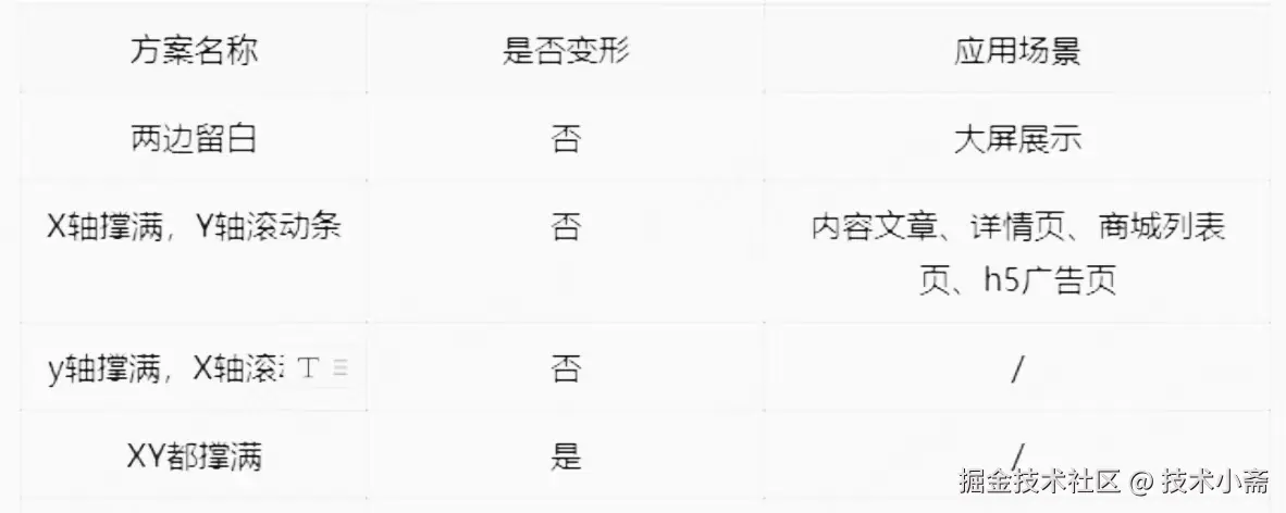
常用方案对比
实现方式
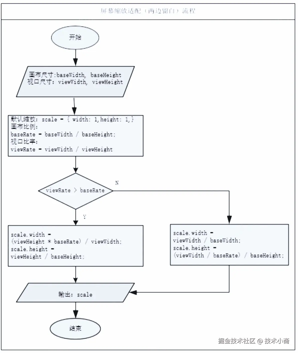
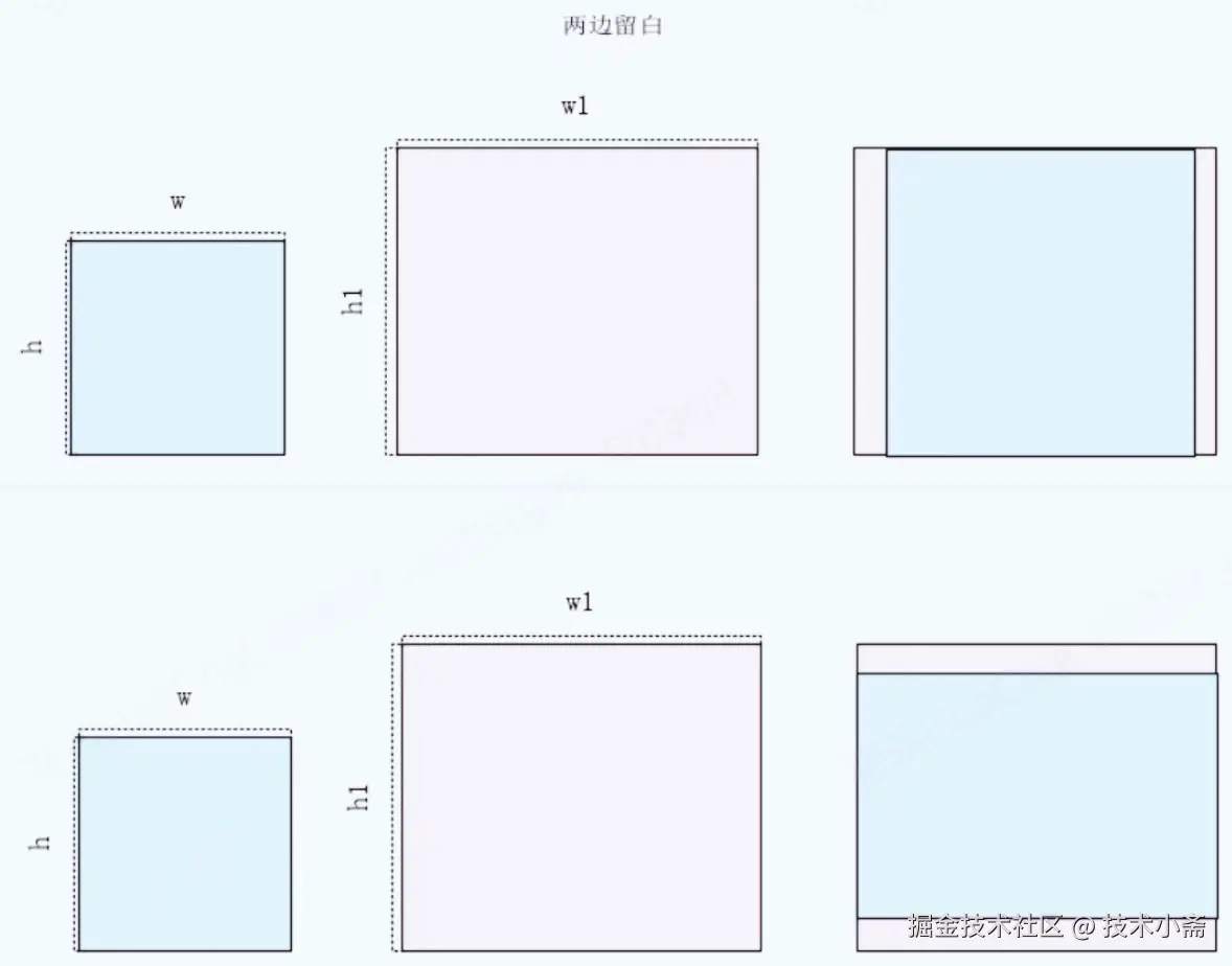
1.两边留白
代码示列:
<!DOCTYPE html>
<html lang="en">
<head>
<meta charset="UTF-8">
<meta name="viewport" content="width=device-width, initial-scale=1.0">
<title>大屏适配</title>
<style>
.screen {
background-color: black
position: relative
}
.bigBox{
width: 960px
height: 540px
top: 50%
left: 50%
position: absolute
background-color:
transform-origin: center center
}
</style>
</head>
<body>
<div class="screen" id="screen">
<div class="bigBox" id="bigBox">
<h1>大屏适配</h1>
</div>
</div>
<script lang="javascript">
var screen = document.getElementById("screen")
var bigBox = document.getElementById("bigBox")
var scale = {}
// 设计尺寸
var baseWidth = 480
var baseHeight = 270
bigBox.style.width = baseWidth + 'px'
bigBox.style.height = baseHeight + 'px'
// 设计宽高比
var baseRate = baseWidth / baseHeight
// 大屏的应用场景:经常是左右留白 画布16:9 scale = scaleHeight = viewHeight/
// 获取视口宽高
var viewWidth = window.innerWidth
var viewHeight = window.innerHeight
screen.style.width = viewWidth + 'px'
screen.style.height = viewHeight + 'px'
// 视口宽高比
var viewRate = viewWidth / viewHeight
if(viewRate>baseRate){
// 太宽了,高度占满
scale.height = viewHeight/baseHeight
scale.width = (viewHeight*baseRate)/baseWidth
}else{
// 太高了,宽度占满
scale.width = viewWidth/baseWidth
scale.height = (viewWidth/baseRate)/baseHeight
}
bigBox.style.transform = `translate(-50%, -50%) scale(${scale.width},${scale.height}) `
</script>
</body>
</html>
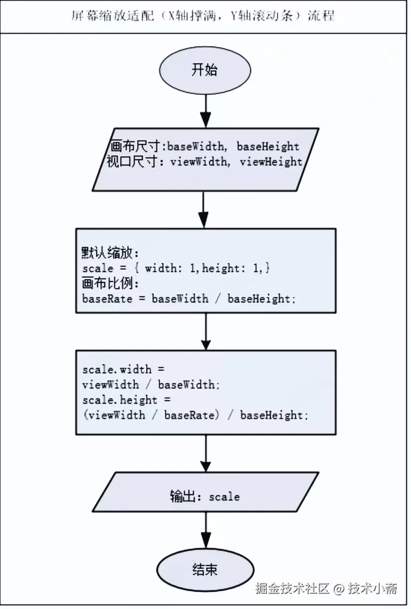
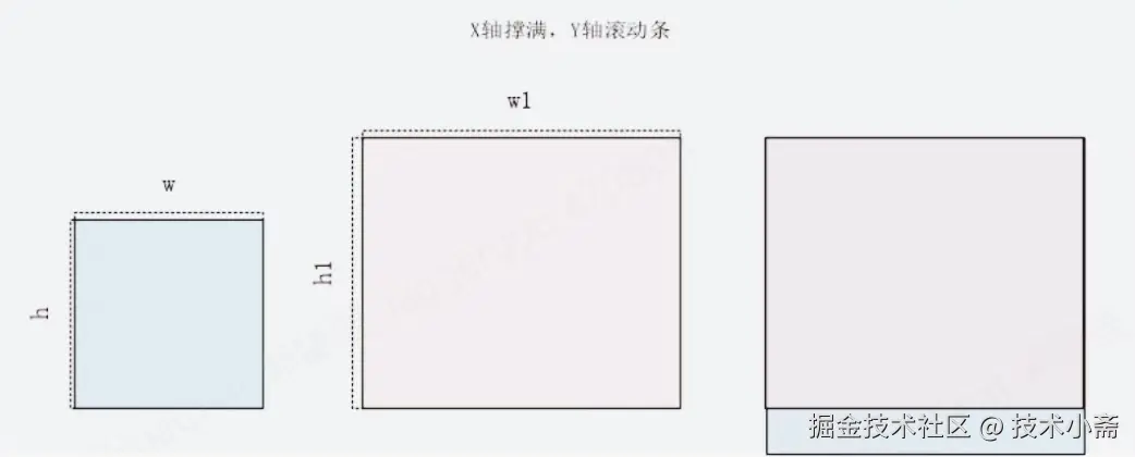
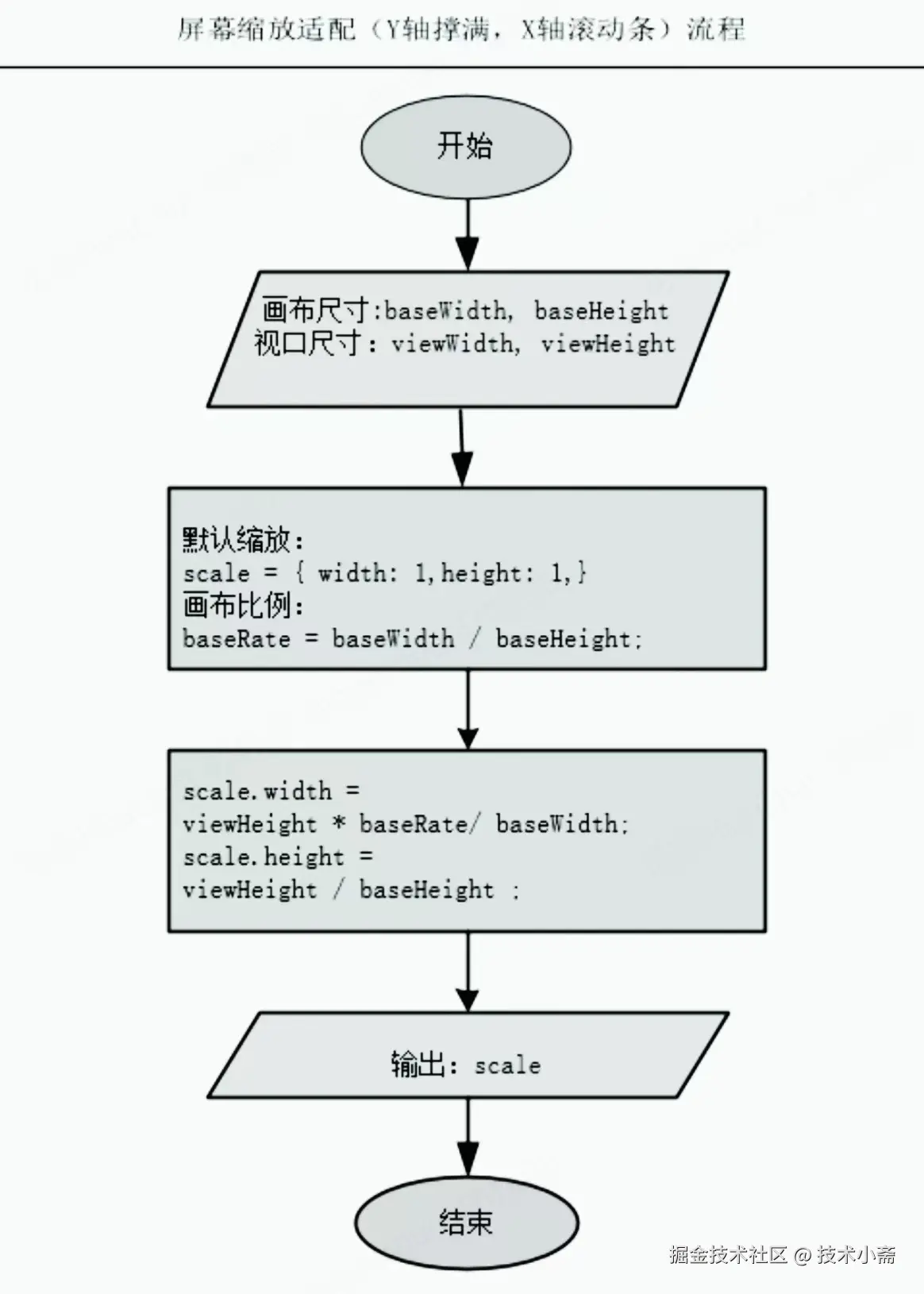
2.宽撑满高滚动条
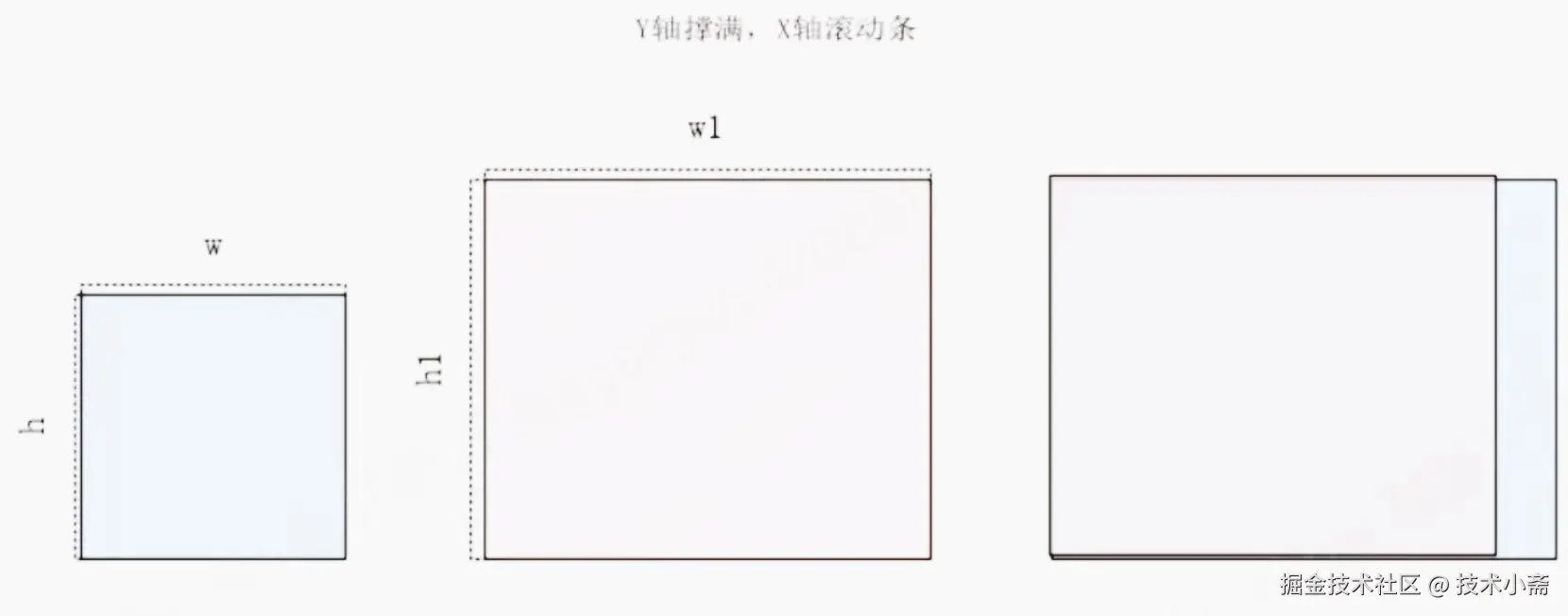
3.高度撑满宽滚动条
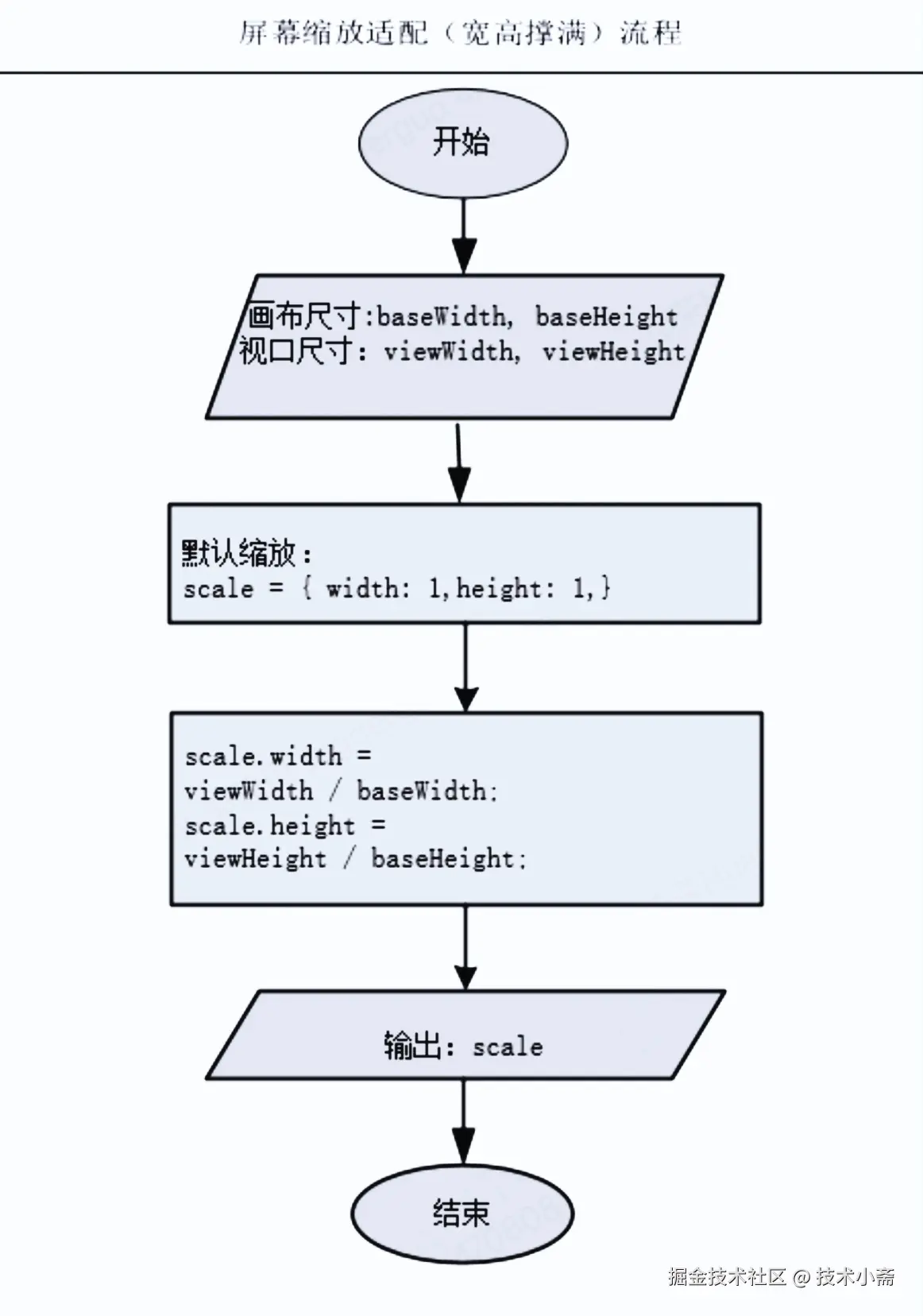
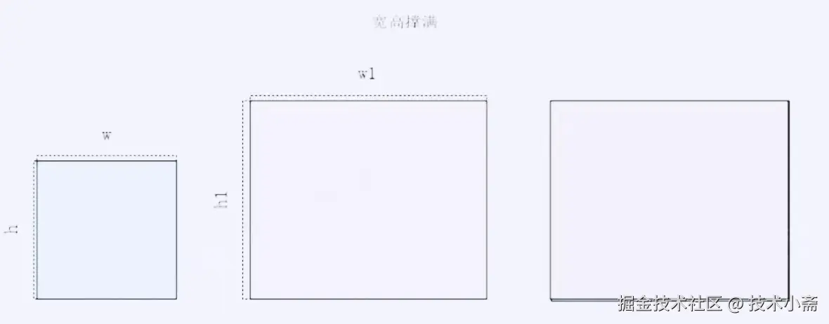
4. 宽高都撑满


