

一、前言
这篇文章我将会详细的向你们介绍 **Button** 组件的设计思路和功能实现。这篇文章也是正式开始我们手写组件库的第一个组件,应该有很多人从刚开始学 Element Plus 是从 Button开始的吧,前面的文章包含初始化整个组件库的内容,接下来就是手搓组件库了,我会以开发组件库的思维去给你分析 **Element Plus** **组件库中那些组件的设计思路和实现原理,**希望对你有所帮助。
二、button 组件的设计思路
一)、button 实现的功能
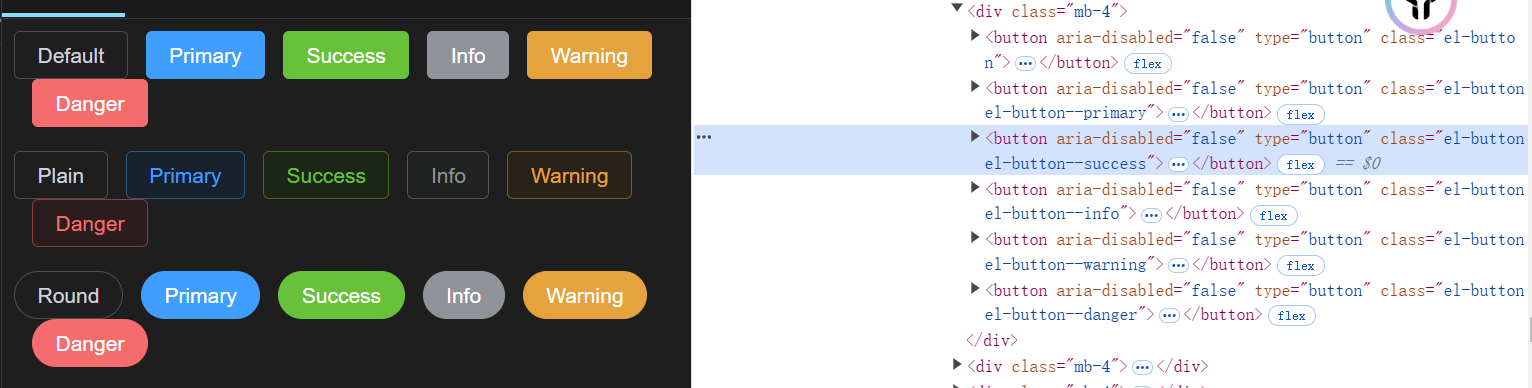
button 组件功能并不是很复杂,大多数功能都是通过定义 boolean 类型的 prop来控制一些功能,ep:link、circle、round、text、bg、plain。
实现这些功能通常是用添加对应的类名,在类名里给这些功能定制样式。让我们来看看Element Plus 中 button组件有哪些需要实现的功能。
Button 属性
属性名
说明
类型
默认值
size
尺寸
enum
—
type
类型
enum
—
plain
是否为朴素按钮
boolean
false
text 2.2.0
是否为文字按钮
boolean
false
bg 2.2.0
是否显示文字按钮背景颜色
boolean
false
link 2.2.1
是否为链接按钮
boolean
false
round
是否为圆角按钮
boolean
false
circle
是否为圆形按钮
boolean
false
loading
是否为加载中状态
boolean
false
loading-icon
自定义加载中状态图标组件
string
/ Component
Loading
disabled
按钮是否为禁用状态
boolean
false
icon
图标组件
string
/ Component
—
autofocus
原生 autofocus
属性
boolean
false
native-type
原生 type 属性
enum
button
auto-insert-space
自动在两个中文字符之间插入空格
boolean
—
color
自定义按钮颜色, 并自动计算 hover
和 active
触发后的颜色
string
—
dark
dark 模式, 意味着自动设置 color
为 dark 模式的颜色
boolean
false
tag 2.3.4
自定义元素标签
string
/ Component
button
Button 插槽
插槽名
说明
default
自定义默认内容
loading
自定义加载中组件
icon
自定义图标组件
Button Expose
属性名
说明
类型
ref
按钮 html 元素
object
size
按钮尺寸
object
type
按钮类型
object
disabled
按钮已禁用
object
shouldAddSpace
是否在两个字符之间插入空格
object
你们可以认真想想如果自己设计这个组件会去怎么设计,后面我将会详细的告诉你 Element Plus 是怎么实现这功能的。这些功能 color 自定义按钮颜色这个功能你们会怎么实现呢,这个功能应该是这些功能里面比较复杂的。
二)、button 功能具体实现
可能我不会按照 Element Plus 文档中的 Button 属性的顺序来分析,我会从实现组件逻辑顺序去实现 button 组件的全部功能。
1.自定义元素标签功能
在设计这个功能,我们第一能想到的应该是 vue 中的动态组件,而且 Element Plus也是这样实现的。它可以是 string 类型也可以是 component 类型,比如这个可以是 span 或者是一个组件。这样设计可以让这个组件既有 button 组件的功能。
1.1.定义 props
首先我们需要在 packages\components\button\src 目录下创建 buton.ts 文件来封装我们实现 button 组件需要用到的 prop 属性。
import { buildProps, definePropType } from '@element-plus/utils'
export const buttonProps = buildProps({
  /**
   * @description custom element tag
   */
  tag: {
    type: definePropType<string | Component>([String, Object]),
    default: 'button',
  },
} as const)
这个 **as const** 是为了保持 **buildProps** 参数中的 **type**或者 **default** **具体的类型,而不会给他推断出一个更加广泛的类型。**比如如果不加这个 as const 可能它推断的类型就是 string,如果有的话它可能就是就是 button 这个字面量。还有加上这个也是为了让这个对象变成可读不可写,防止开发者手动更改。
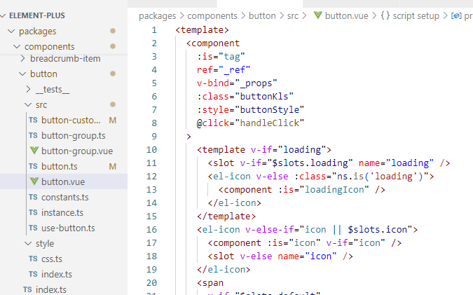
1.2.实现 template 和样式
在 packages\components\button\src目录下创建 button.vue 文件,在 packages\theme-chalk\src 目录下创建 button.scss 文件。
<template>
  <component
    :is="tag"
    >
  </component>
</template>
<script setup lang="ts">
  import { computed } from 'vue'
  import { buttonProps } from './button'
  defineOptions({ name: 'FzButton' })
  const props=buildProps(buttonProps)
  const ns = useNamespace('button')
  const buttonKls = computed(() => [
    ns.b(),
  ])
</script>
这个样式我们先把一个设计一个 button 组件的公共样式就可以了。我们上篇已经设计好组件的样式结构了,所以我们需要把 **button** 组件的公共样式在 **packages\theme-chalk\src\common\var.scss**下声明公共变量。
// Button
// css3 var in packages/theme-chalk/src/button.scss
$button: () !default;
$button: map.merge(
  (
    'font-weight': getCssVar('font-weight-primary'),
  'border-color': getCssVar('border-color'),
  'bg-color': getCssVar('fill-color', 'blank'),
  'text-color': getCssVar('text-color', 'regular'),
  'disabled-text-color': getCssVar('disabled-text-color'),
  'disabled-bg-color': getCssVar('fill-color', 'blank'),
  'disabled-border-color': getCssVar('border-color-light'),
  'divide-border-color': rgba($color-white, 0.5),
  'hover-text-color': getCssVar('color-primary'),
  'hover-bg-color': getCssVar('color-primary', 'light-9'),
  'hover-border-color': getCssVar('color-primary-light-7'),
  'active-text-color': getCssVar('button-hover-text-color'),
  'active-border-color': getCssVar('color-primary'),
  'active-bg-color': getCssVar('button', 'hover-bg-color'),
  'outline-color': getCssVar('color-primary', 'light-5'),
  'hover-link-text-color': getCssVar('color-info'),
  'active-color': getCssVar('text-color', 'primary'),
),
  $button
  );
$button-font-size: () !default;
$button-font-size: map.merge(
  (
    'large': getCssVar('font-size', 'base'),
  'default': getCssVar('font-size', 'base'),
  'small': 12px,
),
  $button-font-size
  );

$button-border-radius: () !default;
$button-border-radius: map.merge(
  (
    'large': getCssVar('border-radius', 'base'),
  'default': getCssVar('border-radius', 'base'),
  'small': calc(#{getCssVar('border-radius', 'base')} - 1px),
),
  $button-border-radius
  );

$button-padding-vertical: () !default;
$button-padding-vertical: map.merge(
  (
    'large': 13px,
  'default': 9px,
  'small': 6px,
),
  $button-padding-vertical
  );

$button-padding-horizontal: () !default;
$button-padding-horizontal: map.merge(
  (
    'large': 20px,
  'default': 16px,
  'small': 12px,
),
  $button-padding-horizontal
  );
有了这些变量值,我们需要在 button.scss 样式中来使用它们。
@use 'sass:map';
@use 'common/var.scss' as *;
@use 'mixins/mixins.scss' as *;
@use 'mixins/var' as *;

@include b(button) {
  @include set-component-css-var('button', $button);
}
@include b(button) {
  display: inline-flex;
  justify-content: center;
  align-items: center;

  line-height: 1;
  height: map.get($input-height, 'default');
  white-space: nowrap;
  cursor: pointer;
  color: getCssVar('button', 'text-color');
  text-align: center;
  box-sizing: border-box;
  outline: none;
  transition: 0.1s;
  font-weight: getCssVar('button', 'font-weight');
  user-select: none;
  vertical-align: middle;
  background-color: getCssVar('button', 'bg-color');
  border: getCssVar('border');
  border-color: getCssVar('button', 'border-color');

  &:hover {
    color: getCssVar('button', 'hover', 'text-color');
    background-color: getCssVar('button', 'hover', 'bg-color');
    border-color: getCssVar('button', 'hover', 'border-color');
    outline: none;
  }

  &:active {
    color: getCssVar('button', 'active', 'text-color');
    background-color: getCssVar('button', 'active', 'bg-color');
    border-color: getCssVar('button', 'active', 'border-color');
    outline: none;
  }

  &:focus-visible {
    outline: 2px solid getCssVar('button', 'outline-color');
    outline-offset: 1px;
    transition: outline-offset 0s outline 0s;
  }

  > span {
    display: inline-flex;
    align-items: center;
  }

  & + & {
    margin-left: 12px;
  }
}
上面的样式主要实现了 button 组件的基本样式,需要说的就是 user-select:none 不可选择,button 的几种状态下的样式,**focus-visible**键盘(tab)导航或者辅助技术触发的焦点 **css**伪类。button 里 span 的样式和 button 之间的样式。
2.自定义图标和图标插槽
2.1定义 props
Button组件中支持传入 icon、loadingIcon 和 相对应的插槽。在 **button** 组件为加载的状态才可显示 **loading** 的图标或者插槽图标。
import { definePropType } from './props'
import type { Component } from 'vue'

export const iconPropType = definePropType<string | Component>([
  String,
  Object,
  Function,
])


import { buildProps, definePropType, iconPropType } from '@fz-mini/utils'
import type { Component} from 'vue'
export const buttonProps = buildProps({
  /**
   * @description icon component
   */
  icon: {
    type: iconPropType,
  },
  /**
   * @description customize loading icon component
   */
  loadingIcon: {
    type: iconPropType,
    default: () => Loading,
  },
   /**
   * @description determine whether it's loading
   */
  loading: Boolean,
})
2.2 实现 template 和样式
实现 props 传的 loading:true 时,展示传入的 loadingIcon 或者具名插槽 loading 的标签。根据 icon 的值或者 icon 具名插槽展示 icon 图标。且 **loading**插槽的优先级大于 **loadingIcon** 属性。
<template>
  <component
    :is="tag"
    :class="buttonKls"
    >
    <template v-if="loading">
      <slot v-if="$slots.loading" name="loading" />
      <fz-icon v-else>
        <component :is="loadingIcon" :class="ns.is('loading')" />
      </fz-icon>
    </template>
    <fz-icon v-else-if="icon || $slots.icon">
      <component :is="icon" v-if="icon" />
      <slot v-else name="icon" />
    </fz-icon>
    <span
      v-if="$slots.default"
      >
      <slot />
    </span>
  </component>
</template>
<script setup lang="ts">
  import { computed } from 'vue'
  import { buttonProps } from './button'
  defineOptions({ name: 'FzButton' })
  const props=buildProps(buttonProps)
  const ns = useNamespace('button')
  const buttonKls = computed(() => [
    ns.b(),
    ns.is('loading', props.loading),
  ])
</script>
有icon 图标时 这个样式只需要找到类名中是否有 fz-icon 这个类名,然后再更改想对应的样式。
如果有 loading 这个属性时,Element Plus 是在这个组件上加上一个遮罩背景色,且通过 **pointer-events:none** 来禁用元素获取到鼠标事件。
.....
@include b(button) {
   ......
  & [class*='#{namespace}-icon'] {
    & + span {
      margin-left: map.get(button-icon-span-gap, 'default');
    }
    svg {
      vertical-align: bottom;
    }
  }
   @include when(loading) {
    position: relative;
    pointer-events: none;
    &:before {
      z-index: 1;
      content: '';
      pointer-events: none;
      position: absolute;
      left: -1px;
      top: -1px;
      right: -1px;
      bottom: -1px;
      border-radius: inherit;
      background-color: getCssVar('mask-color', 'extra-light');
    }
  }
}
3.自定义按钮类型、 圆角按钮、圆形按钮、朴素按钮(plain)
3.1 定义 props
通过这 type 属性可以控制不同颜色的按钮颜色,而 plain 属性这个按钮的样式也和 type 属性有关。
import { buildProps, definePropType, iconPropType } from '@fz-mini/utils'
import type { Component, ExtractPropTypes } from 'vue'
export const buttonTypes = [
  'default',
  'primary',
  'success',
  'warning',
  'danger',
  'info',
  '',
] as const
export const buttonProps = buildProps({
  /**
  * @description button type
  */
  type: {
    type: String,
    vales: buttonTypes,
    default: '',
  },


  /**
        * @description determine whether it's plain button
        */
  plain: Boolean,
  /**
        * @description determine whether it's circle button
        */
  circle: Boolean,
  /**
        * @description determine whether it's round button
        */
  round: Boolean,
})


export type ButtonProps = ExtractPropTypes<typeof buttonProps>
export type ButtonEmits = typeof buttonEmits

export type ButtonType = ButtonProps['type']
export type ButtonNativeTypes = ButtonProps['nativeType']
3.2 实现 template 和样式
这个 template 实现没有什么特别需要注意的,它主要通过 props 来实现动态添加 class 类名。这个 **type** 属性绑定的样式可以 **button-group** 按钮组的 **type** 一起控制所有 **button**,但是单个 **type** 的值比按钮组 **type**的值优先级更高一点。但是我先不写 button-group的功能。
button 组件中所有的逻辑处理我们都用 hooks 的方式处理,在 packages\components\button\src 目录下创建一个 use-button.ts 文件。
import { type SetupContext, computed,ref} from 'vue'
import type { ButtonEmits, ButtonProps } from './button'

export const useButton = (
  props: ButtonProps,
  emits: SetupContext<ButtonEmits>['emit']
) => {


  const _type = computed(() => props.type|| '')
  const _ref = ref<HTMLButtonElement>()

  return {
    _type,
    _ref,
  }
}


<template>
  <component
    :is="tag"
    :class="buttonKls"
    ref="_ref"

    >
    <template v-if="loading">
      <slot v-if="$slots.loading" name="loading" />
      <fz-icon v-else>
        <component :is="loadingIcon" :class="ns.is('loading')" />
      </fz-icon>
    </template>
    <fz-icon v-else-if="icon || $slots.icon">
      <component :is="icon" v-if="icon" />
      <slot v-else name="icon" />
    </fz-icon>
    <span
      v-if="$slots.default"
      >
      <slot />
    </span>
  </component>
</template>
<script setup lang="ts">
  import { computed } from 'vue'
  import { buttonEmits, buttonProps } from './button'
  defineOptions({ name: 'FzButton' })

  const props=buildProps(buttonProps)
  const emits = defineEmits(buttonEmits)


  const ns = useNamespace('button')
  const { _type,handleClick,_ref} =
    useButton(props, emits)
  const buttonKls = computed(() => [
    ns.b(),
    ns.m(_type.value),
    ns.is('plain', props.plain),
    ns.is('round', props.round),
    ns.is('circle', props.circle),
    ns.is('loading', props.loading),

  ])
</script>
这几个属性的功能完全可以用 sass 样式来实现。下面的样式我不在完整写一遍了,默认衔接到上面的样式。设计不同 **type** **button** 组件的样式比较复杂,它和 **plain** 朴素按钮样式有关联。
因为这个 type 属性,它的主要样式是希望继承设置好的基本button 样式,这个 type 属性的类名和.fz-button 类名同级。
因为这个类名在最外面,也需要在 **hover**、**active**伪类和是否是 **disabled**状态下的样式与默认 **button** 组件在这些伪类情况下有样式区分,为了实现这个,Element Plus 采用封装一个复杂对象和 mixins混合来实现它,在 **packages\theme-chalk\src\mixins**目录下创造 **_button.scss** 目录。
为什么要用横线开头命名呢?因为不想它被解析成 css 也不希望这个样式被打包。
@use '../mixins/var' as *;
@use '../mixins/function.scss' as *;
@use '../common/var.scss' as *;

@mixin button-plain($type) {
  $button-color-types: (
    '': (
      'text-color': (
        'color',
        $type,
      ),
      'bg-color': (
        'color',
        $type,
        'light-9',
      ),
      'border-color': (
        'color',
        $type,
        'light-5',
      ),
    ),
    'hover': (
      'text-color': (
        'color',
        'white',
      ),
      'bg-color': (
        'color',
        $type,
      ),
      'border-color': (
        'color',
        $type,
      ),
    ),
    'active': (
      'text-color': (
        'color',
        'white',
      ),
    ),
  );

  @each $type, $typeMap in $button-color-types {
    @each $typeColor, $list in $typeMap {
      @include css-var-from-global(('button', $type, $typeColor), $list);
    }
  }

  &.is-disabled {
    &,
    &:hover,
    &:focus,
    &:active {
      color: getCssVar('color', $type, 'light-5');
      background-color: getCssVar('color', $type, 'light-9');
      border-color: getCssVar('color', $type, 'light-8');
    }
  }
}

@mixin button-variant($type) {
  $button-color-types: (
    '': (
      'text-color': (
        'color',
        'white',
      ),
      'bg-color': (
        'color',
        $type,
      ),
      'border-color': (
        'color',
        $type,
      ),
      'outline-color': (
        'color',
        $type,
        'light-5',
      ),
      'active-color': (
        'color',
        $type,
        'dark-2',
      ),
    ),
    'hover': (
      'text-color': (
        'color',
        'white',
      ),
      'link-text-color': (
        'color',
        $type,
        'light-5',
      ),
      'bg-color': (
        'color',
        $type,
        'light-3',
      ),
      'border-color': (
        'color',
        $type,
        'light-3',
      ),
    ),
    'active': (
      'bg-color': (
        'color',
        $type,
        'dark-2',
      ),
      'border-color': (
        'color',
        $type,
        'dark-2',
      ),
    ),
    //后面配置 disabled 时会使用到
    'disabled': (
      'text-color': (
        'color',
        'white',
      ),
      'bg-color': (
        'color',
        $type,
        'light-5',
      ),
      'border-color': (
        'color',
        $type,
        'light-5',
      ),
    ),
  );

  @each $type, $typeMap in $button-color-types {
    @each $typeColor, $list in $typeMap {
      @include css-var-from-global(('button', $type, $typeColor), $list);
    }
  }

  &.is-plain,
  &.is-text,
  &.is-link {
    @include button-plain($type);
  }
}
@mixin button-plain($type) :
- 定义了按钮的 "Variant" 样式,通常用于有填充背景、文字颜色、边框的按钮。
- 包括了按钮在各种状态(默认、hover、active)下的样式规则。
通过遍历这个变量来实现不同状态下给一些css变量名重新赋值。这个实现原理是通过把 **button** 基本的样式重新赋值,因为基本样式也是通过赋值对应的 **css** 变量来实现的,所以可以达到这种不同 **type** 下 **button** 组件的样式也不一样。
@each $type, $typeMap in $button-color-types {
  @each $typeColor, $list in $typeMap {
    @include css-var-from-global(('button', $type, $typeColor), $list);
  }
}
例如它会输出以下结果。
/* hover  状态*/
--fz-button-button-hover-text-color:var(--fz-color-white);
....
....
@mixin button-variant(type) 实现这个这些类名有相同的样式。
&.is-plain,
&.is-text,
&.is-link {
  @include button-plain($type);
}
最后在 button.scss 文件下引入 button-variant mixin,它将根据传入的 type 会生成一个和 fz-button 同等级的对应 type 的类名。
@use 'sass:map';
@use 'common/var.scss' as *;
@use 'mixins/button' as *;
@use 'mixins/mixins.scss' as *;
@use 'mixins/var' as *;

$button-icon-span-gap: () !default;
$button-icon-span-gap: map.merge(
  $button-icon-span-gap,
  (
    'small': 4px,
  'default': 8px,
  'large': 12px,
)
  );

@include b(button) {
  @include set-component-css-var('button', $button);
}
@include b(button) {
  ......
  @include when(plain) {
    @include css-var-from-global(
      ('button', 'hover', 'text-color'),
    ('color', 'primary')
    );
    @include css-var-from-global(
      ('button', 'hover', 'bg-color'),
    ('fill-color', 'blank')
    );
    @include css-var-from-global(
      ('button', 'hover', 'border-color'),
    ('color', 'primary')
    );
  }

  @include when(round) {
    border-radius: getCssVar('border-radius', 'round');
  }
  @include when(circle) {
    width: map.get($input-height, 'default');
    border-radius: 50%;
    padding: map.get($button-padding-vertical, 'default') - $button-border-width;
  }

  @each $type in (primary, success, warning, danger, info) {
    @include m($type) {
      @include button-variant($type);
    }
  }
}
4.自定义实现文字按钮(text)、链接按钮(link)、文字按钮是否有背景色
4.1 定义props
import { buildProps, definePropType, iconPropType } from '@fz-mini/utils'
import type { Component, ExtractPropTypes } from 'vue'
export const buttonTypes = [
  'default',
  'primary',
  'success',
  'warning',
  'danger',
  'info',
  '',
] as const
export const buttonProps = buildProps({

  /**
   * @description determine whether it's text button
   */
  text: Boolean,
  /**
   * @description determine  whether a text button background color is always on
   */
  bg: Boolean,
  /**
   * @description determine whether it's link button
   */
  link: Boolean,
})


export type ButtonProps = ExtractPropTypes<typeof buttonProps>
export type ButtonEmits = typeof buttonEmits

export type ButtonType = ButtonProps['type']
export type ButtonNativeTypes = ButtonProps['nativeType']
4.2 实现 template 和样式
这个两个功能还是比较容易实现的,直接就是判断 props 中那两个属性是否有值,有值就添加类名。
<template>
  <component
    :is="tag"
    :class="buttonKls"
    ref="_ref"

    >
    <template v-if="loading">
      <slot v-if="$slots.loading" name="loading" />
      <fz-icon v-else>
        <component :is="loadingIcon" :class="ns.is('loading')" />
      </fz-icon>
    </template>
    <fz-icon v-else-if="icon || $slots.icon">
      <component :is="icon" v-if="icon" />
      <slot v-else name="icon" />
    </fz-icon>
    <span
      v-if="$slots.default"
      >
      <slot />
    </span>
  </component>
</template>
<script setup lang="ts">
  import { computed } from 'vue'
  import { buttonEmits, buttonProps } from './button'
  defineOptions({ name: 'FzButton' })

  const props=buildProps(buttonProps)
  const emits = defineEmits(buttonEmits)


  const ns = useNamespace('button')
  const { _type,handleClick,_ref} =
    useButton(props, emits)
  const buttonKls = computed(() => [
    ns.b(),
    ns.m(_type.value),
    ns.is('plain', props.plain),
    ns.is('round', props.round),
    ns.is('circle', props.circle),
    ns.is('loading', props.loading),
    ns.is('text', props.text),
    ns.is('link', props.link),
    ns.is('has-bg', props.bg),
  ])
</script>
接下来我们来实现它的样式,Element Plus 主要就是通过控制字体颜色,背景色和边框色来区分它和基础 **button** 之间差别。**is-text** 这个类名下还会区分是否有 **is-disabled**类名来设计不同样式以及文字按钮是否添加背景色的需求。is-link也和is-text 大致功能差不多,就不过多介绍了,我相信你们看下面的代码应该也能知道怎么实现了。
.....
@include b(button) {
  ......
  @include when(text) {
    color: getCssVar('button', 'text-color');
    border: 0 solid transparent;
    background-color: transparent;


    &:not(.is-disabled) {
      &:hover {
        background-color: getCssVar('fill-color', 'light');
      }

      &:focus-visible {
        outline: 2px solid getCssVar('button', 'outline-color');
        outline-offset: 1px;
        transition:
          outline-offset 0s,
          outline 0s;
      }

      &:active {
        background-color: getCssVar('fill-color');
      }

      @include when(has-bg) {
        background-color: getCssVar('fill-color', 'light');

        &:hover {
          background-color: getCssVar('fill-color');
        }

        &:active {
          background-color: getCssVar('fill-color', 'dark');
        }
      }
    }
  }

  @include when(link) {
    border-color: transparent;
    color: getCssVar('button', 'text-color');
    background: transparent;
    padding: 2px;
    height: auto;

    &:hover {
      color: getCssVar('button', 'hover', 'link-text-color');
    }

    &:not(.is-disabled) {
      &:hover {
        border-color: transparent;
        background-color: transparent;
      }

      &:active {
        color: getCssVar('button', 'active-color');
        border-color: transparent;
        background-color: transparent;
      }
    }
  }
}
5.自定义禁用、(组件点击事件)、尺寸样式
这两个功能还是比较重要的,使用场景也比较常见,button 组件在 Element Plus 中 **disabled** 属性还可以与表单有关联,但是我先实现通过传给 props 值来决定组件是否需要被禁用。不同组件的尺寸是通过根据不同的尺寸来更改对应的 **padding**、**font-size**和**border-radius**来实现。
5.1 定义 props
import { Loading } from '@element-plus/icons-vue'
import { useSizeProp } from '@fz-mini/hooks'
import { buildProps, definePropType, iconPropType } from '@fz-mini/utils'
import type { Component, ExtractPropTypes } from 'vue'
export const buttonTypes = [
  'default',
  'primary',
  'success',
  'warning',
  'danger',
  'info',
  '',
] as const

export const buttonNativeTypes = ['button', 'submit', 'reset'] as const
export const buttonProps = buildProps({
  /**
   * @description button size
   */
  size: useSizeProp,

  /**
   * @description disable the button
   */
  disabled: Boolean,

} as const)

export const buttonEmits = {
  click: (evt: MouseEvent) => evt instanceof MouseEvent,
}

export type ButtonProps = ExtractPropTypes<typeof buttonProps>
export type ButtonEmits = typeof buttonEmits

export type ButtonType = ButtonProps['type']
export type ButtonNativeTypes = ButtonProps['nativeType']
button 需要有点击的需求,在组件中我们采用给子组件给父组件发生点击事件,在一般的封装组件的过程中,我们可能就是直接使用 defineEmits(['click']),但是我们在组件库的封装需要严格的控制传入的事件类型。通过校验传入的是不是 MouseEvent 实例,如果是就返回 true, 不是则返回 false。
export const buttonEmits = {
  click: (evt: MouseEvent) => evt instanceof MouseEvent,
}
5.2 实现 template 和样式
<template>
  <component
    :is="tag"
    v-bind="_props"
    ref="_ref"
    :class="buttonKls"
    @click="handleClick"
    >
    <template v-if="loading">
      <slot v-if="$slots.loading" name="loading" />
      <fz-icon v-else>
        <component :is="loadingIcon" :class="ns.is('loading')" />
      </fz-icon>
    </template>
    <fz-icon v-else-if="icon || $slots.icon">
      <component :is="icon" v-if="icon" />
      <slot v-else name="icon" />
    </fz-icon>
    <span
      v-if="$slots.default"
      >
      <slot />
    </span>
  </component>
</template>
<script lang="ts" setup>
  import { computed } from 'vue'
  import { FzIcon } from '@fz-mini/components/icon'
  import { useNamespace } from '@fz-mini/hooks'
  import { buttonEmits, buttonProps } from './button'
  import { useButton } from './use-button'
  import { useButtonCustomStyle } from './button-custom'

  defineOptions({ name: 'FzButton' })
  const props = defineProps(buttonProps)
  const emits = defineEmits(buttonEmits)

  const ns = useNamespace('button')
  const { _type, _size, _disabled, _ref, handleClick } =
    useButton(props, emits)

  const buttonKls = computed(() => [
    ns.b(),
    ns.m(_type.value),
    ns.m(_size.value),
    ns.is('disabled', _disabled.value),
    ns.is('plain', props.plain),
    ns.is('loading', props.loading),
    ns.is('round', props.round),
    ns.is('circle', props.circle),
    ns.is('text', props.text),
    ns.is('link', props.link),
    ns.is('has-bg', props.bg),
  ])

  defineExpose({
    /** @description button html element */
    ref: _ref,
    /** @description button size */
    size: _size,
    /** @description button type */
    type: _type,
    /** @description button disabled */
    disabled: _disabled,
  })
</script>
处理 handleClick 相对应的逻辑,我们放在 hooks 一起处理。Element Plus 中也将一些必要的属性值暴露给父组件。在禁用状态和加载状态下,我们是不希望用户能点击按钮的,所以我们阻止组件冒泡。
import { type SetupContext, computed, inject, ref, useSlots } from 'vue'
import { buttonGroupContextKey } from './constants'
import type { ButtonEmits, ButtonProps } from './button'

export const useButton = (
  props: ButtonProps,
  emits: SetupContext<ButtonEmits>['emit']
) => {
  const slots = useSlots()
  const _type = computed(() => props.type  || '')
  const _size = computed(() => props.size || '')
  const _disabled = computed(() => props.disabled || false)
  const _ref = ref<HTMLButtonElement>()

  const handleClick = (evt: MouseEvent) => {
    if (_disabled.value || props.loading) {
      evt.stopPropagation()
    }
    emits('click', evt)
  }
  return {
    _type,
    _size,
    _disabled,
    _ref,
    handleClick,
  }
}
在设计样式时,组件的禁用状态在基础按钮、不同type、plain、text、link这些属性都需要被考虑进去。而在实现 **type** 的禁用按钮样式时,是通过在上面实现 **type**样式的 **mixin**里面去配置 **disabled** 的状态对应的变量值来实现的。它会覆盖基础按钮的禁用样式。
.....

@include b(button) {

  .....

  @include when(disabled) {
    &,
    &:hover {
      color: getCssVar('button', 'disabled', 'text-color');
      cursor: not-allowed;
      background-image: none;
      background-color: getCssVar('button', 'disabled', 'bg-color');
      border-color: getCssVar('button', 'disabled', 'border-color');
    }
  }

  .....


  @include when(text) {
    ......

    @include when(disabled) {
      color: getCssVar('button', 'disabled', 'text-color');
      background-color: transparent !important;
    }

    ....
    }


    @include when(link) {
      ....
      @include when(disabled) {
        color: getCssVar('button', 'disabled', 'text-color');
        background-color: transparent !important;
        border-color: transparent !important;
      }

      ....
      }

      .....

      ....
      }
实现按钮的尺寸功能,Element Plus 是通过控制**padding**、**font-size**的大小以及边框对应的圆角来控制的。而且也是将类名提升到最顶级和 fz-button 同级。
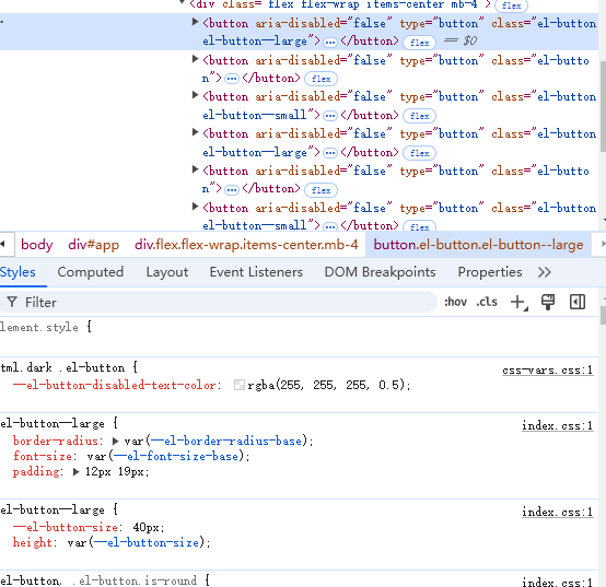
.....

@include b(button) {

  .....
  @each $size in(large, small) {
    @include m($size) {
  @include set-css-var-value(
    ('button', 'size'),
  map.get($input-height, $size)
    );

  height: getCssVar('button', 'size');

  & [class*='#{namespace}-icon'] {
    & + span {
      margin-left: map.get($button-icon-span-gap, $size);
    }
  }

  & {
    @include button-size(
      map.get($button-padding-vertical, $size) - $button-border-width,
      map.get($button-padding-horizontal, $size) - $button-border-width,
      map.get($button-font-size, $size),
      map.get($button-border-radius, $size)
    );
  }

  @include when(circle) {
    width: getCssVar('button', 'size');
    padding: map.get($button-padding-vertical, $size) - $button-border-width;
  }
}
}

}
6.自定义button原生属性和两个字插入空格
6.1 定义props
import { buildProps, definePropType, iconPropType } from '@fz-mini/utils'
import type { Component, ExtractPropTypes } from 'vue'
export const buttonTypes = [
  'default',
  'primary',
  'success',
  'warning',
  'danger',
  'info',
  '',
] as const
export const buttonNativeTypes = ['button', 'submit', 'reset'] as const
export const buttonProps = buildProps({

  /**
   * @description native button type
   */
  nativeType: {
    type: String,
    values: buttonNativeTypes,
    default: 'button',
  },
  /**
   * @description automatically insert a space between two Chinese characters
   */
  autoInsertSpace: {
    type: Boolean,
    default: undefined,
  },
})


export type ButtonProps = ExtractPropTypes<typeof buttonProps>
export type ButtonEmits = typeof buttonEmits

export type ButtonType = ButtonProps['type']
export type ButtonNativeTypes = ButtonProps['nativeType']
6.2 实现 template和样式
import { type SetupContext, computed, inject, ref, useSlots } from 'vue'
import { buttonGroupContextKey } from './constants'
import type { ButtonEmits, ButtonProps } from './button'

export const useButton = (
  props: ButtonProps,
  emits: SetupContext<ButtonEmits>['emit']
) => {
  const slots = useSlots()

  const _type = computed(() => props.type || '')
  const _size = computed(() => props.size || '')
  const _disabled = computed(() => props.disabled || false)
  const autoInsertSpace = computed(() => props.autoInsertSpace ?? false)
  const _ref = ref<HTMLButtonElement>()

  const _props = computed(() => {
    if (props.tag === 'button') {
      return {
        ariaDisabled: _disabled.value,
        disabled: _disabled.value,
        type: props.nativeType,
        autofocus: props.autofocus,
      }
    }
    return {}
  })
  //判断是否位两个汉字,有则且需要隔开两个汉字之间的距离
  const shouldAddSpace = computed(() => {
    const defaultSlot = slots.default?.()
    if (autoInsertSpace.value && defaultSlot?.length === 1) {
      const slot = defaultSlot[0]
      if (slot.type === 'text') {
        const text = slot.children as string
        return /^\p{Unified_Ideograph}{2}$/u.test(text.trim())
      }
    }
    return false
  })

  const handleClick = (evt: MouseEvent) => {
    if (_disabled.value || props.loading) {
      evt.stopPropagation()
    }
    emits('click', evt)
  }
  return {
    _type,
    _size,
    _disabled,
    _ref,
    _props,
    shouldAddSpace,
    handleClick,
  }
}


<template>
  <component
    :is="tag"
    v-bind="_props"
    ref="_ref"
    :class="buttonKls"
    :style="buttonStyle"
    @click="handleClick"
  >
    ....
    <span
      v-if="$slots.default"
      :class="{ [ns.em('text', 'expand')]: shouldAddSpace }"
    >
      <slot />
    </span>
  </component>
</template>
<script lang="ts" setup>
import { computed } from 'vue'
import { FzIcon } from '@fz-mini/components/icon'
import { useNamespace } from '@fz-mini/hooks'
import { buttonEmits, buttonProps } from './button'
import { useButton } from './use-button'
import { useButtonCustomStyle } from './button-custom'

defineOptions({ name: 'FzButton' })
const props = defineProps(buttonProps)
const emits = defineEmits(buttonEmits)

const ns = useNamespace('button')
const { _type, _size, _disabled, _ref, _props, shouldAddSpace, handleClick } =
  useButton(props, emits)


const buttonKls = computed(() => [
  ns.b(),
  ns.m(_type.value),
  ns.m(_size.value),
  ns.is('disabled', _disabled.value),
  ns.is('plain', props.plain),
  ns.is('loading', props.loading),
  ns.is('round', props.round),
  ns.is('circle', props.circle),
  ns.is('text', props.text),
  ns.is('link', props.link),
  ns.is('has-bg', props.bg),
])

defineExpose({
  /** @description button html element */
  ref: _ref,
  /** @description button size */
  size: _size,
  /** @description button type */
  type: _type,
  /** @description button disabled */
  disabled: _disabled,
  /** @description whether adding space */
  shouldAddSpace,
})
</script>

.....

@include b(button) {

  .....
  @include e(text) {
    @include m(expand) {
      letter-spacing: 0.3em;
      margin-right: -0.3em;
    }
  }

}
7.实现自定义按钮颜色
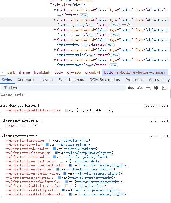
Element Plus 主要是通过利用 **TinyColor**来实现动态生成不同的颜色,可以生成开发者传来的 **color**不同深浅的颜色。主要样式通过更改 **css** 变量名的值来实现效果。这个功能需要着重考虑的就是有无 **plain**的样式和禁用状态的样式。
import { buildProps, definePropType, iconPropType } from '@fz-mini/utils'
import type { Component, ExtractPropTypes } from 'vue'
export const buttonTypes = [
  'default',
  'primary',
  'success',
  'warning',
  'danger',
  'info',
  '',
] as const
export const buttonNativeTypes = ['button', 'submit', 'reset'] as const
export const buttonProps = buildProps({
    /**
   * @description custom button color ,automatically calculate `hover` and `active` color
   */
  color: String,
})


export type ButtonProps = ExtractPropTypes<typeof buttonProps>
export type ButtonEmits = typeof buttonEmits

export type ButtonType = ButtonProps['type']
export type ButtonNativeTypes = ButtonProps['nativeType']
创建一个文件来单独实现动态计算自定义颜色。
import { computed } from 'vue' // 导入 Vue 中的 computed,用于创建计算属性
import { TinyColor } from '@ctrl//tinycolor' // 导入 TinyColor 库,用于操作和处理颜色
import { useNamespace } from '@fz-mini/hooks' // 导入 useNamespace,用于生成独特的命名空间
import type { ButtonProps } from './button' // 导入 ButtonProps 类型,用于定义按钮组件的属性

// darken 函数:根据给定的颜色和混合度,生成一个更暗的颜色
export function darken(color: TinyColor, amount = 20) {
  return color.mix('#141414', amount).toString() // 将传入颜色与 #141414(深色)混合 amount 比例,得到一个更暗的颜色
}

// useButtonCustomStyle 函数:为按钮组件生成自定义样式
export function useButtonCustomStyle(props: ButtonProps) {
  // 计算按钮是否处于禁用状态,默认值为 false
  const _disabled = computed(() => props.disabled || false)

  // 使用 useNamespace 生成唯一的命名空间前缀,避免样式冲突
  const ns = useNamespace('button')

  // 返回一个计算属性,动态生成按钮的样式对象
  return computed(() => {
    let styles: Record<string, string> = {} // 存储按钮的自定义样式

    // 获取按钮的颜色,如果传入的颜色是 CSS 变量,则解析出实际颜色值
    let buttonColor = props.color

    if (buttonColor) {
      // 如果颜色是一个 CSS 变量(形如 var(--variable-name)),则从样式表中获取其值
      const match = (buttonColor as string).match(/var\((.*?)\)/)
      if (match) {
        buttonColor = window
          .getComputedStyle(window.document.documentElement) // 获取根元素的样式
          .getPropertyValue(match[1]) // 提取并返回 CSS 变量的实际值
      }

      // 创建 TinyColor 实例以便于后续对颜色进行操作
      const color = new TinyColor(buttonColor)

      // 计算按钮激活状态时的背景色,暗化颜色
      const activeBgColor = darken(color, 20)

      // 如果按钮是 "plain" 类型(即浅色按钮)
      if (props.plain) {
        // 使用命名空间生成各种样式的 CSS 变量(如背景色、文本色、边框色等)
        styles = ns.cssVarBlock({
          'bg-color': color.tint(90).toString(), // 背景色为颜色的浅色版本
          'text-color': buttonColor, // 文本颜色为原始颜色
          'border-color': color.tint(50).toString(), // 边框色为颜色的中等浅色版本
          'hover-text-color': `var(${ns.cssVarName('color-white')})`, // 悬停时文本颜色为白色
          'hover-bg-color': buttonColor, // 悬停时背景色为原始颜色
          'hover-border-color': activeBgColor, // 悬停时边框色为暗化后的背景色
          'active-bg-color': activeBgColor, // 激活时背景色为暗化后的背景色
          'active-text-color': `var(${ns.cssVarName('color-white')})`, // 激活时文本颜色为白色
          'active-border-color': activeBgColor, // 激活时边框色为暗化后的背景色
        })

        // 如果按钮是禁用状态,则调整禁用状态下的样式
        if (_disabled.value) {
          styles[ns.cssVarBlockName('disabled-text-color')] = color
            .tint(50) // 禁用状态下文本颜色为颜色的浅色版本
            .toString()
          styles[ns.cssVarBlockName('disabled-bg-color')] = color
            .tint(90) // 禁用状态下背景色为颜色的更浅版本
            .toString()
          styles[ns.cssVarBlockName('disabled-border-color')] = color
            .tint(80) // 禁用状态下边框色为颜色的浅色版本
            .toString()
        }
      } else {
        // 对于非 "plain" 类型按钮(普通按钮)
        const hoverBgColor = color.tint(30).toString() // 悬停时背景色为颜色的浅色版本
        // 如果颜色较暗,文本颜色为白色;如果颜色较亮,文本颜色为黑色
        const textColor = color.isDark()
          ? `var(${ns.cssVarName('color-white')})` // 深色背景时,文本为白色
          : `var(${ns.cssVarName('color-black')})` // 浅色背景时,文本为黑色

        // 使用命名空间生成非 "plain" 按钮的样式
        styles = ns.cssVarBlock({
          'bg-color': buttonColor, // 背景色为原始颜色
          'text-color': textColor, // 文本颜色根据背景色判断
          'border-color': buttonColor, // 边框色为原始颜色
          'hover-bg-color': hoverBgColor, // 悬停时背景色为浅色版本
          'hover-text-color': textColor, // 悬停时文本颜色根据背景色判断
          'hover-border-color': hoverBgColor, // 悬停时边框色为浅色版本
          'active-bg-color': activeBgColor, // 激活时背景色为暗化后的颜色
          'active-border-color': activeBgColor, // 激活时边框色为暗化后的颜色
        })

        // 如果按钮是禁用状态,则调整禁用状态下的样式
        if (_disabled.value) {
          const disabledButtonColor = color.tint(50).toString() // 禁用状态下按钮颜色为浅色版本
          // 禁用状态下文本颜色为白色,背景色为禁用按钮颜色
          styles[ns.cssVarBlockName('disabled-bg-color')] = styles[
            ns.cssVarBlockName('disabled-text-color')
          ] = `var(${ns.cssVarName('color-white')})`

          // 禁用状态下边框色为禁用按钮的浅色版本
          styles[ns.cssVarBlockName('disabled-border-color')] =
            disabledButtonColor
        }
      }
    }

    // 返回计算出的按钮样式对象
    return styles
  })
}


<template>
  <component
    :is="tag"
    v-bind="_props"
    ref="_ref"
    :class="buttonKls"
    :style="buttonStyle"
    @click="handleClick"
  >
    .....
  </component>
</template>
<script lang="ts" setup>

import { buttonEmits, buttonProps } from './button'

import { useButtonCustomStyle } from './button-custom'

defineOptions({ name: 'FzButton' })
const props = defineProps(buttonProps)

const buttonStyle = useButtonCustomStyle(props)
....
</script>
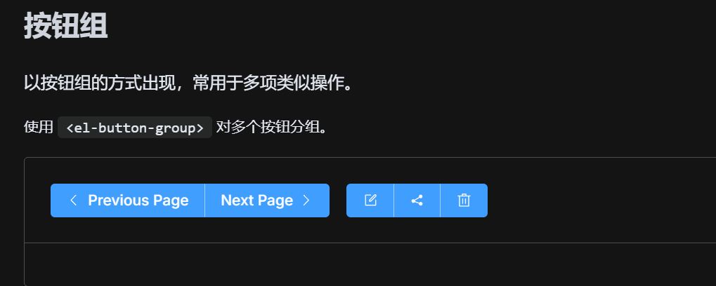
三)、button-group 具体实现
Element Plus 组件库这个按钮组功能比较简单,样式也比较单一。如果你想要在多添加一点功能,你相信你看完这篇文章应该也能开发一点独立的功能了。Element Plus 中按钮组的主要功能是控制多个按钮的大小和类型。
根据它的功能让我们来定义一下它需要传的 props 值。因为它的功能比较少,就直接在packages\components\button\src 目录下创建 button-group.ts 文件。
import { buttonProps } from './button'
import type { ExtractPropTypes } from 'vue'

export const buttonGropProps = {
  /**
   * @description control the size of buttons in this button-group
   */
  size: buttonProps.size,
  /**
   * @description control the type of buttons in this button-group
   */
  type: buttonProps.type,
} as const

export type ButtonGroupProps = ExtractPropTypes<typeof buttonGropProps>
因为需要通过 button-group 的 size和 type 来控制 button 所以需要进行组件之间的通信,我们采用 provide 、inject 的方式来传值。并实现按钮组的模板,因为它和button有关联所以我们需要有关 type 和 size 的逻辑需要添加上。
<template>
  <div :class="ns.b('group')" />
</template>
<script lang="ts" setup>
import { provide, reactive, toRef } from 'vue'
import { useNamespace } from '@fz-mini/hooks'
import { buttonGropProps } from './button-group'
import { buttonGroupContextKey } from './constants'

const ns = useNamespace('button')
const props = defineProps(buttonGropProps)

provide(
  buttonGroupContextKey,
  reactive({
    size: toRef(props.size),
    type: toRef(props.type),
  })
)
</script>


import { type SetupContext, computed, inject, ref, useSlots } from 'vue'
import { buttonGroupContextKey } from './constants'
import type { ButtonEmits, ButtonProps } from './button'

export const useButton = (
  props: ButtonProps,
  emits: SetupContext<ButtonEmits>['emit']
) => {
  const slots = useSlots()

  const buttonGroupContext = inject(buttonGroupContextKey, undefined)
  const _type = computed(() => props.type || buttonGroupContext?.type || '')
  const _size = computed(() => props.size || buttonGroupContext?.size || '')


  ....

}
最后我们来实现一下按钮组样式。
@use 'sass:map';

@use 'common/var' as *;
@use 'mixins/utils' as *;
@use 'mixins/mixins' as *;

@include b(button-group) {
  display: inline-block;
  vertical-align: middle;
  @include utils-clearfix;

  & > .#{$namespace}-button {
    float: left;
    position: relative;
    & + #{namespace}-button {
      margin-left: 0;
    }
    &:first-child {
      border-top-right-radius: 0;
      border-bottom-right-radius: 0;
    }
    &:last-child {
      border-top-left-radius: 0;
      border-top-right-radius: 0;
    }
    //只有一个 button 时的按钮样式
    &:first-child:last-child {
      border-top-left-radius: map.get($button-border-radius, 'default');
      border-bottom-left-radius: map.get($button-border-radius, 'default');
      border-top-right-radius: map.get($button-border-radius, 'default');
      border-bottom-right-radius: map.get($button-border-radius, 'default');

      &.is-round {
        border-radius: getCssVar('border-radius', 'round');
      }

      &.is-circle {
        border-radius: 50%;
      }
    }
    &:not(:first-child):not(:last-child) {
      border-radius: 0;
    }
    &:not(:last-child) {
      margin-right: -1px;
    }

    &:hover,
    &:focus,
    &:active {
      z-index: 1;
    }

    @include when(active) {
      z-index: 1;
    }
  }
}

@each $type in (primary, success, danger, warning, info) {
  .#{namespace}-button-#{$type} {
    &:first-child {
      border-right-color: getCssVar('button', 'divide-border-color');
    }
    &:last-child {
      border-left-color: getCssVar('button', 'divide-border-color');
    }
    &:not(:first-child):not(:last-child) {
      border-left-color: getCssVar('button', 'divide-border-color');
      border-right-color: getCssVar('button', 'divide-border-color');
    }
  }
}
三、配置安装组件
**在设计组件库时,我们希望我们每个组件都可以进行全局导入使用,也能够单独的按需使用而且在使用的时候能够获取到组件上的实例。**而在 Vue 全局使用我们可以通过 app.use()来注册这个组件,那我们可以将它封装成一个插件的形式。
import { NOOP } from '../functions'
import type { SFCWithInstall } from './typescript'
import type { App } from 'vue'

export const withInstall = <T, E extends Record<string, any>>(
  main: T,
  extra?: E
) => {
  ;(main as SFCWithInstall<T>).install = (app: App): void => {
    for (const comp of [main, ...Object.values(extra ?? {})]) {
      app.component(comp.name, comp)
    }
  }
  if (extra) {
    for (const [key, comp] of Object.values(extra)) {
      ;(main as any)[key] = comp
    }
  }
  return main as SFCWithInstall<T> & E
}

export const withNoopInstall = <T>(component: T) => {
  ;(component as SFCWithInstall<T>).install = NOOP
  return component as SFCWithInstall<T>
}
withInstall 功能实现:为主组件 main 添加 install 方法,用于全局注册组件到 Vue 应用中。如果有 extra,则将 extra 中的组件也挂载到主组件上,方便通过 main[extraKey] 的方式访问子组件。返回一个增强后的组件对象,包含主组件和子组件。
app.component(comp.name, comp):注册组件到 Vue 应用。Object.entries(extra):将额外的组件挂载到主组件上,使得可以通过FzButton.ButtonGroup的形式访问子组件。
withNoopInstallinstall 方法为空操作(NOOP)。主要用于按需加载的子组件,例如 ButtonGroup。
封装好注册安装函数,那我们在 packages\components\button\index.ts 文件下安装这两个组件和导出组件相关的函数和资源。
import { withInstall, withNoopInstall } from '@fz-mini/utils'
import Button from './src/button.vue'
import ButtonGroup from './src/button-group.vue'
import type { SFCWithInstall } from '@fz-mini/utils'

export const FzButton: SFCWithInstall<typeof Button> & {
  ButtonGroup: typeof ButtonGroup
} = withInstall(Button, {
  ButtonGroup,
})

export const FzButtonGroup: SFCWithInstall<typeof ButtonGroup> =
  withNoopInstall(ButtonGroup)
export default FzButton

export * from './src/button'
export * from './src/constants'

export type { ButtonInstance, ButtonGroupInstance } from './src/instance'
用户希望全局注册 Button 和 ButtonGroup 组件,代码如下:
// main.ts
import { createApp } from 'vue'
import App from './App.vue'
import { FzButton } from '@fz-mini/ui'

const app = createApp(App)
app.use(FzButton) // 注册 FzButton 和 FzButton.ButtonGroup
app.mount('#app')
Button 和 ButtonGroup 组件会被全局注册,用户可以在模板中直接使用。
用户希望仅引入 ButtonGroup,代码如下:
// main.ts
import { createApp } from 'vue'
import App from './App.vue'
import { FzButtonGroup } from '@fz-miniui'

const app = createApp(App)
// 不需要 app.use(FzButtonGroup),可以直接在组件中按需使用
app.mount('#app')
用户只需要引入 FzButtonGroup,而不影响 Button 组件。
开发者也可以根据暴露出去的实例访问到组件的实例上的方法和属性。
四、总结
本篇详细的介绍了一个组件从设计到实现的全部流程,相信你看完这一篇文章应该能看懂绝大多数的组件结构。码字不易希望各位多多支持,你们的支持才是我前进的动力。
- button 组件的实现
- button-group 组件的实现
组件的所有源码都在这个仓库里github.com/5fyt/fz-min…。
