设计初衷:因为这个vant 的popup 不会基础内容 然后 每次都要写 title 和 底部的样式 所以 直接传入title 和 #footer插槽 让布局较为固定 方便后端直接复制
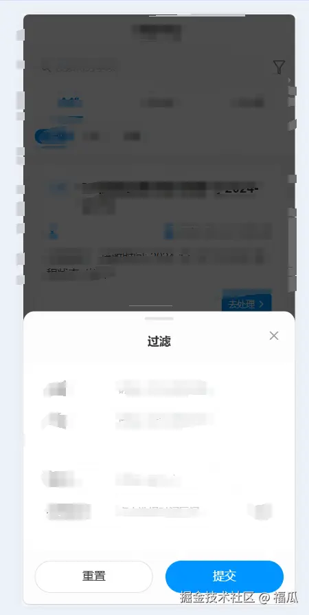
底部弹出效果展示
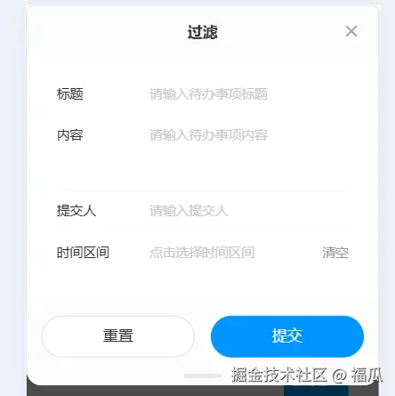
顶部弹出效果展示
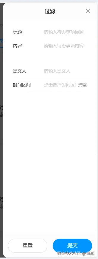
左侧弹出效果展示
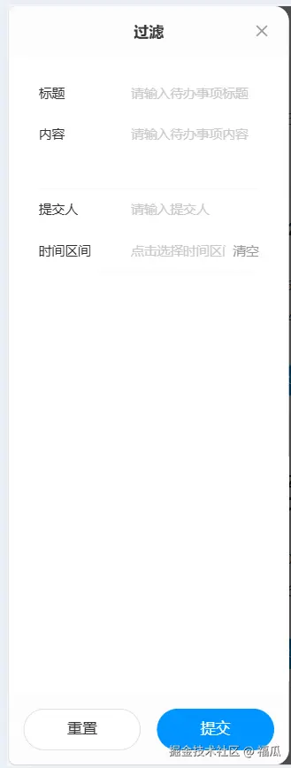
右侧弹出效果展示
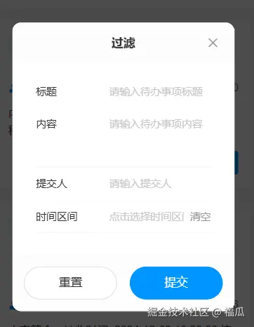
中间弹出效果展示
使用方式 1.创建一个 你喜欢的组件名字 xxx.vue
  <van-popup
    v-model:show="show"
    :position="position"
    :style="popupStyle"
    :class="['enhanced-popup', `enhanced-popup--${position}`]"
    :close-on-click-overlay="closeOnClickOverlay"
    @click-overlay="handleOverlayClick"
  >
    <!-- 弹窗主体内容 -->
    <div class="popup-container">
      <!-- 顶部标题栏 -->
      <div
        v-if="title || $slots.title"
        class="popup-header"
        :class="{ 'popup-header-bottom': position === 'bottom' }"
      >
        <slot name="title">
          <div class="title">{{ title }}</div>
        </slot>
        <van-icon name="cross" class="close-icon" @click="handleClose" />
      </div>

      <!-- 内容区域 -->
      <div class="popup-content">
        <slot />
      </div>

      <!-- 底部区域 -->
      <div
        v-if="$slots.footer"
        class="popup-footer"
        :class="{
          'popup-footer-top': position === 'top'
        }"
      >
        <slot name="footer" />
      </div>

      <!-- 底部拖动条 -->
      <div v-if="['bottom', 'top'].includes(position)" class="drag-handle" />
    </div>
  </van-popup>
</template>

<script setup>
import { computed } from "vue";

/**
 * 组件的 props 定义
 */
const props = defineProps({
  /**
   * 控制弹窗显示
   * @type {Boolean}
   * @default false
   */
  modelValue: {
    type: Boolean,
    default: false
  },
  /**
   * 弹窗位置:top/right/bottom/left/center
   * @type {String}
   * @default "center"
   * @validator value => ["top", "right", "bottom", "left", "center"].includes(value)
   */
  position: {
    type: String,
    default: "center",
    validator: value =>
      ["top", "right", "bottom", "left", "center"].includes(value)
  },
  /**
   * 弹窗标题
   * @type {String}
   * @default ""
   */
  title: {
    type: String,
    default: ""
  },
  /**
   * 点击遮罩是否关闭
   * @type {Boolean}
   * @default true
   */
  closeOnClickOverlay: {
    type: Boolean,
    default: true
  },
  /**
   * 自定义宽度
   * @type {String|Number}
   * @default ""
   */
  width: {
    type: [String, Number],
    default: ""
  },
  /**
   * 自定义高度
   * @type {String|Number}
   * @default ""
   */
  height: {
    type: [String, Number],
    default: ""
  }
});

const emit = defineEmits(["update:modelValue", "close"]);

// 控制显示状态
const show = computed({
  get: () => props.modelValue,
  set: val => emit("update:modelValue", val)
});

// 计算弹窗样式
const popupStyle = computed(() => {
  const style = {};

  // 根据不同位置设置样式
  switch (props.position) {
    case "left":
    case "right":
      style.height = props.height || "100%";
      style.width = props.width || "80%";
      break;
    case "top":
    case "bottom":
      style.width = "100%";
      style.height = props.height || "";
      style.maxHeight = "80%";
      break;
    default: // center
      style.width = props.width || "80%";
      style.height = props.height || "";
      style.maxWidth = "420px";
      break;
  }

  return style;
});

// 关闭弹窗
const handleClose = () => {
  show.value = false;
  emit("close");
};

// 点击遮罩处理
const handleOverlayClick = () => {
  if (props.closeOnClickOverlay) {
    handleClose();
  }
};
</script>

<style lang="less" scoped>
.enhanced-popup {
  // 不同位置的弹窗基础样式
  &--center {
    border-radius: 12px;
  }

  &--top {
    border-radius: 0 0 16px 16px;
  }

  &--bottom {
    border-radius: 16px 16px 0 0;
  }

  &--left {
    border-radius: 0 16px 16px 0;
  }

  &--right {
    border-radius: 16px 0 0 16px;
  }
}

.popup-container {
  display: flex;
  flex-direction: column;
  width: 100%;
  height: 100%;
  background: #fff;
  position: relative;
}

.popup-header {
  position: relative;
  padding: 16px 48px;
  // border-bottom: 1px solid rgb(245, 245, 245);
  background-color: rgba(245, 245, 245, 0.3);

  .title {
    font-size: 16px;
    font-weight: 600;
    color: #333;
    text-align: center;
    line-height: 24px;
  }

  .close-icon {
    position: absolute;
    right: 12px;
    top: 50%;
    transform: translateY(-50%);
    padding: 8px;
    font-size: 18px;
    color: #999;
    cursor: pointer;

    &:active {
      color: #666;
    }
  }
}
.popup-header-bottom {
  padding-top: 30px;
}

.popup-content {
  flex: 1;
  overflow-y: auto;
  padding: 16px;

  // 自定义滚动条样式
  &::-webkit-scrollbar {
    width: 4px;
  }

  &::-webkit-scrollbar-thumb {
    background: #e8e8e8;
    border-radius: 2px;
  }

  &::-webkit-scrollbar-track {
    background: transparent;
  }
}

.popup-footer {
  padding: 16px;
  // border-top: 1px solid #f5f5f5;
  background-color: rgba(245, 245, 245, 0.3);

  // 底部按钮样式
  :deep(.van-button) {
    height: 44px;
    font-size: 16px;

    &--primary {
      background: #0094ff;
      border-color: #0094ff;

      &:active {
        background: darken(#0094ff, 10%);
        border-color: darken(#0094ff, 10%);
      }
    }
  }
}
.popup-footer-top {
  padding-bottom: 30px;
}

// 底部拖动条样式
.drag-handle {
  position: absolute;
  left: 50%;
  transform: translateX(-50%);
  width: 40px;
  height: 4px;
  background: #e8e8e8;
  border-radius: 2px;

  // 顶部弹窗时在底部
  .enhanced-popup--top & {
    bottom: 8px;
  }

  // 底部弹窗时在顶部
  .enhanced-popup--bottom & {
    top: 8px;
  }
}

// 动画相关样式
.van-popup-slide-top-enter-active,
.van-popup-slide-top-leave-active,
.van-popup-slide-bottom-enter-active,
.van-popup-slide-bottom-leave-active,
.van-popup-slide-left-enter-active,
.van-popup-slide-left-leave-active,
.van-popup-slide-right-enter-active,
.van-popup-slide-right-leave-active {
  transition: all 0.3s cubic-bezier(0.4, 0, 0.2, 1);
}

.van-popup-fade-enter-active,
.van-popup-fade-leave-active {
  transition: opacity 0.3s ease;
}
</style>
使用方式 2.使用示例 注意一下导入的组件的名字就可以了
<template>
  <div>
    <van-button @click="showPopup1 = true">打开中弹框</van-button>
    <van-button @click="showPopup2 = true">打开左弹框</van-button>
    <van-button @click="showPopup3 = true">打开右弹框</van-button>
    <van-button @click="showPopup4 = true">打开下弹框</van-button>
    <van-button @click="showPopup5 = true">打开上弹框</van-button>
    <QjyyPopup
      v-model="showPopup1"
      position="center"
      title="登录"
      subtitle="个人中心"
    >
      <p>This is the content of the popup.</p>
      <template #footer>
        <van-button plain>Cancel</van-button>
        <van-button type="primary">Confirm</van-button>
      </template>
    </QjyyPopup>
    <QjyyPopup
      v-model="showPopup2"
      position="left"
      title="登录"
      subtitle="个人中心"
    >
      <p>This is the content of the popup.</p>
      <template #footer>
        <van-button plain>Cancel</van-button>
        <van-button type="primary">Confirm</van-button>
      </template>
    </QjyyPopup>
    <QjyyPopup
      v-model="showPopup3"
      position="right"
      title="登录"
      subtitle="个人中心"
    >
      <p>This is the content of the popup.</p>
      <template #footer>
        <van-button plain>Cancel</van-button>
        <van-button type="primary">Confirm</van-button>
      </template>
    </QjyyPopup>
    <QjyyPopup
      v-model="showPopup4"
      position="bottom"
      title="登录"
      subtitle="个人中心"
    >
      <p>This is the content of the popup.</p>
      <template #footer>
        <van-button plain>Cancel</van-button>
        <van-button type="primary">Confirm</van-button>
      </template>
    </QjyyPopup>
    <QjyyPopup
      v-model="showPopup5"
      position="top"
      title="登录"
      subtitle="个人中心"
    >
      <p>This is the content of the popup.</p>
      <template #footer>
        <div class="flex justify-around gap-8">
          <van-button class="flex-1" plain>Cancel</van-button>
          <van-button class="flex-1" type="primary">Confirm</van-button>
        </div>
      </template>
    </QjyyPopup>
  </div>
</template>

<script setup>
import QjyyPopup from "@/components/QjyyPopup/index.vue";
import { ref } from "vue";

const showPopup1 = ref(false);
const showPopup2 = ref(false);
const showPopup3 = ref(false);
const showPopup4 = ref(false);
const showPopup5 = ref(false);
const onOverlayClick = () => {
  console.log("点击了遮罩");
};
</script>


