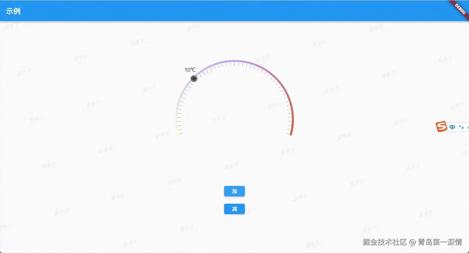
效果如上图
ArcProgressPainter
import 'dart:math' as math;
import 'package:flutter/material.dart';

class ArcProgressPainter extends CustomPainter {
  final double progress;
  final Color backgroundColor;
  final double strokeWidth;
  // final TextStyle textStyle;
  final ui.Image sliderImage;
  final double minValue; // 最小值
  final double maxValue; // 最大值

  ArcProgressPainter({
    required this.progress,
    required this.backgroundColor,
    required this.strokeWidth,
    // required this.textStyle,
    required this.sliderImage,
    this.minValue = 0.0, // 默认最小值为 0
    this.maxValue = 35.0, // 默认最大值为 100
  });

  @override
  void paint(Canvas canvas, Size size) {
    // 限制进度值
    double clampedProgress = progress.clamp(minValue, maxValue);

    final gradientColors = [
      const Color(0xFFFFFFD9),
      const Color(0x77B798FC),
      const Color(0xF9D75E2A),
    ];

    Offset center = Offset(size.width / 2, size.height / 2);
    double radius = math.min(size.width / 2, size.height / 2);

    Rect rect = Rect.fromCircle(center: center, radius: radius).inflate(-strokeWidth / 2);

    double degreesToRadians(num deg) => deg * (math.pi / 180.0);
    double startAngle = degreesToRadians(90 + 75); // 起始角度
    double sweepAngle = degreesToRadians(360 - 150); // 圆弧扫过的角度

    // 绘制圆弧
    for (double i = 0; i < sweepAngle; i += 0.01) {
      double angle = startAngle + i;
      double colorPosition = i / sweepAngle;
      Color color = _calculateGradientColor(gradientColors, colorPosition);

      Paint segmentPaint = Paint()
        ..color = color
        ..strokeWidth = strokeWidth
        ..strokeCap = StrokeCap.round
        ..style = PaintingStyle.stroke;

      canvas.drawArc(
        rect,
        angle,
        0.01, // 绘制小段的角度
        false,
        segmentPaint,
      );
    }

    // 绘制刻度
    int tickCount = 50; // 刻度数量
    double tickSpacing = sweepAngle / tickCount; // 每个刻度之间的间隔
    for (int i = 0; i <= tickCount; i++) {
      double angle = startAngle + i * tickSpacing;
      double tickX = center.dx + (radius - strokeWidth) * math.cos(angle);
      double tickY = center.dy + (radius - strokeWidth) * math.sin(angle);

      // 绘制刻度
      Paint tickPaint = Paint()
        ..color = Colors.grey
        ..style = PaintingStyle.fill;

      // 在每个刻度位置绘制短线或点
      double tickLength = -10; // 刻度的长度
      canvas.drawLine(
        Offset(tickX, tickY),
        Offset(tickX + tickLength * math.cos(angle), tickY + tickLength * math.sin(angle)),
        tickPaint,
      );
    }

    // 计算滑块位置
    double progressAngle = startAngle + ((clampedProgress - minValue) / (maxValue - minValue)) * sweepAngle;

    // 计算滑块的位置
    Offset sliderPosition = Offset(
      center.dx + (radius - strokeWidth) * math.cos(progressAngle),
      center.dy + (radius - strokeWidth) * math.sin(progressAngle),
    );

    // 绘制滑块
    double sliderSize = 10.0; // 滑块的大小
    final imageWidth = sliderImage.width.toDouble();
    final imageHeight = sliderImage.height.toDouble();
    final imageRect = Rect.fromCircle(center: sliderPosition, radius: sliderSize);

    // 使用 canvas.drawImageRect 绘制滑块图片
    canvas.drawImageRect(
      sliderImage, // 使用 ui.Image
      Rect.fromLTWH(0, 0, imageWidth, imageHeight), // 图片的源区域
      imageRect, // 目标区域
      Paint(),
    );

    // 绘制进度值文字
    String progressText = "${clampedProgress.toStringAsFixed(0)}℃"; // 显示进度值
    TextSpan span = TextSpan(
      style: const TextStyle(fontSize: 15, color: Colors.black),
      text: progressText,
    );
    TextPainter textPainter = TextPainter(
      text: span,
      textAlign: TextAlign.center,
      textDirection: TextDirection.ltr,
    );
    textPainter.layout();
    Offset textOffset = Offset(
      sliderPosition.dx - textPainter.width / 2 - 10,
      sliderPosition.dy - sliderSize - textPainter.height - 5, // 滑块上方位置
    );
    textPainter.paint(canvas, textOffset);
  }

  // 计算渐变颜色
  Color _calculateGradientColor(List<Color> colors, double position) {
    int index = (position * (colors.length - 1)).floor();
    double localPosition = (position * (colors.length - 1)) - index;
    return Color.lerp(colors[index], colors[index + 1], localPosition) ?? colors.last;
  }

  @override
  bool shouldRepaint(covariant CustomPainter oldDelegate) => true;
}
ArcProgressBar
1.这个是重点
// 加载图片并转换为 ui.Image
Future loadImage(String path) async {
// 加载资源文件
final data = await rootBundle.load(path)
// 把资源文件转换成Uint8List类型
final bytes = data.buffer.asUint8List()
// 解析Uint8List类型的数据图片
final image = await decodeImageFromList(bytes)
_sliderImage = image
setState(() {})
}
import 'package:flutter/material.dart';
import 'dart:ui' as ui;
import 'package:flutter/services.dart';
import 'arc_progress_painter .dart';
class ArcProgressBar extends StatefulWidget {
final double progress;
const ArcProgressBar({super.key, required this.progress});
@override
_ArcProgressBarState createState() => _ArcProgressBarState();
}
class _ArcProgressBarState extends State<ArcProgressBar> {
ui.Image? _sliderImage;
@override
void initState() {
super.initState();
loadImage("images/bgi (8).webp");
}
Future loadImage(String path) async {
final data = await rootBundle.load(path);
final bytes = data.buffer.asUint8List();
final image = await decodeImageFromList(bytes);
_sliderImage = image;
setState(() {});
}
@override
Widget build(BuildContext context) {
return _sliderImage == null
? const Center(child: CircularProgressIndicator())
: CustomPaint(
size: const Size(450, 320),
painter: ArcProgressPainter(
progress: widget.progress,
backgroundColor: Colors.grey,
strokeWidth: 5.0,
sliderImage: _sliderImage!,
),
);
}
}


