前言:
日常开发中如果需要接收用户输入,就可以使用输入组件来完成
TextInput:单行输入框
常用参数:
常用属性:
| 名称 | 参数类型 | 描述 |
|---|
| type | InputType | 设置输入框类型。默认值:InputType.Normal |
| showUnderline | boolean | 设置是否开启下划线。下划线默认颜色为'#33182431',默认粗细为1px,文本框尺寸48vp(下划线只支持InputType.Normal类型)。默认值:false |
| passwordIcon | PasswordIcon | onIconSrc:输入状态时图标offIconSrc:隐藏状态时图标 |
| placeholderColor | ResourceColor | 设置placeholder文本颜色。默认值跟随主题。 |
常用枚举:
| 名称 | 描述 |
|---|
| Normal | 基本输入模式。 可输入数字、字母、下划线、空格、特殊字符。 |
| Password | 密码输入模式。支持输入数字、字母、下划线、空格、特殊字符。密码显示小眼睛图标并且默认会将文字变成圆点。密码输入模式不支持下划线样式。在已启用密码保险箱的情况下,支持用户名、密码的自动保存和自动填充。 |
| Email | 邮箱地址输入模式。支持数字,字母,下划线,.字符,以及@字符(只能存在一个@字符)。 |
| Number | 纯数字输入模式。 |
@Entry
@Component
struct Page01_TextInput {
@State username:string =''
@State password:string =''
build() {
Column(){
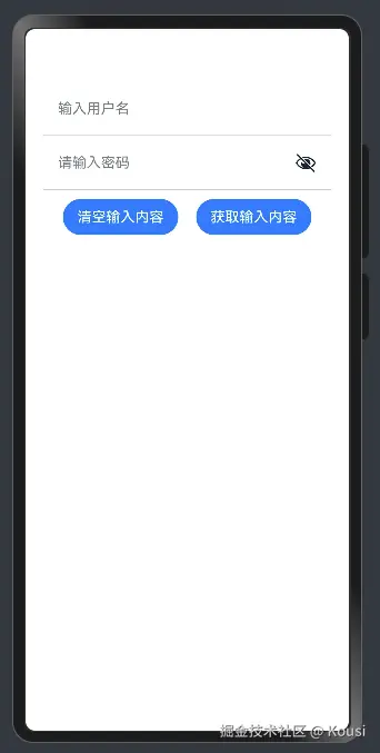
TextInput({placeholder:'输入用户名',text:$$this.username})
.type(InputType.Normal)
.backgroundColor(Color.Transparent)
.borderRadius(0)
.height(60)
.border({
width:{bottom:1}
,color:'#ccc'
})
TextInput({placeholder:'请输入密码',text:$$this.password})
.type(InputType.Password)
.height(60)
.backgroundColor(Color.Transparent)
.borderRadius(0)
.border({
width:{bottom:1}
,color:'#ccc'
})
Row({space:20}){
Button('清空输入内容')
.onClick(()=>{
this.username=''
this.password=''
})
Button('获取输入内容')
.onClick(()=>{
AlertDialog.show({
message:`用户名:${this.username},密码:${this.password}`
})
})
}
.margin({top:10})
}
.padding(20)
}
}


