前言:
Swiper组件提供滑动轮播显示的能力。Swiper本身是一个容器组件,当设置了多个子组件后,可以对这些子组件进行轮播显示
基础使用:
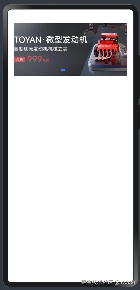
- 轮播内容:内容作为Swiper的子组件即可
- 尺寸:设置 Swiper 的尺寸:内容会拉伸为和 Swiper 一致(优先级高)、设置内容尺寸:会将Swiper撑开
@Entry
@Component
struct Index {
  build() {
    Column(){
      Swiper(){
        Image('/images/ic_swiper_xmyp01.jpeg')
        Image('/images/ic_swiper_xmyp02.jpeg')
        Image('/images/ic_swiper_xmyp03.jpeg')
        Image('/images/ic_swiper_xmyp04.jpeg')
      }
      .width(325)
      .height(150)

    }
    .width('100%')
  }
}
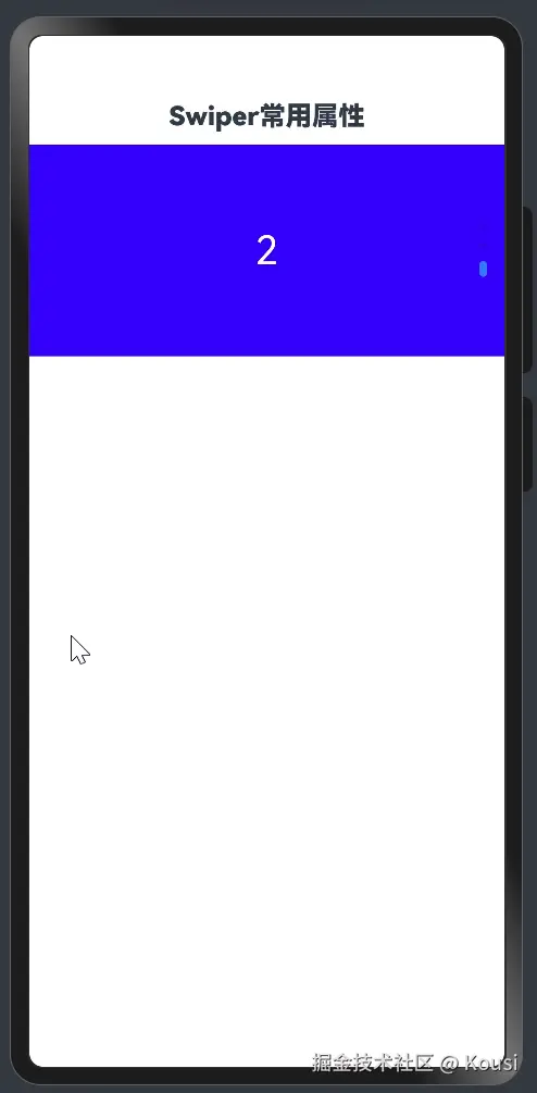
常用属性:
| loop | boolean | 是否开启循环。设置为true时表示开启循环,在LazyForEach懒循环加载模式下,加载的组件数量建议大于5个。默认值:true |
|---|
| autoPlay | boolean | 子组件是否自动播放。默认值:false**说明:**loop为false时,自动轮播到最后一页时停止轮播。手势切换后不是最后一页时继续播放。 |
| interval | number | 使用自动播放时播放的时间间隔,单位为毫秒。默认值:3000 |
| vertical | boolean | 是否为纵向滑动。默认值:false |
@Entry
@Component
struct Page02_SwiperAttribute {
build() {
Column() {
Text('Swiper常用属性')
.fontSize(20)
.fontWeight(900)
.padding(10)
Swiper() {
Text('0')
.textAlign(TextAlign.Center)
.backgroundColor(Color.Red)
.fontColor(Color.White)
.fontSize(30)
Text('1')
.textAlign(TextAlign.Center)
.backgroundColor(Color.Green)
.fontColor(Color.White)
.fontSize(30)
Text('2')
.textAlign(TextAlign.Center)
.backgroundColor(Color.Blue)
.fontColor(Color.White)
.fontSize(30)
}
.width('100%')
.height(160)
.loop(false)
.autoPlay(true)
.interval(4000)
.vertical(true)
}
.width('100%')
.height('100%')
}
}
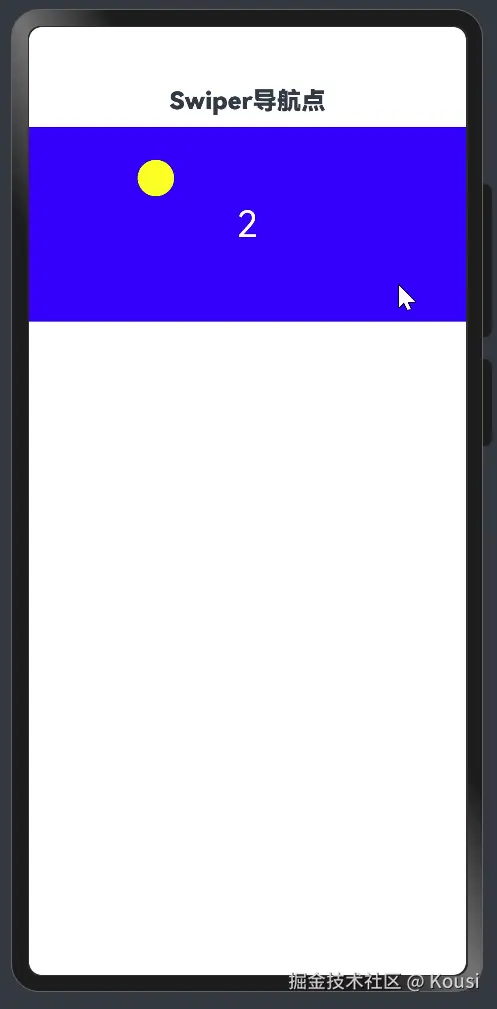
调整导航点:
| itemWidth | Length | 否 | 设置Swiper组件圆点导航指示器的宽,不支持设置百分比。默认值:6单位:vp |
|---|
| itemHeight | Length | 否 | 设置Swiper组件圆点导航指示器的高,不支持设置百分比。默认值:6单位:vp |
| selectedItemWidth | Length | 否 | 设置选中Swiper组件圆点导航指示器的宽,不支持设置百分比。默认值:12单位:vp |
| selectedItemHeight | Length | 否 | 设置选中Swiper组件圆点导航指示器的高,不支持设置百分比。默认值:6单位:vp |
| color | ResourceColor | 否 | 设置Swiper组件圆点导航指示器的颜色。默认值:'#182431'(10%透明度) |
| selectedColor | ResourceColor | 否 | 设置选中Swiper组件圆点导航指示器的颜色。默认值:'#007DFF' |
@Entry
@Component
struct Page03_SwiperIndicator {
build() {
Column() {
Text('Swiper导航点')
.fontSize(20)
.fontWeight(900)
.padding(10)
Swiper() {
Text('0')
.textAlign(TextAlign.Center)
.backgroundColor(Color.Red)
.fontColor(Color.White)
.fontSize(30)
Text('1')
.textAlign(TextAlign.Center)
.backgroundColor(Color.Green)
.fontColor(Color.White)
.fontSize(30)
Text('2')
.textAlign(TextAlign.Center)
.backgroundColor(Color.Blue)
.fontColor(Color.White)
.fontSize(30)
}
.width('100%')
.height(160)
.indicator(
Indicator.dot()
.left(10)
.top(10)
.bottom(10)
.right(10)
.itemWidth(20)
.itemHeight(20)
.selectedItemWidth(30)
.selectedItemHeight(30)
.selectedColor(Color.Yellow)
.color(Color.Blue)
)
}
.width('100%')
.height('100%')
}
}


