

前言
前端开发实践中,SVG图标因其可拓展性和灵活性而成为图标展示的首选方式。组件库通常也集成了一系列通用的图标组件,使得开发者能够轻松的在项目中实现这些图标的快速部署和使用。
当使用组件库提供的Icon组件时,可能会好奇为什么每个图标都可以直接以其名称作为组件名来引入。 实际上,组件库中确实是通过为每个图标声明了一个独立的React组件来实现的,但是这个过程并不是通过常规的手动声明方式完成的。
组件库在构建过程中,通过自动化脚本扫描到目标路径下的所有图标文件,并通过模版字符串等方式为每个文件生成一个对应的React组件。这个过程会涉及到:
- Icon组件封装: 封装一个具备默认属性,并且对原生svg属性拓展的Icon组件。
- 文件扫描:脚本遍历包含图标的目录。
- 代码生成: 为每个图标自动创建一个React组件,组件名与图标名相对应。
- 组件导出: 为这些自动生成的组件完成统一的导出,使得它们可以在项目直接引入使用。
以上,就是目前组件库中构建图标组件的常见流程,那接下来我们就一步一步的跑通这个流程。
Icon组件封装
Props属性:
- className: 节点类名
- style: 节点样式
- spin:(拓展): 图标是否旋转,可以通过CSS中的关键帧动画结合translate属性实现旋转效果。
- component: 外界使用时自定义的Icon组件,并且为这个组件提供统一的Props默认值,用户可以选择性的进行覆盖。
- children: Svg文件中,被svg标签包裹的内容。
默认特性:
- svg的大小可以通过父组件的fontsize属性来进行控制,这里通过CSS中的em单位来实现,1em就等于父组件中的fontsize的大小。
- svg中的颜色默认与父组件中的颜色保持一致,这里可以通过currentColor特性完成。
currentcolor关键字表示元素的color属性的值。这可以在默认情况下不接收color值的属性上使用color值。
如果 currentcolor 用于 color 属性的值,那么会给元素继承 color 属性的值。
实现:
类型声明 :
- 通过Omit,过滤掉需要覆盖掉Svg元素的Props, 然后声明过滤掉的Props。
// 类型声明, 重载className、style、spin的属性
export interface IconProps extends Omit<SVGAttributes<SVGElement>, "className"> {
  className?: string;
  style?: CSSProperties;
  spin?: boolean;
  component?: React.ComponentType<React.SVGProps<SVGSVGElement>>;
}
组件声明:
- className生成。
- 将自定义的默认Props与传入的Props进行合并。
- 判断用户传入的是component 属性, 还是children属性。
export function Icon(props: IconProps): JSX.Element {
  const {
    className,
    spin,
    style,
    viewBox,
    component: Component,
    children,
    ...rest
  } = props
  // 处理className
  const prefix = getPrefix("icon")
  const classNames = cs(
    {
      [`${prefix}-spin`]: spin
    },
    className
  )
  // 属性合并
  const defaultProps = {
    width: "1em",
    height: "1em",
    fill: "currenColor",
    className: classNames,
    viewBox,
    ...rest
  }
  // 处理Component
  if (Component) {
    return (
      <Component {...defaultProps} />
    )
  }

  // 处理Children
  warning(
    !Boolean(viewBox),
    "Make sure that you provide correct ViewBox"
  )
  return (
    <svg {...defaultProps}>
      {children}
    </svg>
  )
}
Icon组件生成
准备工作:
-
在packages下,创建一个icon文件夹。
-
npm初始化,并且修改包名称, 配置稍后需要使用的依赖和脚本。
- 基础的开发环境和打包所需要的依赖,在前面都有说明,这里就不再赘述。
- svgo, 这个库主要用来处理和优化svg文件,自2.0版本之后可以用抽象语法树来处理节点。
{ "name": "@mini-ui/icons", "version": "1.0.0", "description": "", "main": "index.js", "module": "./dist/index.mjs", "types": "./dist/index.d.mts", "scripts": { "build": "ts-node ./scripts/build.ts && tsup" }, "keywords": [], "author": "", "license": "ISC", "dependencies": { "react": "18.3.1" }, "devDependencies": { "@types/node": "22.7.5", "@types/react": "18.3.11", "typescript": "5.6.2", "ts-node": "10.9.2", "tsup": "8.3.0", "svgo": "3.3.2" } } ``` -
在icon文件夹下新建一个svgs文件夹,用来存储svg文件。
-
在icon文件夹下新建一个scripts文件夹,用来存储打包的脚本文件。
-
在icon文件夹下新建一个src/rccomponents文件夹,用于存储脚本生成的Icon组件。
-
在icons根目录中创建一个index.d.ts文件用来声明Icon组件的props。
开发部分:
基础描述:
- 我们需要借助node的path、fs/promises(node版本14+)模块来完成开发。
- path用来读取,合并路径地址。
- fs/promises是fs的promise版本,主要用来读取文件内容,写入文件内容, 判断文件状态。
开发主线:
数据结构类型声明
interface IconRecord {
  fileName: string;
  fileContent: string;
}
遍历svgs文件夹,找到svgs目录下所有的svg文件
- 如果是文件夹,那么递归遍历直到svg文件位置。
- 如果是文件,那么就停止遍历,提取文件名,并转化成为大驼峰组件命名规范,然后读取文件内容,将读取结果返回出去。
async function travelPath(basePath: string) {
  const res: IconRecord[] = []
  const basicDirs = await fs.readdir(basePath)

  for (const target of basicDirs) {
    const combinedPath = path.join(basePath, target)
    const targetStat = await fs.stat(combinedPath) // 获取目标路径文件/文件夹的信息
    if (targetStat.isDirectory()) {
      res.push(...(await travelPath(combinedPath)))
    }

    if (targetStat.isFile() && combinedPath.endsWith(".svg")) {
      const content = await fs.readFile(combinedPath, 'utf-8')
      res.push({
        fileName: kebab2Camel(delExt(target)),
        fileContent: normalizeSvgAttrs(content)
      })
    }
  }

  return res
}
对svg文件名称、内容进行优化
- 通过配置svgo对svg的属性进行删减、优化, 这里借鉴了arco-design的配置。
- 通过svgo的插件的xast语法,在svg节点中增加一个cutomProps的属性,然后会把这个属性替换成
{...defaultProps}是为了能够在组件模版中解构默认的props。 - 通过正则表达式,切割svg字符串中的属性值,这里是为了遵循react的小驼峰属性语法。
const SVGO_CONFIG: Config = {
  plugins: [
    'removeUnknownsAndDefaults',
    'cleanupAttrs',
    'removeXMLNS',
    'removeDoctype',
    'removeXMLProcInst',
    'removeComments',
    'removeMetadata',
    'removeTitle',
    'removeDesc',
    'removeUselessDefs',
    'removeEditorsNSData',
    'removeEmptyAttrs',
    'removeHiddenElems',
    'removeEmptyText',
    'removeEmptyContainers',
    // 'removeViewBox',
    'cleanupEnableBackground',
    'convertStyleToAttrs',
    'convertColors',
    'convertPathData',
    'convertTransform',
    'removeNonInheritableGroupAttrs',
    'removeUselessStrokeAndFill',
    'removeUnusedNS',
    'cleanupIds',
    'cleanupNumericValues',
    'moveElemsAttrsToGroup',
    'moveGroupAttrsToElems',
    'collapseGroups',
    // 'removeRasterImages',
    'mergePaths',
    'convertShapeToPath',
    'sortAttrs',
    'removeDimensions',
    {
      name: "addAttributeToSvg",
      fn: () => {
        return {
          element: {
            enter: (node) => {
              if(node.name === "svg")
                node.attributes.customProps = ""
            }
          }
        }
      }
    }
  ]
}
function normalizeSvgAttrs(data: string) {
  return svgo.optimize(data, SVGO_CONFIG)
    .data
    .replace(/customProps=""/g, '{...defaultProps}')
    .replace(/stroke-width=/g, 'strokeWidth=')
    .replace(/stroke-linecap=/g, 'strokeLinecap=')
    .replace(/stroke-linejoin=/g, 'strokeLinejoin=')
    .replace(/fill-rule=/g, 'fillRule=')
    .replace(/clip-rule=/g, 'clipRule=')
    .replace(/stroke-miterlimit=/g, 'strokeMiterlimit=')
    .replace(/class=/g, 'className=');

}
通过模版生成Icon文件
-
上面优化后的数据,可以通过模版字符串(其他的插值语法模版也都可以),去解析文件名,文件内容。
-
模版内容:
 function iconTemplate({ fileName, fileContent }: IconRecord) {
   return ` // 本文件由 "@mini-ui/icons/scripts/build.ts" 生成, 禁止手动修改!
 import type { IconProps } from "../../index.d.ts"
 export function Icon${fileName} (props: IconProps): JSX.Element {
   const {
     className = "",
     spin,
     style,
     component: Component,
     children,
     ...rest
   } = props
   // 处理className
   const classNames = className + (spin ? "mini-icon-spin" : "")
   // 属性合并
   const defaultProps:IconProps = {
     width: "1em",
     height: "1em",
     fill: "currenColor",
     className: classNames,
     ...rest
   }

   return (
     ${fileContent}
   )
 }
   `
 }
- 生成的遍历函数:
async function generateIcon(records: IconRecord[]) {
  async function generateFile(record: IconRecord) {
    const targetPath = path.join(__dirname, "..", "src", "components", record.fileName + ".tsx")
    const template = iconTemplate(record)
    fs.writeFile(targetPath, template)

    console.log("has generated " + record.fileName + "component")
  }

  records.forEach(generateFile)
}
- 最后生成导出文件即可。
async function generateExportModule(records: IconRecord[]) {
  const targetPath = path.join(__dirname, "..", "src", "components", "index.tsx")
  const exportStr = records.map(item => `export { Icon${item.fileName} } from "./${item.fileName}"`).join('\n')
  fs.writeFile(targetPath, exportStr)
  console.log("has generated export file")
}
- 将上面的方法串联起来。
async function main() {
  const basePath = path.join(__dirname, "..", "svgs")
  const fileRecords = await travelPath(basePath)

  // generateIcon
  generateIcon(fileRecords)
  generateExportModule(fileRecords)

}
测试:
分别打包封装的Icon组件和Icon***的组件: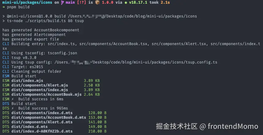
引入:
- 在demo/icon/custom-index.tsx中声明引用。
import type { IconProps } from "@mini-ui/ui"
import { Icon } from "@mini-ui/ui"

import { IconAccountBook } from "@mini-ui/icons"

import "@mini-ui/ui/dist/components/Icon/style/index.css"

function AccountBook(props: IconProps) {
  return (
    <svg {...props} xmlns="http://www.w3.org/2000/svg" viewBox="0 0 1024 1024">
      <path d="M880 184H712v-64c0-4.4-3.6-8-8-8h-56c-4.4 0-8 3.6-8 8v64H384v-64c0-4.4-3.6-8-8-8h-56c-4.4 0-8 3.6-8 8v64H144c-17.7 0-32 14.3-32 32v664c0 17.7 14.3 32 32 32h736c17.7 0 32-14.3 32-32V216c0-17.7-14.3-32-32-32zM648.3 426.8l-87.7 161.1h45.7c5.5 0 10 4.5 10 10v21.3c0 5.5-4.5 10-10 10h-63.4v29.7h63.4c5.5 0 10 4.5 10 10v21.3c0 5.5-4.5 10-10 10h-63.4V752c0 5.5-4.5 10-10 10h-41.3c-5.5 0-10-4.5-10-10v-51.8h-63.1c-5.5 0-10-4.5-10-10v-21.3c0-5.5 4.5-10 10-10h63.1v-29.7h-63.1c-5.5 0-10-4.5-10-10v-21.3c0-5.5 4.5-10 10-10h45.2l-88-161.1c-2.6-4.8-.9-10.9 4-13.6 1.5-.8 3.1-1.2 4.8-1.2h46c3.8 0 7.2 2.1 8.9 5.5l72.9 144.3 73.2-144.3a10 10 0 0 1 8.9-5.5h45c5.5 0 10 4.5 10 10 .1 1.7-.3 3.3-1.1 4.8z" />
    </svg>
  )
}

export default function App() {

  return (
    <div style={{ height: "50px", display: "flex", gap: "20px", fontSize: "30px"}}>
      <Icon spin component={AccountBook} />
      <Icon spin viewBox="0 0 1024 1024">
        <path d="M880 184H712v-64c0-4.4-3.6-8-8-8h-56c-4.4 0-8 3.6-8 8v64H384v-64c0-4.4-3.6-8-8-8h-56c-4.4 0-8 3.6-8 8v64H144c-17.7 0-32 14.3-32 32v664c0 17.7 14.3 32 32 32h736c17.7 0 32-14.3 32-32V216c0-17.7-14.3-32-32-32zM648.3 426.8l-87.7 161.1h45.7c5.5 0 10 4.5 10 10v21.3c0 5.5-4.5 10-10 10h-63.4v29.7h63.4c5.5 0 10 4.5 10 10v21.3c0 5.5-4.5 10-10 10h-63.4V752c0 5.5-4.5 10-10 10h-41.3c-5.5 0-10-4.5-10-10v-51.8h-63.1c-5.5 0-10-4.5-10-10v-21.3c0-5.5 4.5-10 10-10h63.1v-29.7h-63.1c-5.5 0-10-4.5-10-10v-21.3c0-5.5 4.5-10 10-10h45.2l-88-161.1c-2.6-4.8-.9-10.9 4-13.6 1.5-.8 3.1-1.2 4.8-1.2h46c3.8 0 7.2 2.1 8.9 5.5l72.9 144.3 73.2-144.3a10 10 0 0 1 8.9-5.5h45c5.5 0 10 4.5 10 10 .1 1.7-.3 3.3-1.1 4.8z" />
      </Icon>
      <IconAccountBook width="2em" height="2em" fill="skyblue" spin/>
    </div>
  )
}
- 在website/docs/guide/components/icon.mdx中引入预览。
    # 图标组件

    ## 自定义图标
    <code src="../../../../demo/icon/custom-icon.tsx" />
