Echarts图中关系图graph和路径图lines结合使用
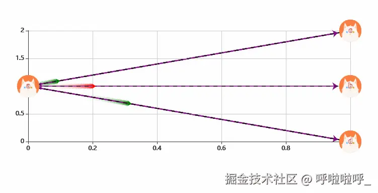
1、效果图:
2、整体代码:(注意lines图的数据集格式)
<template>
  <div>
    <div id="about" style="width: 800px;height: 400px"></div>
  </div>
</template>

<script>
import echarts from 'echarts'
export default {
  name: "About",
  data(){
    return{}
  },
  methods:{
    init(){
      var mychart=echarts.init(document.getElementById('about'))
      var option= {
        //使用直角坐标需要xAxis和yAxis
        xAxis: {
          show: true,
          type: 'value'
        },
        yAxis: {
          show: true,
          type: 'value'
        },
        //直角坐标系中的绘图网格
        grid: {
          top: '20%',
          bottom: '25%'
        },
        //提示框样式
        tooltip: {
          formatter: "{c}"//字符串模板:{c}:数据值
        },
        series: [{
          type: "graph",
          layout: "none",//图的布局(none不采用任何布局)
          focusNodeAdjacency: true, // 鼠标悬浮到某节点,则此节点以及其所有邻接节点高亮
          roam: true, // 鼠标缩放和平移漫游
          symbolSize: [50, 50],//节点标记大小
          symbol:'image://'+require('@/assets/1.png'),//节点图标(写在这里所有的图标都一样)
          //categories: "categories",//节点分类的类目
          coordinateSystem: 'cartesian2d',//指定该系列使用的坐标系(直角坐标系需要添加xAxis和yAxis坐标)
          edgeSymbol:['circle','arrow'],//边两端的标记类型(左边圆圈,右边箭头)
          edgeSymbolSize: [4, 10],//边两端的标记大小
          lineStyle: {//关系边的公用线条样式
            normal: {
              width: 2,
              shadowColor: "none",
              color: "purple",
            }
          },
          label: {//图形上的文本标签
            show: true,//是否显示图形上的文本标签
          },
          //节点集合(节点的name不能重复)
          data: [
            {
              name: "a",
               //symbol:'image://'+require('@/assets/1.png'),//节点图标(写在这里可以分别显示不同的图标)
              value:[0,1]//坐标
            },
            {
              name: "b",
              value:[1,1]
            },
            {
              name: "c",
              value:[1,2]
            },{
            name:'d',
              value:[1,0]
            }
          ],
          //线集合
          links: [
            {
              source: "a",//边的源节点名称
              target: "b"//边的目标节点名称
            },
            {
              source: "a",
              target: "c"
            },
            {
              source: "a",
              target: "d"
            }
          ]
        },


          {
            type: 'lines',
             polyline: true,//是否是多段线
             coordinateSystem: 'cartesian2d',//指定该系列使用的坐标系(直角坐标系需要添加xAxis和yAxis坐标)
             lineStyle: {//线的样式
              type: 'dashed',//线的类型(虚线)
              width: 2,//线宽
              color: 'black'//线的颜色
            },
            effect: {//线特效的配置
              show: true,//是否显示特效
              trailLength: 0.1,//特效尾迹的长度。取从 0 到 1 的值,数值越大尾迹越长
              symbol: 'arrow',//线条两端的标记类型,这里使用 "arrow" 表示箭头, "circle" 表示圆形标记,""rect"矩形
              symbolSize: 8//线两端的标记大小
            },
            //线的数据集(第一个coord是起点,第二个coord是终点)
            data:[
              [
                {coord:[0,1]},{coord:[1,0],effect:{color:'green'}}
              ],
              [
                {coord:[0,1]},{coord:[1,1],effect:{color:'red'}}
              ],
              [
                {coord:[0,1]},{coord:[1,2],effect:{color:'green'}}
              ]

            ]
          }]
      }
      mychart.setOption(option)
    }
  },
  mounted() {
    this.init()
  },
}
</script>


