

1️⃣ 伪元素 2️⃣ 元素叠加
- 伪元素(通用,容易出现偏移的情况)
<div className="main-title" id="dynamic-main-title"> {this.state.mainTitle} </div>

.main-title {
background: linear-gradient(to top, #fef7dd, #fffdfa);
background-clip: text; // 背景剪裁
color: transparent; //背景设置为透明
position: relative;
}
/* 伪元素设置阴影 */
.main-title::before {
content: attr(data-title);
position: absolute;
z-index: -1;
text-shadow: 0 0.04rem 0.0533rem rgba(0, 0, 0, 0.25);
}
getMainTitleContent() {
const dynamicTitle = document.getElementById('dynamic-main-title')
const titleText = this.state.mainTitle
dynamicTitle.setAttribute('data-title', titleText)
}
- 元素叠加(适用于字体本身已绝对定位!比较好用)
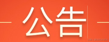
<div className="title" > 公告 </div>
<div className="title_shadow"> 公告 </div>

.title {
  background: linear-gradient(to top, #fef7dd, #fffdfa);
  background-clip: text;
  color: transparent;
  position: absolute;
  left: 50%;
  transform: translate(-50%, -50%);
}
/* 叠加设置阴影 */
.title_shadow {
  color: transparent;
  text-shadow: 0 0.04rem 0.0533rem rgba(0, 0, 0, 0.25);
  position: absolute;
  left: 50%;
  transform: translate(-50%, -50%);
  z-index: -1;
}
注意: 若包裹字体的 div 只有字体大小,没有宽高,在某些机型上(iphone x)会出现意外的线条,因为 background-clip: text; 没有剪切好。此时需要设置一下高度。
