

这篇文章记录一下在uni-app开发中需要在uni-date-picker组件中设置禁用日期的功能。

引用组件
我们可以配置uni-ui的自动导入,也可以下载uni-date-picker组件到自己的项目,这两种方式都可以,不过当使用uni开发小程序时,推荐使用自动引入方式,下面的介绍也是以自动引入方式介绍。(网上有相似的介绍,我也是参考网上的文章,可是按照别人博客修改后还是有奇奇怪怪的问题。这里我给出了我出现问题解决办法)
修改源码
1. 首先给引入组件的位置传递你要禁用的日期
<template>
  <uni-datetime-picker
    start-placeholder="请选择入住时间"
    end-placeholder="请选择离店时间"
    type="datetimerange"
    :start="new Date().getTime()"
    :disabledDate="disabledDate"
  ></uni-datetime-picker>
</template>

<script setup>
const disabledDate = ref(["2024-06-14", "2024-06-17", "2006-06-18"]); // 下单的人是否是未成年
</script>
2. 然后就是找到uni-ui自动引入后的uni-datetime-picker源码的位置
node_moudles -> @dcloudio -> uni-ui -> lib -> uni-datetime-picker

修改的地方:在uni-datetime-picker.vue文件中新增传递过来的disabledDate数据然后再传给下一级组件calendar组件,按照其他博客描述,这里不清楚到底是使用了那个caeldar组件,所以就都传递了disabledDate参数
props: {
	// 禁用日期
	disabledDate:{
		type: Array,
		default: []
	},
}
<view class="popup-x-body">
    <!-- 第一处 -->
    <Calendar
          ref="left"
          :disabledDate="disabledDate"
          :showMonth="false"
          :start-date="calendarRange.startDate"
          :end-date="calendarRange.endDate"
          :range="true"
          :pleStatus="endMultipleStatus"
          @change="leftChange"
          @firstEnterCale="updateRightCale"
          style="padding: 0 8px"/>
    <!-- 第二处 -->
    <Calendar
          ref="right"
          :disabledDate="disabledDate"
          :showMonth="false"
          :start-date="calendarRange.startDate"
          :end-date="calendarRange.endDate"
          :range="true"
          @change="rightChange"
          :pleStatus="startMultipleStatus"
          @firstEnterCale="updateLeftCale"
          style="padding: 0 8px; border-left: 1px solid #f1f1f1"/>
  </view>
  <!-- 第三处 -->
  <Calendar
        v-if="isPhone"
        :disabledDate="disabledDate"
        ref="mobile"
        :clearDate="false"
        :date="calendarDate"
        :defTime="mobileCalendarTime"
        :start-date="calendarRange.startDate"
        :end-date="calendarRange.endDate"
        :selectableTimes="mobSelectableTime"
        :startPlaceholder="startPlaceholder"
        :endPlaceholder="endPlaceholder"
        :default-value="defaultValue"
        :pleStatus="endMultipleStatus"
        :showMonth="false"
        :range="isRange"
        :hasTime="hasTime"
        :insert="false"
        :hideSecond="hideSecond"
        @confirm="mobileChange"
        @maskClose="close"/>
  <!-- 第四处 -->
  <Calendar
        ref="pcSingle"
        :disabledDate="disabledDate"
        :showMonth="false"
        :start-date="calendarRange.startDate"
        :end-date="calendarRange.endDate"
        :date="calendarDate"
        @change="singleChange"
        :default-value="defaultValue"
        style="padding: 0 8px"/>
3.calendar 组件,位置跟 uni-datetime-picker.vue 在同一目录,操作也是一样,接受传递过来的参数,传递给下一级组件 calendar-item
props: {
	// 禁用日期
	disabledDate:{
		type: Array,
		default: []
	},
}
<calendar-item
    class="uni-calendar-item--hook"
    :weeks="weeks" :calendar="calendar"
    :selected="selected"
    :lunar="lunar"
    :checkHover="range"
    :disabledDate="disabledDate"
    @change="choiceDate"
    @handleMouse="handleMouse">
</calendar-item>
4. calendar-item 组件,位置跟 uni-datetime-picker.vue 在同一目录,接受传递过来的参数,使用 es6 数组的 includes 方法,判断需要禁用的日期数组中,是否包含所有遍历的日期

<view class="uni-calendar-item__weeks-box-item" :class="{
				'uni-calendar-item--checked':calendar.fullDate === weeks.fullDate && (calendar.userChecked ||
				!checkHover) && !disabledDate.includes(weeks.fullDate),
				'uni-calendar-item--checked-range-text': checkHover,
				'uni-calendar-item--before-checked':weeks.beforeMultiple,
				'uni-calendar-item--multiple': weeks.multiple,
				'uni-calendar-item--after-checked':weeks.afterMultiple,
				'uni-calendar-item--disable':weeks.disable,
				'uni-calendar-item--disable':disabledDate.includes(weeks.fullDate)
				}">
			<text v-if="selected&&weeks.extraInfo" class="uni-calendar-item__weeks-box-circle"></text>
			<text class="uni-calendar-item__weeks-box-text uni-calendar-item__weeks-box-text-disable uni-calendar-item--checked-text">{{weeks.date}}</text>
		</view>
到这里博客上的文章就结束了,但是当我测试的时候发现,根本就没有生效啊🙃🙃🙃,去认真的阅读了源码,修改了下面的几处代码,显示效果才得以完善。
首先修改calendar.vue组件的方法,添加了一段代码,这里使用了this.$props拿到了传递过来的disabledDate参数,然后进行了includes方法的判断。
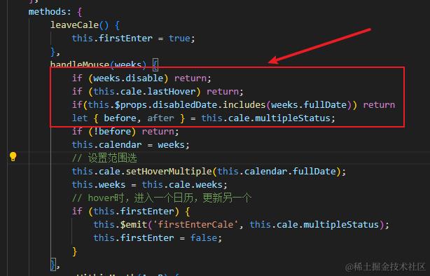
 handleMouse(weeks) {
    if (weeks.disable) return;
    if (this.cale.lastHover) return;
    if(this.$props.disabledDate.includes(weeks.fullDate)) return
    let { before, after } = this.cale.multipleStatus;
    if (!before) return;
    this.calendar = weeks;
    // 设置范围选
    this.cale.setHoverMultiple(this.calendar.fullDate);
    this.weeks = this.cale.weeks;
    // hover时,进入一个日历,更新另一个
    if (this.firstEnter) {
        this.$emit('firstEnterCale', this.cale.multipleStatus);
        this.firstEnter = false;
    }
},
接着在calendar-item.vue文件中自定义了禁用的显示文字,因为我的效果就是让用户知道这个日期段中被禁用了.
<view class="uni-calendar-item__weeks-box-item" :class="{
				'uni-calendar-item--checked':calendar.fullDate === weeks.fullDate && (calendar.userChecked ||
				!checkHover) && !disabledDate.includes(weeks.fullDate),
				'uni-calendar-item--checked-range-text': checkHover,
				'uni-calendar-item--before-checked':weeks.beforeMultiple,
				'uni-calendar-item--multiple': weeks.multiple,
				'uni-calendar-item--after-checked':weeks.afterMultiple,
				'uni-calendar-item--disable':weeks.disable,
				'uni-calendar-item--disable':disabledDate.includes(weeks.fullDate)
				}">
			<text v-if="selected&&weeks.extraInfo" class="uni-calendar-item__weeks-box-circle"></text>
			<text class="uni-calendar-item__weeks-box-text uni-calendar-item__weeks-box-text-disable uni-calendar-item--checked-text">{{weeks.date}}</text>
               <text v-show="disabledDate.includes(weeks.fullDate)" style="font-size: 25rpx; color: #d1d1d1" >已禁用</text>
		</view>
这样效果就显示成功了。但是还是有一点小毛病,那就是虽然这个日期被禁用了,但是如果选择日期段包含禁用日期还是可以选择上的

 这个我暂时还没有改,只能前端选择完时间后进行判断。
最后的最后:参考文章:blog.csdn.net/qq_40881695…
感谢作者的分享😄😄😄
