

1、效果展示
封面阶段展示(会旋转)
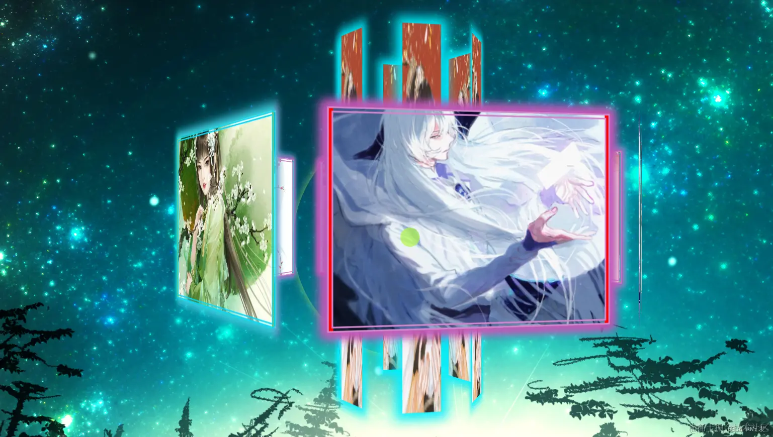

进入内部效果展示(会旋转)
内部水晶球展示
2、主要模块讲解
2.1 封面效果模块
在外部视角中,旋转大厅由外部六面大屏,内部六面竖屏组成,且保持一个旋转效果。外部大屏大致原理为,建立6个div模块,每个模块使用transform的rotateY(计算好旋转一定的角度),然后在translateZ(计算好脱离屏幕的距离),再在外层大盒子添加透视属性perspective即可。关于perspective属性值,大家可以手动去试一下,设置的越大,表示视角距离屏幕越远。同理内部六根柱子也是一样的偏移原理。在此效果上,小编还添加了旋转动画效果,使用css的animation属性使整个大厅以22s的周期进行旋转,使得画面更加具有观赏性。大致css属性如下:
2.2 进入大厅后内部效果展示
我们通过变换perspective的属性值来实现由外到内的一个缓缓的一个进入效果。关于perspective属性值的问题,我们可以从前面div的translateZ的值来对比,比如一个div往Z轴平移300px,我们如果perspective值为800px,此时看到的就是第一张图外层的效果,如果设置为290px时,我们的观测点位置就在里面,我们就可以看到div的里面(反面)的内容。为了是外层和内层所展示的东西不同,小编再生成偏转6个div,偏移距离稍小于前面的300px,这样就使得外部看的和内部看的不一样。
2.3 水晶层效果
水晶层也是由12个div通过偏移组成,下方设置有水晶台,水纹不断向周围扩散,闪闪发光的效果。
3、代码展示
可通过修改背景图片url来完成替换
<!DOCTYPE html>
<html lang="en">
<head>
<meta charset="UTF-8">
<meta http-equiv="X-UA-Compatible" content="IE=edge">
<meta name="viewport" content="width=device-width, initial-scale=1.0">
<title>照片墙</title>
<style>
@keyframes rotate {
0% {
transform: rotateY(0deg);
}
100% {
transform: rotateY(360deg);
}
}
@keyframes hot {
0% {}
50% {
width: 100px;
height: 100px;
opacity: 1;
}
70% {
width: 425px;
height: 425px;
opacity: 0.7;
}
100% {
width: 825px;
height: 725px;
opacity: 0.9;
}
}
@keyframes last {
0% {
width: 0;
}
100% {
width: 275px;
}
}
@keyframes enter {
0% {
perspective: 880px;
}
100% {
perspective: 280px;
}
}
.currentA {
animation: enter 6s ease forwards;
}
.currentB {
animation: rotate 52s infinite linear !important;
}
.currentC {
background-size: 100% 100%;
}
body {
background-image: url("https://ts1.cn.mm.bing.net/th/id/R-C.4c848530d5db0372269a3d9eee485151?rik=RaV6%2fsh0GmVMtw&riu=http%3a%2f%2fimgs.aixifan.com%2flive%2f1483416197972%2f1483416197972.jpg&ehk=hedtNts0LGHxuGmui0GMdUsvMrEONZz410kBlMoZfSc%3d&risl=1&pid=ImgRaw&r=0");
overflow: hidden;
}
.bigA {
width: 600px;
height: 200px;
margin: 100px auto;
transform-style: preserve-3d;
transform: scale(1.1);
perspective: 880px;
}
.view {
position: relative;
margin: 250px auto;
width: 310px;
height: 210px;
text-align: center;
background-size: 120% 120%;
transform-style: preserve-3d;
animation: rotate 22s infinite linear;
}
.view div {
position: absolute;
top: 0;
left: 0;
width: 280px;
height: 210px;
box-shadow: 0px 0px 10px 5px rgb(192, 89, 183);
border: 6px double rgb(209, 134, 203);
box-sizing: border-box;
font-size: 10px;
overflow: hidden;
cursor: default;
background-size: cover;
background-repeat: no-repeat;
}
.view div[class$="b"] {
color: rgba(6, 255, 255, 0.5);
}
.view div[class$="2"] {
top: 50%;
left: 50%;
margin-top: -250px;
margin-left: -25px;
width: 50px;
height: 500px;
line-height: 500px;
border: rgb(0, 238, 255);
box-shadow: 0 0 15px 8px rgb(0, 238, 255);
}
.view div[class$="3"],
.view div[class$="4"] {
/* 水晶背景图 */
width: 70px;
height: 80px;
top: 50%;
left: 50%;
margin-top: -40px;
margin-left: -35px;
text-align: center;
line-height: 80px;
border-radius: 12px;
border: 2px solid rgb(0, 225, 255);
box-shadow: 0 0 15px 3px cyan;
background: url("https://ts1.cn.mm.bing.net/th/id/R-C.4c848530d5db0372269a3d9eee485151?rik=RaV6%2fsh0GmVMtw&riu=http%3a%2f%2fimgs.aixifan.com%2flive%2f1483416197972%2f1483416197972.jpg&ehk=hedtNts0LGHxuGmui0GMdUsvMrEONZz410kBlMoZfSc%3d&risl=1&pid=ImgRaw&r=0") -761px -880px;
}
/*********************************************/
.view .front {
background-color: skyblue;
transform: translateZ(300px);
background-image: url("https://ts1.cn.mm.bing.net/th/id/R-C.2f37b1f94c9c0ce36679c48d525226aa?rik=U4Y1G4E3WZVWzA&riu=http%3a%2f%2fk1.jsqq.net%2fuploads%2fallimg%2f150902%2f5_150902055359_2.jpg&ehk=7BYZEfbXLhKoz7iVYxX2aAiwqqNGMbT05c5x%2far2iX0%3d&risl=&pid=ImgRaw&r=0");
background-position: center;
}
.view .back {
background-color: red;
transform: rotateY(180deg) translateZ(300px);
background-image: url("https://gd-hbimg.huaban.com/c1ae6e64ab8d6be64865fa762905ada57ca549574036f-I7na06_fw658");
background-position: center;
}
.view .right-front {
background-color: grey;
transform: rotateY(60deg)translateZ(300px);
background-image: url("https://tse1-mm.cn.bing.net/th/id/OIP-C.0JUCV896kPvlIN3ldgTeegHaJy?rs=1&pid=ImgDetMain");
border: 5px double rgb(29, 162, 196);
box-shadow: 0 0 15px 5px rgb(7, 230, 238);
background-position: center;
}
.view .right-back {
background-color: rgb(150, 185, 67);
transform: rotateY(120deg) translateZ(300px);
background-image: url("https://tse3-mm.cn.bing.net/th/id/OIP-C.UHVo3WUJLFyjhNLaymtpiAHaKz?rs=1&pid=ImgDetMain");
border: 5px double rgb(3, 216, 253);
box-shadow: 0 0 15px 5px rgb(2, 248, 236);
background-position: center;
}
.view .left-back {
background-color: rgb(150, 185, 67);
transform: rotateY(240deg) translateZ(300px);
background-image: url("https://ts1.cn.mm.bing.net/th/id/R-C.b9ecbcf11ad7b714a63526945067ad94?rik=z0dyhTqxaT37fA&riu=http%3a%2f%2fpic1.16xx8.com%2fallimg%2fhiobi2%2f4-1ZGH042245R.jpg&ehk=rGeMTjrB6HNu2J3Np7xluU4SMMIaUDP6rIPdAzcEpn8%3d&risl=&pid=ImgRaw&r=0");
border: 5px double rgb(29, 162, 196);
box-shadow: 0 0 15px 5px rgb(1, 179, 250);
background-position: center;
}
.view .left-front {
background-color: rgb(150, 185, 67);
transform: rotateY(300deg) translateZ(300px);
background-image: url("https://pic4.zhimg.com/50/v2-efb7696383d0214727a518a10370f164_hd.jpg?source=1940ef5c");
border: 5px double rgb(29, 162, 196);
box-shadow: 0 0 15px 5px rgb(4, 245, 233);
background-position: center;
}
/******************************************************************/
.view .frontb {
/* background-color: skyblue; */
transform: translateZ(298px) rotateY(180deg);
background-image: url("https://ts1.cn.mm.bing.net/th/id/R-C.2b16b86d37ae494bc6fe7e10b6e78086?rik=Bu8wA3nD2Ypl6Q&riu=http%3a%2f%2fwww.gufengjia.com%2fd%2ffile%2fimages%2f201907011220%2f32-1P511204103-52.jpg&ehk=eva35L5l7qqBBbBig4yffb0aqIwkp%2f%2bXPYTyIeojSp8%3d&risl=&pid=ImgRaw&r=0");
background-position: center;
}
.view .backb {
/* background-color: red; */
transform: rotateY(180deg) translateZ(298px)rotateY(180deg);
background-image: url("https://ts1.cn.mm.bing.net/th/id/R-C.2f37b1f94c9c0ce36679c48d525226aa?rik=U4Y1G4E3WZVWzA&riu=http%3a%2f%2fk1.jsqq.net%2fuploads%2fallimg%2f150902%2f5_150902055359_2.jpg&ehk=7BYZEfbXLhKoz7iVYxX2aAiwqqNGMbT05c5x%2far2iX0%3d&risl=&pid=ImgRaw&r=0");
background-position: center;
}
.view .right-frontb {
/* background-color: grey; */
transform: rotateY(60deg)translateZ(298px)rotateY(180deg);
background-image: url("https://img.zcool.cn/community/01714e59117af9a801216a3eef650e.jpg@2o.jpg");
background-position: center;
}
.view .right-backb {
/* background-color: rgb(150, 185, 67); */
transform: rotateY(120deg) translateZ(298px)rotateY(180deg);
background-image: url("https://tse3-mm.cn.bing.net/th/id/OIP-C.UHVo3WUJLFyjhNLaymtpiAHaKz?rs=1&pid=ImgDetMain");
background-position: center;
}
.view .left-backb {
/* background-color: rgb(150, 185, 67); */
transform: rotateY(240deg) translateZ(298px)rotateY(180deg);
background-image: url("https://ts1.cn.mm.bing.net/th/id/R-C.7518cfc79ff93e3ab1b7c9813fe24335?rik=Avnv7y6coEjyVw&riu=http%3a%2f%2fwww.ioioz.com%2fwp-content%2fuploads%2f2018%2f12%2f21292331N-1.jpg&ehk=8rGy%2bAa0EyajA9AdeWZ4ndXZC7P%2bTRGHZXFOXIvsnKQ%3d&risl=&pid=ImgRaw&r=0");
background-position: center;
}
.view .left-frontb {
/* background-color: rgb(150, 185, 67); */
transform: rotateY(300deg) translateZ(298px)rotateY(180deg);
background-image: url("https://ts1.cn.mm.bing.net/th/id/R-C.e8b335451add1d66bb5d801b76d612da?rik=LJB7aDlR6ZB6pw&riu=http%3a%2f%2fn.sinaimg.cn%2fsinacn21%2f178%2fw640h1138%2f20180430%2fa5fd-fzvpatr6137631.jpg&ehk=uLjbca6IgOyXgdO62D0R4YvO%2b%2b99L%2foiSnFs8pqkqlU%3d&risl=&pid=ImgRaw&r=0");
background-position: center;
}
/**************************************************************/
.view .front2 {
transform: translateZ(120px);
}
.view .back2 {
transform: rotateY(180deg) translateZ(100px);
}
.view .right-front2 {
transform: rotateY(60deg)translateZ(100px);
}
.view .right-back2 {
transform: rotateY(120deg) translateZ(100px);
}
.view div[class$="2"] button {
position: absolute;
width: 50px;
height: 50px;
top: 52%;
left: 50%;
margin-left: -25px;
margin-top: -24px;
text-align: center;
border: none;
background: none;
}
.view .left-back2 {
transform: rotateY(240deg) translateZ(100px);
}
.view .left-front2 {
transform: rotateY(300deg) translateZ(100px);
}
/******************************/
.view .one3 {
background-color: rgb(150, 185, 67);
transform: rotateX(41deg) translateZ(46px);
}
.view .two3 {
background-color: pink;
transform: rotateY(60deg) rotateX(41deg) translateZ(46px);
}
.view .three3 {
background-color: red;
transform: rotateY(120deg) rotateX(41deg) translateZ(46px);
}
.view .four3 {
background-color: rgb(112, 113, 190);
transform: rotateY(180deg) rotateX(41deg) translateZ(46px);
}
.view .five3 {
background-color: rgb(41, 119, 67);
transform: rotateY(240deg) rotateX(41deg) translateZ(46px);
}
.view .six3 {
background-color: rgb(29, 8, 8);
transform: rotateY(300deg) rotateX(41deg) translateZ(46px);
}
/********************************************/
.view .one4 {
/* z-index: 10; */
background-color: rgb(34, 124, 69);
transform: rotateX(-41deg) translateZ(46px);
}
.view .two4 {
background-color: pink;
transform: rotateY(60deg) rotateX(-41deg) translateZ(46px);
}
.view .three4 {
background-color: red;
transform: rotateY(120deg) rotateX(-41deg) translateZ(46px);
}
.view .four4 {
background-color: rgb(112, 113, 190);
transform: rotateY(180deg) rotateX(-41deg) translateZ(46px);
}
.view .five4 {
background-color: rgb(41, 119, 67);
transform: rotateY(240deg) rotateX(-41deg) translateZ(46px);
}
.view .six4 {
background-color: rgb(29, 8, 8);
transform: rotateY(300deg) rotateX(-41deg) translateZ(46px);
}
/************************************************/
.view .bigB {
display: none;
position: absolute;
top: -200px;
left: -150px;
width: 600px;
height: 600px;
transform: rotateX(-90deg) translateZ(-200px);
border-radius: 50%;
}
.bigB .dotted {
z-index: 999;
position: absolute;
left: 50%;
top: 50%;
width: 80px !important;
height: 80px !important;
border-radius: 45px !important;
transform: translate(-50%, -50%);
/* background-color: rgb(108, 209, 209); */
}
.bigB h1[class^="hot"] {
position: absolute;
left: 50%;
top: 50%;
transform: translate(-50%, -50%);
width: 100px;
height: 100px;
box-shadow: 0 0 14px rgb(201, 91, 164);
border-radius: 50%;
animation: hot 3.6s linear infinite;
}
.hottwo {
animation-delay: 1.2s !important;
}
.hotthree {
animation-delay: 2.4s !important;
}
/*************************************************************/
.view .bigC {
position: absolute;
top: 25px;
left: 75px;
width: 160px;
height: 160px;
transform: rotateX(90deg) translateZ(-90px);
border-radius: 50%;
}
.bigC .dottedC {
z-index: 999;
position: absolute;
left: 50%;
top: 50%;
width: 30px !important;
height: 30px !important;
border-radius: 50%;
transform: translate(-50%, -50%);
/* background-color: rgb(5, 155, 255); */
box-shadow: 0 0 10px 5px cyan;
}
.bigC h1[class^="hot"] {
position: absolute;
left: 50%;
top: 50%;
transform: translate(-50%, -50%);
width: 50px;
height: 50px;
box-shadow: 0 0 14px rgb(201, 91, 164);
border-radius: 50%;
animation: hot 1.2s linear infinite;
}
.hot2C {
animation-delay: 0.4s !important;
}
.hot3C {
animation-delay: 0.8s !important;
}
/******************************************/
/*********************************************************************/
.bigD .dottedD {
z-index: 96;
position: absolute;
left: 50%;
top: 50%;
width: 30px !important;
height: 30px !important;
border-radius: 50%;
transform: translate(-50%, -50%);
background-color: rgba(176, 246, 72, 0.7);
}
.bigD h1[class^="hot"] {
position: absolute;
left: 50%;
top: 50%;
transform: translate(-50%, -50%);
width: 50px;
height: 50px;
box-shadow: 0 0 14px rgb(174, 235, 117);
border-radius: 50%;
animation: hot 1.5s linear infinite;
}
.hot2D {
animation-delay: .5s !important;
}
.hot3D {
animation-delay: 1s !important;
}
/* 注意权重问题 */
</style>
</head>
<body>
<div class="bigD" id="enter_btn">
<p class="dottedD"></p>
<h1 class="hot1D"></h1>
<h1 class="hot2D"></h1>
<h1 class="hot3D"></h1>
</div>
<div class="bigA">
<section class="view">
<!-- 外层 -->
<div class="front"></div>
<div class="back"></div>
<div class="left-front"></div>
<div class="left-back"></div>
<div class="right-front"></div>
<div class="right-back"></div>
<!-- 内层 -->
<div class="frontb"></div>
<div class="backb"></div>
<div class="left-frontb"></div>
<div class="left-backb"></div>
<div class="right-frontb"></div>
<div class="right-backb"></div>
<!-- 近卫层 -->
<div class="front2"> <img src="https://pic4.zhimg.com/50/v2-efb7696383d0214727a518a10370f164_hd.jpg?source=1940ef5c" alt="" width="100%" height="100%"> </div>
<div class="back2"><img src="https://pic4.zhimg.com/50/v2-efb7696383d0214727a518a10370f164_hd.jpg?source=1940ef5c" alt="" width="100%" height="100%"></div>
<div class="left-front2"><img src="https://pic4.zhimg.com/50/v2-efb7696383d0214727a518a10370f164_hd.jpg?source=1940ef5c" alt="" width="100%" height="100%"></div>
<div class="left-back2"><img src="https://pic4.zhimg.com/50/v2-efb7696383d0214727a518a10370f164_hd.jpg?source=1940ef5c" alt="" width="100%" height="100%"></div>
<div class="right-front2"><img src="https://pic4.zhimg.com/50/v2-efb7696383d0214727a518a10370f164_hd.jpg?source=1940ef5c" alt="" width="100%" height="100%"></div>
<div class="right-back2">
<img src="https://pic4.zhimg.com/50/v2-efb7696383d0214727a518a10370f164_hd.jpg?source=1940ef5c" alt="" width="100%" height="100%">
</div>
<!-- 水晶层 -->
<div class="one3">爱 </div>
<div class="two3">意</div>
<div class="three3">随</div>
<div class="four3">风</div>
<div class="five3">起</div>
<div class="six3">6</div>
<div class="one4"></div>
<div class="two4"></div>
<div class="three4"></div>
<div class="four4"></div>
<div class="five4"></div>
<div class="six4"></div>
<div class="bigB">
<p class="dotted"></p>
<h1 class="hot1"></h1>
<h1 class="hottwo"></h1>
<h1 class="hotthree"></h1>
</div>
<div class="bigC">
<p class="dottedC"></p>
<h1 class="hot1C"></h1>
<h1 class="hot2C"></h1>
<h1 class="hot3C"></h1>
</div>
</section>
</div>
<script>
let enter_btn = document.getElementById('enter_btn');
let bigA = document.querySelector('.bigA');
let view = document.querySelector('.view');
let bigB = document.querySelector('.bigB');
let bigD = document.querySelector('.bigD');
enter_btn.addEventListener('click', () => {
bigA.classList.add('currentA')
view.classList.add('currentB')
bigB.style.display = 'block';
bigD.style.display = 'none';
})
</script>
</body>
</html>
