

原文链接:blog.csdn.net/weixin_4069…
R语言可视化【ggplot2】
文章的文字/图片/代码部分/全部来源网络或学术论文或课件,文章会持续修缮更新,仅供学习使用。
目录
三、ggplot2(Grammar of Graphics)
一、可视化介绍
可视化:可视化将数据以一定的变换和视觉编码原则映射为可视化视图。用户对可视化的感知和理解通过人的视觉通道完成。
可视化编码:可视化编码 (visual encoding) 是可视化的核心内容,是将数据信息映射成可视化元素的技术,其通常具有表达直观、易于理解和记忆等特性。
可视编码由两部分组成: 标记和视觉通道。
标记:代表数据属性的分类,通常是一些几何图形元素,例如:点、线、面、体。
视觉通道:表示人眼所能看到的各种元素的属性,包括大小、形状、颜色等,往往用来展示属性的定量信息。
视觉通道有:位置、长度、角度、方向、面积、体积、饱和度、色相、纹理、形状。
色彩空间:
RGB 色彩空间:采用笛卡尔坐标系定义颜色,三个轴分别对应红色 (R)、绿色 (G) 和蓝色 (B) 三个分量。 RGB 色彩空间是迄今为止使用最广泛的色彩空间,几乎所有的电子显示设备都使用 RGB色彩空间。
CMYK 色彩空间:青色 (Cyan)、品红色 (Magenta)、黄色 (Yellow)和黑色 (Black)。通常用于印刷行业中。
二、不同情况适用的图形
类别比较:
数值关系:
数据分布:
时间序列:
局部与整体:
举几个例子:
类别比较:柱形图
类别比较:条形图
类别比较:克利夫兰点图
棒棒糖图 (lollipop chart):类似柱形图/条形图,只是将矩形转变成线条,减少展示空间,重点放在数据点上,看起来更加简洁美观。
克利夫兰点图 (Cleveland’s dot plot):滑珠散点图,类似棒棒糖图,只是没有连接的线条,重点强调数据的排序展示及互相之间差距。
哑铃图 (dumbbell plot):可以看成多数据系列的克利夫兰点图,只是使用直线连接了两个数据系列的数据点。
类别比较:南丁格尔玫瑰图
南丁格尔玫瑰图 (Nightingale rose chart, coxcomb chart, polar area diagram) 即极坐标柱形图,是一种圆形的柱形图,由弗罗伦斯·南丁格尔所发明。适用于 X 轴变量是环状周期型序数的情况,比如月份、星期、日期等,这些都是具有周期性的序数型数据。在数据量比较多时,使用南丁格尔玫瑰图更能节省绘图空间。
数值关系:散点图
数值关系:气泡图
数值关系:三维散点/气泡图
数值关系:瀑布图
瀑布图 (waterfall plot) 用于展示拥有相同的 X 轴变量数据 (如相同的时间序列)、不同的 Y 轴离散型变量 (如不同的类别变量) 和Z 轴数值变量,可以清晰地展示不同变量之间的数据变化关系。
数值关系:峰峦图
数值关系:相关系数图
相关系数图:相关系数矩阵的可视化
热力图 (heatmap) 就是将一个网格矩阵映射到指定的颜色序列上,恰当地选取颜色来展示数据。
气泡图是将一个网格矩阵映射到气泡的面积和颜色上,这样使用两个视觉特征表示数据,可以让读者更加清晰地观察数据。
数值关系:韦恩图
韦恩图 (venn diagram),用于显示元素集合重叠区域的图表。通过图形与图形之间的层叠关系,来表示集合与集合之间的相交关系。每个集合通常以一个圆圈表示。一般来说,超过 5 个集合的场景,不适合使用韦恩图。
数据分布:直方图
数据分布:核密度估计图
核密度估计图 (kernel density plot) 是直方图的变种,使用平滑曲线来绘制水平数值,从而得出更平滑的分布。核密度估计图比直方图优胜的地方是,它们不受所使用分组数量的影响,所以能更
好地界定分布形状。
局部整体:直方图/密度图
      ggplot

      (df

      , aes

      (x

      = MXSPD

      , fill

      = Location

      )

      )

      +


      geom_histogram

      (binwidth

      =

      1

      , alpha

      =

      0.5

      , colour

      =

      "black"

      , size

      =

      0.25

      )

      +


      theme_cowplot

      (

      )


      ggplot

      (df

      , aes

      (x

      = MXSPD

      , fill

      = Location

      )

      )

      +


      geom_density

      (binwidth

      =

      1

      , alpha

      =

      0.5

      , colour

      =

      "black"

      , size

      =

      0.25

      )

      +


      theme_cowplot

      (

      )
数据分布:散点分布图
散点分布图是指使用散点图的方式展示数据的分布规律。
抖动散点图 (jitter chart),每个类别数据点的 Y 轴数值保持不变,数据点 X 轴数值沿着 X 轴类别标签中心线在一定范围内随机生成,然后绘制成散点图。
数据分布:柱形分布图
数据分布:箱形图
箱形图 (box plot)、箱须图 (box-whisker plot),能显示出一组数据的最大值、最小值、中位数,以及上下四分位数,可以用来反映一组或多组连续型定量数据分布的中心位置和散布范围。
数据分布:小提琴图、雨云图
小提琴图 (violin plot) 用于显示数据分布及其概率密度,结合了箱形图和密度图的特征,主要用来显示数据的分布形状。
雨云图 (raincloud plot) 可以看成箱形图、密度图和抖动散点图的组合图表,清晰、完整、美观地展示了所有数据信息。
数据分布:显著性标签的箱形图
      ggboxplot

      (mydata

      , x

      =

      "Class"

      , y

      =

      "Value"

      ,


      fill

      =

      "Class"

      , palette

      = palette

      ,


      add

      =

      "none"

      , size

      =

      0.5

      , add.params

      =

      list

      (size

      =

      0.25

      )

      )

      +


      geom_hline

      (yintercept

      = mean

      (mydata

      $Value

      )

      , linetype

      =

      2

      )

      +


      stat_compare_means

      (method

      =

      "anova"

      , label.x

      =

      0.8

      ,label.y

      =

      7.8

      )

      +


      stat_compare_means

      (label

      =

      "p.signif"

      , method

      =

      "t.test"

      ,


      ref.group

      =

      ".all."

      , hide.ns

      =

      TRUE

      ,label.y

      =

      8

      )

      +


      theme_cowplot

      (

      )
ggpubr:易于绘制符合出版物要求的图表,包括显著性标签
时间序列:折线图/面积图
折线图 (line chart) 用于在连续间隔或时间跨度上显示定量数值。
面积图 (area graph) 是在折线图的基础之上形成的,使用颜色或者纹理填充,这样可以更好地突出趋势信息,让图表更加美观。多数据系列的面积图如果使用得当,那么效果可以比多数据系列的折线图美观很多。注意要用透明度,系列不要超过 3 个。
时间序列:堆积面积图
堆积面积图 (stacked area graph),每一个系列的开始点是先前数据系列的结束点,在表现分量的变化情况时格外有用。
百分比堆积面积图,不能反映总量的变化,但是可以清晰地反映每个数值所占百分比随时间或类别变化的趋势线。
局部整体:饼图
饼图 (pie chart) 被广泛地应用于各个领域,用于表示不同分类的占比情况,通过角度大小来对比各种分类。饼图不适用于多分类的数据,原则上一张饼图不可多于 9 个分类。在绘制饼图前一定注意要把多个类别按一定的规则排序。阅读饼图就如同阅读钟表一样,人会潜意识地从而 12 点开始顺时针往下阅读内容。
局部整体:圆环图
圆环图 (又叫作甜甜圈图, donut chart),其本质是将饼图的中间区域挖空。圆环图比较的不是角度是弧长。圆环图相对于饼图空间的利用率更高,可以使用空心区域显示文
本信息 (标题等)。
高维数据:降维
人眼一般能感知的空间为二维和三维。高维数据变换就是使用降维度的方法,使用线性或非线性变换把高维数据投影到低维空间,去掉冗余属性,同时尽可能地保留高维空间的重要信息和特征。
主成分分析 PCA、多维尺度分析 MDS、 t-SNE、 UMAP
高维数据:分面图
分面图 (facet) 根据数据类别按行或者列,使用散点图、气泡图、柱形图或者曲线图等基础图表展示数据,揭示数据之间的关系,可以适用于三到五维的数据结构类型。
三维数据:
四维数据:
五维数据:
高维数据:矩阵散点图
矩阵散点图 scatter plot matrix 是散点图的高维扩展。将高维度数据的每两个变量组成一个散点图,从而将高维度数据中所有的变量两两之间的关系展示出来。
高维数据:热力图
热力图 (heat map) 是一种将规则化矩阵数据转换成颜色色调的常用的可视化方法,其中每个单元对应数据的某些属性,属性的值通过颜色映射转换为不同色调并填充规则单元。
高维数据:平行坐标系图
平行坐标系图 (parallel coordinates chart) 是一种用来呈现多变量,或者高维度数据的可视化技术,用它可以很好地呈现多个变量之间的关系。
高维数据:图标法-花瓣图
位置 2 维 + 花瓣 5 维
层次关系:树形图
层次关系:矩形树状图
矩形树状图 (treemap):利用嵌套式矩形来显示树状结构数据,以不同颜色区块呈现不同类别,可以透过区块大小看出各类别数值大小比较。
层次关系: Voronoi 树图
网络关系:和弦图
网络关系:桑基图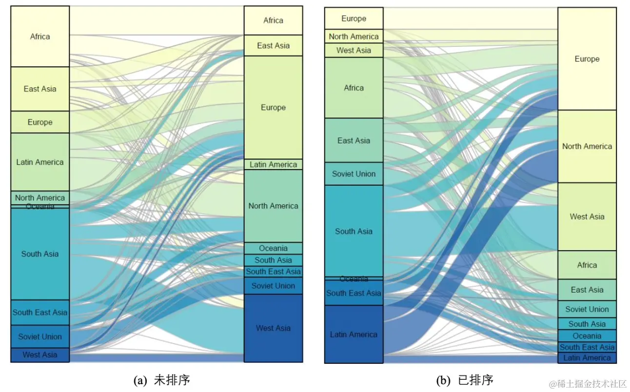
网络关系:节点链接图
网络关系:节点链接图
地理空间 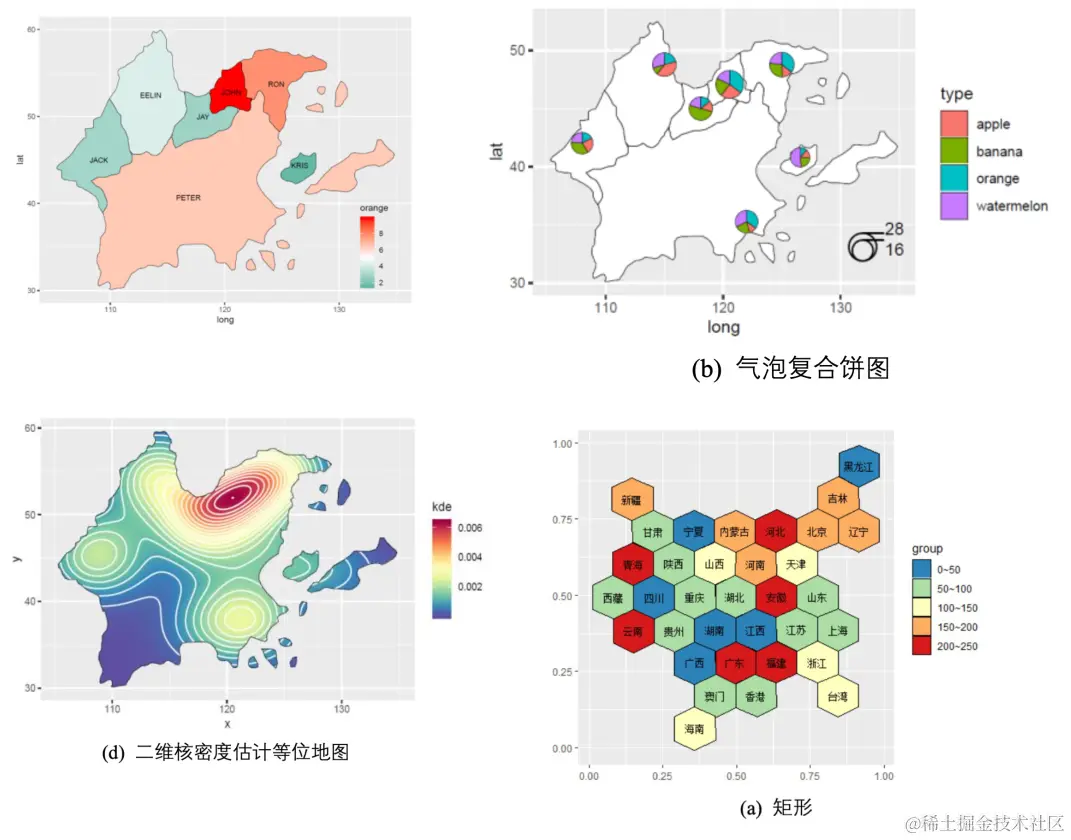
小结
三、ggplot2(Grammar of Graphics)
- ggplot2 基于图形语法,提供了一种全新的图形创建方式。
- 绘图过程归纳为数据 data、转换 transformation、度量 scale、坐标系 coordinate、元素 element、指引 guide、显示 display 等一系列独立的步骤。
- 通过将这些步骤搭配组合,来实现个性化的统计绘图。
ggplot2的图层:
Data 数据: Input data
Geom 几何对象: A geometry representing data. Points, Lines etc
Aesthetic 视觉通道: Visual characteristics of the geometry. Size, Color, Shape etc
Scale 度量: How visual characteristics are converted to display values
Statistics 统计: Statistical transformations. Counts, Means etc
Coordinates 坐标: Numeric system to determine position of geometry. Cartesian, Polar etc
Facets 分面: Split data into subsets
ggplot2 图形语法特点:
- 采用图层的设计方式,有利于结构化思维实现数据可视化;
- 将表征数据和图形细节分开,能快速将图形表现出来;
- 图形美观,扩展包丰富,易于定制个性化图表。
ggplot2 基本绘图语法:
      library

      (ggplot2

      )


      library

      (RColorBrewer

      )


      library

      (wesanderson

      )


      library

      (cowplot

      )


      library

      (reshape2

      )


      str

      (mpg

      )


      head

      (mpg

      )


      ggplot

      (data

      = mpg

      , mapping

      = aes

      (x

      =displ

      , y

      =hwy

      , colour

      =

      class

      )

      )

      +


          geom_point

      (

      )
data 为数据集,主要是数据框 (data.frame) 格式的数据集;
mapping 为变量的视觉通道映射,用来表示变量 x 和 y,还可以用来控制颜色 (color)、大小 (size) 或形状 (shape) 等视觉通道。
      # different vis channels


      df

      <- read.csv

      (

      "pubdata/Facet_Data.csv"

      , header

      =

      TRUE

      )


      ggplot

      (df

      , aes

      (SOD

      , tau

      , size

      = age

      )

      )

      +


          geom_point

      (shape

      =

      21

      , color

      =

      "black"

      , fill

      =

      "#336A97"

      , stroke

      =

      0.25

      )

      +


          theme_cowplot

      (

      )


      ggplot

      (df

      , aes

      (SOD

      , tau

      , fill

      = age

      , size

      = age

      )

      )

      +


          geom_point

      (shape

      =

      21

      , colour

      =

      "black"

      , stroke

      =

      0.25

      , alpha

      =

      0.8

      )

      +


          theme_cowplot

      (

      )


      ggplot

      (df

      , aes

      (SOD

      , tau

      , fill

      = Class

      )

      )

      +


          geom_point

      (shape

      =

      21

      , size

      =

      3

      , colour

      =

      "black"

      , stroke

      =

      0.25

      )

      +


          theme_cowplot

      (

      )


      ggplot

      (df

      , aes

      (SOD

      , tau

      , fill

      = Class

      , size

      = age

      )

      )

      +


          geom_point

      (shape

      =

      21

      , colour

      =

      "black"

      , stroke

      =

      0.25

      , alpha

      =

      0.8

      )

      +


          theme_cowplot

      (

      )
      # different scales


      ggplot

      (df

      , aes

      (x

      =SOD

      , y

      =tau

      , size

      =age

      )

      )

      +


          geom_point

      (shape

      =

      21

      , color

      =

      "black"

      , fill

      =

      "#E53F2F"

      , stroke

      =

      0.25

      , alpha

      =

      0.8

      )

      +


          scale_size

      (

      range

      =

      c

      (

      1

      ,

      8

      )

      )

      +


          theme_cowplot

      (

      )


      ggplot

      (df

      , aes

      (SOD

      , tau

      , fill

      =age

      , size

      =age

      )

      )

      +


          geom_point

      (shape

      =

      21

      ,colour

      =

      "black"

      ,stroke

      =

      0.25

      , alpha

      =

      0.8

      )

      +


          scale_size

      (

      range

      =

      c

      (

      1

      ,

      8

      )

      )

      +


          scale_fill_distiller

      (palette

      =

      "Reds"

      )

      +


          theme_cowplot

      (

      )


      ggplot

      (df

      , aes

      (x

      =SOD

      , y

      =tau

      , fill

      =Class

      , shape

      =Class

      )

      )

      +


          geom_point

      (size

      =

      3

      , colour

      =

      "black"

      , stroke

      =

      0.25

      )

      +


          scale_fill_manual

      (values

      =

      c

      (

      "#36BED9"

      ,

      "#FF0000"

      ,

      "#FBAD01"

      )

      )

      +


          scale_shape_manual

      (values

      =

      c

      (

      21

      ,

      22

      ,

      23

      )

      )

      +


          theme_cowplot

      (

      )


      ggplot

      (df

      , aes

      (SOD

      , tau

      , fill

      =Class

      , size

      =age

      )

      )

      +


          geom_point

      (shape

      =

      21

      , colour

      =

      "black"

      , stroke

      =

      0.25

      , alpha

      =

      0.8

      )

      +


          scale_fill_manual

      (values

      =

      c

      (

      "#36BED9"

      ,

      "#FF0000"

      ,

      "#FBAD01"

      )

      )

      +


          scale_size

      (

      range

      =

      c

      (

      1

      ,

      8

      )

      )

      +


          theme_cowplot

      (

      )
      # multi-plots


      p1

      <- ggplot

      (mtcars

      , aes

      (disp

      , mpg

      )

      )

      + geom_point

      (

      )


      p2

      <- ggplot

      (mtcars

      , aes

      (qsec

      , mpg

      )

      )

      + geom_point

      (

      )


      plot_grid

      (p1

      , p2

      , labels

      =

      c

      (

      'A'

      ,

      'B'

      )

      )
      # color brewer


      df

      <- structure

      (

      list

      (cond

      = structure

      (

      1

      :

      3

      , .Label

      =

      c

      (

      "A"

      ,

      "B"

      ,

      "C"

      )

      ,

      class

      =

      "factor"

      )

      ,


                           yval

      =

      c

      (

      2

      ,

      2.5

      ,

      1.6

      )

      )

      , .Names

      =

      c

      (

      "cond"

      ,

      "yval"

      )

      ,

      class

      =

      "data.frame"

      ,


                      row.names

      =

      c

      (

      NA

      ,

      -

      3L

      )

      )


      p1

      <- ggplot

      (df

      , aes

      (x

      =cond

      , y

      =yval

      , fill

      =cond

      )

      )

      + geom_bar

      (stat

      =

      "identity"

      )

      +


          scale_fill_manual

      (values

      =brewer.pal

      (

      9

      ,

      "Blues"

      )

      [

      3

      :

      5

      ]

      )


      p2

      <- ggplot

      (df

      , aes

      (x

      =cond

      , y

      =yval

      , fill

      =cond

      )

      )

      + geom_bar

      (stat

      =

      "identity"

      )

      +


          scale_fill_manual

      (values

      =brewer.pal

      (

      9

      ,

      "Set1"

      )

      [

      1

      :

      3

      ]

      )


      p3

      <- ggplot

      (df

      , aes

      (x

      =cond

      , y

      =yval

      , fill

      =cond

      )

      )

      + geom_bar

      (stat

      =

      "identity"

      )

      +


          scale_fill_manual

      (values

      =

      c

      (brewer.pal

      (

      9

      ,

      "Spectral"

      )

      [

      3

      ]

      ,


                                     brewer.pal

      (

      9

      ,

      "Spectral"

      )

      [

      6

      ]

      ,


                                     brewer.pal

      (

      9

      ,

      "Spectral"

      )

      [

      8

      ]

      )

      )


      plot_grid

      (p1

      , p2

      , p3

      , nrow

      =

      1

      )
      # bar plots


      mydata

      <- data.frame

      (Cut

      =

      c

      (

      "Fair"

      ,

      "Good"

      ,

      "Very Good"

      ,

      "Premium"

      ,

      "Ideal"

      )

      ,


                         Price

      =

      c

      (

      4300

      ,

      3800

      ,

      3950

      ,

      4700

      ,

      3500

      )

      )


      ggplot

      (data

      = mydata

      , aes

      (x

      =Cut

      , y

      =Price

      )

      )

      +


          geom_bar

      (stat

      =

      "identity"

      , width

      =

      0.7

      ,


                   colour

      =

      "black"

      , size

      =

      0.25

      , fill

      =

      "#FC4E07"

      )

      +


          coord_flip

      (

      )

      +


          theme_cowplot

      (

      )
      mydata

      <-read.csv

      (

      "pubdata/MultiColumn_Data.csv"

      ,check.names

      =

      FALSE

      ,


                       sep

      =

      ","

      ,na.strings

      =

      "NA"

      ,


                       stringsAsFactors

      =

      FALSE

      )


      mydata

      <-melt

      (mydata

      ,id.vars

      =

      'Catergory'

      )


      ggplot

      (data

      =mydata

      ,aes

      (Catergory

      ,value

      ,fill

      =variable

      )

      )

      +


          geom_bar

      (stat

      =

      "identity"

      ,position

      =position_dodge

      (

      )

      ,


                   color

      =

      "black"

      ,width

      =

      0.7

      ,size

      =

      0.25

      )

      +


          scale_fill_manual

      (values

      =

      c

      (

      "#00AFBB"

      ,

      "#FC4E07"

      )

      )

      +


          ylim

      (

      0

      ,

      10

      )

      +


          theme

      (


              axis.title

      =element_text

      (size

      =

      15

      ,face

      =

      "plain"

      ,color

      =

      "black"

      )

      ,


              axis.text

      = element_text

      (size

      =

      12

      ,face

      =

      "plain"

      ,color

      =

      "black"

      )

      ,


              legend.title

      =element_text

      (size

      =

      14

      ,face

      =

      "plain"

      ,color

      =

      "black"

      )

      ,


              legend.background

      =element_blank

      (

      )

      ,


              legend.position

      =

      c

      (

      0.88

      ,

      0.88

      )


      )
      mydata

      <-read.csv

      (

      "pubdata/StackedColumn_Data.csv"

      ,sep

      =

      ","

      ,na.strings

      =

      "NA"

      ,stringsAsFactors

      =

      FALSE

      )


      mydata

      <-melt

      (mydata

      ,id.vars

      =

      'Clarity'

      )


      ggplot

      (data

      =mydata

      ,aes

      (variable

      ,value

      ,fill

      =Clarity

      )

      )

      +


          geom_bar

      (stat

      =

      "identity"

      ,position

      =

      "stack"

      , color

      =

      "black"

      , width

      =

      0.7

      ,size

      =

      0.25

      )

      +


          scale_fill_manual

      (values

      =brewer.pal

      (

      9

      ,

      "YlOrRd"

      )

      [

      c

      (

      6

      :

      2

      )

      ]

      )

      +


          ylim

      (

      0

      ,

      15000

      )

      +


          theme

      (


              axis.title

      =element_text

      (size

      =

      15

      ,face

      =

      "plain"

      ,color

      =

      "black"

      )

      ,


              axis.text

      = element_text

      (size

      =

      12

      ,face

      =

      "plain"

      ,color

      =

      "black"

      )

      ,


              legend.title

      =element_text

      (size

      =

      14

      ,face

      =

      "plain"

      ,color

      =

      "black"

      )

      ,


              legend.background

      =element_blank

      (

      )

      ,


              legend.position

      =

      c

      (

      0.85

      ,

      0.82

      )


      )
      mydata

      <-read.csv

      (

      "pubdata/StackedColumn_Data.csv"

      ,sep

      =

      ","

      ,na.strings

      =

      "NA"

      ,stringsAsFactors

      =

      FALSE

      )


      mydata

      <-melt

      (mydata

      ,id.vars

      =

      'Clarity'

      )


      ggplot

      (data

      =mydata

      ,aes

      (variable

      ,value

      ,fill

      =Clarity

      )

      )

      +


          geom_bar

      (stat

      =

      "identity"

      , position

      =

      "fill"

      ,color

      =

      "black"

      , width

      =

      0.8

      ,size

      =

      0.25

      )

      +


          scale_fill_manual

      (values

      =brewer.pal

      (

      9

      ,

      "GnBu"

      )

      [

      c

      (

      7

      :

      2

      )

      ]

      )

      +


          theme

      (


              axis.title

      =element_text

      (size

      =

      15

      ,face

      =

      "plain"

      ,color

      =

      "black"

      )

      ,


              axis.text

      = element_text

      (size

      =

      12

      ,face

      =

      "plain"

      ,color

      =

      "black"

      )

      ,


              legend.title

      =element_text

      (size

      =

      14

      ,face

      =

      "plain"

      ,color

      =

      "black"

      )

      ,


              legend.position

      =

      "right"


      )
      # cleveland plot


      mydata

      <- read.csv

      (

      "pubdata/DotPlots_Data.csv"

      ,sep

      =

      ","

      ,na.strings

      =

      "NA"

      ,stringsAsFactors

      =

      FALSE

      )


      mydata

      $

      sum

      <- rowSums

      (mydata

      [

      ,

      2

      :

      3

      ]

      )


      order

      <-sort

      (mydata

      $

      sum

      ,index.return

      =

      TRUE

      ,decreasing

      =

      FALSE

      )


      mydata

      $City

      <- factor

      (mydata

      $City

      , levels

      = mydata

      $City

      [order

      $ix

      ]

      )


      ggplot

      (mydata

      , aes

      (

      sum

      , City

      )

      )

      +


          geom_point

      (shape

      =

      21

      , size

      =

      3

      , colour

      =

      "black"

      , fill

      =

      "#FC4E07"

      )

      +


          theme_cowplot

      (

      )
      # scatter plot with smoothing


      mydata

      <- read.csv

      (

      "pubdata/Scatter_Data.csv"

      ,stringsAsFactors

      =

      FALSE

      )


      p

      <- ggplot

      (data

      = mydata

      , aes

      (x

      ,y

      )

      )

      +


              geom_point

      (fill

      =

      "black"

      ,colour

      =

      "black"

      ,size

      =

      3

      ,shape

      =

      21

      )

      +


              scale_y_continuous

      (breaks

      = seq

      (

      0

      ,

      125

      ,

      25

      )

      )

      +


              theme_cowplot

      (

      )


      p

      + geom_smooth

      (method

      =

      'loess'

      , span

      =

      0.4

      , se

      =

      TRUE

      , formula

      =y

      ~x

      ,


                           colour

      =

      "#00A5FF"

      , fill

      =

      "#00A5FF"

      , alpha

      =

      0.2

      )


      p

      + geom_smooth

      (method

      =

      "lm"

      ,se

      =

      TRUE

      ,formula

      =y

      ~ splines

      ::bs

      (x

      ,

      5

      )

      ,colour

      =

      "red"

      )


      p

      + geom_smooth

      (method

      =

      'gam'

      ,formula

      =y

      ~s

      (x

      )

      )
      # bubble chart


      ggplot

      (data

      =mtcars

      , aes

      (x

      =wt

      ,y

      =mpg

      )

      )

      +


          geom_point

      (aes

      (size

      =disp

      , fill

      =disp

      )

      , shape

      =

      21

      , colour

      =

      "black"

      , alpha

      =

      0.8

      )


      ggplot

      (data

      =mtcars

      , aes

      (x

      =wt

      , y

      =mpg

      )

      )

      +


          geom_point

      (aes

      (size

      =disp

      , fill

      =disp

      )

      , shape

      =

      21

      , colour

      =

      "black"

      , alpha

      =

      0.8

      )

      +


          scale_fill_gradient2

      (low

      =

      "#377EB8"

      ,high

      =

      "#E41A1C"

      ,


                               limits

      =

      c

      (

      0

      ,

      max

      (mtcars

      $ disp

      )

      )

      ,


                               midpoint

      = mean

      (mtcars

      $disp

      )

      )

      +


          theme_cowplot

      (

      )


      ggplot

      (data

      =mtcars

      , aes

      (x

      =wt

      ,y

      =mpg

      )

      )

      +


          geom_point

      (aes

      (size

      =disp

      ,fill

      =disp

      )

      ,shape

      =

      22

      ,colour

      =

      "black"

      ,alpha

      =

      0.8

      )

      +


          scale_fill_gradient2

      (low

      =

      "#377EB8"

      ,high

      =

      "#E41A1C"

      ,limits

      =

      c

      (

      0

      ,

      max

      (mtcars

      $ disp

      )

      )

      ,


                               midpoint

      = mean

      (mtcars

      $disp

      )

      )
      # histogram/density


      df

      <- read.csv

      (

      "pubdata/Hist_Density_Data.csv"

      , stringsAsFactors

      =

      FALSE

      )


      ggplot

      (df

      , aes

      (x

      = MXSPD

      , fill

      = Location

      )

      )

      +


          geom_histogram

      (binwidth

      =

      1

      , alpha

      =

      0.5

      , colour

      =

      "black"

      , size

      =

      0.25

      )

      +


          theme_cowplot

      (

      )


      ggplot

      (df

      , aes

      (x

      = MXSPD

      ,  fill

      = Location

      )

      )

      +


          geom_density

      (alpha

      =

      0.5

      , colour

      =

      "black"

      , size

      =

      0.25

      )

      +


          theme_cowplot

      (

      )
      # jitter


      library

      (SuppDists

      )


      set.seed

      (

      141079

      )


      n

      <- rnorm

      (

      100

      ,

      3

      ,

      1

      )


      s

      <- rJohnson

      (

      100

      , parms

      <-JohnsonFit

      (

      c

      (

      0

      ,

      1

      ,

      -

      .5

      ,

      4

      )

      ,moment

      =

      "use"

      )

      )


      k

      <- rJohnson

      (

      100

      , parms

      <-JohnsonFit

      (

      c

      (

      0

      ,

      1

      ,

      -

      .5

      ,

      4

      )

      ,moment

      =

      "use"

      )

      )


      mm

      <- rnorm

      (

      100

      ,

      rep

      (

      c

      (

      2

      ,

      4

      )

      , each

      =

      50

      )

      *

      sqrt

      (

      0.9

      )

      ,

      sqrt

      (

      0.1

      )

      )


      mydata

      <- data.frame

      (


          Class

      = factor

      (

      rep

      (

      c

      (

      "n"

      ,

      "s"

      ,

      "k"

      ,

      "mm"

      )

      , each

      =

      100

      )

      ,


      c

      (

      "n"

      ,

      "s"

      ,

      "k"

      ,

      "mm"

      )

      )

      ,


          Value

      =

      c

      (n

      , s

      , k

      , mm

      )


      )


      ggplot

      (mydata

      , aes

      (Class

      , Value

      )

      )

      +


          geom_jitter

      (aes

      (fill

      = Class

      )

      , position

      = position_jitter

      (

      0.3

      )

      , shape

      =

      21

      , size

      =

      2

      )

      +


          scale_fill_manual

      (values

      =

      c

      (brewer.pal

      (

      7

      ,

      "Set2"

      )

      [

      c

      (

      1

      ,

      2

      ,

      4

      ,

      5

      )

      ]

      )

      )

      +


          theme_cowplot

      (

      )
      # violin plot


      ggplot

      (mydata

      , aes

      (Class

      , Value

      )

      )

      +


          geom_violin

      (aes

      (fill

      = Class

      )

      , trim

      =

      FALSE

      )

      +


          geom_boxplot

      (width

      =

      0.2

      )

      +


          scale_fill_manual

      (values

      =

      c

      (brewer.pal

      (

      7

      ,

      "Set2"

      )

      [

      c

      (

      1

      ,

      2

      ,

      4

      ,

      5

      )

      ]

      )

      )

      +


          theme_cowplot

      (

      )
# ggpubr
library
(ggpubr
)
palette
<-
c
(brewer.pal
(
7
,
"Set2"
)
[
c
(
1
,
2
,
4
,
5
)
]
)
ggboxplot
(mydata
, x
=
"Class"
, y
=
"Value"
,
fill
=
"Class"
, palette
= palette
,
add
=
"none"
, size
=
0.5
, add.params
=
list
(size
=
0.25
)
)
+
geom_hline
(yintercept
= mean
(mydata
$Value
)
, linetype
=
2
)
+
#娣诲姞鍧囧€肩嚎
stat_compare_means
(method
=
"anova"
, label.x
=
0.8
,label.y
=
7.8
)
+
# 娣诲姞鍏ㄩ儴鏁版嵁鐨刟nnova 鏂规硶鐨刾-value
stat_compare_means
(label
=
"p.signif"
, method
=
"t.test"
,
ref.group
=
".all."
, hide.ns
=
TRUE
,label.y
=
8
)
+
# 娣诲姞姣忕粍鍙橀噺涓庡叏閮ㄦ暟鎹殑鏄捐憲鎬?
theme_cowplot
(
)
      # line plot, area plot


      linedata

      <- read.csv

      (

      'pubdata/linearea.csv'

      )


      linedata

      $date

      <-as.Date

      (linedata

      $date

      ,origin

      =

      "1970-01-01"

      )


      ggplot

      (linedata

      , aes

      (x

      = date

      , y

      = y

      )

      )

      +


          geom_line

      (color

      =

      "black"

      , size

      =

      0.5

      )

      +


      # geom_bar(color="steelblue", stat = "identity") +


          scale_x_date

      (date_labels

      =

      "%Y"

      , date_breaks

      =

      "1 year"

      )

      +


          theme_cowplot

      (

      )
      # donut plot


      model11

      <- read.csv

      (

      "pubdata/model11.csv"

      )


      model11

      $Organism

      <- factor

      (model11

      $Organism

      , levels

      = model11

      $Organism

      )


      mypalette

      <- wes_palette

      (

      "Darjeeling2"

      , n

      =

      11

      , type

      =

      "continuous"

      )


      mypalette

      <-

      c

      (brewer.pal

      (

      11

      ,

      "Paired"

      )

      )


      ggplot

      (data

      = model11

      , aes

      (ymax

      =ymax

      , ymin

      =ymin

      , xmax

      =

      4

      , xmin

      =

      3

      , fill

      =Organism

      )

      )

      +


          geom_rect

      (

      )

      +


          coord_polar

      (theta

      =

      "y"

      )

      +


          xlim

      (

      c

      (

      2

      ,

      4

      )

      )

      +


          labs

      (x

      =

      NULL

      , y

      =

      NULL

      , fill

      =

      NULL

      , title

      =

      "GEO Sample/Organism Distribution"

      )

      +


          guides

      (fill

      = guide_legend

      (

      )

      )

      +


          scale_fill_manual

      (values

      = mypalette

      )

      +


          theme_classic

      (

      )

      +


          theme

      (axis.line

      = element_blank

      (

      )

      ,


                axis.text

      = element_blank

      (

      )

      ,


                axis.ticks

      = element_blank

      (

      )

      ,


                plot.title

      = element_text

      (hjust

      =

      0.5

      , color

      =

      "#666666"

      )

      )
      # heatmap


      library

      (pheatmap

      )


      df

      <- scale

      (mtcars

      )


      colormap

      <- colorRampPalette

      (rev

      (brewer.pal

      (n

      =

      7

      , name

      =

      "RdYlBu"

      )

      )

      )

      (

      100

      )


      breaks

      <- seq

      (

      min

      (unlist

      (

      c

      (df

      )

      )

      )

      ,

      max

      (unlist

      (

      c

      (df

      )

      )

      )

      , length.out

      =

      100

      )


      pheatmap

      (df

      , color

      = colormap

      , breaks

      = breaks

      , border_color

      =

      "black"

      ,


               cutree_col

      =

      2

      ,


               cutree_row

      =

      4


      )
      # treemap


      library

      (treemapify

      )


      comm

      <- read.csv

      (

      "pubdata/communities.csv"

      )


      comm

      $name

      <- factor

      (comm

      $name

      , levels

      = comm

      $name

      )


      mypalette

      <-

      c

      (brewer.pal

      (

      10

      ,

      "Paired"

      )

      )


      mypalette

      <- wes_palette

      (

      "Darjeeling2"

      , n

      =

      10

      , type

      =

      "continuous"

      )


      ggplot

      (data

      = comm

      , aes

      (area

      = activelab

      , fill

      = name

      , label

      = name

      )

      )

      +


          geom_treemap

      (show.legend

      =

      F

      )

      +


          geom_treemap_text

      (colour

      =

      "white"

      , place

      =

      "centre"

      , grow

      =

      T

      )

      +


          scale_fill_manual

      (values

      = mypalette

      )
