<div id="main" style="width:2000px;height:1200px"></div>
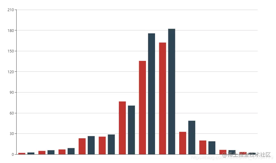
- 先来一个简简单单的
var myChart = echarts.init(document.getElementById('main'));
var option = {
xAxis: [
{ type: 'category', }
],
yAxis: [
{ type: 'value' }
],
series: [
{
name: '蒸发量',
type: 'bar',
data:[2.0, 4.9, 7.0, 23.2, 25.6, 76.7, 135.6, 162.2, 32.6, 20.0, 6.4, 3.3],
},
{
name: '降水量',
type: 'bar',
data:[2.6, 5.9, 9.0, 26.4, 28.7, 70.7, 175.6, 182.2, 48.7, 18.8, 6.0, 2.3],
}
]
};
myChart.setOption(option);
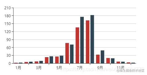
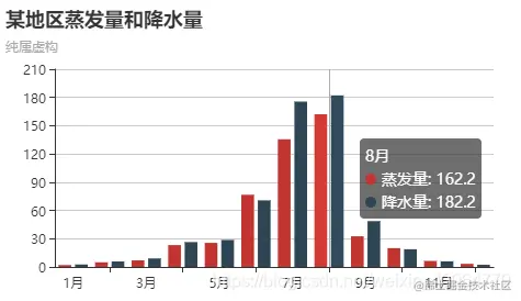
- 在
option.xAxis 加上横坐标 data
data: ['1月', '2月', '3月', '4月', '5月', '6月', '7月', '8月', '9月', '10月', '11月', '12月']
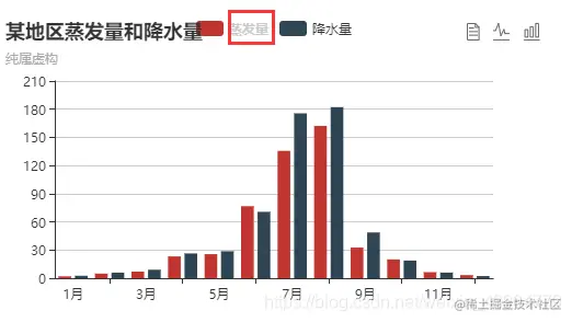
- 与
xAxis同级,加上图标的标题title
title: {
  text: '某地区蒸发量和降水量',
  subtext: '纯属虚构'
},
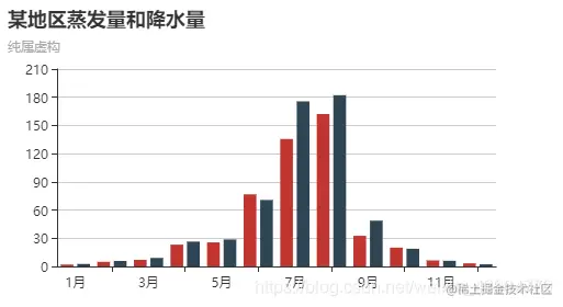
- 同级加上
tooltip,使鼠标悬浮有文字提示
tooltip: {
  trigger: 'axis'
},
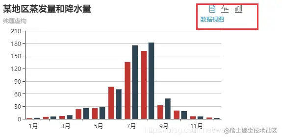
- 同级,
toolbox使右上角出现工具栏,分别是:数据视图;切换折线图或柱状图
toolbox: {
  show: true,
  feature: {
    dataView: {show: true, readOnly: false},
    magicType: {show: true, type: ['line', 'bar']},
  }
},
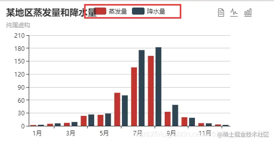
- 同级,加上
legend出现图例
legend: {
  show: true,
  data: [
    {
      name: '蒸发量',
    },
    {
      name: '降水量',
    }
  ]
},
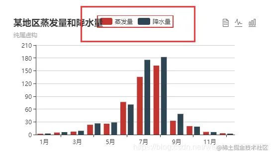
- 在
legend中也可以改变图例边框样式
orient: 'horizontal',
borderColor: '#df3434',
borderWidth: 2,
- 在
legend.data中加textStyle可以改变图例的文字样式
textStyle: {
    fontSize: 12,
    fontWeight: 'bolder',
    color: '#cccccc'
},
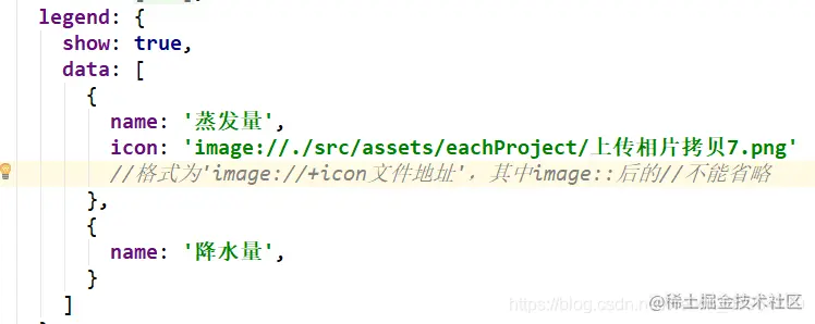
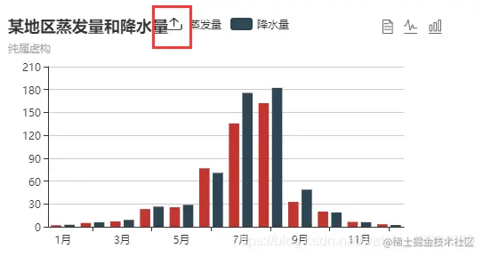
- 在
legend.data中就可以将图例的色块变为图片
icon: 'image://./src/assets/eachProject/上传相片拷贝7.png'
- 将
series中的data变为
data: [
    {value: 2.0, name: ' '},
    {value: 4.9, name: ' '},
    {value: 7.0, name: ' '},
    {value: 23.2, name: ' '},
    {value: 25.6, name: ' '},
    {value: 76.7, name: ' '},
    {value: 135.6, name: ' '},
    {value: 162.2, name: ' '},
    {value: 32.6, name: ' '},
    {value: 20.0, name: ' '},
    {value: 6.4, name: ' '},
    {value: 3.3, name: ' '},
]
data: [
    {value: 2.6, name: '',},
    {value: 5.9, name: '',},
    {value: 9.0, name: '',},
    {value: 26.4, name: '',},
    {value: 28.7, name: '',},
    {value: 70.7, name: '',},
    {value: 175.6, name: '',},
    {value: 182.2, name: '',},
    {value: 48.7, name: '',},
    {value: 18.8, name: '',},
    {value: 6.0, name: '',},
    {value: 2.3, name: '',},
]
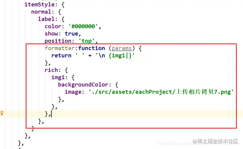
- 同
data级别 ,使柱状图末端显示的数字改为图片
formatter:function (params) {
    return ' ' + '\n {img1|}'
},
rich: {
    img1: {
        backgroundColor: {
            image: './src/assets/eachProject/上传相片拷贝7.png'
        },
    },
},
- 如果不想把数字去掉,那么:
formatter:function (params) {
return ' ' + '\n {img1|}' + params.value;
},
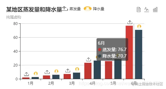
- 完整的代码
var myChart = echarts.init(document.getElementById('main'));
var option = {
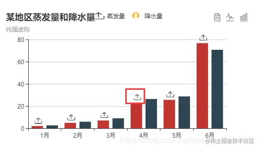
title: {text: '某地区蒸发量和降水量', subtext: '纯属虚构'},
tooltip: {trigger: 'axis'},
toolbox: {
show: true,
feature: {
dataView: {show: true, readOnly: false},
magicType: {show: true, type: ['line', 'bar']},
}
},
xAxis: [
{
type: 'category',
data: ['1月', '2月', '3月', '4月', '5月', '6月',]
}
],
yAxis: [{type: 'value'}],
legend: {
show: true,
data: [
{
name: '蒸发量',
icon: 'image://./src/assets/eachProject/上传相片拷贝7.png'
},
{
name: '降水量',
icon: 'image://./src/assets/eachProject/头像的副拷贝5.png'
}
]
},
series: [
{
name: '蒸发量',
type: 'bar',
data: [
{value: 2.0, name: '一月'},
{value: 4.9, name: '二月'},
{value: 7.0, name: '三月'},
{value: 23.2, name: '四月'},
{value: 25.6, name: '五月'},
{value: 76.7, name: '六月'},
],
itemStyle: {
normal: {
label: {
color: '#000000',
show: true,
position: 'top',
formatter: function (params) {
return ' ' + '\n {img1|}'
},
rich: {
img1: {
backgroundColor: {
image: './src/assets/eachProject/上传相片拷贝7.png'
},
},
},
},
}
},
},
{
name: '降水量',
type: 'bar',
data: [
{value: 2.6, name: '',},
{value: 5.9, name: '',},
{value: 9.0, name: '',},
{value: 26.4, name: '',},
{value: 28.7, name: '',},
{value: 70.7, name: '',},
],
itemStyle: {
normal: {
label: {
color: '#000000',
show: true,
position: 'top',
formatter: function (params) {
return ' ' + '\n {img1|}'
},
rich: {
img1: {
backgroundColor: {
image: './src/assets/eachProject/头像的副拷贝5.png'
},
},
},
},
}
},
}
],
};
myChart.setOption(option);