该文章主要对 element-ui 里的 dialog 组件的二次封装,主要针对close-on-click-modal和close-on-press-escape的默认属性做了更改,其他的属性正常按照 dialog 组件的文档进行设置
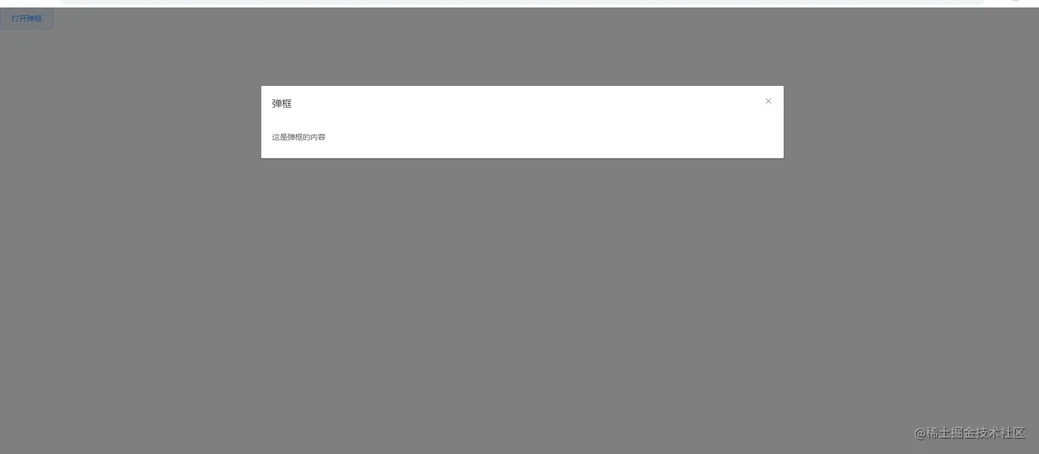
页面效果:
1、首先在项目中下载elemnent-ui
npm i element-ui -S
2、在main.ts中进行注册
import Vue from 'vue'
import App from './App.vue'
import router from './router'
import store from './store'
import ElementUI from 'element-ui';
import 'element-ui/lib/theme-chalk/index.css';
import AiDialog from '@/components/AiDialog/AiDialogindex.vue'
Vue.component("AiDialog", AiDialog);
Vue.config.productionTip = false
Vue.use(ElementUI);
new Vue({
router,
store,
render: h => h(App)
}).$mount('#app')
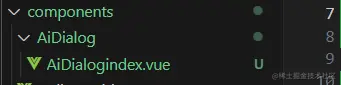
3、在components里面创建,并放入以下代码
<template>
  <el-dialog v-model="visibleDialog" v-bind="$attrs" :close-on-click-modal="false" :close-on-press-escape="false"
    v-on="$listeners">
    <template slot="title">
      <slot name="title"></slot>
    </template>
    <slot></slot>
    <template slot="footer">
      <slot name="footer"></slot>
    </template>
  </el-dialog>
</template>

<script>
export default {
  props: {
    value: {
      default: false,
      type: Boolean,
    }
  },
  watch: {
    value(val) {
      this.visibleDialog = val
    },
    visibleDialog() {
      this.$emit('update:value', this.visibleDialog)
    }
  },
  data() {
    return {
      visibleDialog: false
    }
  },
  mounted() {

  },
  methods: {
  }
}
</script>
5、在对应要展示的页面进行使用即可
<template>
  <div>
    <el-button @click="visibleDialog=true" class="close" width="750px">打开弹框</el-button>
    <AiDialog title="弹框" :visible.sync="visibleDialog">
      这是弹框的内容
    </AiDialog>
  </div>
</template>

<script>
export default {
  data() {
    return {
      visibleDialog: false
    }
  }
}
</script>


