$responsePoints: (
'mob': (
320px,
768px,
),
'pad': (
769px,
1024px,
),
'pc': (
1025px
),
);
@mixin response($pointName) {
$point: map-get($responsePoints, $pointName );
@if type-of($point) == 'list' {
$min: nth($point, 1);
$max: nth($point, 2);
@media(min-width: $min) and (max-width: $max) {
@content;
}
}
@else {
@media (min-width: $point) {
@content;
}
}
}
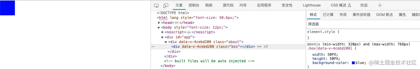
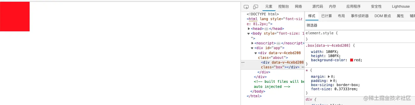
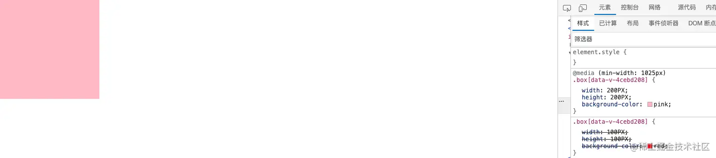
.box {
width: 100PX;
height: 100PX;
background-color: red;
@include response('mob') {
width: 50PX;
height: 50PX;
background-color: blue;
}
@include response('pc') {
width: 200PX;
height: 200PX;
background-color: pink;
}
}


