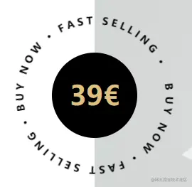
默认文字围绕园一直旋转,鼠标悬停快速旋转一周,案例中此盒子是在一个大盒子里水平垂直居中的,所以css里会有定位相关的属性,最外面应该再包裹一个div,加上 position: relative; ,textPath里面的内容是外围的文字,可修改
HTML
<div class="animation">
<div class="animation-inside">39€</div>
<div class="circle">
<svg viewBox="0 0 100 100">
<path
d="M 50 50 m -50 0 a 50 50 0 1 1 100 0 a 50 50 0 1 1 -100 0 z"
id="circle"
/>
<text>
<textPath xlink:href="#circle">
B U Y N O W · F A S T S E L L I N G · B U Y N O W · F A S T S E L L I N G ·
</textPath>
</text>
</svg>
</div>
</div>
CSS
.animation {
cursor: pointer;
.animation-inside {
position: absolute;
left: 50%;
top: 50%;
transform: translate(-50%, -50%);
z-index: 888;
width: 120px;
height: 120px;
background-color: #000;
color: @primary;
border-radius: 50%;
display: flex;
align-items: center;
justify-content: center;
font-weight: 600;
font-size: 38px;
}
.circle {
position: absolute;
left: 0;
right: 0;
top: 0;
bottom: 0;
margin: auto;
z-index: 999;
width: 200px;
height: 200px;
font-size: 7px;
font-weight: 600;
animation: rotate 50s linear infinite;
svg {
display: block;
overflow: visible;
transition: 0.5s;
}
svg:hover {
transform: rotate(-1turn);
}
path {
fill: none;
}
}
@keyframes rotate {
0% {
transform: rotate(0deg);
}
100% {
transform: rotate(360deg);
}
}
}


