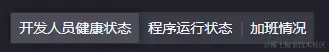
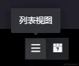
改了个 antd 的 radio button的样式 哈哈哈
import React, {ReactElement} from 'react';
import {Radio, Tooltip} from 'antd';
import {observer} from 'mobx-react';
import './index.less';

RadioBtnGroup.defaultProps = {
  prefixCls: 'mc-radioBtnGroup'
};

function warperTooltip(ele: ReactElement, option): ReactElement {
  return (
    <Tooltip title={option.tipTitle}>
      {ele}
    </Tooltip>
  );
}

function RadioBtnGroup({
  value,
  options = [],
  onChange,
  prefixCls
}): ReactElement {
  return (
    <Radio.Group
      defaultValue={value}
      className={prefixCls}
    >
      {options.map((option) => {
        const ele = (
          <div>
            {option.iconClass && (
              <i
                className={option.iconClass}
                {...option.iconColor ? {style: {color: option.iconColor}} : {}}
              />
            )}
            {option.label && <span>{option.label}</span>}
          </div>
        );
        return (
          <Radio
            key={option.value}
            value={option.value}
            className={`${prefixCls}_btn`}
            onChange={(e) => onChange(e.target.value)}
          >
            {option.tipTitle ? warperTooltip(ele, option) : ele}
          </Radio>
        );
      })}
    </Radio.Group>
  );
}

export default observer(RadioBtnGroup);
@prefixCls: ~'mc-radioBtnGroup';

.@{prefixCls} {
  background-color: rgba(117, 118, 133, 0.3);
  border-radius: 2px;
  &_btn.ant-radio-wrapper {
    min-width: 32px;
    height: 32px;
    justify-content: center;
    align-items: center;
    margin-right: 0;
    .ant-radio {
      display: none;
    }
    &:not(:first-child)&:not(&-checked)::before {
      content: '|';
      width: 2px;
      color: rgba(95, 95, 107, 1);
    }
    i {
      font-size: 14px;
    }
    &-checked {
      margin: 1px;
      border-radius: 2px;
      min-width: 30px;
      height: 30px;
      background-color: rgba(197, 197, 209, 0.12);
      box-shadow: 0px 0px 8px 0px rgba(0,0,0,0.5);
      & + label {
        &::before {
          content: none !important;
        }
      }
    }
  }
}


