1.新建弹窗组件 可根据实际情况自定义
<!--
 * @Description  : 弹窗组件
 * @Author       : wxy
 * @Date         : 2023-03-29 14:21:12
 * @LastEditTime : 2023-03-30 16:40:56
 * @LastEditors  : wxy
 * @FilePath     : \luban-front\src\components\LbNotification\index.vue
-->
<template>
  <div class="wrapper">
    <div class="icon">
      <svg-icon :icon-class="iconName" class-name="card-panel-icon" />
    </div>
    <div class="content">
      {{ startMsg }}
      <span class="reason-red">{{ msgInfoData.reason }}</span>
      <span v-if="msgInfoData.case_name">异常原因:</span>
      <span class="case-blue">{{ msgInfoData.case_name }}</span>
    </div>
  </div>
</template>
<script>
export default {
  props: {
    msgInfoData: {
      type: Object,
      default: () => { }
    },
    title: {
      type: String,
      default: ''
    },
    code: {
      type: Number,
      default: null
    }
  },
  data () {
    return {
      show: false
    }
  },
  mounted () {
  },
  computed: {
    startMsg () {
      const msgMap = {
        200: '用例转换成功',
        400: '用例转换异常,异常原因:',
      }
      return msgMap[this.code] || '用例转换失败,失败原因:'
    },
    iconName () {
      const iconMap = {
        200: 'msg_success',
        400: 'msg_warning',
      }
      return iconMap[this.code] || 'msg_error'
    }
  },
  methods: {
  },
}
</script>
<style lang='scss' scoped>
.wrapper {
  display: flex;
  width: 330px;
  padding: 14px 26px 14px 13px;
  border-radius: 8px;
  box-sizing: border-box;
  border: 1px solid #ebeef5;
  position: fixed;
  background-color: #fff;
  box-shadow: 0 2px 12px 0 rgba(0, 0, 0, .1);
  transition: opacity .3s, transform .3s, left .3s, right .3s, top .4s, bottom .3s;
  overflow: hidden;
  top: 16px;
  right: 16px;
  z-index: 9999;

  .icon {
    width: 30px;
    height: 30px;
  }

  .content {
    flex: 1;
    font-size: 14px;
    line-height: 21px;
    margin: 6px 0 0;
    color: #606266;
    text-align: justify;

    .reason-red {
      color: #d58e95;
    }

    .case-blue {
      color: rgb(0, 175, 255)
    }
  }
}
</style>
2.新建lbNotification.js
import LbNotification from "@/components/LbNotification";
export default {
install(Vue) {
let NotifyConstructor, instance;
const lbNotify = (data) => {
return new Promise((resolve, reject) => {
_create(data, reject);
_mount();
_destroy(data);
resolve();
});
};
const _create = (data, reject) => {
NotifyConstructor = Vue.extend(LbNotification);
instance = new NotifyConstructor({ propsData: data, data: { show: true }});
instance.hide = () => {
reject();
};
};
const _mount = () => {
const dom = document.createElement("div");
instance.$mount(dom);
document.body.appendChild(instance.$el);
};
const _destroy = ({ duration = 2000 }) => {
clearTimeout(timer);
const timer = setTimeout(() => {
document.body.removeChild(instance.$el);
instance.show = false;
instance.$destroy();
instance = null;
}, duration);
};
Vue.prototype.$lbNotify = lbNotify;
}
};
3.main.js注册
import lbNotification from "./utils/lbNotification";
Vue.use(lbNotification)
const lb_this = new Vue({
el: "#app",
router,
store,
render: h => h(App)
});
export default lb_this;
4.文件使用
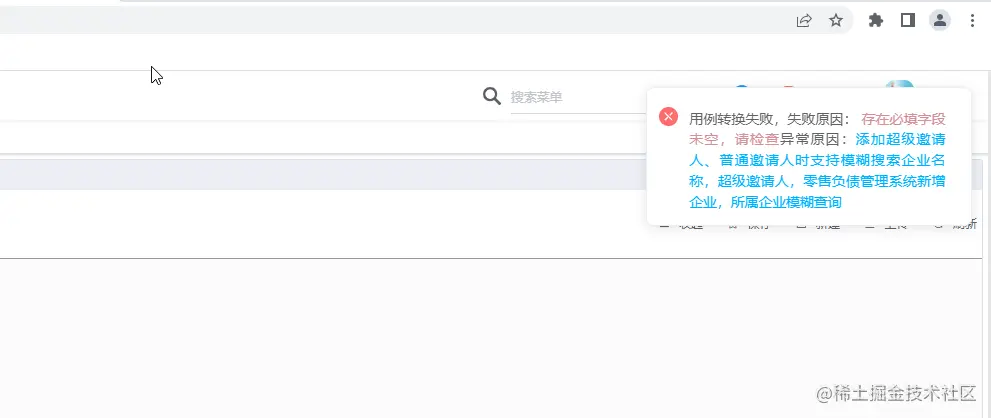
lb_this.$lbNotify({ code: 201, duration: 3000, msgInfoData: {
reason: "存在必填字段未空,请检查",
case_name: "添加超级邀请人、普通邀请人时支持模糊搜索企业名称,超级邀请人,零售负债管理系统新增企业,所属企业模糊查询" }
});
5.弹窗效果


