<style>
*{
padding: 0;
margin: 0;
box-sizing: border-box;
}
.box {
transform-style: preserve-3d;
position: relative;
width: 200px;
height: 200px;
margin: 100px auto;
transition: all 3s;
}
.box div {
position: absolute;
left: 0;
top: 0;
width: 100%;
height: 100%;
line-height: 200px;
text-align: center;
font-size: 30px;
color: #fff;
}
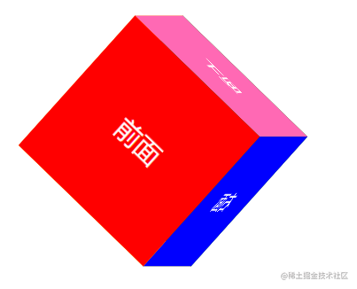
.box div:nth-child(1){
transform: translateZ(100px);
background-color: red;
}
.box div:nth-child(2){
transform: translateZ(-100px);
background-color: green;
}
.box div:nth-child(3){
transform: translateX(-100px) rotateY(-90deg);
background-color: orange;
}
.box div:nth-child(4){
transform: translateX(100px) rotateY(-90deg);
background-color: blue;
}
.box div:nth-child(5){
transform: translateY(-100px) rotateX(-90deg);
background-color: hotpink;
}
.box div:nth-child(6){
transform: translateY(100px) rotateX(-90deg);
background-color: yellow;
}
.box:hover {
transform: rotateY(360deg) rotateZ(45deg);
}
</style>
```html
<div class="box">
<div>前面</div>
<div>后面</div>
<div>左面</div>
<div>右面</div>
<div>上面</div>
<div>下面</div>
</div>


