1.效果:
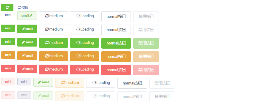
2.使用:
    <div class="mg-btn small warning">warning按钮</div>
    <div class="mg-btn medium success">success按钮</div>
    <div class="mg-btn warning disabled">禁用按钮</div>
3. scss完整源码:里面的变量可以直接在scss文件内定义,示例是全局变量
@mixin buttonSize($size) {
@if $size == 'medium' {
height: 36px;
line-height: 16px;
padding: 10px 20px;
font-size: 14px;
border-radius: 4px;
& > .mg-icon {
line-height: 16px;
}
} @else if ($size == 'small') {
height: 32px;
line-height: 14px;
padding: 9px 15px;
font-size: 12px;
border-radius: 3px;
& > .mg-icon {
line-height: 14px;
}
} @else if ($size == 'mini') {
height: 28px;
line-height: 14px;
padding: 7px 15px;
font-size: 12px;
border-radius: 3px;
& > .mg-icon {
line-height: 14px;
}
} @else {
height: 40px;
line-height: 16px;
padding: 12px 20px;
font-size: 14px;
border-radius: 4px;
& > .mg-icon {
line-height: 16px;
}
}
}
@mixin buttonType($theme,$color:#ffffff) {
color: $color;
background-color: $theme;
border-color: $theme;
&:hover {
background: rgba($theme, .9);
border-color: rgba($theme, .9);
color: $color
}
&::before {
background: rgba($theme, 0.1);
}
&::after {
border: 1px solid rgba($theme, 0.5);
}
&.disabled,
&:disabled {
cursor: not-allowed;
//pointer-events: none;
background: rgba($theme, .5);
border-color: rgba($theme, .1);
&:hover {
background: rgba($theme, .5);
border-color: rgba($theme, .5);
color: $color
}
&::before {
background: rgba($theme, 0.15);
border-color: rgba($theme, .5);
}
&::after {
border: 1px solid rgba($theme, 0.1);
}
}
}
@mixin buttonIsPlainType($theme) {
color: $theme;
background: rgba($theme, .1);
border-color: rgba($theme, .2);
&:hover {
background: rgba($theme, .09);
border-color: rgba($theme, .3);
color: $theme
}
&::before {
background: rgba($theme, 0.1);
}
&::after {
border: 1px solid rgba($theme, 0.3);
}
&.disabled,
&:disabled {
cursor: not-allowed;
color: rgba($theme, .5);
border-color: rgba($theme, .1);
&:hover {
border-color: rgba($theme, .2);
color: #c0c4cc;
}
&::before {
background-color: rgba($theme, .1);
border-color: rgba($theme, .2);
}
&::after {
border: 1px solid rgba($theme, 0.1);
}
}
}
@mixin buttonDisabled() {
color: #c0c4cc;
cursor: not-allowed;
background-image: none;
background-color: #fff;
border-color: #ebeef5;
&:hover {
background-color: #eee;
border-color: #ebeef5;
color: #c0c4cc;
}
&::before {
background-color: rgba(#eee, .1);
border-color: #ebeef5;
}
&::after {
border-color: #ebeef5;
}
}
@mixin buttonAnimation() {
&::before, &::after {
content: '';
position: absolute;
transition: all 0.3s;
bottom: 0;
left: 0;
width: 100%;
height: 100%;
z-index: 1;
}
&::before {
opacity: 0;
background: rgba($color-primary, 0.1);
transform: scale(1.3, 1.3);
border-radius: 3px;
}
&:hover::before {
opacity: 1;
transform: scale(1, 1);
}
&::after {
transition: all 0.3s;
border: 1px solid #dcdfe6;
border-radius: 3px;
}
&:hover::after {
transform: scale(0, 0);
opacity: 0;
}
}
.mg-btn {
position: relative;
display: inline-block;
line-height: 1;
white-space: nowrap;
cursor: pointer;
background: #fff;
//border: 1px solid #dcdfe6;
border: none;
color: #606266;
-webkit-appearance: none;
text-align: center;
box-sizing: border-box;
outline: none;
margin: 0;
transition: .1s;
font-weight: 500;
-moz-user-select: none;
-webkit-user-select: none;
-ms-user-select: none;
@include buttonSize('normal');
@include buttonAnimation();
&-groups {
display: flex;
flex-wrap: wrap;
align-content: center;
flex: 1; //子元素都有相同的长度
& > .mg-btn {
margin-right: 8px;
}
}
&:hover {
color: $color-primary;
}
&:active {
background: rgba($color-primary, 0.2);
}
&.disabled,
&:disabled {
@include buttonDisabled()
}
&.fit {
width: 100%;
}
&.medium {
@include buttonSize('medium');
}
&.small {
@include buttonSize('small');
}
&.mini {
@include buttonSize('mini');
}
&.primary {
@include buttonType($color-primary)
}
&.success {
@include buttonType($color-success)
}
&.warning {
@include buttonType($color-warning)
}
&.danger {
@include buttonType($color-danger)
}
&.info {
@include buttonType($color-info)
}
&.text {
@include buttonType(#fff, #4949b6)
}
//朴素按钮
&.is-plain {
background: #fff;
@include buttonAnimation();
&.disabled,
&:disabled {
@include buttonDisabled()
}
&.primary {
@include buttonIsPlainType($color-primary)
}
&.success {
@include buttonIsPlainType($color-success)
}
&.warning {
@include buttonIsPlainType($color-warning)
}
&.danger {
@include buttonIsPlainType($color-danger)
}
&.info {
@include buttonIsPlainType($color-info)
}
&.text {
@include buttonType(#fff, #4949b6)
}
}
}


