html部分
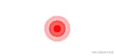
    <div class="circleBox">
      <div class="circle"></div>
      <div class="circle1"></div>
      <div class="circle2"></div>
      <div class="circle3"></div>
    </div>
css部分
.circleBox {
  position: relative;
  width: 100px;
  height: 100px;
  margin: 10px auto;

  .circle,
  .circle1,
  .circle2,
  .circle3 {
    width: 2vw;
    height: 2vw;
    background: rgba(112, 161, 255, 0.1);
    border: 1px solid rgba(112, 161, 255, 0.15);
    border-radius: 999px;
    position: absolute;
    top: 50%;
    left:10%;
    // transform: translate(-50%,-75%);
  }
  .circle1,
  .circle2,
  .circle3 {
    animation-name: circleChange;
    animation-duration: 3s;
    animation-iteration-count: infinite;
    animation-timing-function: linear;
  }
  .circle1 {
    animation-delay: 1s;
  }
  .circle2 {
    animation-delay: 2s;
  }
  .circle3 {
    animation-delay: 3s;
  }

  @keyframes circleChange {
    0% {
      transform: scale(1);
      opacity: 0.95;
    }
    25% {
      transform: scale(2);
      opacity: 0.75;
    }
    50% {
      transform: scale(3);
      opacity: 0.5;
    }
    75% {
      transform: scale(4);
      opacity: 0.25;
    }
    100% {
      transform: scale(5);
      opacity: 0.05;
    }
  }
}


