交互展示
使用
import { Button, Message } from 'Ocean';
import React from 'react';

const Basic = () => {
  return (
    <>
      <Button
        width={100}
        height={40}
        onClick={() => {
          Message.open({
            type: 'success',
            content: 'Welcome!  Ocean',
          });
        }}
        type="primary"
      >
        打开Modal
      </Button>
    </>
  );
};
需求
- message 基本使用
- 自定义宽度
- 自定义不同方向的动画
- 最大 message 个数
- 自定义持续时间
- 不同 message 类别
实现
const Message = (props: Message) => {
const {
content,
closeable,
topMessage = 0,
maxCount = 1,
changeMessage,
type = "success",
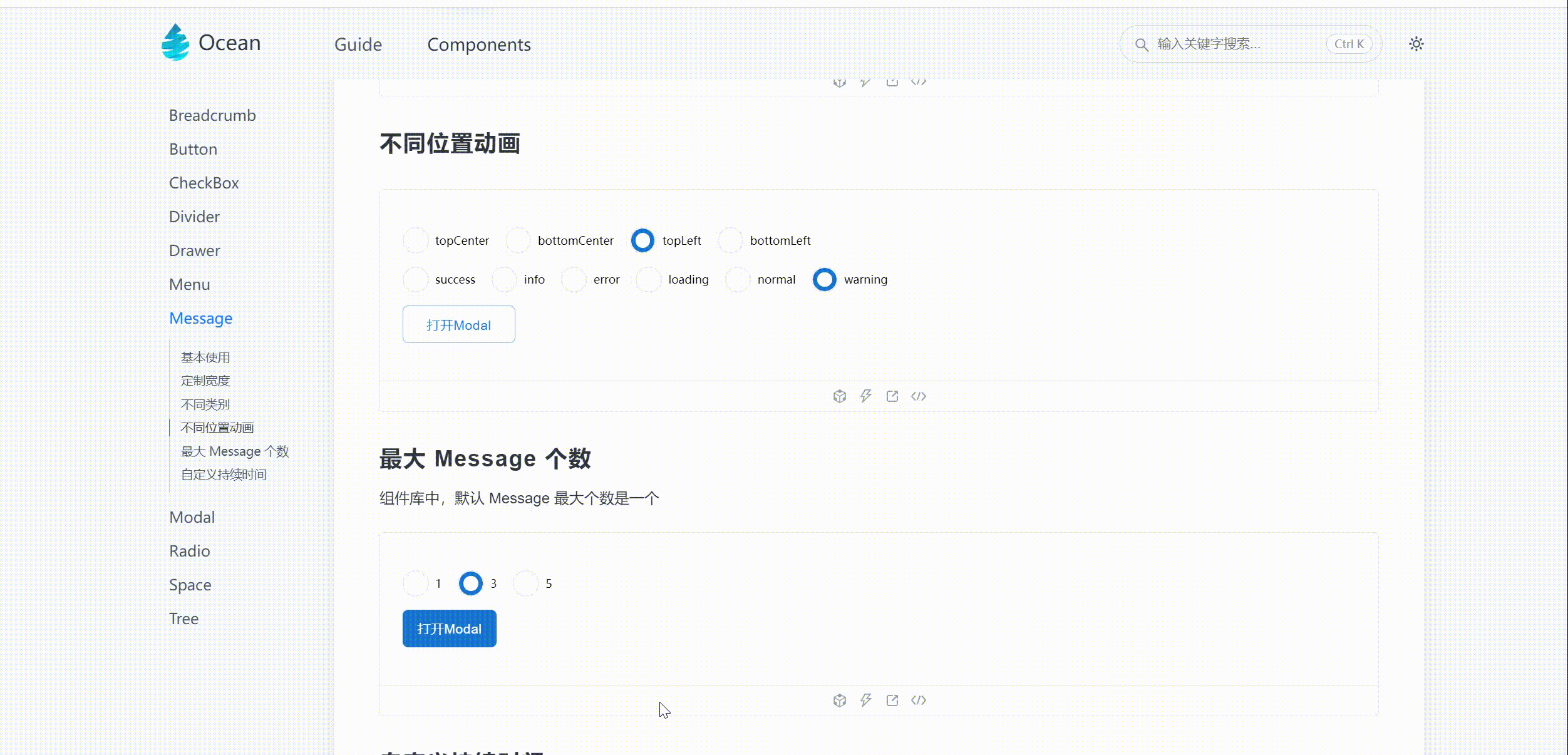
width,
position = 'top',
} = props;
const domRef = useRef<any>(null);
const isEdge = position === 'bottomLeft' || position === 'topLeft';
useLayoutEffect(() => {
if (topMessage > maxCount) {
changeMessage?.(1);
domRef.current.style[judgePosition(position)] = `${23}px`;
} else {
domRef.current.style[judgePosition(position)] = `${
(topMessage - 1) * 70 + 23
}px`;
}
}, [topMessage]);
const messageIcon = useMemo(() => {
if (type === 'info') {
return (
<ExclamationCircleFilled
style={{ color: primaryColor, fontSize: defaultFontSize }}
/>
);
}
if (type === 'error') {
return (
<CloseCircleFilled
style={{ color: errorColor, fontSize: defaultFontSize }}
/>
);
}
if (type === 'normal') {
return <></>;
}
if (type === 'success') {
return (
<CheckCircleFilled
style={{ color: successColor, fontSize: defaultFontSize }}
/>
);
}
if (type === 'warning') {
return (
<ExclamationCircleFilled
style={{ color: warningColor, fontSize: defaultFontSize }}
/>
);
}
if (type === 'loading') {
return (
<LoadingOutlined
style={{ color: primaryColor, fontSize: defaultFontSize }}
/>
);
}
}, [type]);
return (
<MessageWrapper ref={domRef} width={width} isEdge={isEdge}>
{messageIcon}
<span className="message-content">{content}</span>
</MessageWrapper>
);
};


