

我正在参加「兔了个兔」创意投稿大赛,详情请看:「兔了个兔」创意投稿大赛
前言
本文主要介绍使用 HTML+CSS 实现一只移动的小白兔动画效果,希望各位小伙伴在2023年美好如约而至,开开心心的"蹦"入兔年的怀抱中。
1、整体介绍
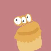
如上效果图所示,整体分为两部分,跳动的小白兔+云朵。 小白兔在跳动的过程中显现出云朵。
- 细分如下,兔子包含身体、耳朵、眼睛、尾巴、脚、跳动的阴影。
- 云朵,主要是飘动的而动画以及阴影
2、代码实现
定义dom,页面包含两个元素,分别代表兔子和云彩。如下所示:
<!DOCTYPE html>
<html>
  <head>
    <meta charset="utf-8" />
    <title>跳动的兔子</title>
    <link href="style.css" rel="stylesheet">
  </head>
  <body>
    <div class="rabbit">
    </div>
    <div class="clouds">
    </div>
  </body>
</html>
style.css文件说明:
- body居中显示
body {
    margin: 0;
    height: 100vh;
    display: flex;
    align-items: center;
    justify-content: center;
    background: linear-gradient(midnightblue, black);
    font-size: 30px;
}
- 兔子的身体,设置背景色,以及border-radius
/* 兔子的身体 */
.rabbit {
    width: 5em;
    height: 3em;
    color: whitesmoke;
    background: currentColor;
    border-radius: 70% 90% 60% 50%;
}
- 兔子的眼睛
.rabbit {
    background:
        radial-gradient(
            circle at 4.2em 1.4em,
            #333 0.15em,
            transparent 0.15em
        ), /* eye */
        currentColor;
}
- 兔子的耳朵 均通过css伪元素实现
/* 兔子的右耳 */
.rabbit::before {
    content: '';
    position: absolute;
    width: 0.75em;
    height: 2em;
    background-color: currentColor;
    border-radius: 50% 100% 0 0;
    transform: rotate(-30deg);
    top: -1em;
    right: 1em;
}

/* 兔子的左耳 */
.rabbit::before {
    border: 0.1em solid;
    border-color: gainsboro transparent transparent gainsboro;
    box-shadow: -0.5em 0 0 -0.1em;
}
- 兔子的尾巴
/* 兔子尾巴 */
.rabbit::after {
    content: '';
    position: absolute;
    width: 1em;
    height: 1em;
    background-color: currentColor;
    border-radius: 50%;
    left: -0.3em;
    top: 0.5em;
}
- 兔子的腿
/* 兔子的腿 */
.rabbit::after {
    box-shadow:
        0.5em 1em 0,
        4em 1em 0 -0.2em,
        4em 1em 0 -0.2em;
}
- 兔子的影子
/* 兔子的影子 */
.rabbit {
    box-shadow: -0.2em 1em 0 -0.75em #333;
}
- 云朵
/* 云朵 */
.clouds {
    width: 2em;
    height: 2em;
    color: whitesmoke;
    background: currentColor;
    border-radius: 100% 100% 0 0;
    transform: translate(0, -5em);
}

.clouds::before,
.clouds::after {
    content: '';
    position: absolute;
    background-color: currentColor;
    bottom: 0;
}

.clouds::before {
    width: 1.25em;
    height: 1.25em;
    border-radius: 100% 100% 0 100%;
    left: -30%;
}

.clouds::after {
    width: 1.5em;
    height: 1.5em;
    border-radius: 100% 100% 100% 0;
    right: -30%;
}

.rabbit {
    z-index: 1;
}

.clouds,
.clouds::before,
.clouds::after {
    box-shadow:
    5em 2em 0 -0.3em,
    -2em 2em 0 0;
}
- 兔子跳动的动画
/* 兔子跳动的动画 */
.rabbit {
    animation: hop 3s linear infinite;
}

@keyframes hop {
    20% {
        transform: rotate(-10deg) translate(1em, -2em);
        box-shadow: -0.2em 1em 0 -1em #333;
    }
    40% {
        transform: rotate(10deg) translate(3em, -4em);
        box-shadow: -0.2em 3.25em 0 -1.1em #333;
    }
    60%, 75% {
        transform: rotate(0deg) translate(4em, 0);
        box-shadow: -0.2em 1em 0 -0.75em #333;
    }
}
- 兔子腿的动画
/* 兔子腿的动画 */
.rabbit::after {
    animation: kick 3s infinite linear;
}

@keyframes kick {
    40% {
        box-shadow:
            0.5em 2em 0,
            4.2em 1.75em 0 -0.2em,
            4.4em 1.9em 0 -0.2em;
    }
}
- 云朵飘动的动画
/* 云朵飘动的动画 */
.clouds {
    animation: cloudy 3s infinite linear forwards;
    filter: opacity(0);
}

@keyframes cloudy {
    40% {
        transform: translate(-3em, -5em);
        filter: opacity(0.75);
    }
    55% {
        transform: translate(-4em, -5em);
        filter: opacity(0);
    }
}
好了,到这里就实现了一个跳动的兔子动画,并且跳动的时候会又云朵。 最后附上源码: 希望对你有所帮助!

