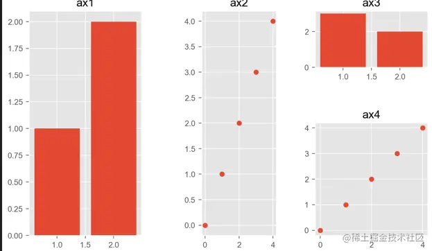
1.折线图
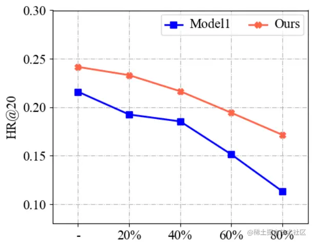
代码如下:
def plot_line():
x = np.array([1, 2, 3, 4, 5])
model1 = np.array([0.2160, 0.1925, 0.1854, 0.1513, 0.1132])
Ours = np.array([0.2416, 0.2331, 0.2165, 0.1943, 0.1715])
plt.figure(figsize=(5, 4))
plt.grid(linestyle="-.")
ax = plt.gca()
linewidth = 2.0
markersize = 7
plt.plot(x, model1, marker='s', markersize=markersize, color="blue", label="Model1", linewidth=linewidth)
plt.plot(x, Ours, marker='X', markersize=markersize, color="tomato", label="Ours", linewidth=linewidth)
group_labels = ['-', '20%', '40%', '60%', '80%']
plt.xticks(x, group_labels, fontsize=15)
y_ticks = [0.10, 0.15, 0.20, 0.25, 0.30]
y_lables = ['0.10', '0.15', '0.20', '0.25', '0.30']
plt.yticks(np.array(y_ticks), y_lables, fontsize=15)
plt.ylabel(f"HR@20", fontsize=15)
plt.xlim(0.5, 5.5)
plt.ylim(0.08, 0.30)
plt.legend(loc=0, numpoints=1, ncol=2)
leg = plt.gca().get_legend()
ltext = leg.get_texts()
plt.setp(ltext, fontsize=15)
plt.tight_layout()
plt.savefig(f'pics/line.png', format='png')
plt.show()
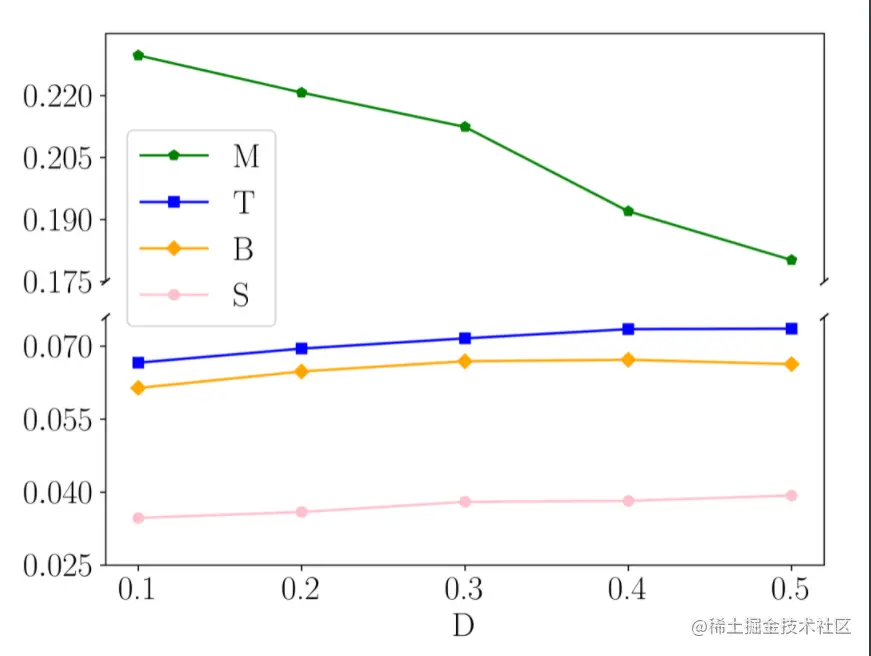
2. 折线截断图
3. 柱状图
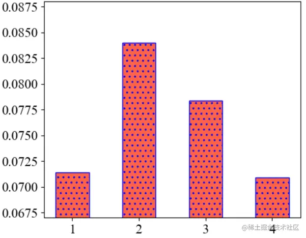
代码如下:
def plot_bar():
result1 = [0.0714, 0.0840, 0.0784, 0.0709]
plt.figure(figsize=(5, 4))
plt.ylim(0.067, 0.088)
labels = ['1', '2', '3', '4']
plt.xticks(fontsize=15)
plt.yticks(fontsize=15)
colors = ['tomato'] * 4
plt.bar(np.arange(len(result1)), result1, ec='b', hatch=2 * '.', width=0.5,
tick_label=labels,
color=colors)
plt.tight_layout()
plt.savefig(f'pics/bar.png', format='png')
plt.show()
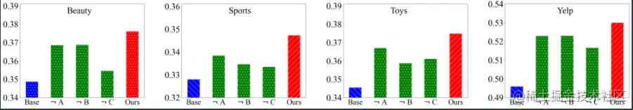
4. 多柱状图
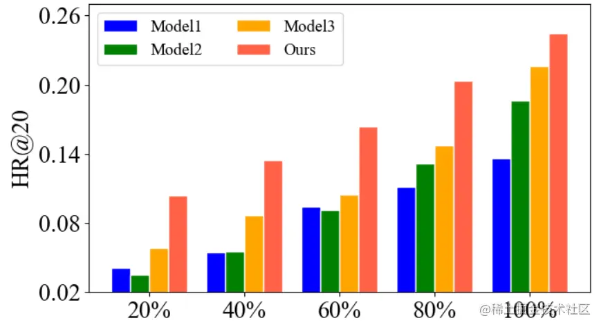
代码如下:
def plot_multi_bar():
model1 = np.array([0.0409, 0.0543, 0.0943, 0.1115, 0.1363])
model2 = np.array([0.0351, 0.0557, 0.0916, 0.1315, 0.1860])
model3 = np.array([0.0586, 0.0865, 0.1046, 0.1476, 0.2160])
Ours = np.array([0.1043, 0.1344, 0.1638, 0.2035, 0.2446])
plt.figure(figsize=(7, 4))
x = np.arange(5)
total_width, n = 0.8, 4
width = total_width / n
x = x - (total_width - width) / n
low = 0.02
up = 0.27
plt.ylim(low, up)
plt.ylabel(f"HR@20", fontsize=20)
labels = ['Model1', 'Model2', 'Model3', 'Ours']
plt.bar(x, model1, width=width, color='blue', edgecolor='w')
plt.bar(x + width, model2, width=width, color='green', edgecolor='w')
plt.bar(x + 2*width, model3, width=width, color='orange', edgecolor='w')
plt.bar(x + 3*width, Ours, width=width, color='tomato', edgecolor='w')
plt.xticks(x +1.5*width, labels=['20%', '40%', '60%', '80%', '100%'], fontsize=20)
y_lables = ['0.02', '0.08', '0.14', '0.20', '0.26']
y_ticks = [float(i) for i in y_lables]
plt.yticks(np.array(y_ticks), y_lables, fontsize=20)
plt.legend(labels=labels, ncol=2,
prop={'size': 14})
plt.tight_layout()
plt.savefig('./pics/multi_bar.png', format='png')
plt.show()
5. 柱状截断图
6. 柱状折线图
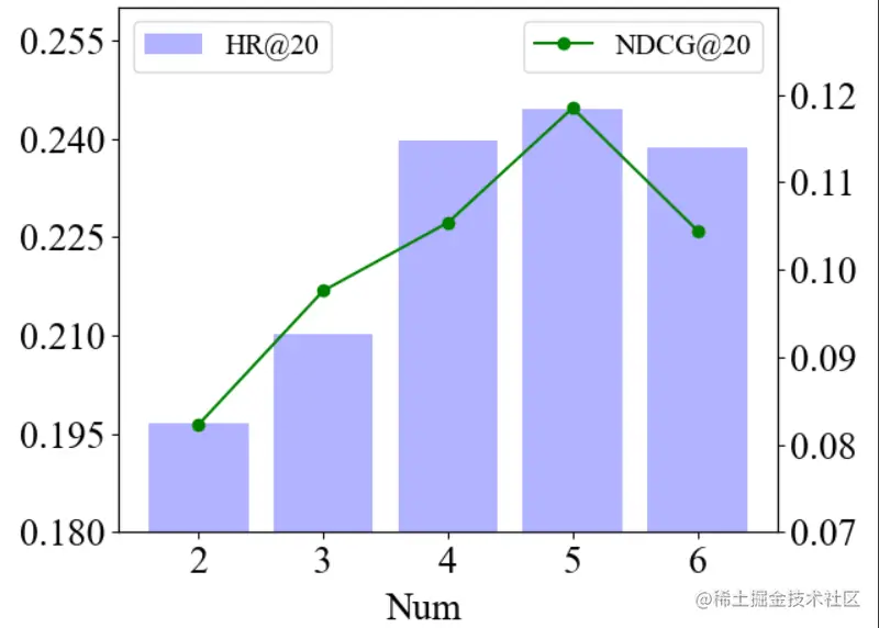
代码如下:
def plot_bar_and_line():
fontsize=20
result1 = [0.1967, 0.2103, 0.2398, 0.2446, 0.2387]
l = [i for i in range(5)]
lx = ['2', '3', '4', '5', '6']
fig = plt.figure()
ax1 = fig.add_subplot(111)
plt.bar(l, result1, alpha=0.3, color='blue', label='HR@20')
ax1.set_ylim([0.18, 0.26])
ax1.set_yticks(np.arange(0.18, 0.26, 0.015))
plt.legend(loc="upper left", prop={'size': 15})
plt.xticks(l, lx, fontsize=fontsize)
plt.yticks(fontsize=fontsize)
result2 = [0.0823, 0.0976, 0.1054, 0.1185, 0.1045]
ax2 = ax1.twinx()
ax2.plot(l, result2, 'or-', label='NDCG@20', color='green')
ax2.legend(loc=2)
ax2.set_ylim([0.07, 0.13])
ax2.set_yticks(np.arange(0.07, 0.13, 0.01))
plt.text(1.5, 0.06, "Num", fontsize=20)
plt.legend(loc="upper right", prop={'size': 15})
plt.yticks(fontsize=fontsize)
plt.tight_layout()
plt.savefig('pics/bar_and_line.png', format='png')
plt.show()
7. 常规组合图
8. 其他组合图