定位
- 先使用定位,然后通过top和left确认大概位置,在使用manrgin调整位置
* {
margin: 0;
padding: 0;
box-sizing: border-box;
}
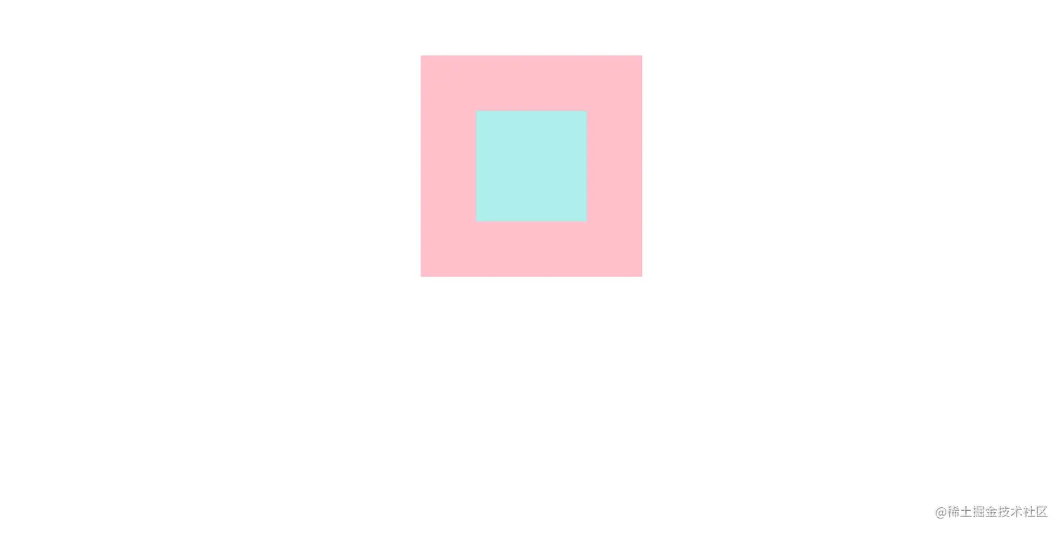
.father {
width: 400px;
height: 400px;
background-color: pink;
margin: 100px auto;
position: relative;
}
.son {
width: 200px;
height: 200px;
background-color: paleturquoise;
position: absolute;
top: 50%;
left: 50%;
margin-top: -100px;
margin-left: -100px;
}
<div class="father">
    <div class="son">
    </div>
  </div>
* {
    margin: 0;
    padding: 0;
    box-sizing: border-box;
  }

  .father {
    width: 400px;
    height: 400px;
    background-color: pink;
    margin: 100px auto;
    position: relative;
  }

  .son {
    width: 200px;
    height: 200px;
    background-color: paleturquoise;
    position: absolute;
    top: 100px;
    left: 100px;

  }
<div class="father">
    <div class="son">
    </div>
  </div>
- 先使用定位,然后通过top和left确认大概位置,在使用transform:translate()调整位置
* {
    margin: 0;
    padding: 0;
    box-sizing: border-box;
  }

  .father {
    width: 400px;
    height: 400px;
    background-color: pink;
    margin: 100px auto;
    position: relative;
  }

  .son {
    width: 200px;
    height: 200px;
    background-color: paleturquoise;
    position: absolute;
    top: 50%;
    left: 50%;
    transform: translate(-50%, -50%);
  }
<div class="father">
    <div class="son">
    </div>
  </div>
Flex布局
- 先使用dasply:flex进行布局,在通过 align-items: center ; 实现垂直方向居中,通过justify-content: center; 。
* {
    margin: 0;
    padding: 0;
    box-sizing: border-box;
  }

  .father {
    width: 400px;
    height: 400px;
    background-color: pink;
    margin: 100px auto;
    display: flex;
    align-items: center;
    justify-content: center;
  }

  .son {
    width: 200px;
    height: 200px;
    background-color: paleturquoise;

  }
<div class="father">
    <div class="son">
    </div>
  </div>

