px和%
- px是基本单位,绝对单位(其他都是相对单位)
- %相对于父元素(dom树上的节点的父元素)的宽度比例
<!DOCTYPE html>
<html lang="en">
  <head>
    <meta charset="UTF-8" />
    <meta http-equiv="X-UA-Compatible" content="IE=edge" />
    <meta name="viewport" content="width=device-width, initial-scale=1.0" />
    <title>Document</title>
    <style>
      #container {
        width: 200px;
        height: 200px;
        position: relative;
        background-color: #ccc;
      }
      #box {
        width: 100px;
        height: 100px;
        position: absolute;
        left: 50%;
        top: 50%;
        margin-top: -50px;
        margin-left: -50px;
        background-color: blue;
      }
    </style>
  </head>
  <body>
    <div id="container">
      <div id="box"></div>
    </div>
  </body>
</html>
em和rem
- em是相对于当前元素的font-size
- rem相对于根节点的font-size
    <div style="font-size: 20px">
      <p style="text-indent: 2em; font-size: 40px;">哈哈哈哈</p>
      <p style="text-indent: 2em; ">哈哈哈哈哈哈</p>
    </div>
em

媒体查询和rem
<!DOCTYPE html>
<html lang="en">
<head>
<meta charset="UTF-8" />
<meta http-equiv="X-UA-Compatible" content="IE=edge" />
<meta name="viewport" content="width=device-width, initial-scale=1.0" />
<title>Document</title>
<style>
@media only screen and (max-width: 374px) {
html {
font-size: 86px;
}
}
@media only screen and (min-width: 375px) and (max-width: 413px) {
html {
font-size: 100px;
}
}
@media only screen and (min-width: 414px) {
html {
font-size: 110px;
}
}
p {
font-size: 0.16rem;
}
</style>
</head>
<body>
<p>红红火火恍恍惚惚</p>
</body>
</html>
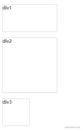
vw/vh
- vw屏幕宽度的1%
- vh屏幕高度的1%
- vmin两者的最小值,vmax两者的最大值
<!DOCTYPE html>
<html lang="en">
<head>
  <meta charset="UTF-8">
  <meta http-equiv="X-UA-Compatible" content="IE=edge">
  <meta name="viewport" content="width=device-width, initial-scale=1.0">
  <title>Document</title>
  <style>
    div{
      border:1px solid #ccc;
      margin-top: 20px;
    }
    #div1{
      width: 10vw;
      height: 10vh;
    }
    #div2{
      width: 10vmax;
      height: 10vmax;
    }
    #div3{
      width: 10vmin;
      height: 10vmin;
    }
  </style>
</head>
<body>
  <div id="div1">div1</div>
  <div id="div2">div2</div>
  <div id="div3">div3</div>
</body>
</html>


