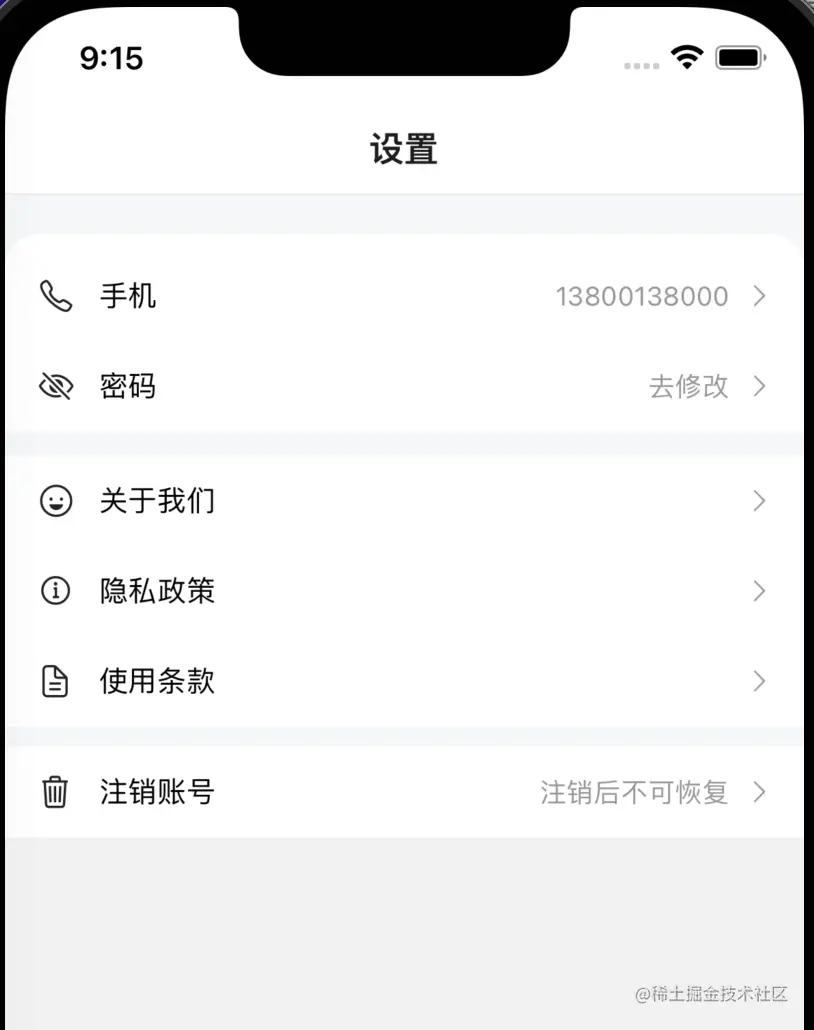
效果图
参数
CellGroup Props
| 参数 | 说明 | 类型 | 默认值 |
|---|
| round | 是否展示为圆角卡片风格 | boolean | false |
Cell Props
| 参数 | 说明 | 类型 | 默认值 |
|---|
| title | 左侧标题 | string | - |
| rightText | 右侧文字内容 | string | - |
| leftIcon | 左侧图标 | string | - |
| border | 是否显示内边框 | boolean | true |
| isLink | 是否展示右侧箭头并开启点击反馈 | boolean | false |
Cell Events
基础用法
import {Cell, CellGroup} from '../components/Cell';

<CellGroup round>
    <Cell
        leftIcon="ios-wallet-outline"
        title="我的钱包"
        rightText="账户余额100元"
        isLink
        onPress={() => alert('navigation to xxx...')}
    />
    <Cell
        border={false}
        leftIcon="nutrition-outline"
        title="抵用券"
        rightText="0"
    />
</CellGroup>
组件Cell.js
import {StyleSheet,Text,View,Image,TouchableOpacity,PixelRatio} from 'react-native';
import React from 'react';
import Ionicons from 'react-native-vector-icons/Ionicons';
export function CellGroup(props) {
return (
<View style={[styles.cellGroupView, {borderRadius: props.round ? 8 : 0}]}>
{props.children}
</View>
);
}
export function Cell(props) {
return (
<TouchableOpacity
activeOpacity={props.isLink ? 0.5 : 1}
onPress={props.onPress}>
<View
style={[
styles.cellView,
{borderBottomWidth: props.border ? 1 / PixelRatio.get() : 0},
]}>
<View style={styles.innerView}>
{props.leftIcon && (
<Ionicons size={16} color={'#666'} name={props.leftIcon} />
)}
<Text style={styles.titleStyle}>{props.title}</Text>
</View>
<View style={styles.innerView}>
{props.rightText && (
<Text style={styles.rightTextStyle}>{props.rightText}</Text>
)}
{props.isLink && (
<Ionicons name="chevron-forward" size={14} color={'#999'} />
)}
</View>
</View>
</TouchableOpacity>
);
}
Cell.defaultProps = {
title: '',
rightText: '',
leftIcon: '',
border: true,
isLink: false,
};
CellGroup.defaultProps = {
round: false,
};
const styles = StyleSheet.create({
cellGroupView: {
backgroundColor: '#fff',
},
cellView: {
paddingHorizontal: 16,
height: 44,
flexDirection: 'row',
alignItems: 'center',
justifyContent: 'space-between',
borderBottomColor: '#ddd',
},
innerView: {
height: 44,
flexDirection: 'row',
alignItems: 'center',
},
titleStyle: {
marginLeft: 12,
},
rightTextStyle: {
marginRight: 8,
color: '#999',
},
});
大家根据自身业务需求来丰富Cell的功能,如:给组件添加左侧和右侧图片,添加额外类名等属性


