注意:使用此组件必须:Element-plus版本2.6以上;@wocwin/t-ui-plus最新版本。
2024-08-29 TSelectTable 单选开启键盘事件,键盘向上/下滚动条根据移动的选择区域而滚动
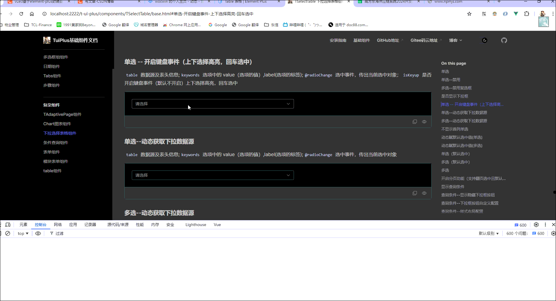
一、最终效果
二、代码示例
<t-select-table
  :table="table"
  :columns="table.columns"
  :max-height="400"
  :keywords="{ label: 'name', value: 'id' }"
  @radioChange="radioChange"
></t-select-table>
三、参数配置
1. 配置参数(Attributes)继承 el-table 及 el-select 属性
| 参数 | 说明 | 类型 | 默认值 |
|---|
| v-model | 绑定值 | boolean / string / number | 仅显示 |
| table | 表格数据对象 | Object | {} |
| ---data | 展示下拉数据源 | Array | [] |
| ---total | 数据总条数 | Number | - |
| ---pageSize | 每页显示条目个数 | Number | - |
| ---currentPage | 当前页数 | Number | - |
| columns | 表头信息 | Array | [] |
| ----bind | el-table-column Attributes | Object | - |
| ----noShowTip | 是否换行 (设置:noShowTip:true) | Boolean | false |
| ----fixed | 列是否固定( left, right) | string, boolean | - |
| ----align | 对齐方式(left/center/right) | String | center |
| ----render | 返回三个参数(text:当前值,row:当前整条数据 ,index:当前行) | function | - |
| ----slotName | 插槽显示此列数据(其值是具名作用域插槽) | String | - |
| ------scope | 具名插槽获取此行数据必须用解构接收{scope} | Object | 当前行数据 |
| keywords | 关键字配置(value-key 配置) | Object | 无 |
| ------label | 选项的标签 | String | ‘label’ |
| ------value | 选项的值 | String / number | ‘value’ |
| radioTxt | 单选文案 | String | 单选 |
| multiple | 是否开启多选 | Boolean | false |
| rowClickRadio | 是否开启整行选中(单选) | boolean | true |
| isShowFirstColumn | 是否显示首列(单选) | boolean | true |
| defaultSelectVal | 设置第一页默认选中项--keywords.value 值) | Array | - |
| filterable | 是否开启过滤(根据 keywords 的 label 值进行过滤) | Boolean | true |
| reserveSelection | 是否支持翻页选中 | Boolean | true |
| isShowPagination | 开启分页 | Boolean | false |
| tableWidth | table 宽度 | Number | 550 |
| isKeyup | 单选是否开启键盘事件 | Boolean | false |
| isShowQuery | 是否允许配置查询条件(继承TQueryCondition的所有属性、事件、插槽) | Boolean | false |
| isShowBlurBtn | 条件查询组件是否显示隐藏下拉框按钮 | Boolean | false |
| btnBind | 显示下拉框按钮配置,继承el-button所有属性;默认值{type:'danger',btnTxt:'关闭下拉框'} | Object | - |
| isClearQuery | 关闭下拉框是否清空搜索条件 | Boolean | false |
2. 事件(events)继承 el-table 及 el-select 属性
| 事件名 | 说明 | 回调参数 |
|---|
| page-change | 页码改变事件 | 返回选中的页码 |
| selectionChange | 多选事件 | 返回选中的项数据及选中项的 keywords.value 集合 |
| radioChange | 单选 | 返回当前项所有数据 |
3.方法(Methods)继承 el-table 及 el-select 属性
| 方法名 | 说明 | 回调参数 |
|---|
| clear | 清空选中项 | |
| focus | 使 input 获取焦点 | |
| blur | 使 input 失去焦点,并隐藏下拉框 | |
四、具体代码
<template>
<el-input
v-if="isShowInput"
v-model="selectInputVal"
v-bind="{ clearable: true, ...inputAttr }"
@focus="() => emits('input-focus')"
@blur="() => emits('input-blur')"
@click="() => emits('input-click')"
@clear="() => emits('input-clear')"
:style="{ width: inputWidth ? `${inputWidth}px` : '100%' }"
>
<template v-for="(index, name) in slots" v-slot:[name]="data">
<slot :name="name" v-bind="data" />
</template>
</el-input>
<el-select
v-else
ref="selectRef"
:model-value="multiple ? state.defaultValue : selectDefaultLabel"
popper-class="t-select-table"
:style="{ width: selectWidth ? `${selectWidth}px` : '100%' }"
:multiple="multiple"
v-bind="selectAttr"
:value-key="keywords.value"
:filterable="filterable"
:filter-method="filterMethod || filterMethodHandle"
v-click-outside="closeBox"
@visible-change="visibleChange"
@remove-tag="removeTag"
@clear="clear"
@keyup="selectKeyup"
>
<template #empty>
<div
class="t-table-select__table"
:style="{ width: tableWidth ? `${tableWidth}px` : '100%' }"
>
<div class="table_query_condition" v-if="isShowQuery">
<t-query-condition
ref="tQueryConditionRef"
:boolEnter="false"
@handleEvent="handleEvent"
v-bind="$attrs"
>
<template v-for="(index, name) in slots" v-slot:[name]="data">
<slot :name="name" v-bind="data"></slot>
</template>
<template #querybar v-if="isShowBlurBtn">
<el-button v-bind="{ type: 'danger', ...btnBind }" @click="blur">{{
btnBind.btnTxt || "关闭下拉框"
}}</el-button>
<slot name="querybar"></slot>
</template>
</t-query-condition>
</div>
<slot name="toolbar"></slot>
<el-table
ref="selectTable"
:data="state.tableData"
:class="{
radioStyle: !multiple,
highlightCurrentRow: isRadio,
keyUpStyle: isKeyup
}"
highlight-current-row
border
:row-class-name="getRowClassName"
:row-key="getRowKey"
@row-click="rowClick"
@cell-dblclick="cellDblclick"
@selection-change="handlesSelectionChange"
v-bind="$attrs"
>
<el-table-column
v-if="multiple"
type="selection"
width="55"
align="center"
:reserve-selection="reserveSelection"
:selectable="selectable"
fixed
></el-table-column>
<el-table-column
type="radio"
width="55"
:label="radioTxt"
fixed
align="center"
v-if="!multiple && isShowFirstColumn"
>
<template #default="scope">
<el-radio
v-model="radioVal"
:label="scope.$index + 1"
:disabled="scope.row.isRadioDisabled"
@click.stop="radioChangeHandle($event, scope.row, scope.$index + 1)"
></el-radio>
</template>
</el-table-column>
<el-table-column
v-for="(item, index) in columns"
:key="index + 'i'"
:type="item.type"
:label="item.label"
:prop="item.prop"
:min-width="item['min-width'] || item.minWidth"
:width="item.width"
:align="item.align || 'center'"
:fixed="item.fixed"
v-bind="{ 'show-overflow-tooltip': true, ...item.bind, ...$attrs }"
>
<template #default="scope">
<template v-if="item.render">
<render-col
:column="item"
:row="scope.row"
:render="item.render"
:index="scope.$index"
/>
</template>
<template v-if="item.slotName">
<slot :name="item.slotName" :scope="scope"></slot>
</template>
<div v-if="!item.render && !item.slotName">
<span>{{ scope.row[item.prop] }}</span>
</div>
</template>
</el-table-column>
<slot></slot>
</el-table>
<slot name="footer"></slot>
<div class="t-table-select__page" v-if="isShowPagination">
<el-pagination
v-model:current-page="table.currentPage"
v-model:page-size="table.pageSize"
size="small"
background
@current-change="handlesCurrentChange"
layout="total, prev, pager, next, jumper"
:pager-count="table['pager-count'] || 5"
:total="table.total"
v-bind="$attrs"
/>
</div>
</div>
</template>
</el-select>
</template>
<script setup lang="ts" name="TSelectTable">
import TQueryCondition from "../../query-condition/src/index.vue"
import RenderCol from "./renderCol.vue"
import {
computed,
useAttrs,
useSlots,
ref,
watch,
nextTick,
reactive,
onMounted,
onUpdated
} from "vue"
import { ElMessage } from "element-plus"
import ClickOutside from "../../utils/directives/click-outside/index"
const props = defineProps({
inputValue: {
type: [Array, String, Number, Boolean, Object],
default: undefined
},
modelValue: {
type: [Array, String, Number, Boolean, Object],
default: undefined
},
isShowInput: {
type: Boolean,
default: false
},
inputWidth: {
type: [String, Number],
default: 550
},
inputAttr: {
type: Object,
default: () => {
return {}
}
},
value: {
type: [String, Number, Array]
},
table: {
type: Object,
default: () => {
return {}
}
},
columns: {
type: Array as unknown as any[],
default: () => []
},
radioTxt: {
type: String,
default: "单选"
},
isShowQuery: {
type: Boolean,
default: false
},
isClearQuery: {
type: Boolean,
default: false
},
isShowBlurBtn: {
type: Boolean,
default: false
},
btnBind: {
type: Object,
default: () => {
return {
btnTxt: "关闭下拉框"
}
}
},
rowClickRadio: {
type: Boolean,
default: true
},
isShowFirstColumn: {
type: Boolean,
default: true
},
filterable: {
type: Boolean,
default: true
},
reserveSelection: {
type: Boolean,
default: true
},
isShowPagination: {
type: Boolean,
default: false
},
filterMethod: {
type: Function
},
keywords: {
type: Object,
default: () => {
return {
label: "label",
value: "value"
}
}
},
isKeyup: {
type: Boolean,
default: false
},
multiple: {
type: Boolean,
default: false
},
selectWidth: {
type: [String, Number],
default: 550
},
tableWidth: {
type: [String, Number],
default: 550
},
selfExpanded: {
type: Boolean,
default: false
},
isExpanded: {
type: Boolean,
default: false
},
defaultSelectVal: {
type: Array,
default: () => []
},
selectable: Function
})
const selectAttr = computed(() => {
return {
clearable: true,
...useAttrs()
}
})
const vClickOutside = ClickOutside
const emits = defineEmits([
"page-change",
"selectionChange",
"radioChange",
"update:inputValue",
"input-focus",
"input-blur",
"input-clear",
"input-click"
])
const slots = useSlots()
const isDefaultSelectVal = ref(true)
const forbidden = ref(true)
const isRadio = ref(false)
const isQueryVisible = ref(false)
const isVisible = ref(false)
const radioVal = ref("")
const selectDefaultLabel: any = ref(props.modelValue)
let selectInputVal: any = computed({
get() {
return props.inputValue
},
set(val) {
emits("update:inputValue", val)
}
})
const state: any = reactive({
defaultSelectValue: props.defaultSelectVal,
tableData: props.table.data,
defaultValue: props.value,
ids: [],
tabularMap: {}
})
const selectRef: any = ref<HTMLElement | null>(null)
const selectTable: any = ref<HTMLElement | null>(null)
const tQueryConditionRef: any = ref<HTMLElement | null>(null)
const nowIndex = ref(-1)
watch(
() => props.table.data,
val => {
state.tableData = val
nextTick(() => {
state.tableData &&
state.tableData.length > 0 &&
state.tableData.forEach((item: { [x: string]: any }) => {
state.tabularMap[item[props.keywords.value]] = item[props.keywords.label]
})
})
},
{ deep: true }
)
watch(
() => props.defaultSelectVal,
val => {
console.log("props.defaultSelectVal---watch", val, isDefaultSelectVal.value)
state.defaultSelectValue = val
if (val.length > 0 && isDefaultSelectVal.value) {
defaultSelect(val)
}
},
{ deep: true }
)
onMounted(() => {
if (state.defaultSelectValue && state.defaultSelectValue.length > 0 && isDefaultSelectVal.value) {
defaultSelect(state.defaultSelectValue)
}
if (props.selfExpanded) {
selectRef.value.expanded = true
}
})
onUpdated(() => {
if (props.isShowQuery) {
selectTable.value.doLayout()
}
})
const visibleChange = (visible: boolean) => {
isVisible.value = visible
if (isQueryVisible.value) {
selectRef.value.expanded = true
}
if (visible) {
if (
state.defaultSelectValue &&
state.defaultSelectValue.length > 0 &&
isDefaultSelectVal.value
) {
defaultSelect(state.defaultSelectValue)
}
initTableData()
} else {
if (
tQueryConditionRef.value &&
props.isShowQuery &&
props.isClearQuery &&
!selectRef.value.expanded &&
!props.selfExpanded
) {
tQueryConditionRef.value?.resetData()
}
findLabel()
filterMethodHandle("")
}
if (props.selfExpanded) {
selectRef.value.expanded = true
}
}
const handleEvent = () => {
selectRef.value.expanded = true
}
const queryVisibleChange = (val: boolean) => {
isQueryVisible.value = val
}
const closeBox = () => {
if (tQueryConditionRef.value && props.isShowQuery) {
selectRef.value.expanded = true
Object.values(tQueryConditionRef.value?.props?.opts).map((val: any) => {
if (val.comp.includes("select") || val.comp.includes("picker") || val.comp.includes("date")) {
val.eventHandle = {
"visible-change": ($event: boolean) => queryVisibleChange($event)
}
selectRef.value.expanded = true
}
})
if (isVisible.value && props.isShowQuery) {
selectRef.value.expanded = true
} else {
selectRef.value.expanded = false
}
}
}
const attrs: any = useAttrs()
const selectKeyup = (e: { keyCode: any }) => {
if (!props.multiple && props.isKeyup && state.tableData.length > 0) {
const newIndex = nowIndex.value * 1
const nextIndex = e.keyCode === 40 ? newIndex + 1 : e.keyCode === 38 ? newIndex - 1 : newIndex
const rowHeight = selectTable.value.$el.querySelectorAll('.el-table__row')[0].clientHeight;
const headerHeight = selectTable.value.$el.querySelectorAll('.el-table__header')[0].clientHeight;
const maxHeight = attrs['max-height'] ? attrs['max-height'] - headerHeight : 0;
const height = rowHeight * (nextIndex + 3);
const scrollTop = height > maxHeight ? height - maxHeight : 0;
if (attrs['max-height']) {
selectTable.value.setScrollTop(scrollTop);
}
const validNextIndex = Math.max(0, Math.min(nextIndex, state.tableData.length - 1))
selectTable.value.setCurrentRow(state.tableData[validNextIndex])
nowIndex.value = validNextIndex
if (e.keyCode === 13) {
rowClick(state.tableData[validNextIndex])
}
}
}
const findLabel = () => {
nextTick(() => {
if (props.multiple) {
selectRef.value.selected?.forEach((item: { currentLabel: any; value: any }) => {
item.currentLabel = item.value
})
} else {
selectDefaultLabel.value =
(state.defaultValue && state.defaultValue[props.keywords.label]) || ""
}
})
}
const handlesCurrentChange = (val: any) => {
if (props.multiple) {
if (!props.reserveSelection) {
clear()
}
} else {
clear()
}
emits("page-change", val)
}
const defaultSelect = (defaultSelectVal: any[]) => {
if (props.multiple) {
const multipleList = defaultSelectVal
.map(val => state.tableData.find(row => row[props.keywords.value] === val))
.filter(Boolean) as any[]
setTimeout(() => {
state.defaultValue = multipleList.map(item => item[props.keywords.label])
multipleList.forEach(row => {
selectTable.value.toggleRowSelection(row, true)
})
selectRef.value?.selected?.forEach(item => {
item.currentLabel = item.value
})
}, 0)
} else {
const row = state.tableData.find(item => item[props.keywords.value] === defaultSelectVal[0])
if (row) {
radioVal.value = state.tableData.indexOf(row) + 1
state.defaultValue = row
setTimeout(() => {
selectDefaultLabel.value = row[props.keywords.label]
}, 0)
emits("radioChange", row, row[props.keywords.value])
}
}
}
const handlesSelectionChange = (val: any[]) => {
isDefaultSelectVal.value = false
state.defaultValue = val.map(item => item[props.keywords.label])
state.ids = val.map(item => item[props.keywords.value])
if (val.length === 0) {
isDefaultSelectVal.value = true
state.defaultSelectValue = []
}
emits("selectionChange", val, state.ids)
}
const getRowClassName = ({ row }: any) => {
if (!props.multiple && JSON.stringify(row) === JSON.stringify(state.defaultValue)) {
return "selected_row_style"
}
return ""
}
const getRowKey = (row: { [x: string]: any }) => {
return row[props.keywords.value]
}
const filterMethodHandle = (val: string) => {
if (!props.filterable) return
const tableData = JSON.parse(JSON.stringify(props.table?.data))
if (!tableData || tableData.length === 0) return
if (!props.multiple) {
if (val) {
radioVal.value = ""
} else {
const defaultIndex = tableData.findIndex(
item => item[props.keywords.value] === selectDefaultLabel.value
)
if (defaultIndex !== -1) {
radioVal.value = defaultIndex + 1
}
}
}
state.tableData = tableData.filter(item => {
return item[props.keywords.label].includes(val)
})
}
const initTableData = () => {
nextTick(() => {
if (props.multiple) {
state.defaultValue?.forEach(row => {
const matchedRow = state.tableData.find(
item => item[props.keywords.value] === row[props.keywords.value]
)
if (matchedRow) {
selectTable.value.toggleRowSelection(matchedRow, true)
}
})
} else {
const matchedRow = state.tableData.find(
item => item[props.keywords.value] === selectDefaultLabel.value
)
if (matchedRow) {
selectTable.value.setCurrentRow(matchedRow)
}
}
})
}
const copyDomText = (val: any) => {
const text = val
const input = document.createElement("input")
input.value = text
document.body.appendChild(input)
input.select()
document.execCommand("copy")
document.body.removeChild(input)
}
const cellDblclick = (row: { [x: string]: any }, column: { property: string | number }) => {
try {
copyDomText(row[column.property])
ElMessage.success("复制成功")
} catch (e) {
ElMessage.error("复制失败")
}
}
const radioChangeHandle = (event: { preventDefault: () => void }, row: any, index: any) => {
event.preventDefault()
if (row.isRadioDisabled) return
isDefaultSelectVal.value = false
radioClick(row, index)
}
const isForbidden = () => {
forbidden.value = false
setTimeout(() => {
forbidden.value = true
}, 0)
}
const radioClick = (row: { [x: string]: any }, index: string) => {
forbidden.value = !forbidden.value
if (radioVal.value === index) {
radioVal.value = ""
isForbidden()
resetState()
emits("radioChange", {}, null)
} else {
updateState(row, index)
}
if (props.isExpanded) {
selectDefaultLabel.value = state.defaultValue[props.keywords.label] || ""
selectRef.value.expanded = true
} else {
blur()
}
}
const resetState = () => {
state.defaultValue = {}
state.defaultSelectValue = []
isDefaultSelectVal.value = true
}
const updateState = (row: { [x: string]: any }, index: string) => {
isForbidden()
radioVal.value = index
state.defaultValue = row
emits("radioChange", row, row[props.keywords.value])
}
const rowClick = async (row: { [x: string]: any }) => {
if (row.isRadioDisabled) return
if (!props.rowClickRadio) return
if (!props.multiple) {
const rowIndex = props.table?.data.findIndex(
item => item[props.keywords.value] === row[props.keywords.value]
)
if (rowIndex !== -1) {
isDefaultSelectVal.value = false
await radioClick(row, rowIndex + 1)
if (radioVal.value) {
isRadio.value = true
} else {
isRadio.value = false
}
}
}
}
const removeTag = (tag: any) => {
const row = state.tableData.find(
(item: { [x: string]: any }) => item[props.keywords.label] === tag
)
console.log("tags删除后回调", row)
selectTable.value.toggleRowSelection(row, false)
isDefaultSelectVal.value = true
}
const clear = () => {
if (props.multiple) {
selectTable.value.clearSelection()
isDefaultSelectVal.value = true
state.defaultSelectValue = []
state.defaultValue = []
} else {
selectTable.value.setCurrentRow(-1)
nowIndex.value = -1
radioVal.value = ""
isDefaultSelectVal.value = true
state.defaultSelectValue = []
forbidden.value = false
selectDefaultLabel.value = null
state.defaultValue = null
emits("radioChange", {}, null)
}
}
const blur = () => {
selectRef.value.blur()
}
const focus = () => {
selectRef.value.focus()
}
defineExpose({
focus,
blur,
clear,
props,
tQueryConditionRef,
selectRef,
selectTable
})
</script>
<style lang="scss">
.t-select-table {
// 单选样式
.radioStyle {
.el-radio {
.el-radio__label {
display: none;
}
&:focus:not(.is-focus):not(:active):not(.is-disabled) .el-radio__inner {
box-shadow: none;
}
}
.el-table__row {
cursor: pointer;
}
}
// 键盘事件开启选择高亮
.keyUpStyle {
.el-table__body {
tbody {
.current-row {
color: var(--el-color-primary) !important;
cursor: pointer;
}
}
}
}
// 键盘事件开启选中行样式
.selected_row_style {
color: var(--el-color-primary);
cursor: pointer;
}
// 选中行样式
.highlightCurrentRow {
:deep(.current-row) {
color: var(--el-color-primary);
cursor: pointer;
}
}
.t-table-select__table {
padding: 10px;
.el-table__body,
.el-table__header {
margin: 0;
}
// 条件查询组件样式
.table_query_condition {
width: 100%;
overflow-x: auto;
overflow-y: hidden;
padding: 10px;
}
}
.t-table-select__page {
padding-top: 5px;
padding-right: 10px;
.el-pagination {
display: flex;
justify-content: flex-end;
align-items: center;
margin-right: calc(2% - 20px);
background-color: var(--el-table-tr-bg-color);
}
}
}
</style>
五、组件地址
gitHub组件地址
gitee码云组件地址
六、相关文章
vue3+ts基于Element-plus再次封装基础组件文档
基于ElementUi再次封装基础组件文档
基于ant-design-vue再次封装基础组件文档


