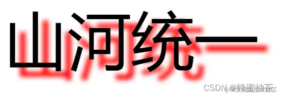
文字阴影
- 作用:给文字添加阴影效果
- 属性名:text-shadow
- 取值:
| 参数 | 作用 |
|---|
| h-shadow | 必须,水平偏移量。允许负值 |
| v-shadow | 必须,垂直偏移量。允许负值 |
| blur | 可选,模糊度 |
| color | 可选,阴影颜色 |
- 直接连写:text-shadow: 16px 14px 8px red;
<!DOCTYPE html>
<html lang="en">
<head>
    <meta charset="UTF-8">
    <meta http-equiv="X-UA-Compatible" content="IE=edge">
    <meta name="viewport" content="width=device-width, initial-scale=1.0">
    <title>Document</title>
    <style>
        div {
            font-size: 100px;
            font-weight: 700px;
            text-align: center;
            line-height: 300px;
            text-shadow: 16px 14px 8px red;
        }
    </style>
</head>
<body>
    <div>山河统一</div>
</body>
</html>
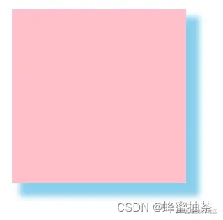
盒子阴影
- 作用:给盒子添加阴影效果
- 属性名:box-shadow
- 取值:
| 参数 | 作用 |
|---|
| h-shadow | 必须,水平偏移量。允许负值 |
| v-shadow | 必须,垂直偏移量。允许负值 |
| blur | 可选,模糊度 |
| spread | 可选,阴影扩大 |
| color | 可选,阴影颜色 |
| inset | 可选,将阴影改为内部阴影 |
- 直接连写:box-shadow: 12px 12px 7px 3px skyblue;
<!DOCTYPE html>
<html lang="en">
<head>
    <meta charset="UTF-8">
    <meta http-equiv="X-UA-Compatible" content="IE=edge">
    <meta name="viewport" content="width=device-width, initial-scale=1.0">
    <title>Document</title>
    <style>
        div {
            width: 200px;
            height: 200px;
            margin: 100px auto;
            background-color: pink;
            box-shadow: 12px 12px 7px 3px skyblue;
        }
    </style>
</head>
<body>
    <div></div>
</body>
</html>


